


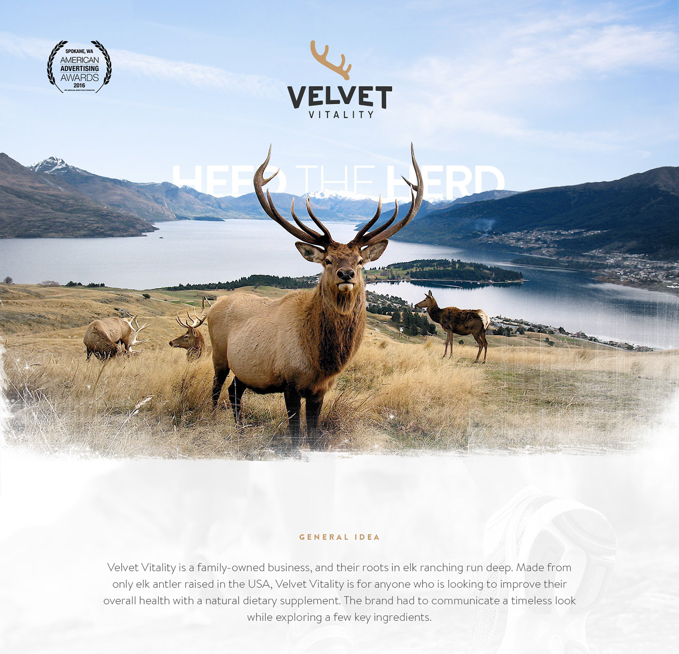
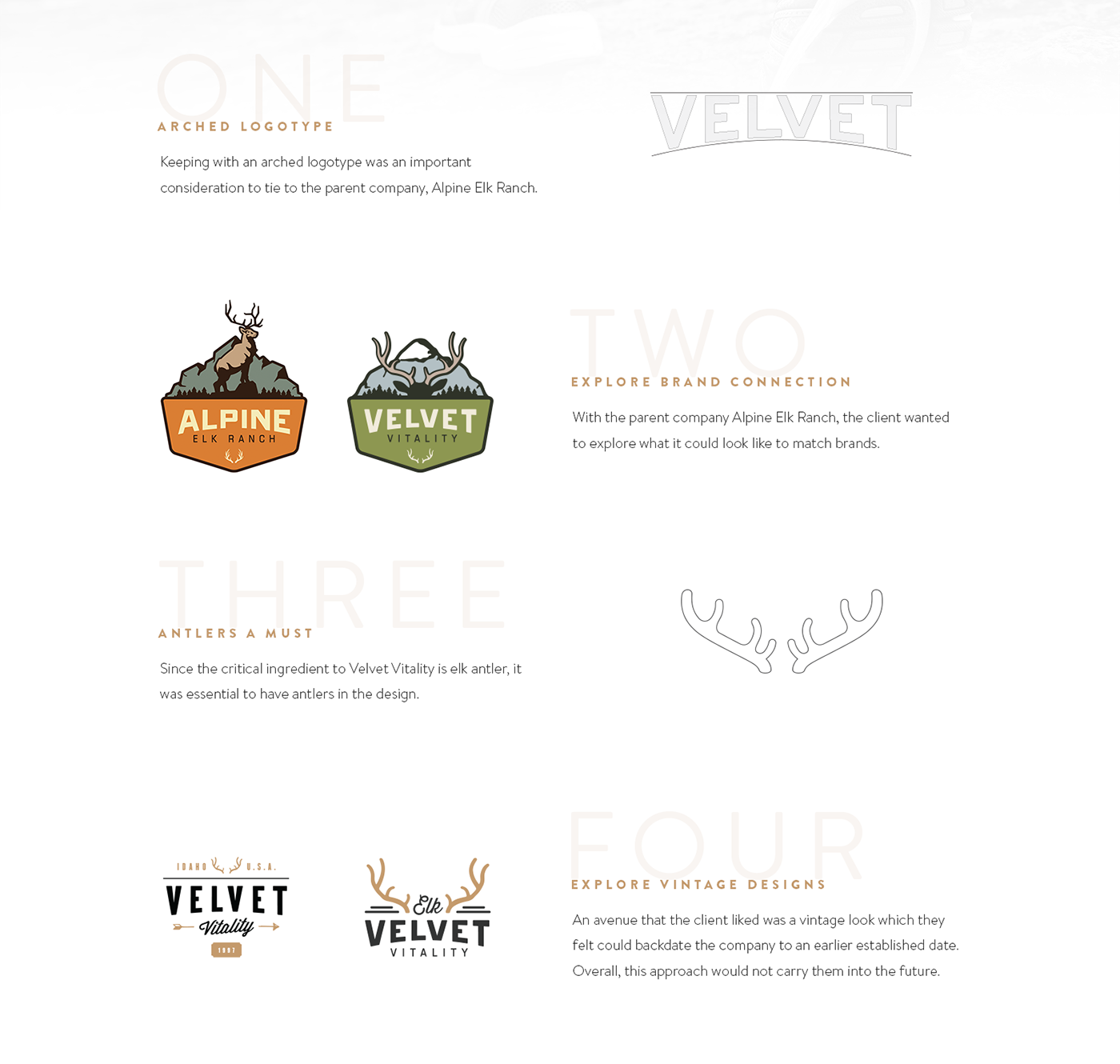
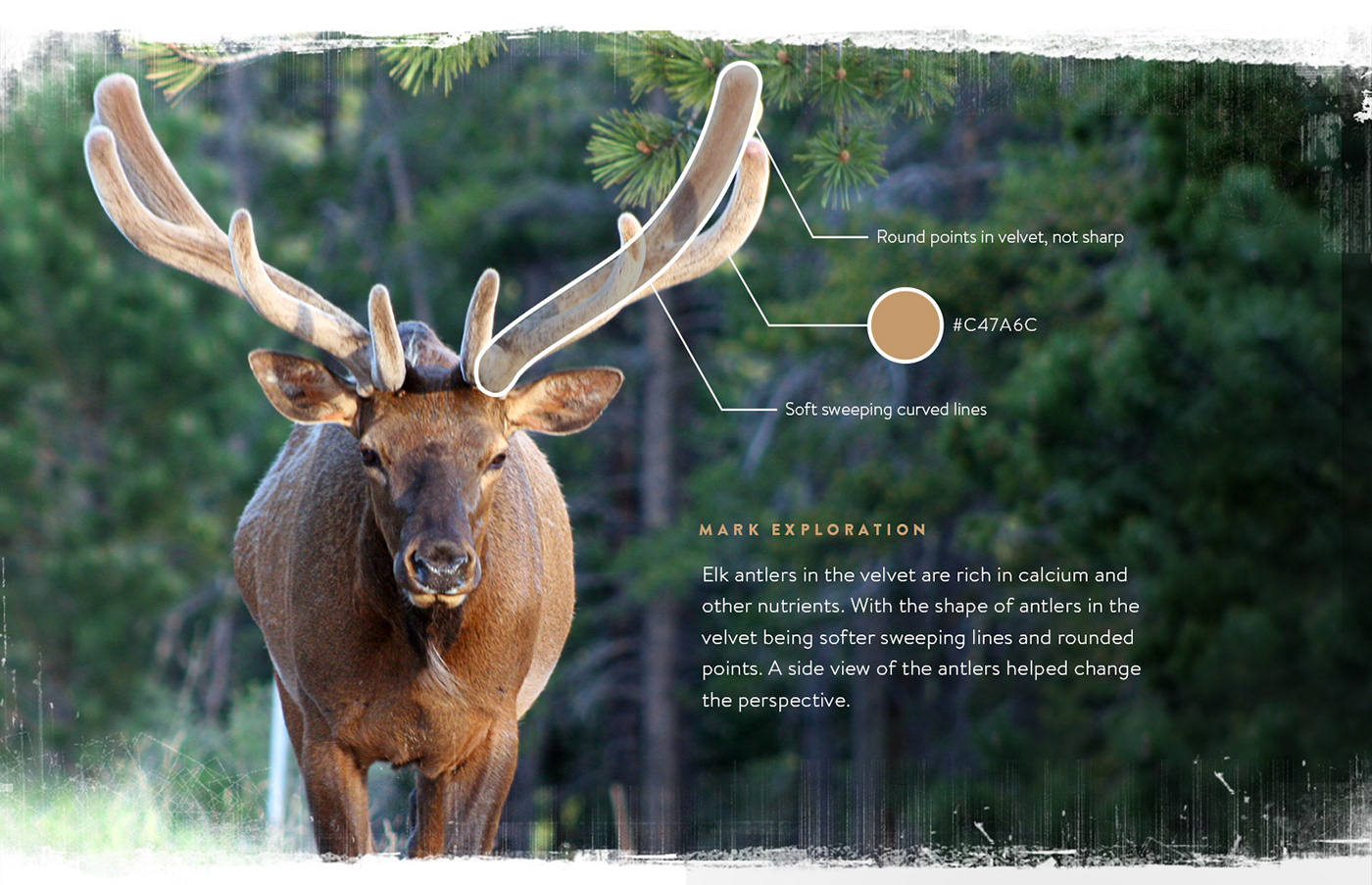

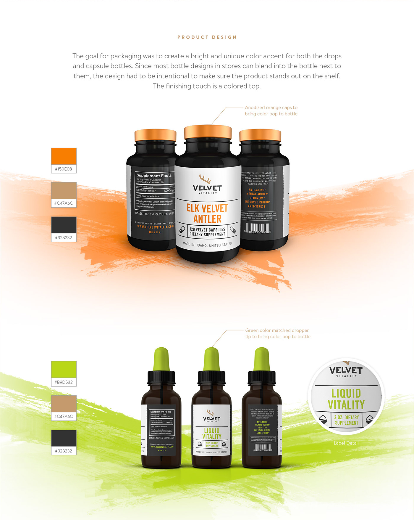
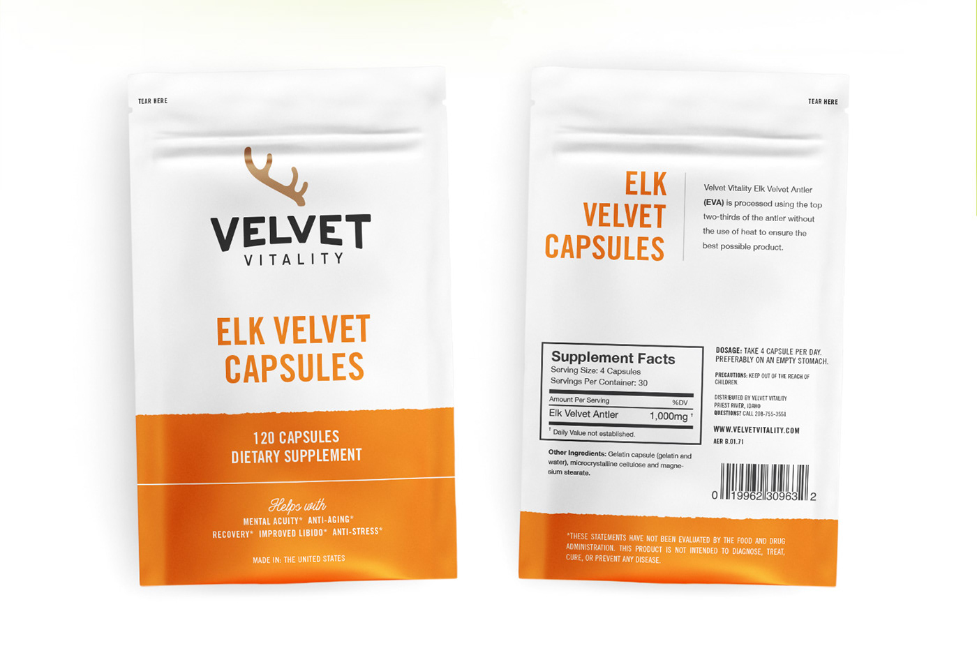
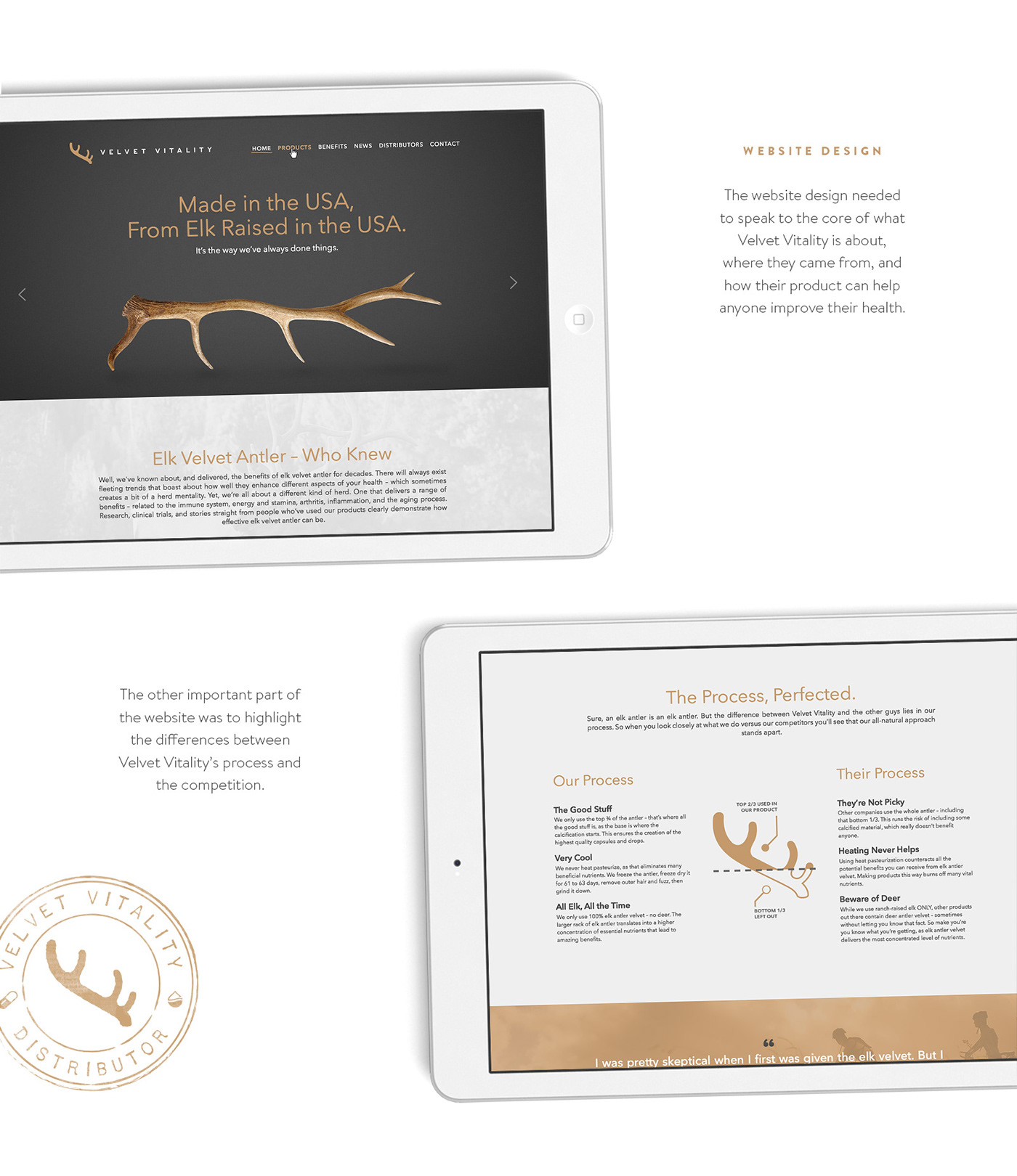
Velvet Vitality is a family-owned business, and their roots in elk ranching run deep. Made from only elk antler raised in the USA, Velvet Vitality is for anyone who is looking to improve their overall health with a natural dietary supplement. The brand had to communicate a timeless look while exploring a few key ingredients. Keeping with a arched logotype was an important consideration to tie to the parent company, Alpine Elk Ranch. Keeping with an arched logotype was an important consideration to tie to the parent company, Alpine Elk Ranch. Since the critical ingredient to Velvet Vitality is elk antler, it was essential to have antlers in the design. An avenue that the client liked was a vintage look which they felt could backdate the company to an earlier established date. Overall, this approach would not carry them into the future. Elk antlers in the velvet are rich in calcium and other nutrients. With the shape of antlers in the velvet being softer sweeping lines and rounded points. A side view of the antlers helped change the perspective. The goal for packaging was to create a bright and unique color accent for both the drops and capsule bottles. Since most bottle designs in stores can blend into the bottle next to them, the design had to be intentional to make sure the product stands out on the shelf. The finishing touch is a colored top. The website design needed to speak to the core of what Velvet Vitality is about, where they came from, and how their product can help anyone improve their health. The other important part of the website was to highlight the differences between Velvet Vitality’s process and the competition.


