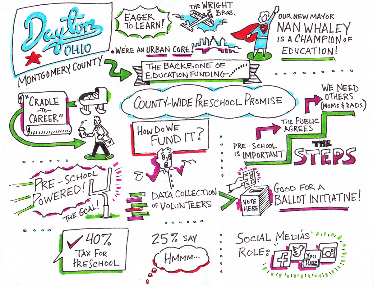
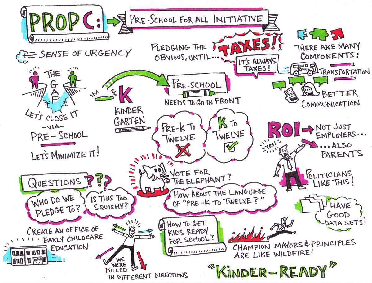
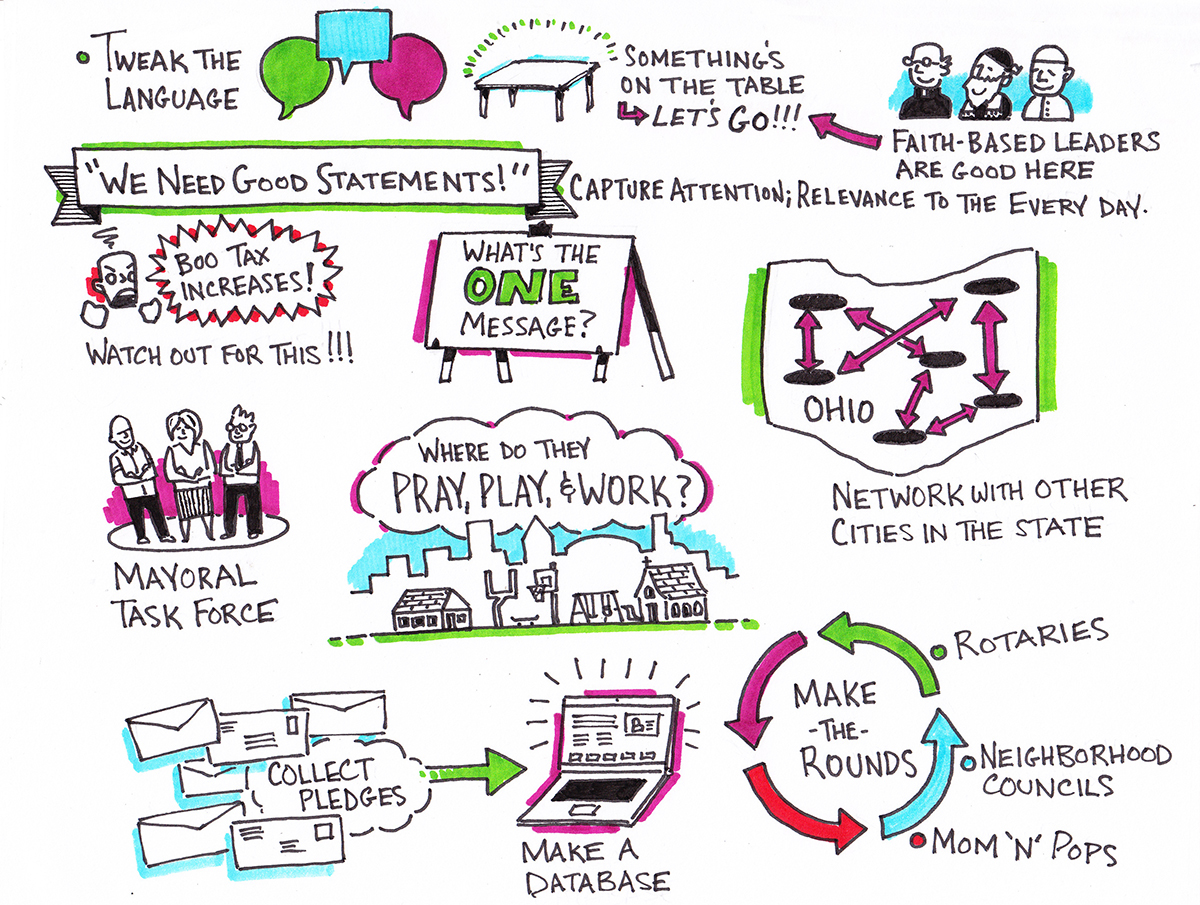
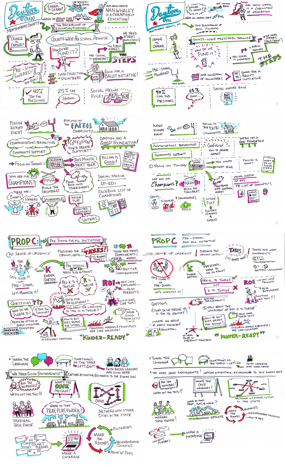
Sketchnotes from a webinar highlighting the city of Dayton, OH's early learning initiatives. These four pages represent 15 minutes of conversation, which included an introductory presentation, followed by an open-panel discussion. The real-time raw sketchnotes were subsequently traced and reworked into polished meeting notes, while still keeping the spontaneous look of the original capture. The final polished sketchnotes were subsequently distributed to the webinar participants.
Below are the original sketchnotes; these were done into an 8.5" x 11 sketchbook with fine-point retractable Sharpies. The subsequent polished versions were done onto the same-sized paper, with with Faber-Castell PITT pens for the linework, and both Sharpies and Prismacolor Design markers for color.
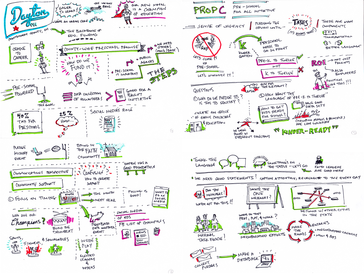
Side-by-side showing the real-time raw sketchnotes on the left, and the refined/polished versions on the right. None of the original content was edited; the visuals were merely rendered nicer, the text rewritted to be more readable, and the overall layout tweaked to evenly fill out the pages.
Below are some photos from the production process, as well as close-ups of some of the visual metaphors distilled from the verbal content of the webinar. While sketchnoting seems to exist in a grey area between visualization and illustration, my approach is to use a "doodle-based" styled-illustration into infographic design and data visualization.
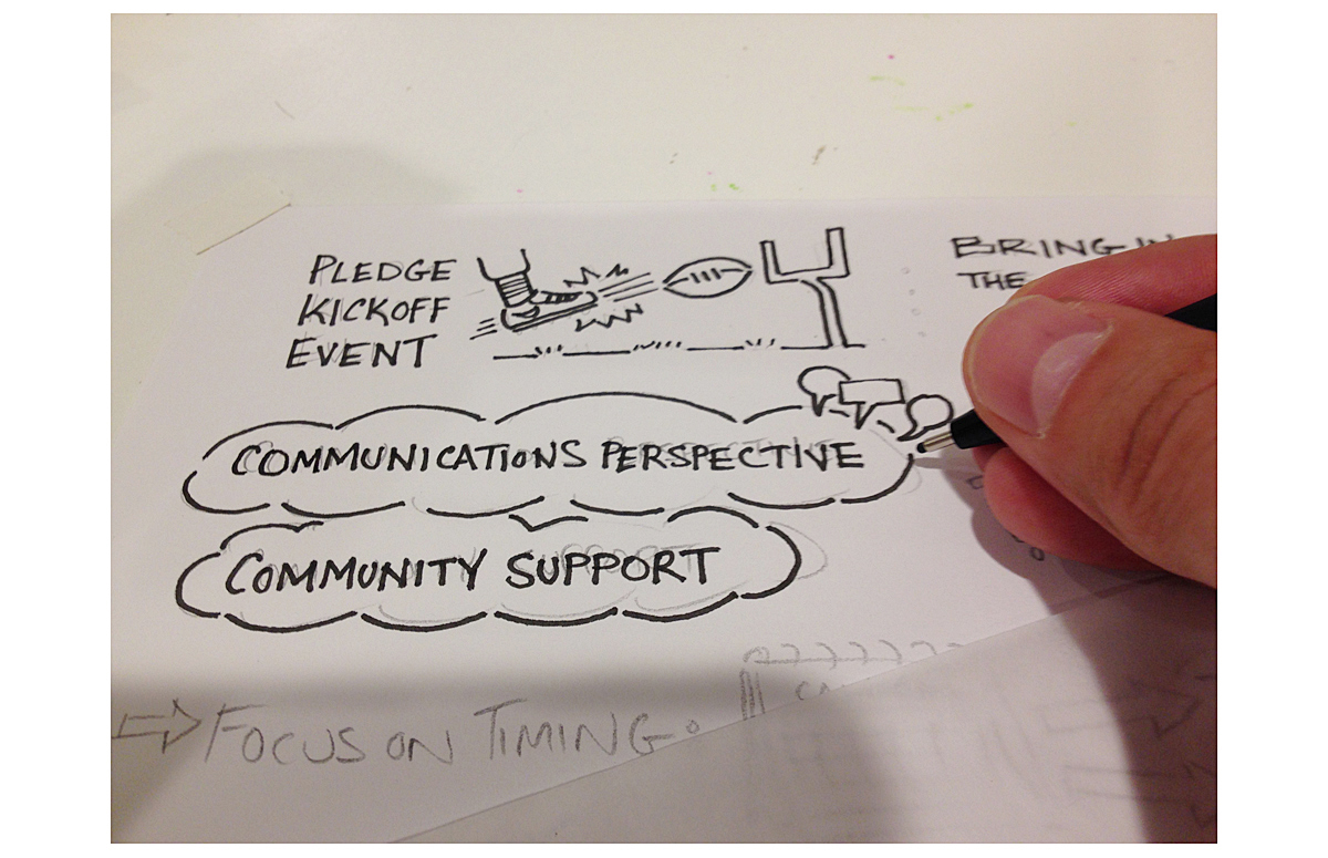
First, the initial sketchnotes are traced over with a pencil to improve the visual metaphors, correct any typos, and to shore up the typography.
A pre-color page after penciling and inking.
A finished page.
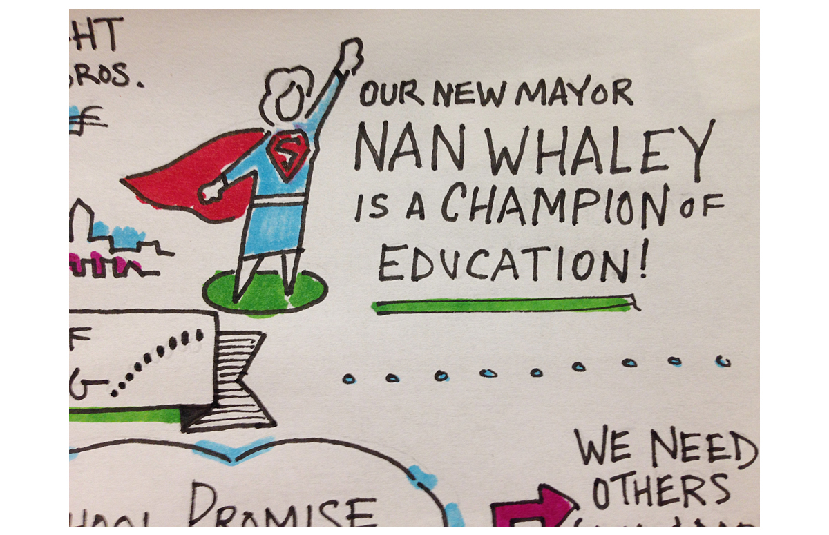
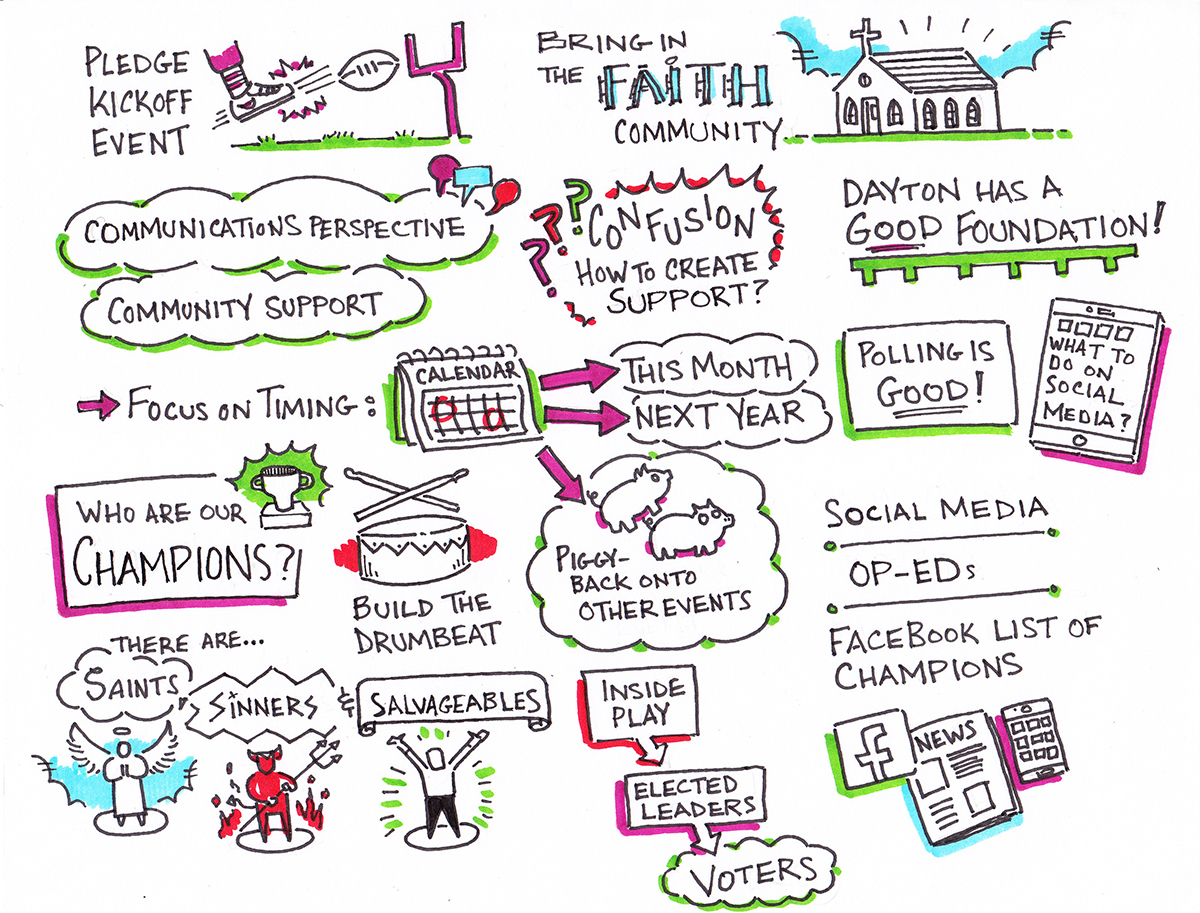
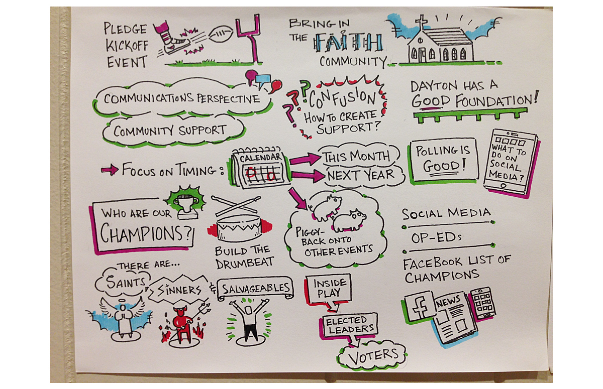
When somebody is said to "champion" an initiative, they truly are the superheros of the initiative.
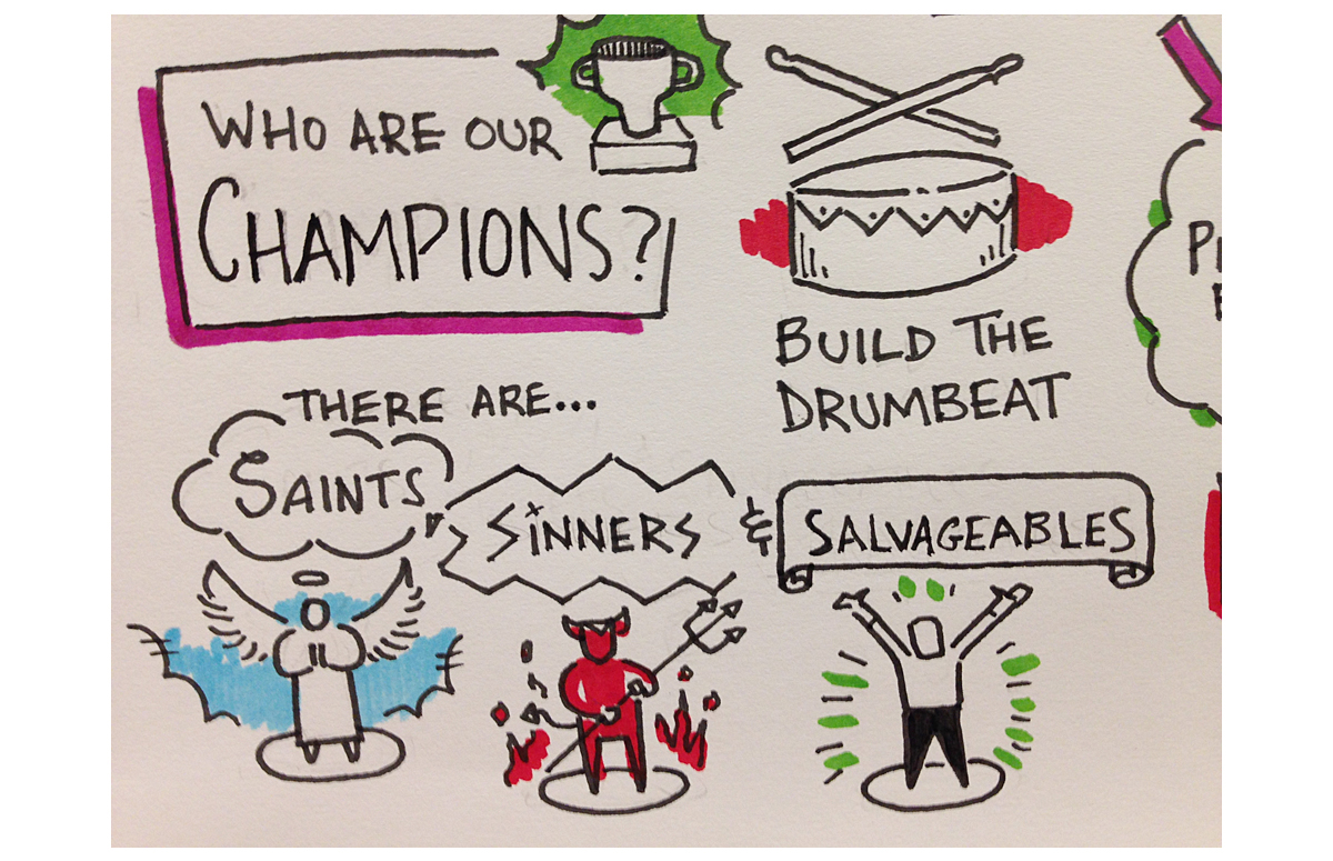
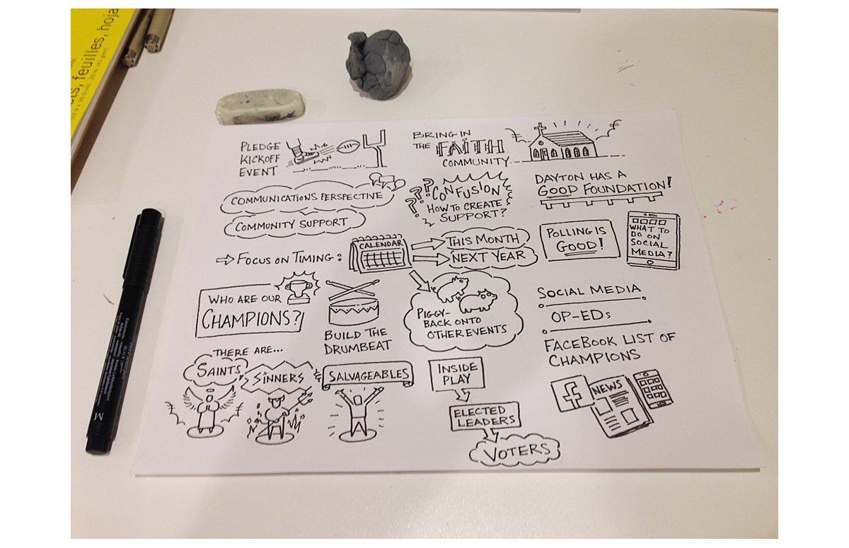
"There are Saints, Sinners, and Salvageables". This was such a powerful statement made in regards to the stakeholders and the end market. Likewise, "Build the Drumbeat" was a strong statement, implying that the initiative was an imperative.
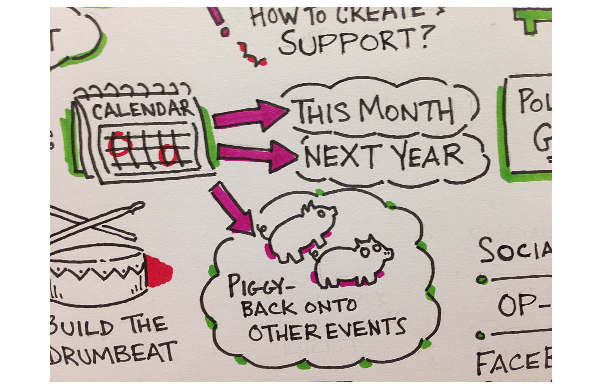
When something needs to be done, it needs to be done within a timeframe, and on time. When timeframes were mentioned, I added in the calendar. Likewise, the mention of "piggy-backing" the initiative onto third-party events was a great suggestion that definitely needed a noticable and memorable capture.
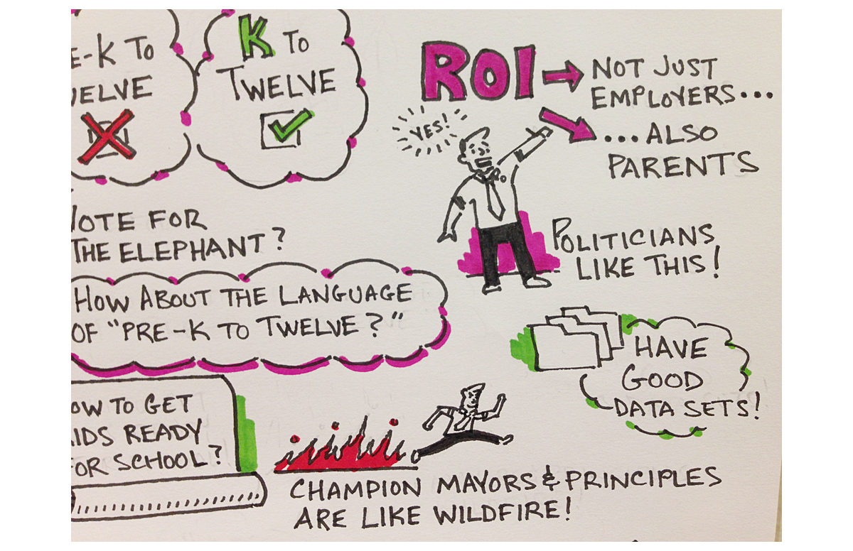
"Champions spread the initiative like wildfire"!
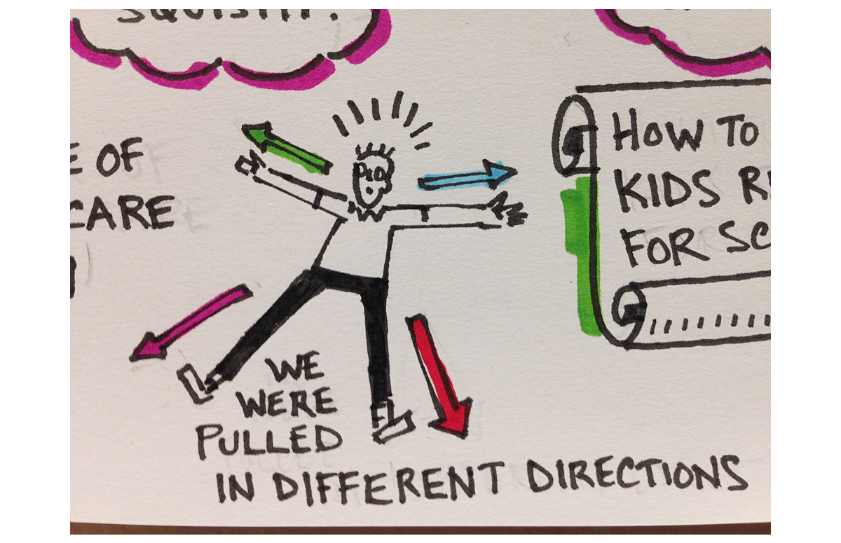
With so much going on, stakeholders were pulled in different directions.
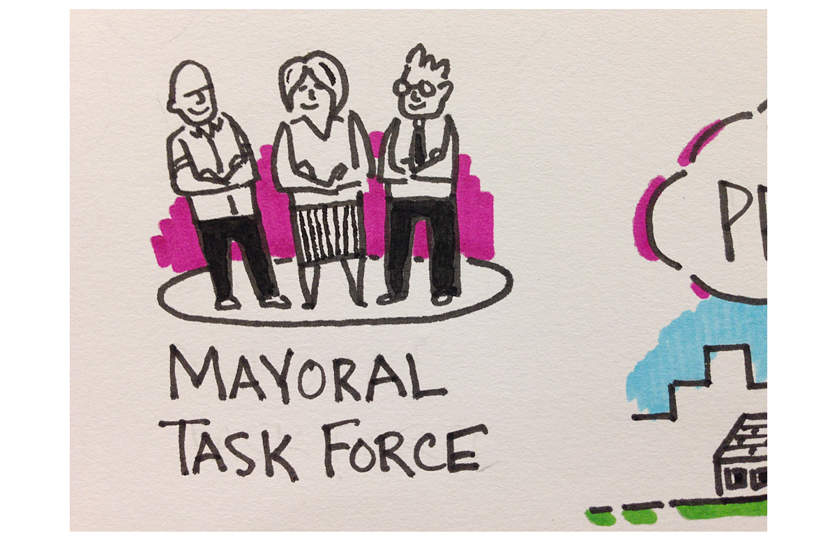
A mayoral task force is needed!
Sampling different marker swatches to get the right color balance. Since these hand-drawn sketchnotes and infographics mimic the look of graphic recording, the color palette is similar to the color range of Neuland graphic recording markers. For this work, dual-tipped Prismacolor Design markers and retractable Sharpies were employed.

Thanks for viewing!
- Jason
Let's visualize your information. Feel free to contact me to discuss your illustration and data visualization needs.

