

Ahgora develops innovative technologies for human resources to empower professionals in the field with time, tools, and real-time data. Currently, they work with large Brazilian companies, and, with the market expanding, they needed a landing page to centralize new leads from large companies.


At this step, we understand the targeted audience. What they do, how they think, and what they want can help you empathize with them and understand their perspectives. Creating a user-centric solution is essential.


We did qualitative research to identify the target audience in the Brazilian scenario. We also recognized that the majority identify themselves with humanized communications, ethnic diversity, and corporate and formal environments.


We did a simple research with big companies around Brazil, and most of them reported the difficulty of accurately understanding pricing, the solutions provided by the product, and also viewing the product itself with a complete list of features.


Now any idea is welcome, and quantity is better than quality. Searching for references and talking to others can help us think about how the solutions should be, share ideas, mix and remix, building on direct and indirect references until we have a good amount of content to start the creation process.


A wireframe is a blueprint or schematic that helps communicate the interface's structure.

This is a part of the first wireframe. That's how the header was planned.


This is where ideas come to life. The purpose of the prototype is to validate the previous step's ideas and create tangible and tactile representations that meet the targeted audience's needs.
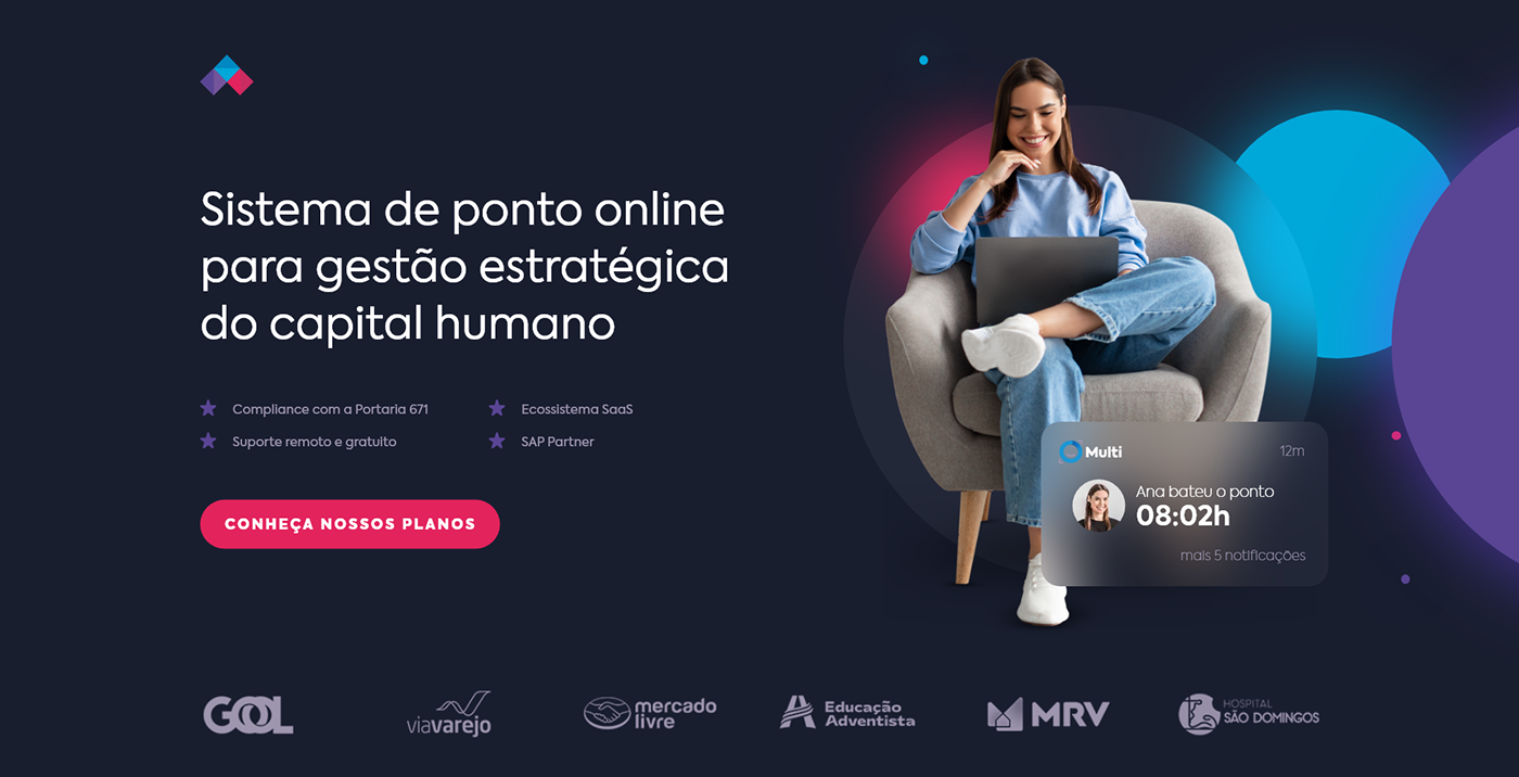
This is the final version of the header. The image exemplifying human interaction with the app helps leads to see themselves using the product. The logos of the companies Ahgora work with increase the value and credibility of the product.
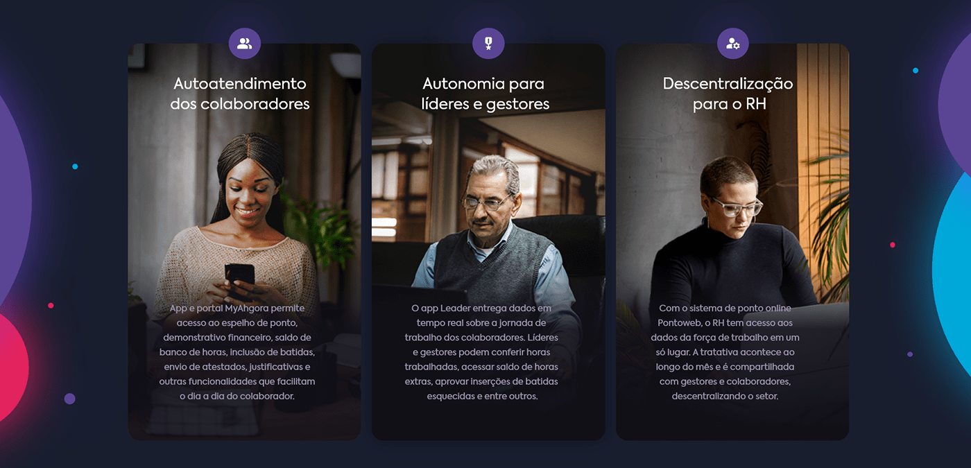
We used images of people a lot because the Brazilian audience needs to see real things, interact with them, and imagine themselves using the product. We also tried to keep the diversity and technology present in the images.

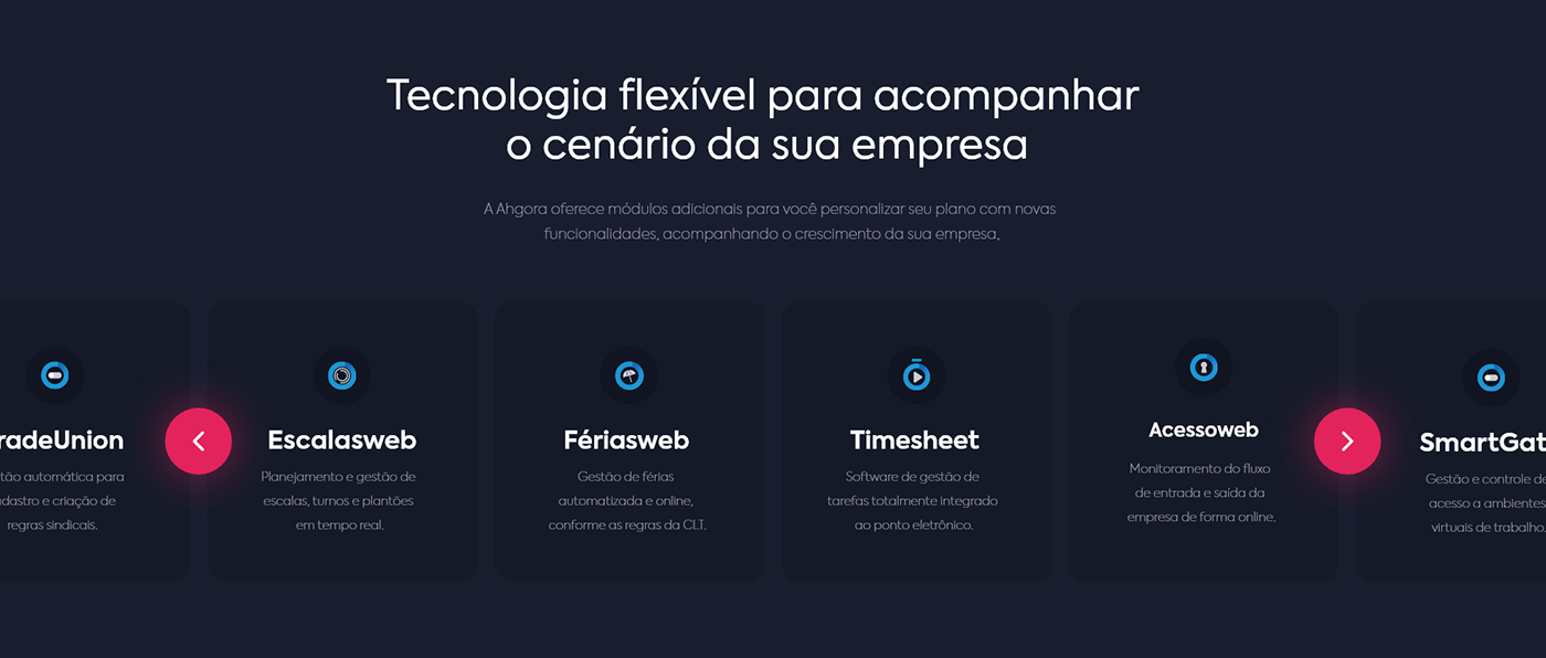
This is the main feature of the landing page. Through this simple question, we could identify the type of lead and customize the product section depending on whether or not they already have a similar product. We made a simple scroll animation and put the question full-screen so that users would undoubtedly see the section and interact with it.


With a heatmap and recordings, we have already made some changes to improve usability.

IIn the first version of the header, we used the same color of the buttons in the bullet points that describe the product. This made some users believe that topics were clickable. Previously we also created a more flashy notification on the image, with a button that users tried to click. We also noticed that some users were clicking on company logos.


We fixed all of these interaction issues by changing the icons' color and the bullet points' text. We also made the logos monochrome and lowered the brightness. As for the notification, we made it more subtle by making a dark background and removing the button. All these changes are proving positive and have drastically reduced the number of wrong clicks.

If you like my work, leave a comment down below and don't forget to follow me.


