Easee
Shaping the future of electricity
__
Easee is a green-tech company established in 2018. They aim to distribute energy more sustainably by providing people with intelligent, user-friendly products that save energy, thus contributing to a greener tomorrow.
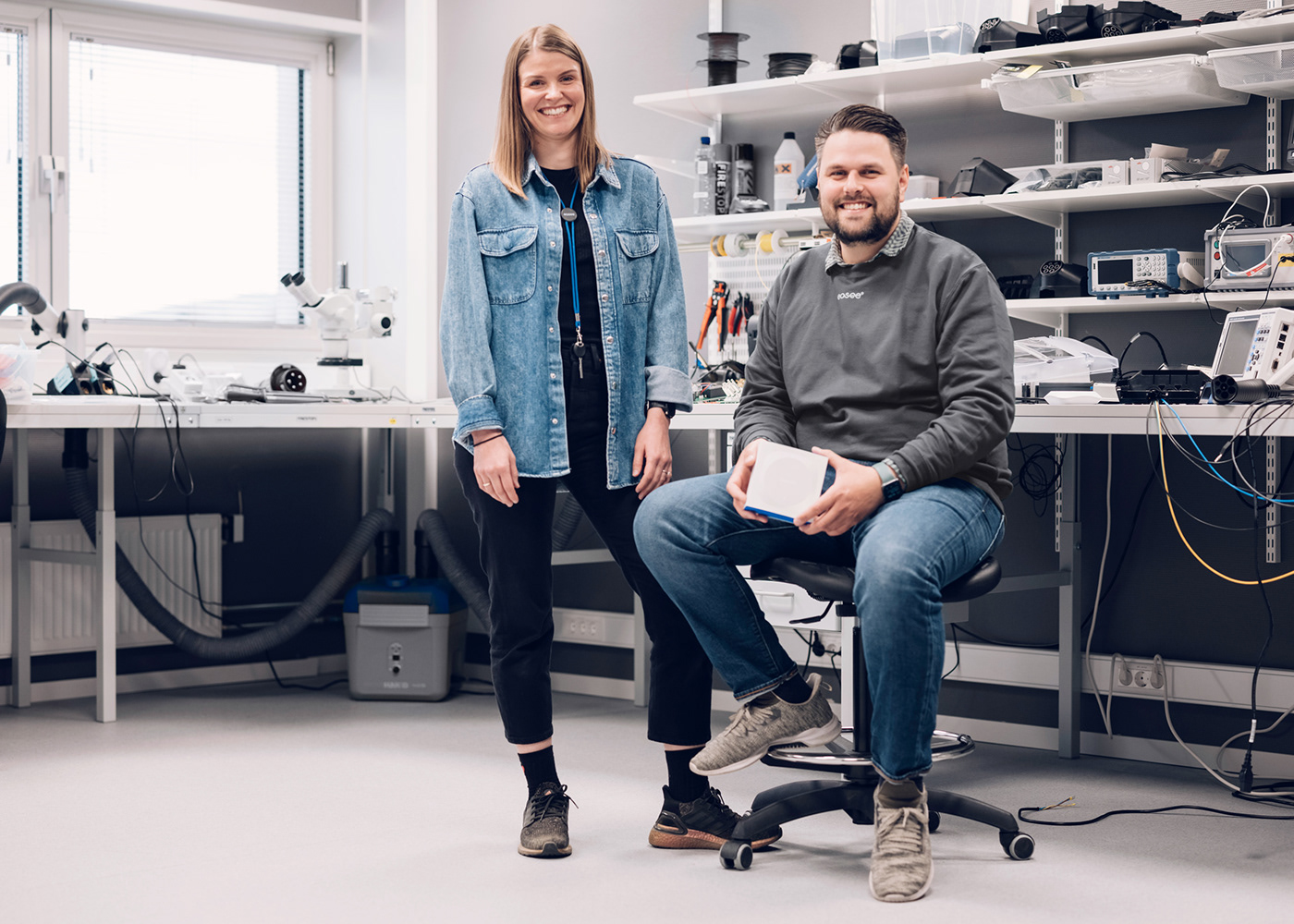
We have been working with Easee since 2019. In that short time, the company has expanded from 17 local employees to 200 employees across six countries. Together, we have developed and implemented their brand identity and digital presence. Built on the concept of balanced energy flow, the brand identity is characterized by a minimalist yet expressive visual language that creates a unique, clear and consistent brand experience across all touchpoints.
We have been working with Easee since 2019. In that short time, the company has expanded from 17 local employees to 200 employees across six countries. Together, we have developed and implemented their brand identity and digital presence. Built on the concept of balanced energy flow, the brand identity is characterized by a minimalist yet expressive visual language that creates a unique, clear and consistent brand experience across all touchpoints.
Credits:
Tommy Ellingsen, Line Owren, Easee design team, Grensesnitt
Year:
2019-
Deliverables:
Brand strategy, Brand identity, Brand implementation, Brand management, Brand portal, Digital design, Application design, Motion design
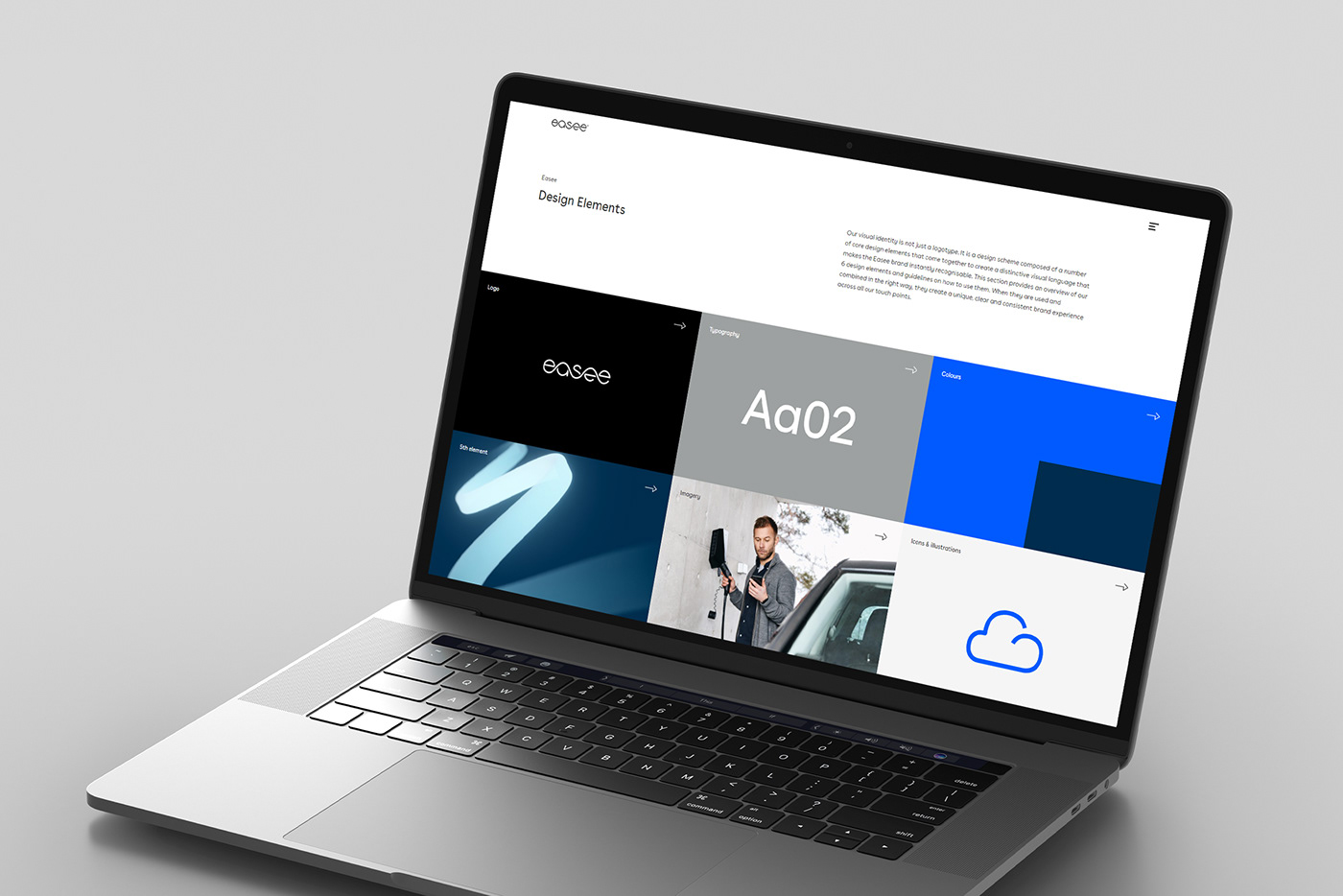
Based on a natural sinus waveform, we developed a 5th element as an expansion of the existing logo. It connects the visual solutions, creating a unified, dynamic and coherent brand expression with the possibility to evolve and adapt.

An expansion of the Easee logotype where the waveform comes to life as an energy flow.


Buenos Aires blends aesthetics and functionality from the classic and modern typographical eras to create a typeface with a timeless, friendly and unique expression.


Sharing distinct details and characteristics found in the letterforms of the brand typography and the Easee logo, each icon is meticulously designed and follows the single line introduced in Easee’s logotype.


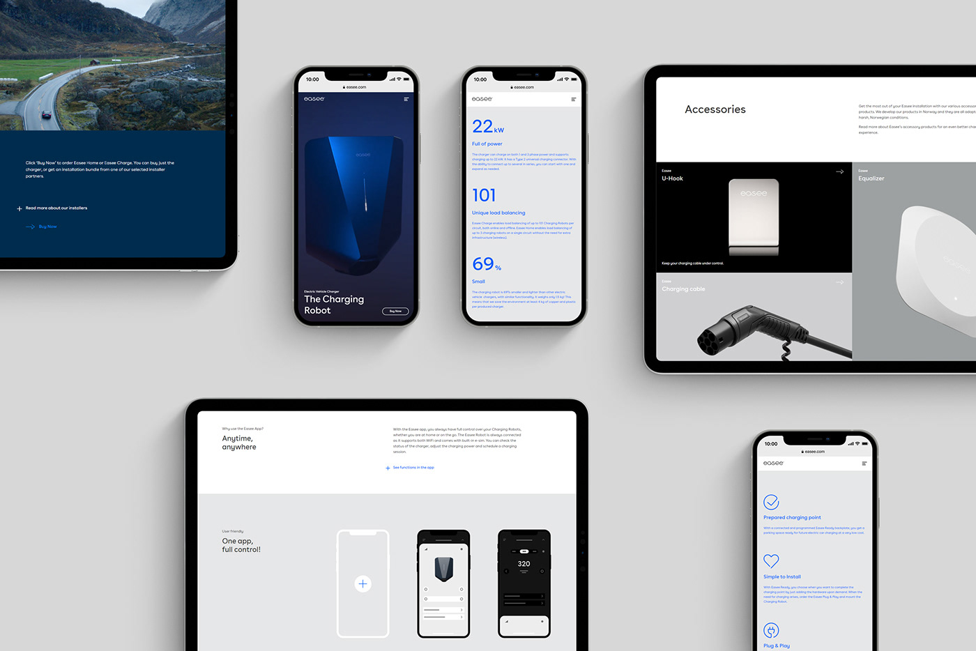
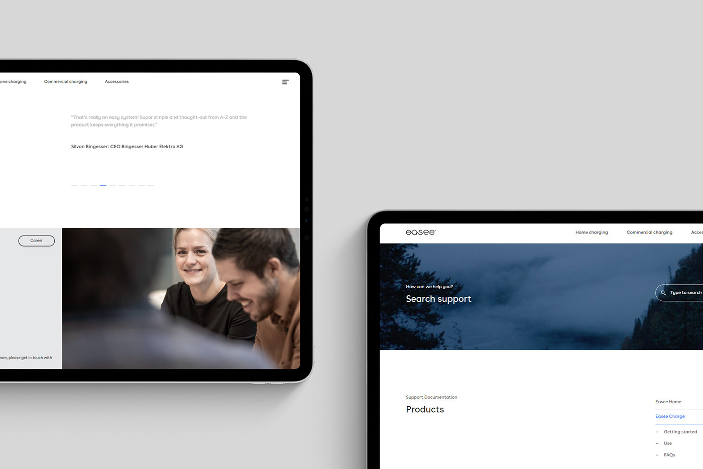
We redesigned their digital presence to increase their visibility as a rapidly growing brand.


To ensure a smooth distribution of all the brand assets, we created a fully responsive brand manual.