Simply - Cooking oil
Simply Cooking Oil - Packaging Redesign
___
Simply Cooking Oil, produced by Wilmar International and Calofic, has built a solid history of quality over the years. It has become an essential part of Vietnamese daily life, widely used in households and restaurants. Made from natural ingredients, Simply Cooking Oil stands out as a trusted brand in the culinary of Vietnam.
Challenge
Bratus and Simply joined forces to revamp the packaging, aiming to establish a strong brand identity, enhance shelf presence, and foster customer loyalty. The objective was to create packaging that would catch the eye of store shelves and seamlessly blend into kitchen environments. Rather than exuding an upscale, exclusive vibe, the focus was crafting a friendly, modern design that would appeal to the mass market and convey an affordable character.
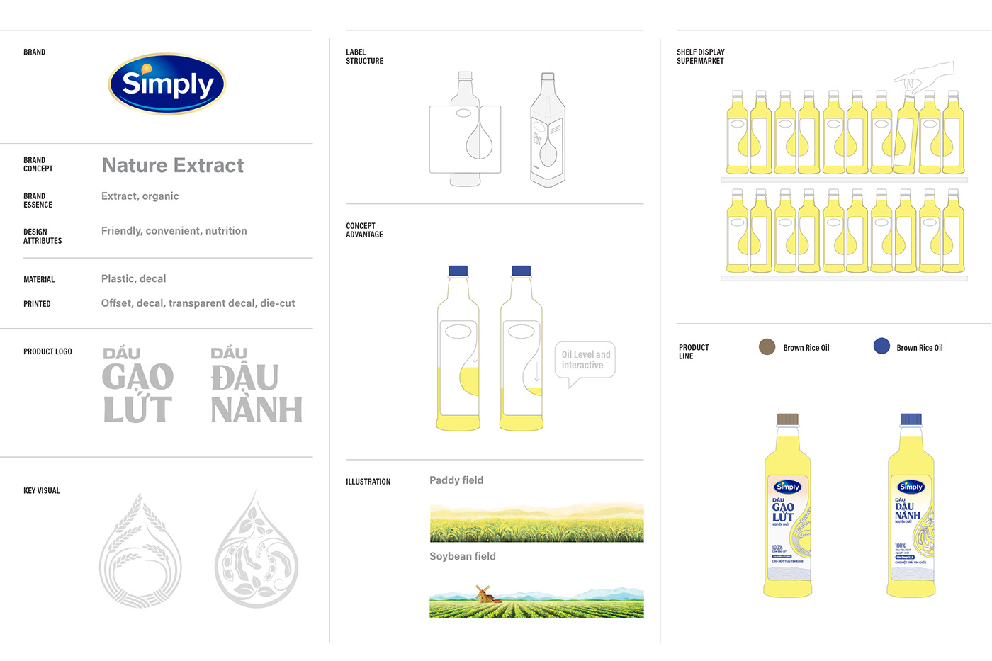
Brand concept
The brand concept of "Nature Extract" serves as the focal point for the design development, drawing inspiration from the core values of the brand. It is centered around the idea of "savoring pure oil to the fullest," where the focus is on savoring the cooking oil in its purest form. The concept highlights the careful selection and filtration of ingredients, ensuring that each drop of Simply oil is packed with natural, unadulterated nutrients. This emphasis on purity and nourishment forms the essence of the brand and is reflected in the design to create visually appealing and enticing packaging.
"Savour pure oil to the fullest"
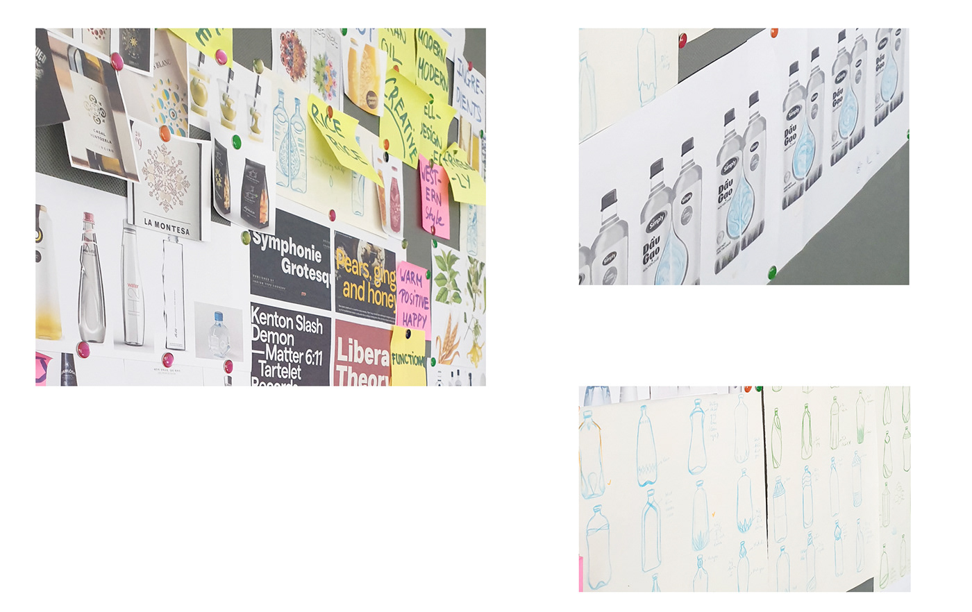
Design strategy
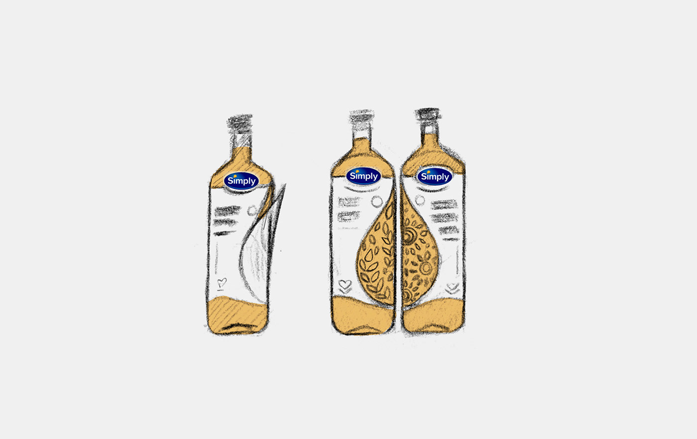
The packaging has been designed to convey the concept of "Nature Extract." The key visual takes inspiration from oil drops and surface movements, evoking the flow and blending of oil through a combination of clean illustrations and organic details. This collection of nutritious elements symbolizes the product's origin.
Internally, the oil drop is intentionally used to create refractions and reflections, showcasing the transparency of the oil. The design incorporates a clean layout with transparent spaces and content framed by drop shapes, further enhancing the overall aesthetic.
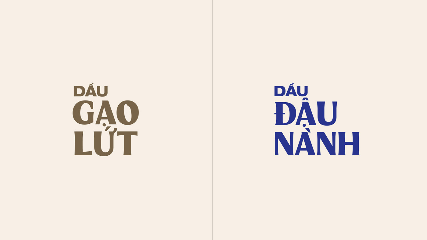
We employed a color palette with different colorways to differentiate the various products. Yellow represents the rice oil, while blue signifies the soybean oil.
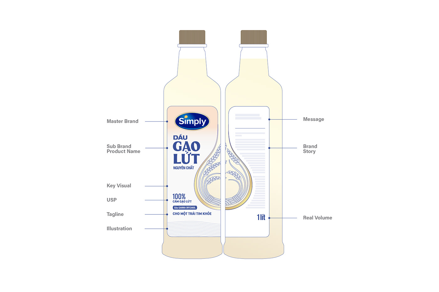
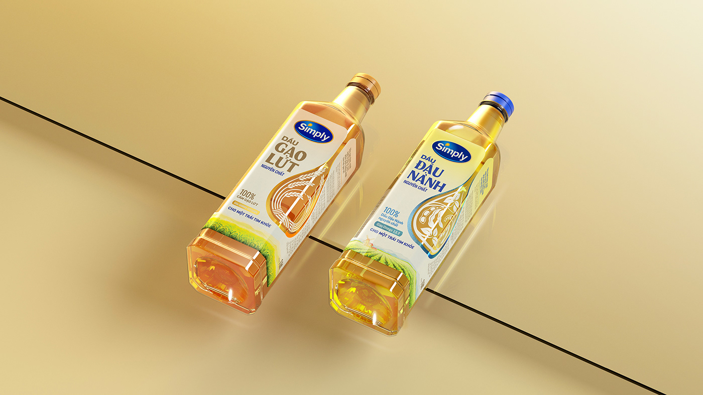
The Key Visual expression embodies the concept of "Nature Extract," symbolizing the complete enjoyment of pure cooking oil to its fullest.

Users can observe the interactive transparency reflections of the cooking oil during its usage.


Credits
__
Client: Calofic
Brand: Simply
Design Firm: Bratus Agency
Creative Director: Jimmi Tuan
Senior Graphic Designer: Si Tran, Alex Dang, Nguyen X. Hoang
Illustration Landscape: Duc Bui
Showcase / Animation: Khoa Nguyen
Product Set / DI: Jimmi Tuan
Account Director: Quyen Tran
Project Manager: Hien Nguyen
Thanks for watching & your appreciation!


