Fedrigoni — Ispira Visual Book

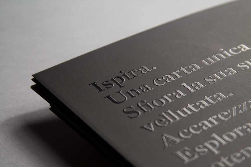
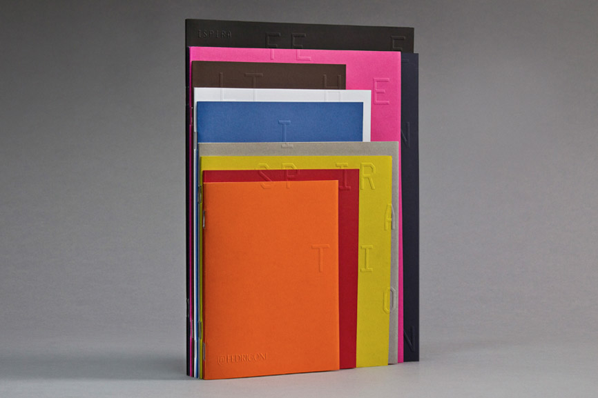
The new Ispira visual book for Fedrigoni is no common catalogue.
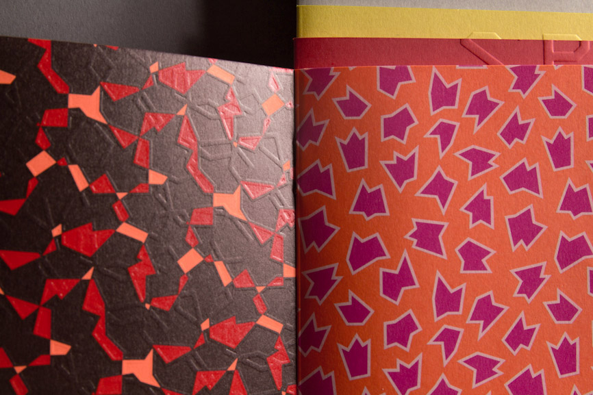
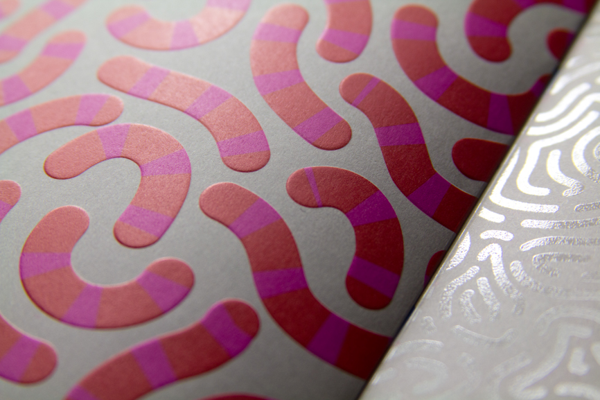
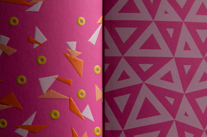
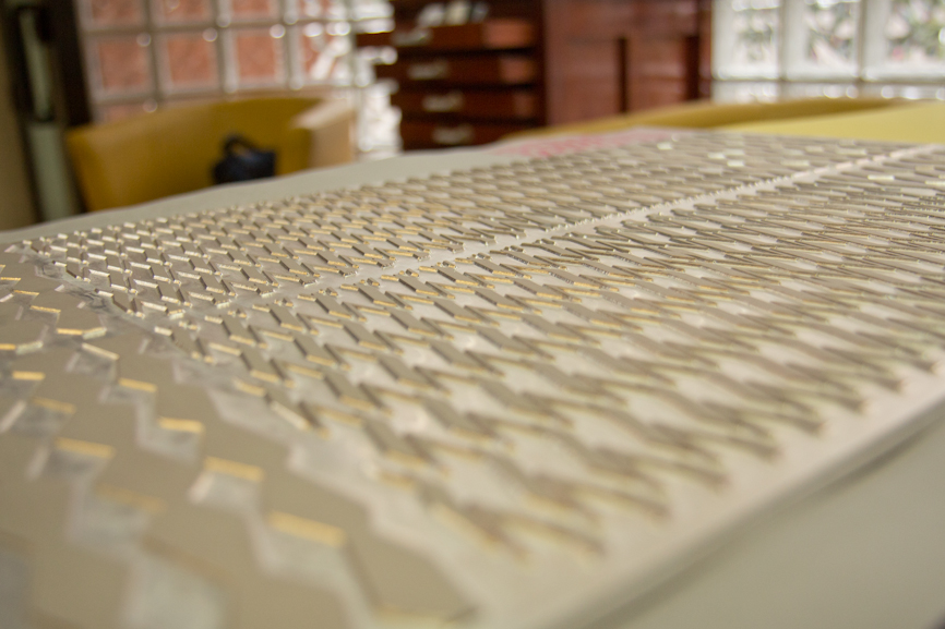
The smooth texture of the paper is enhanced by special treatments.
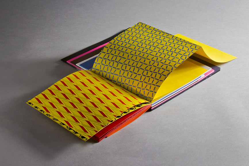
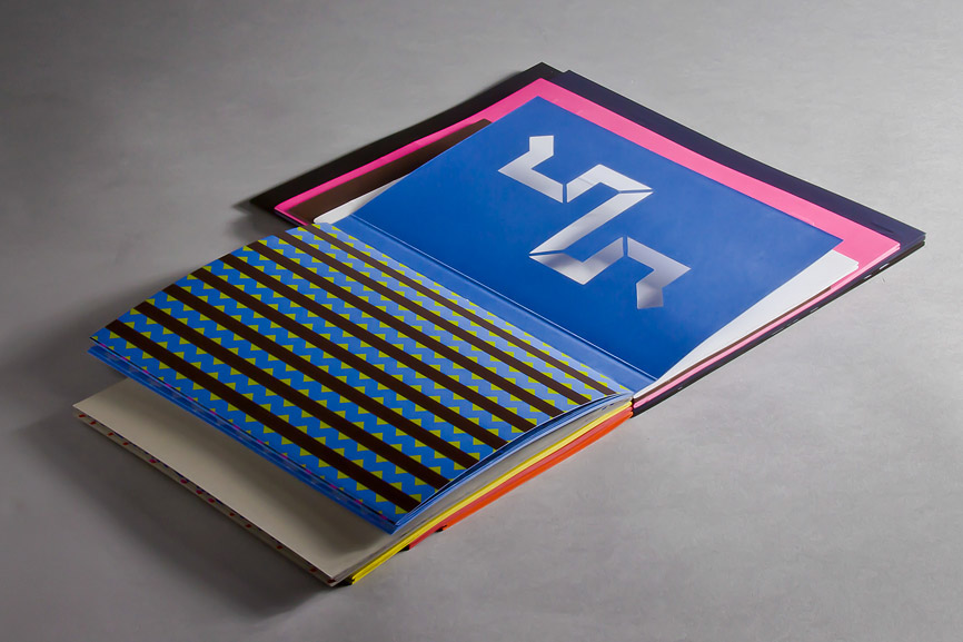
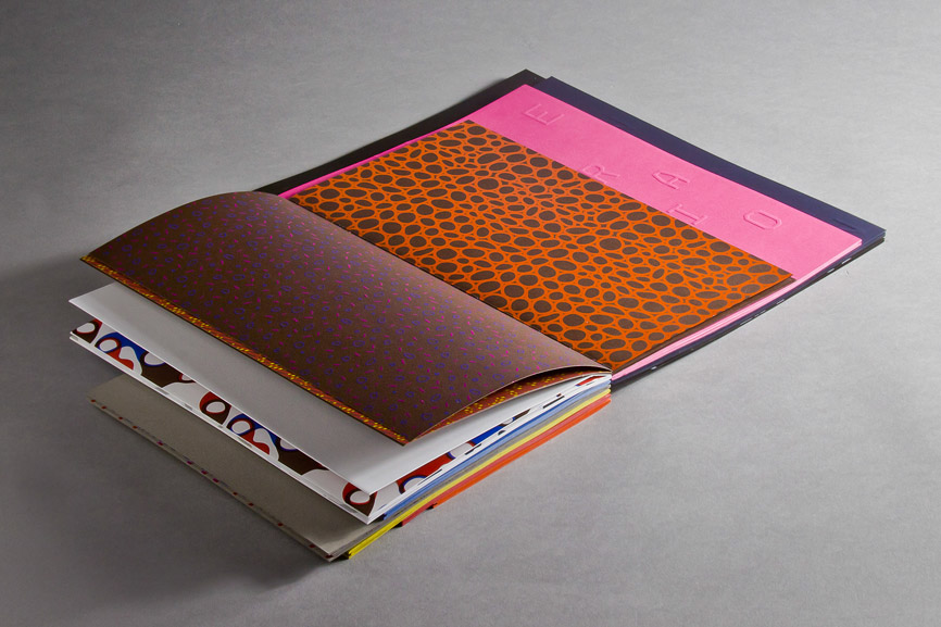
Each paper is narrated through a different visual experience where everything changes many times: the color of the paper, the weight, the size, the inks used, the printing techniques.
A whole new experience to explore with touch.
PROJECT FEATURES
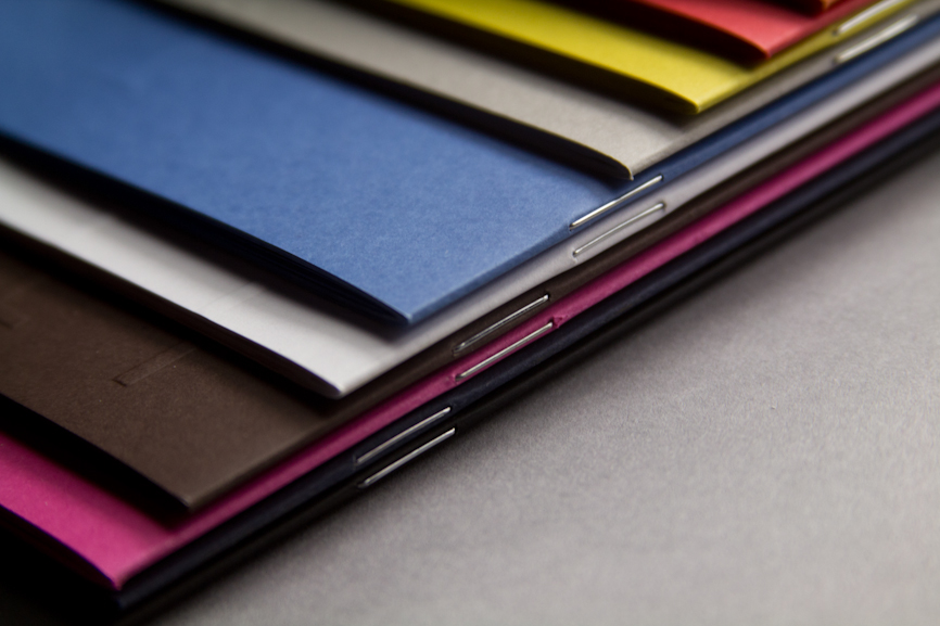
— 10 differently sized sextodecimo
— 10 paper colors
— 10 Pantone inks
— 100 patterns
— 10 paper colors
— 10 Pantone inks
— 100 patterns
Each sextodecimo contains 4 paper weights.
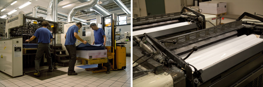
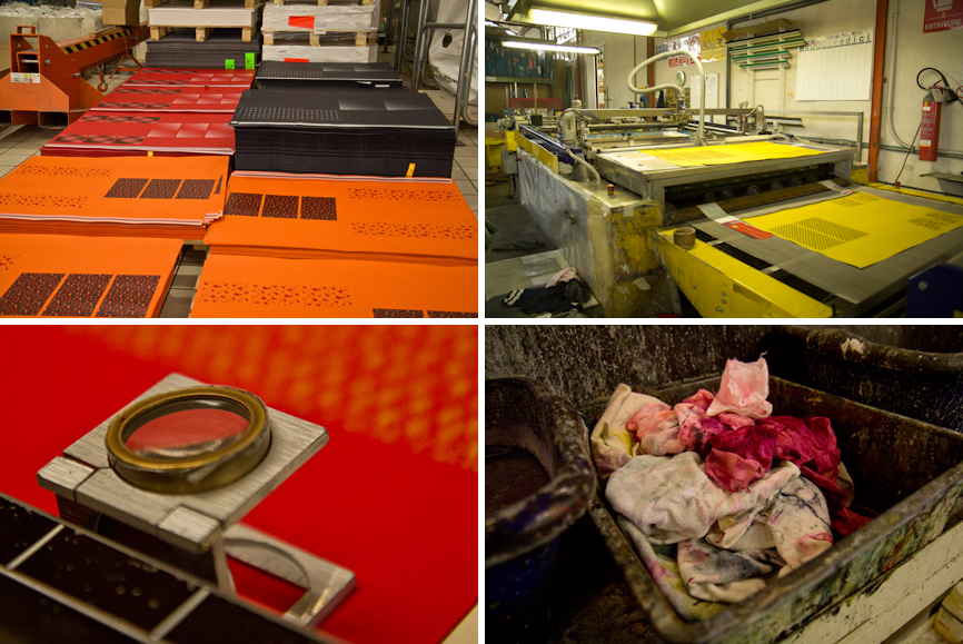
SPECIAL TREATMENTS
— Offset printing: 2 Pantone + 2 offset white
— Hot foil: 2 different foils
— Silk screen: 2 UV varnishes
— Embossing
— Die cutting
— Handmade Binding: stapled & glued
— Hot foil: 2 different foils
— Silk screen: 2 UV varnishes
— Embossing
— Die cutting
— Handmade Binding: stapled & glued


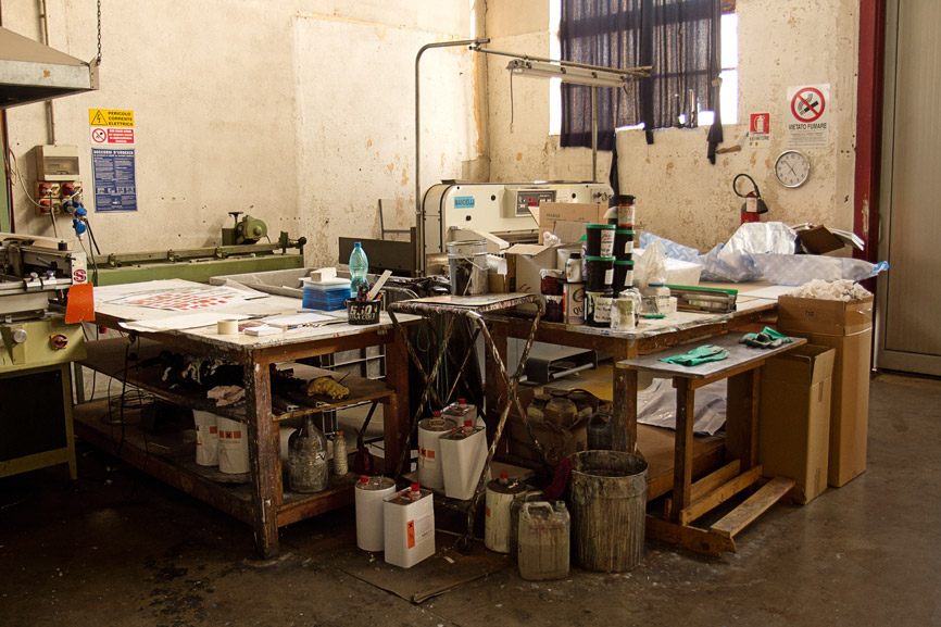
Feel The Inspiration — The Movie
(What’s behind the visual book)
It’s so exciting for us to assist to the entire development
of a project like this, so we decided to create a short movie to tell
each careful treatment and the amazing contribute of this fabulous teamwork.
of a project like this, so we decided to create a short movie to tell
each careful treatment and the amazing contribute of this fabulous teamwork.

The color system
Our first idea was to create a visual book for a paper made to be printed, without using print at all. It would have been great to enjoy the book only by touching it.
But Fedrigoni said: “What about a little bit of color?” So we decided to only work with the color palette taken from the paper collection.
The color system was developed directly from the 10 colors of Ispira collection, and then applied to the spreads after two offset white layers.

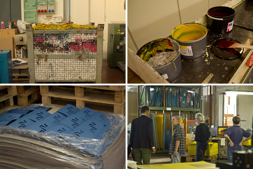
Texturama
Our focus was to show the new Ispira paper range at the first glance.
We designed a grid to create a consistent layout system that can show each paper.
Our focus was to show the new Ispira paper range at the first glance.
We designed a grid to create a consistent layout system that can show each paper.
When the book is closed, it seems like a stack of folders.
When you start to open, each page is treated with embossing or transparent varnishes on one side and printed on the other: in this way, a visual game starts to develop while turning the page.
When you start to open, each page is treated with embossing or transparent varnishes on one side and printed on the other: in this way, a visual game starts to develop while turning the page.


Cover grid system


CONCEPT
Happycentro
Happycentro
ART DIRECTION
Federico Galvani
Federico Galvani
TYPOGRAPHY & GRAPHIC DESIGN
Ilaria Roglieri
Ilaria Roglieri
FEEL THE INSPIRATION – The Movie
Milena Tipaldo
Milena Tipaldo
SOUNDTRACK
“Celeste” by Les Entants from New Zealand
“Celeste” by Les Entants from New Zealand
PRINT MANAGEMENT
Studio Fasoli
Thanks to: Riccardo Zambelli
Studio Fasoli
Thanks to: Riccardo Zambelli
OFFSET PRINT
Stampa Grafica
Thanks to: Giovanni Lui
Stampa Grafica
Thanks to: Giovanni Lui
SILK SCREEN PRINT
Euroimmagine
Thanks to: Giulio & Francesca
Euroimmagine
Thanks to: Giulio & Francesca
EMBOSSING AND HOT FOIL
Tipografia Economica
Thanks to: Ricky Pattaro & the family
Tipografia Economica
Thanks to: Ricky Pattaro & the family
BINDING
Emmebi
Thanks to: Daniele Zucchetti
Emmebi
Thanks to: Daniele Zucchetti
PAPER PROCESSING & FINISHING
La Cartotecnica
Thanks to: Fabrizio & Simonetta
La Cartotecnica
Thanks to: Fabrizio & Simonetta
SPECIAL THANKS TO
Luca Avesani
fedrigonicartiere.com
Luca Avesani
fedrigonicartiere.com
