
If I had a world of my own, everything would be nonsense.
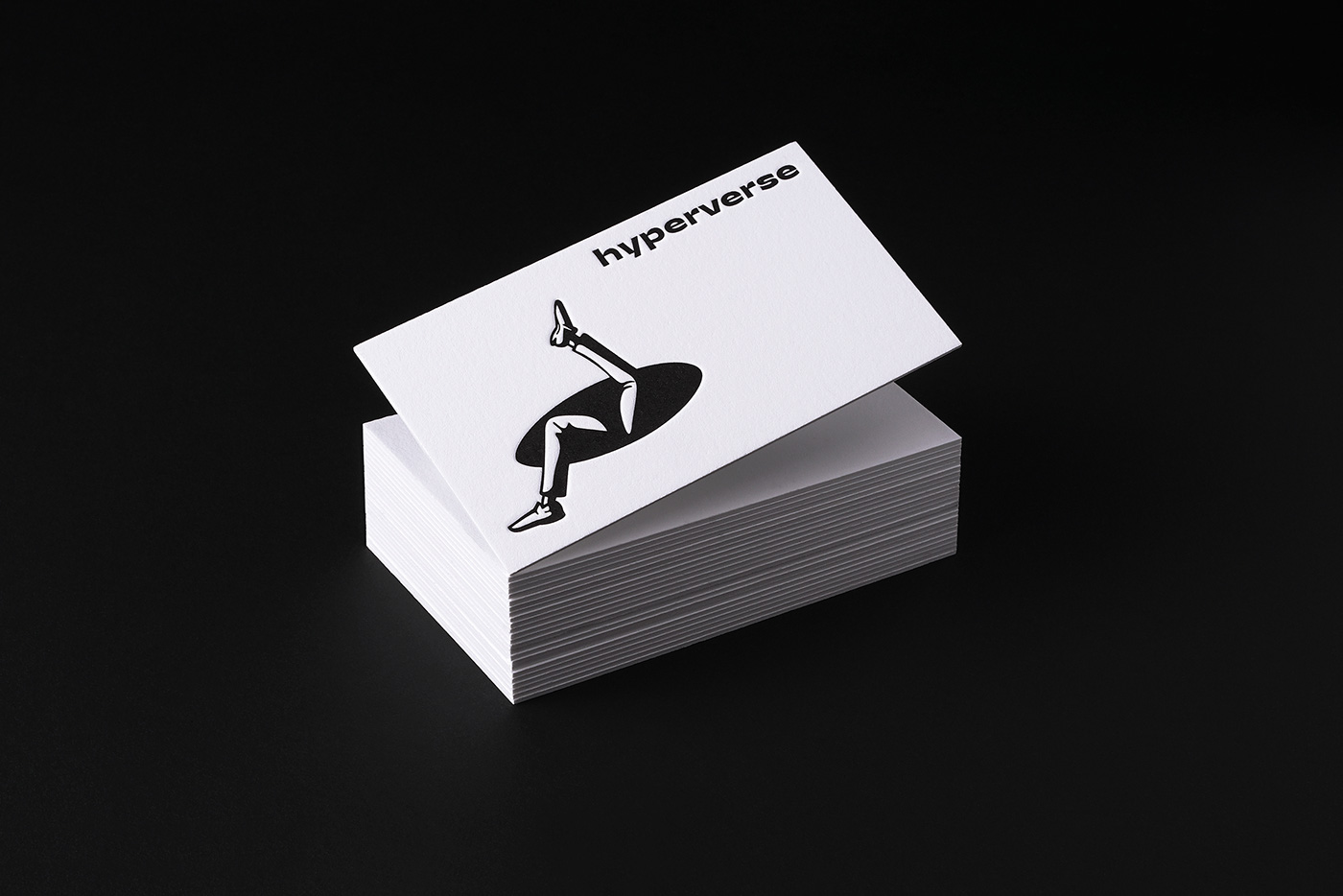
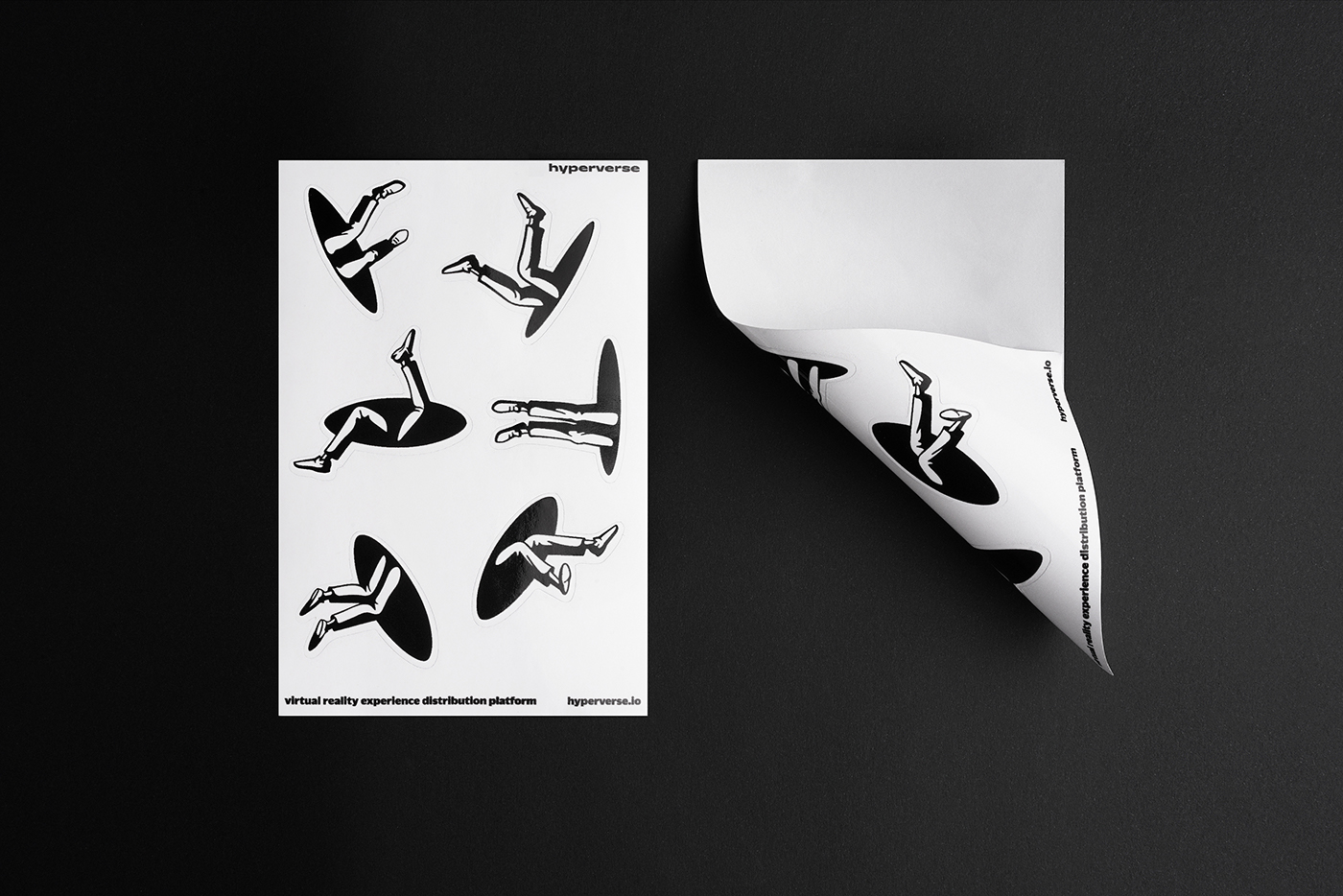
Hyperverse is a host of all the words. The company produces the equipment — VR suits with backpacks that allow their users to literally roam the virtual worlds. The equipment runs on the platform that eases development of games for such a suite. The company also act as a publisher for the third party developers.
The new virtual worlds are not just high-tech wizardry. They are literal wizardry. They were never seen before. They amaze and sweep one off one’s feet.
For the Hyperverse identity we mixed clean spooky depiction of a literal black hole with a couple of old-fashioned hand-drawn legs, a person falling down a rabbit hole. The mix of simple and detailed causes the sense of an old-fashioned nonsense fairy tale. The identity is dynamic — the interchangeable variety of legs and rabbit holes to underline that we are dealing with the hyperverse of endless worlds.
The wide-lettered powerful logo is reminiscent of Roger Excoffon and was designed to evoke a vague feeling of a fantastic trans-dimensional airline. It carries a deja vu of checking into a first-class seat next to a robot. Or an old-fashioned unicorn.
#shukadesign 2017


art direction → ivan velichko
design and typography → marina gaiman, ekaterina sedunova, mary yudina
design and typography → marina gaiman, ekaterina sedunova, mary yudina
designed by shuka®
© all rights reserved


