Here's a gallery of vector icons, elements, and illustrations that I've created for various projects, including infographics, data visualizations, maps, and presentations.
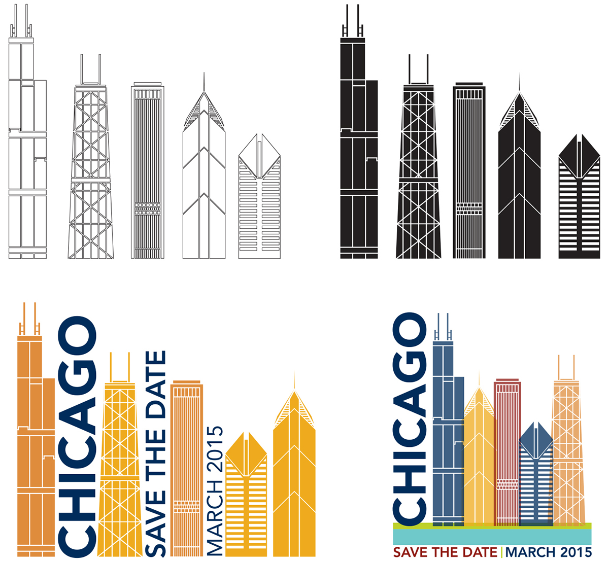
Illustrations of iconic Chicago skyline buildings, including typographic and color options, for the American College of Cardiology's Annual Meeting Save The Date card.
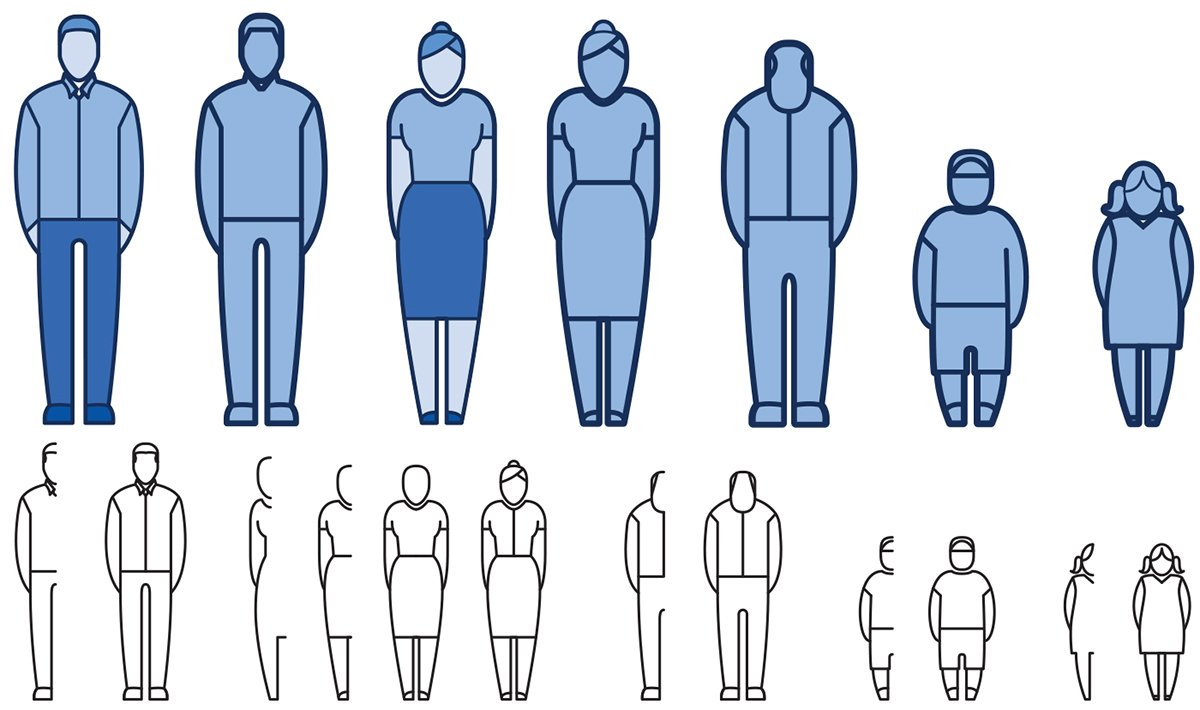
Basic figure icons I created to use for various data visualization and visual presentation projects for the American College of Cardiology.

Icons developed for various projects at the American College of Cardiology (ACC). The icon on the left represents the iconic (no pun intended) Man-helping-Man statue standing in the courtyard of the ACC's Heart House building, and was used for thier Community Service Day marketing.
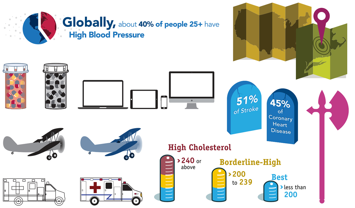
Assorted icons and illustrations created for infographics and visual PPT presentations at the American College of Cardiology.

Illustrations designed for an infographic about sugar. These particular illustrations represent the increase in sugar consumption from the late 1800s, through the 1970s, and up to today.
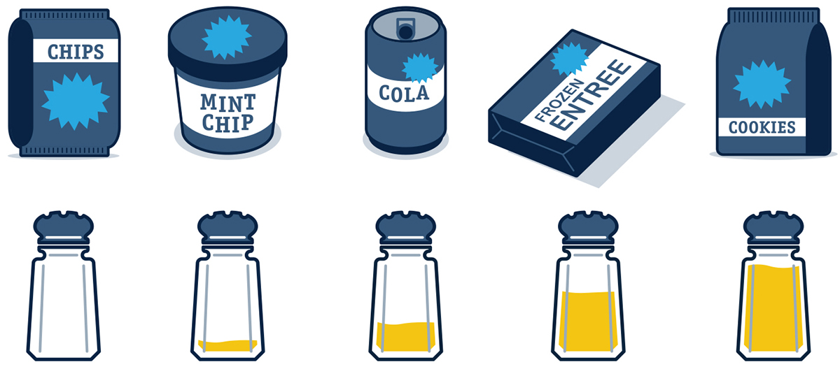
Icons developed for an infographic about salt and salt consumption. Generic marketing blurbs about salt (such as "Extra Reduced Low Sodium!") were placed into the light blue flashes on the food packaging.
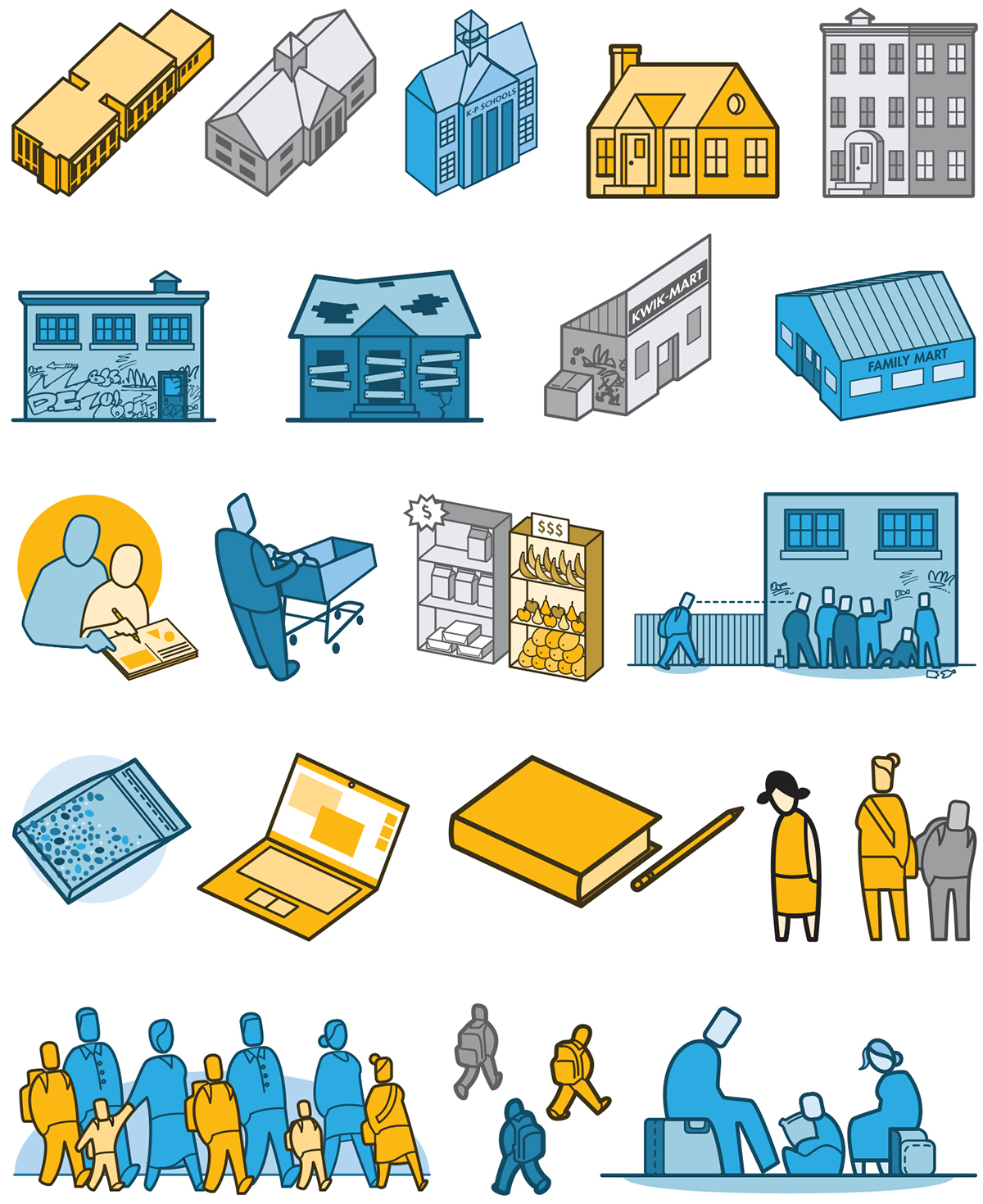
Illustrated icons for the Urban Institutes report on how local community issues affect the schools and students in a Washington, DC neighborhood.
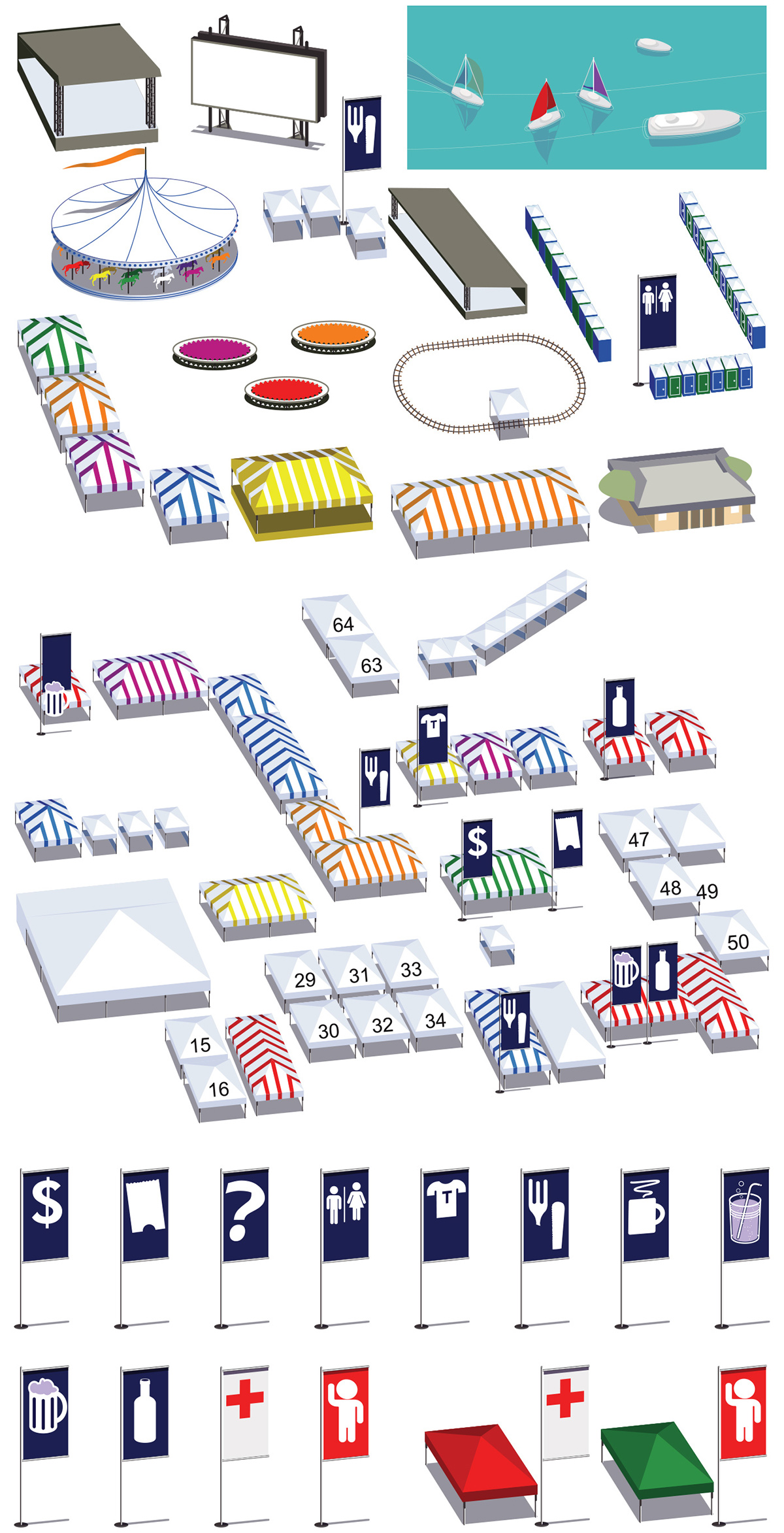
Illustrated isometric structures, elements, and wayfinding icons for the Taste of Chicago Festival interactive map.
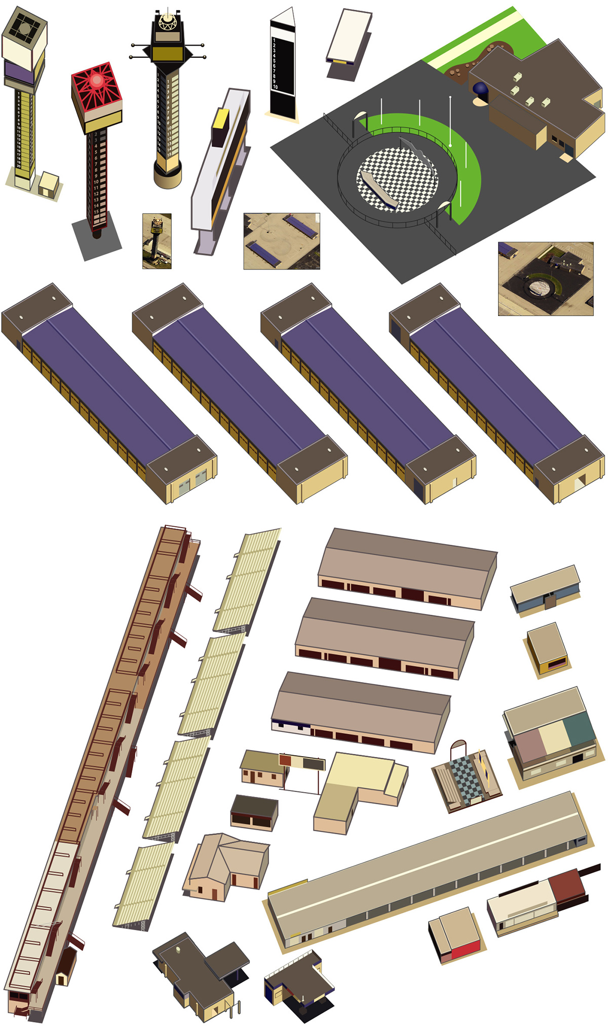
Illustrated isometric structures created for various NASCAR racetrack maps.

Illustrated isometric structures and elements for the Raymond James NFL SuperBowl stadium and campus maps.
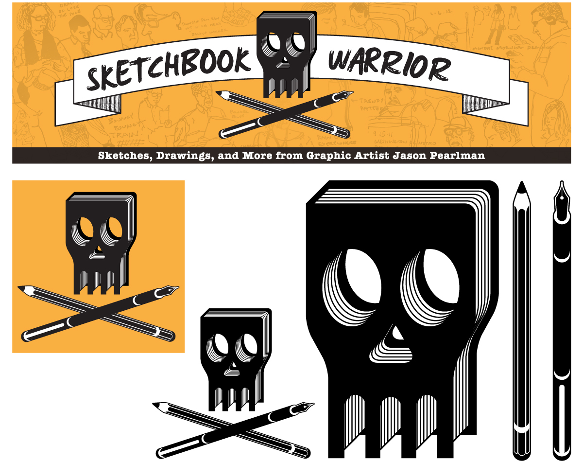
Logo and header banner for my Wordpress blog to showcase updates from my sketchbooks. Had some fun with this, emphasizing the rouge nature of on-site sketching and my choice of sketching materials; a 4x6 hardcover sketchbook and a fountain pen. The color scheme was chosen the make the elements stand out starkly while not being an alarming color like red, and at the same time, the orange contrasts nicely with the iconic blue of Facebook and the coloring of the header design blends into the interface aesthetic of the Wordpress blog.
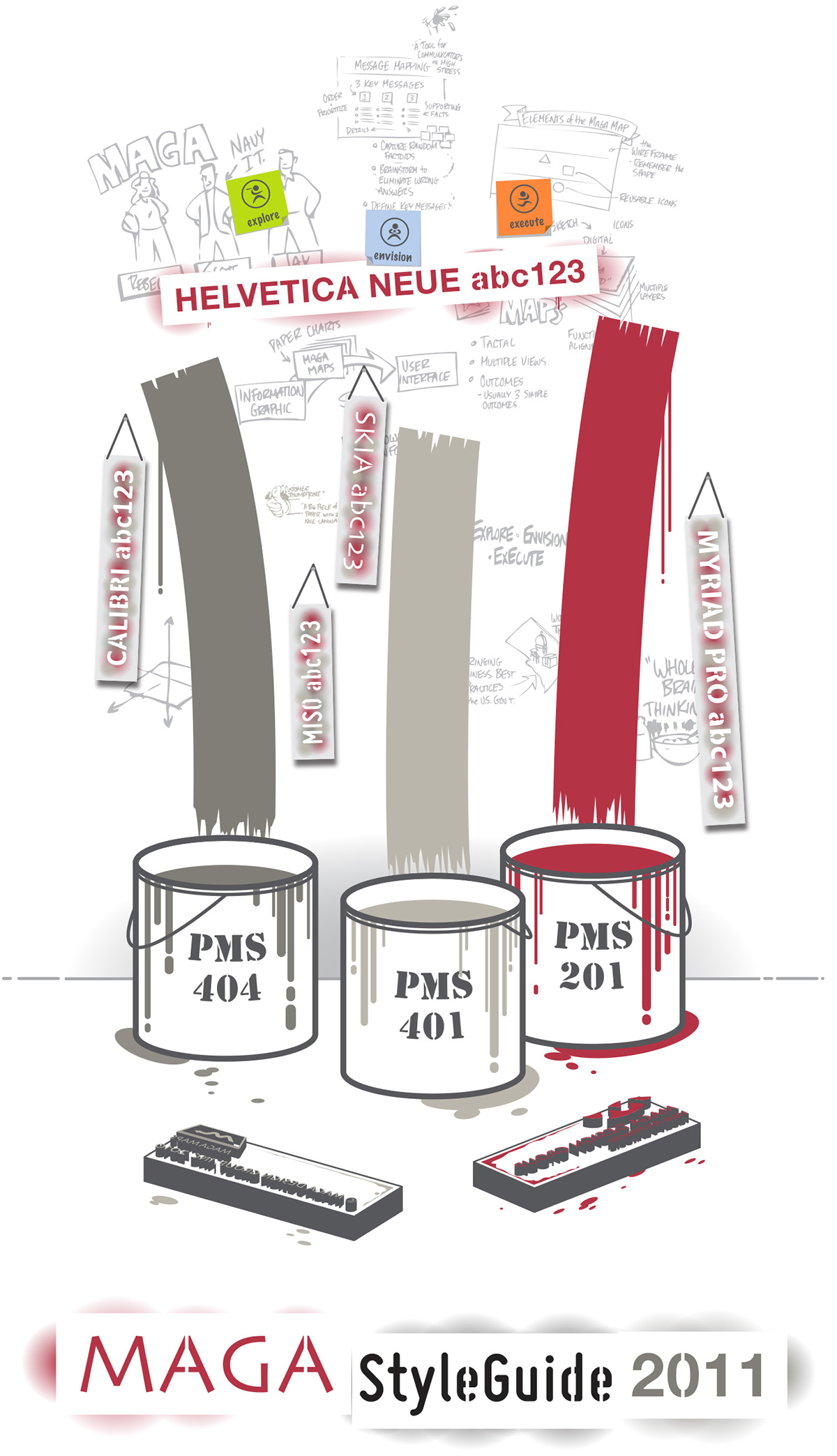
Cover illustration for Maga Design Groups 2011 branding style guide. Being a very tech-savvy data visualization studio, this was a fun juxtaposition while still keeping the nod to Maga's incredible range of creativity.
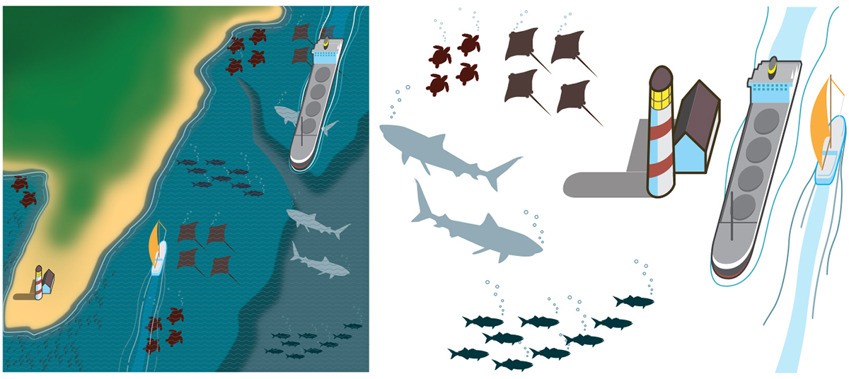
Marine life visualization map of the New York Bight for the Wildlife Conservation Society (basemap created in Photoshop; elements created in Illustrator).

