
Assignment
Established in 2000, Stella Pharm is now one of Vietnam leading generics manufacturers and distribution for hospitals, pharmacies and sells all types of hundreds prescription and non-prescription drugs and consumer health care products.
The pharma market in Vietnam has grown sharply, and it is getting more and more competitive. Small, big brands and foreign brands keep entering the market; Stella needs a strong brand's presence by establishing its own identity and needs a better reflect the business and opportunities to break into global export markets.
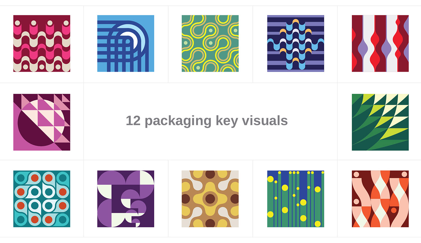
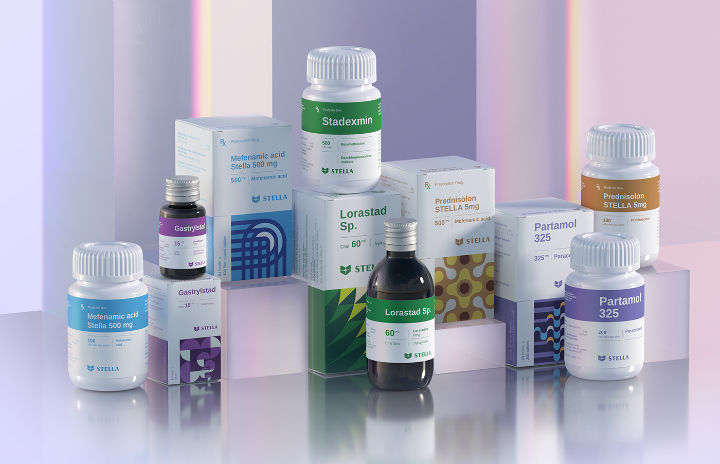
The packaging has to help show the 12 different system product categories.
They needed to feel distinctive, modern, bold to stand out in a landscape flooded with
pharmacy stores.
Strategy
The core value of Stella represents the brand's attitude and conviction toward customers.
Through solid and in-depth research, Stella approaches to resolve customers' diseases concerns drug treatment to give honest efficacy and change from deep within human organ systems.
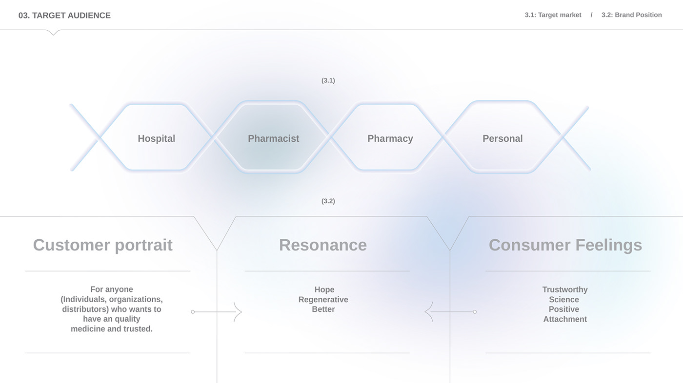
With a broad target audience, Bratus's task was to create a unique private packaging brand from the ground up, re-structure the product portfolio, gathering a wide range of products into a
coherent yet distinct brand.
Our collaboration with Stella product development teams, pharmacists, and market research to ensure the packaging works seamlessly across physical stores
and e-commerce.
We developed a clear positioning strategy for the brand, becoming the "treatment and regenerative" this became the guiding principle for creating the visual and packaging system.

Design system
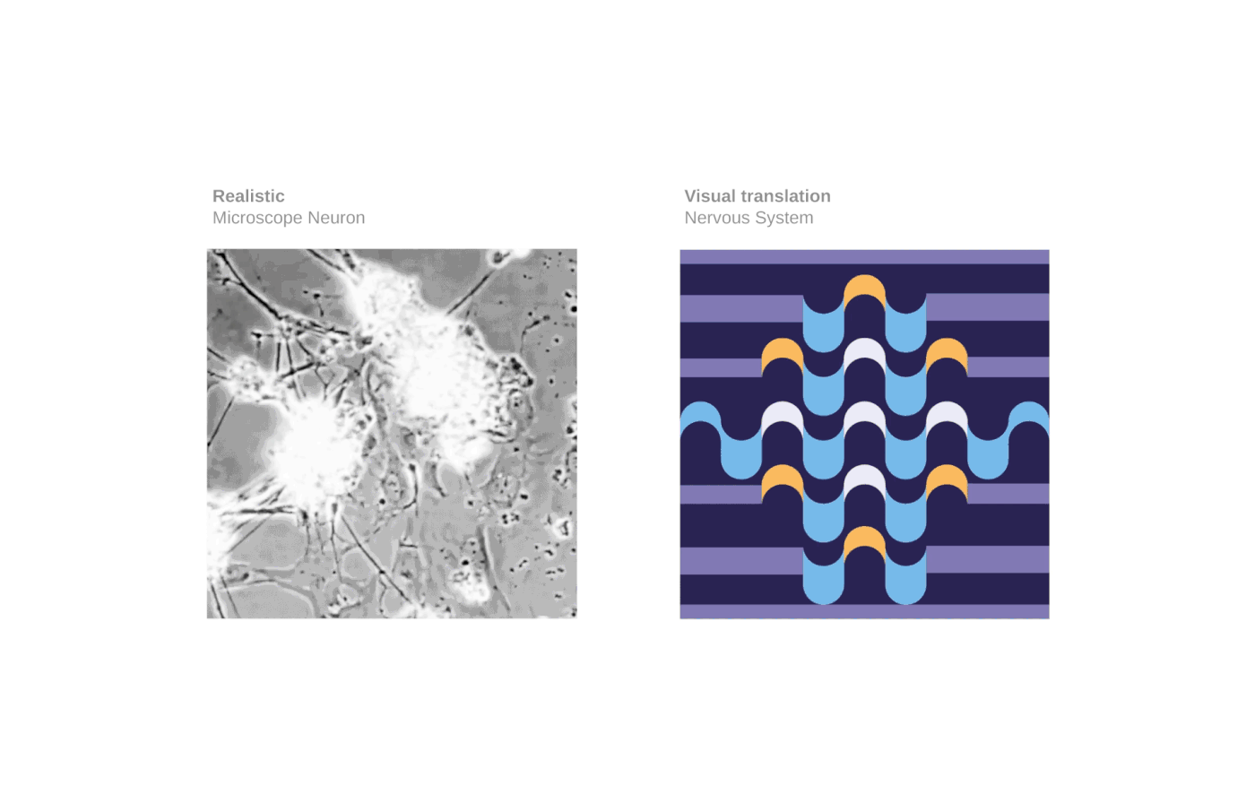
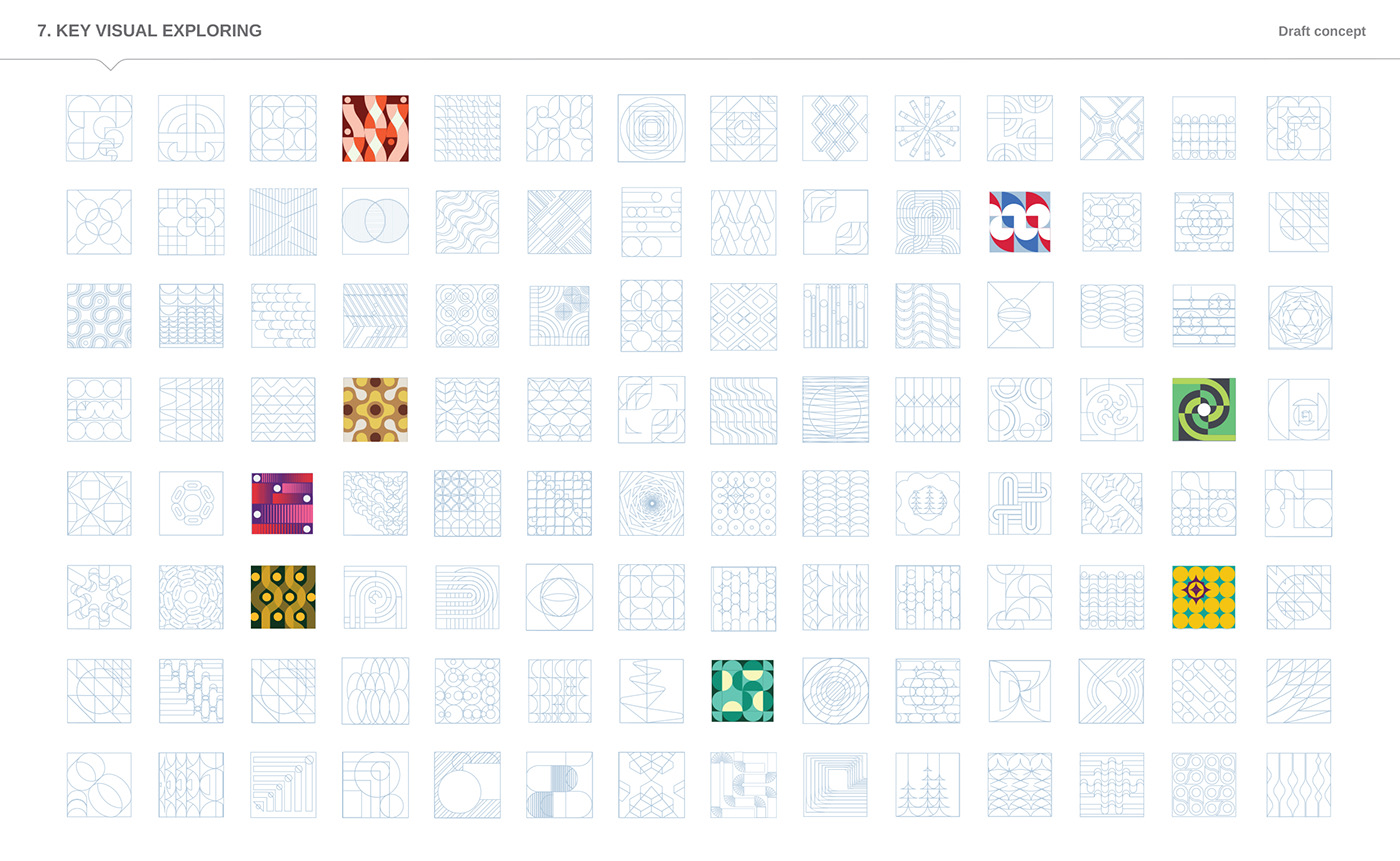
We developed the central design concept of treatment and regenerative that reflects those diseases applying treating methods by using microscopic pictures of the diseases as a sample and illustrated the healing process.
We create the geometric language to design visual patterns that let us be bold with abstract reflects the concept of human organ systems, drug treatment to create a key visual system for 12 different categories with conceptual graphics in geometric forms.
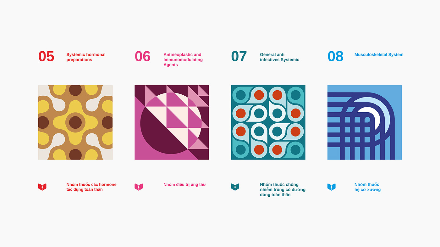
Each category key visual reflects the concept of human organ systems: joints and bones, cells, microbes, immune system, genetic chromosomes, neurological, stomach, and their operations show how products help cure diseases.
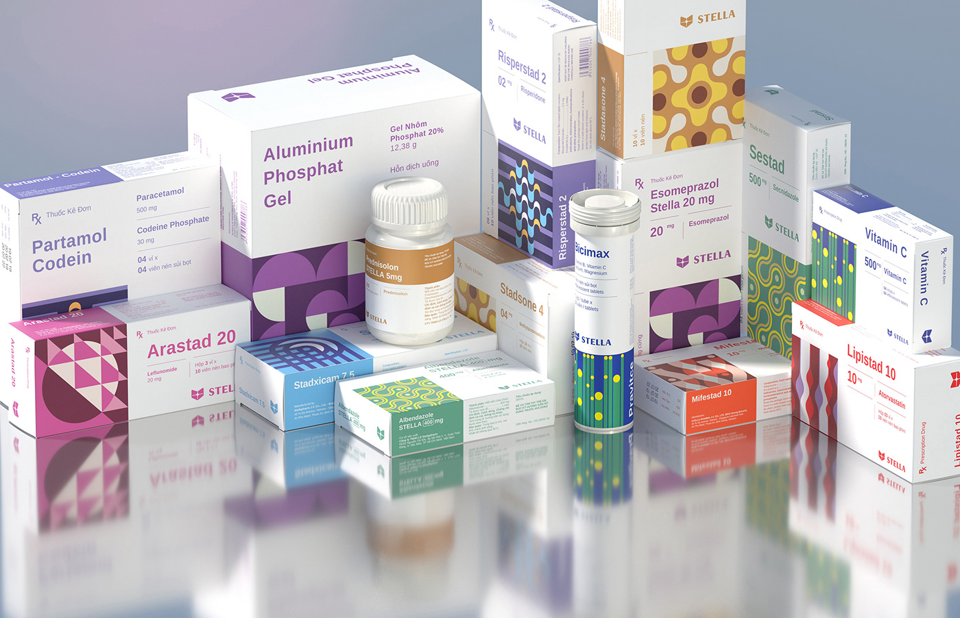
Structural design provides a good surface area in which to deploy graphic motifs improves the clarifying and consistent packaging contents, helping the pharmacists ease categorizing, distinguishing different doses.
Furthermore, the systematic layout grid also promotes flexibility when applied to different sizes and products, from boxes, jars, tubes, and blisters.
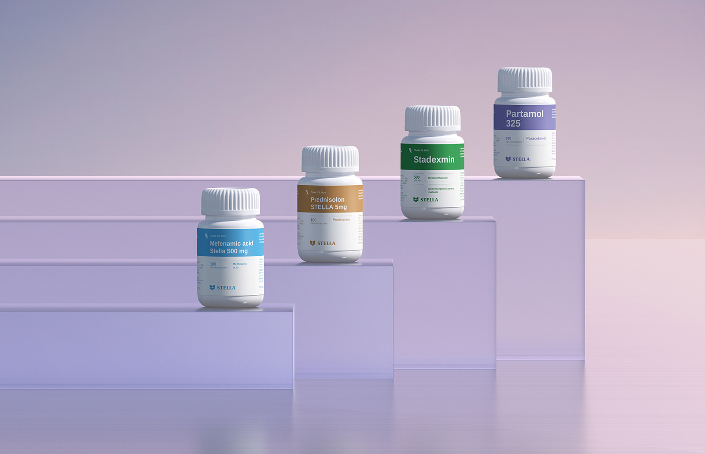
The color palette system is also composed to distinguish different types of this massive medicine system.
The color palette system is also composed to distinguish different types of this massive medicine system.


Outcome
We helped define the new packaging, forward-looking brand with research, science, technology at its heart, and the purpose of creating hope and a better future for people.
The design uses an abstract visual to show the cure diseases process. Thus, that customers easily recognize the medicines, however, do not have negative feelings to use.
The design uses an abstract visual to show the cure diseases process. Thus, that customers easily recognize the medicines, however, do not have negative feelings to use.
All products are packed in bright, striking packaging, where each category has its color. The focus is on the ''human organ systems & transformation system" and is consistently displayed in various patterns to demonstrate the effect of the products visually.


Credits
__
Client: Stella Pharm
Design Firm: Bratus Agency
Creative Director/Designer: Jimmi Tuan
Senior Graphic Designer: Si Tran, Trang Pham
Showcase/3D & 2D Animation: Khoa Nguyen, Si Tran
Product Set Design: Jimmi Tuan
Account Manager: Hien Nguyen


