
Client: Nicolas from Osteopathic Life Clinic.
Client's profession: Nicolas is an Osteopath.
Client's location: Ireland.
Client's needs: Logo, website, hosting, SEO.
Client's goals: The primary focus of the website was actually SEO and to become competitive in the city of Dublin.
Tools used: Design - Affinity Designer, Affinity Photo.
Development: Project was regrettably cancelled due to COVID.

Nicolas' clientele are predominately mothers and babies. The original branding and logo of the business was far to cold and serious. I wanted to completely revamp the entire clinic with friendly fonts, inviting colours, and welcoming imagery.

Original logo
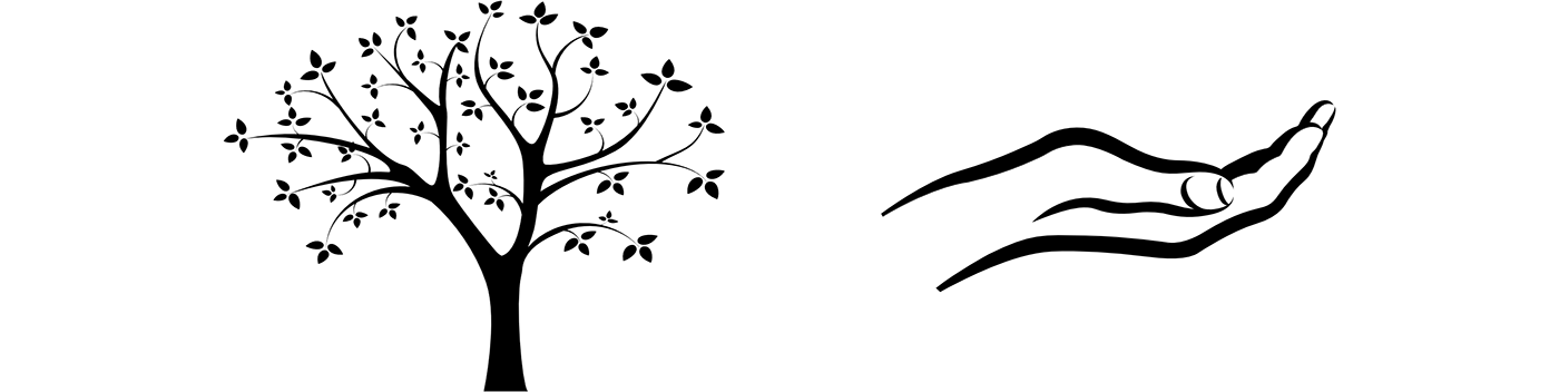
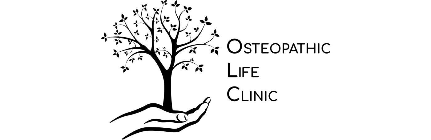
First I wanted to get rid of the snake. This does not speak health to me even though it is the symbol of medicine. I decided for a tree since it is symbolic of health and vitality. In addition the name of the clinic had life in it and I thought a tree would represent this well. In addition, the cupped, opened hand is a very symbolic symbol for the type of Osteopathy he practices. So life in the form of a tree coming out of his hands has very solid imagery.
I decided on Comfortaa for the font of the logo as it is very friendly, very solid, and yet very professional.
Here are some final alternatives.


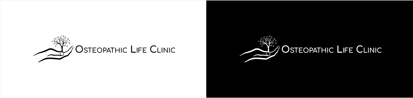
Dark and light versions of the new logo

Final logo

The website was crucial. The priority throughout were the images. I wanted images the had plenty of white in the background. I wanted to avoid overly cheesy stock images as well, yet at the same time could not compromise using native photography. The images needed to set the tone. I used colour to add emphasis but not to dominate.
I also came up with the idea to add a 'quick glance' feature. Which included prices, opening times, and locations. Often this is what patients look for the most when visiting a website and I wanted that information instantly available.

Mood board
I had originally decided on a vibrant array of pastel colours as seen on the mood board above. However I moved to a pink/purple lavender colour when designing the website. I was immediately aware that this was an extremely feminine colour which I did not want to dominate. So I offset it with darker shades of purple and greys throughout to add a bit of masculinity.

Final colour palette
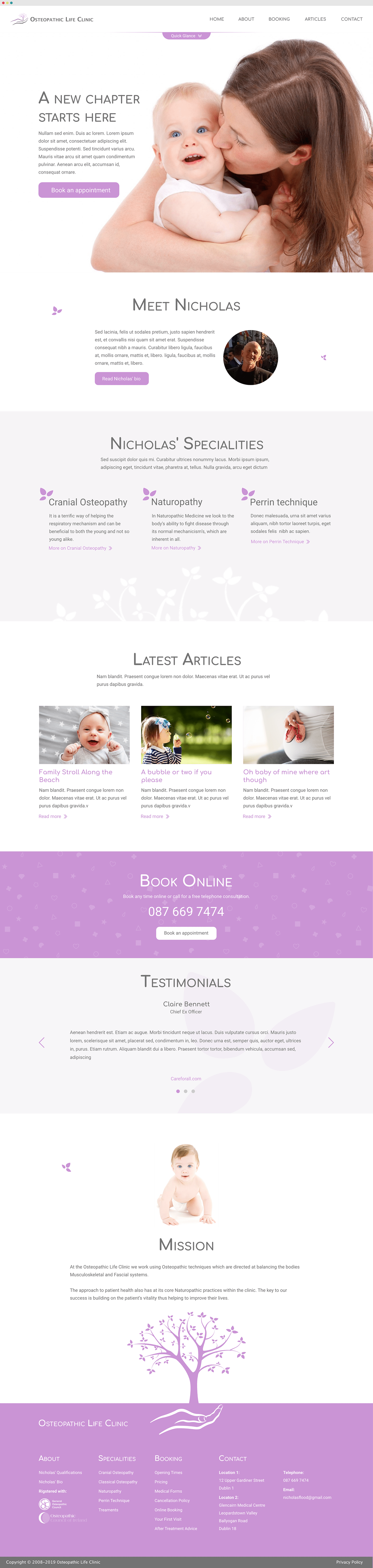
Home page
This is the 'quick glance' in action. Displaying relevant information quickly.
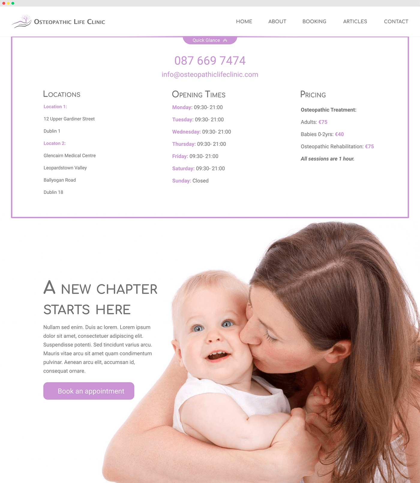
Quick glance feature in action

Mobile view of the quick glance feature

About page

Contact page

Booking page

Layout for article pages.
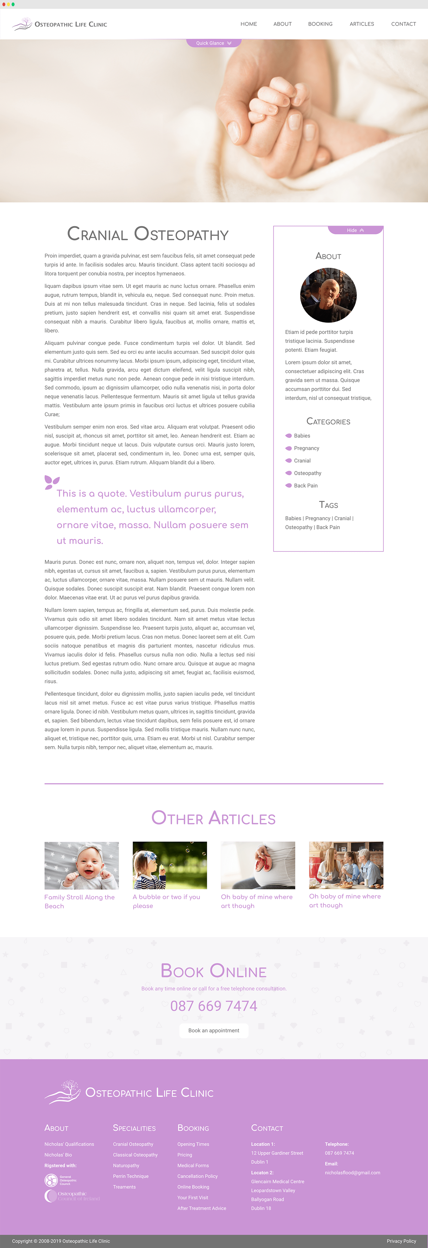
Layout with a sidebar for article pages.

© 2021 SquirrelWise
Contact: david@squirrelwise.com
website | dribbble
website | dribbble


