Challenge
The creation of a snacking brand in a pre-packed meat market that needs to stand out from the traditional meat products, compete with other snacking alternatives, and sit not only under the Campofrio mother brand but also in the individual portfolios of Justin Bridou, Aoste, Fiorucci and Stegeman.

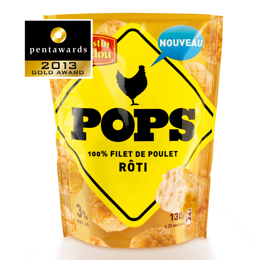
Solution
Pops is based on an iconic road sign which identifies a warning for something that is coming. It was the perfect answer as a brand shape for an on-the-go snacking product. The vibrant yellow color combined with the shape size and bold black typeface guarantees maximum shelf impact. In addition a chicken icon is introduced to give the packaging a touch of humor while simultaneously identifying the content. The space around the brand block can easily be adapted for meat variants and even be designed to introduce innovative variants in a future architecture.
For the launch of Pops - or Chicken Pops - a guerrilla action was proposed using the iconic yellow diamond shape as stickers introducing quote and actions that both enforce the bold brand personality and allow consumers to 'brand' their environment.


