Oldies Radio
Logotype & visual identity radical redesign
Logotype & visual identity radical redesign
The client: Oldies Radio is mid-size Prague commercial radio station focused on playing 1960s, 70s and 80s music. The typical array of music genre is a bit wider though: they also play some early 1990s music, as long as it's close to classic rock and pop-rock style. The radio has about 70.000 listeners based in Prague and it's vicinity and since their old identity was almost non-existant, they asked us to create a new one from the scratch.
The project: Focal point of the design process was search for visual element which would characterize pretty much 40 years of different music styles and approaches. We found this element in logos and identities of electric guitar and amps producers, such as Marshall, Gibson, Fender, Epiphone, Randall and many more. These icons always stood side by side with the interprets, no matter which era or style, and their logos didn't change a bit. They all have a lot in common, too: typical semi-script style, some of them more hand-like, other more geometric; the way the letters are always connected, black and white color keys. We decided to create the Oldies Radio logotype and identity as a homage to these music instument producer icons, and this is what became the basic concept behind majority of the decisions regarding the style direction of this new identity.


Basic identity applications

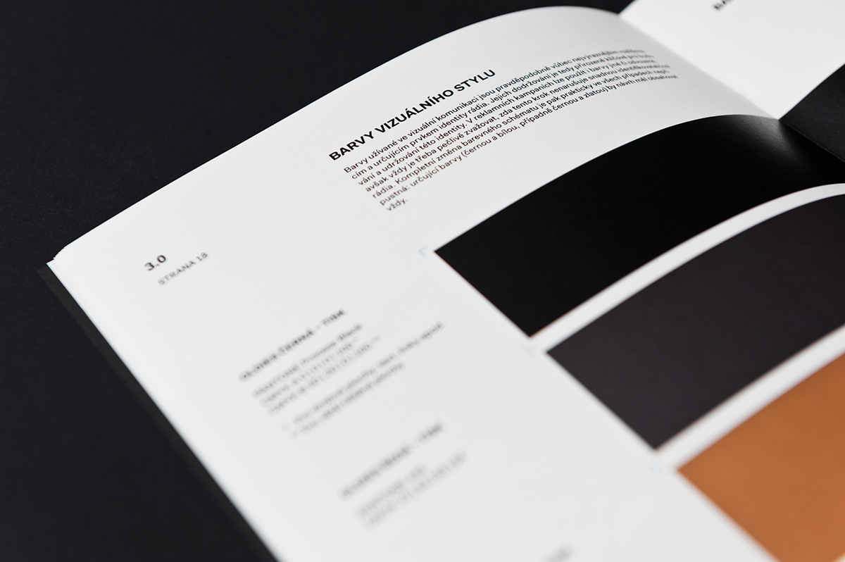
OLDIES BLACK ~ Pantone Process BlackOLDIES GRAY ~ Pantone 445OLDIES GOLD ~ Pantone 875WHITE
The identity color key
The identity color key
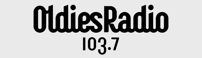
Basic logotype in inverted (black on light) color scheme

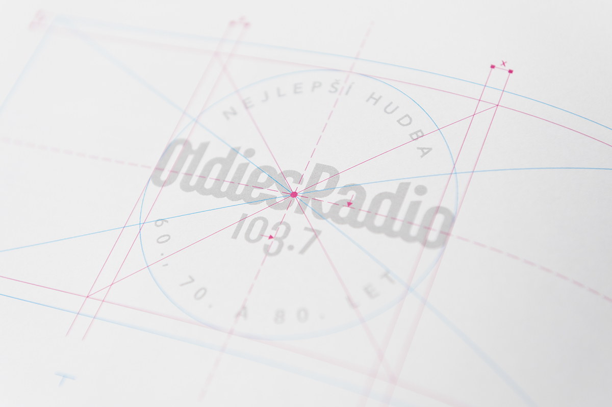
Logotype constructed on a grid
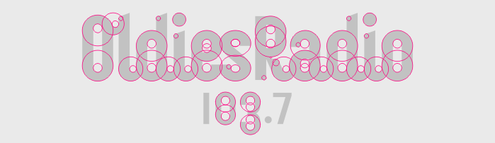
Logotype constructed by using circle sections
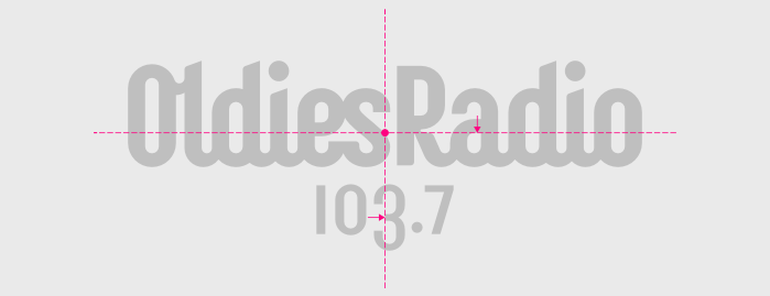
Optical center of the logotype
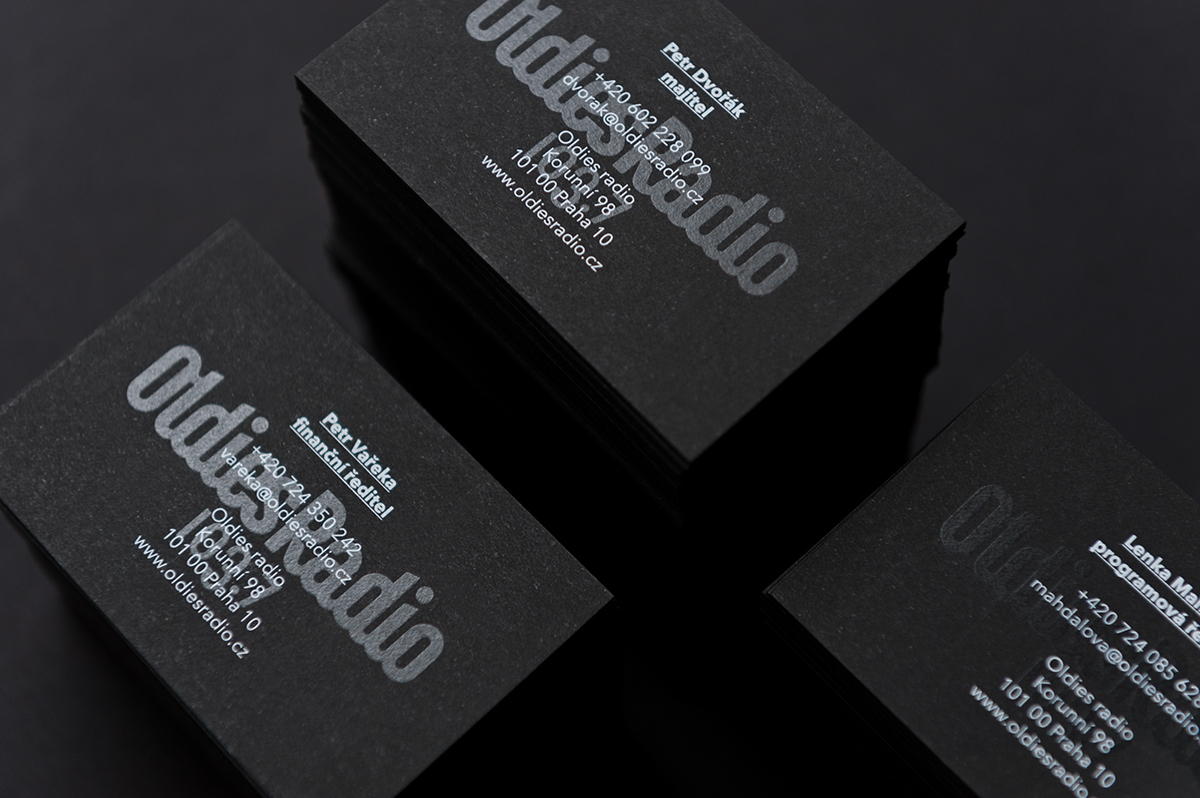
Business cards: thick black paper with white silkscreen print and coated logotype

Two different alignments of the annoyingly long claim: radial & linear version
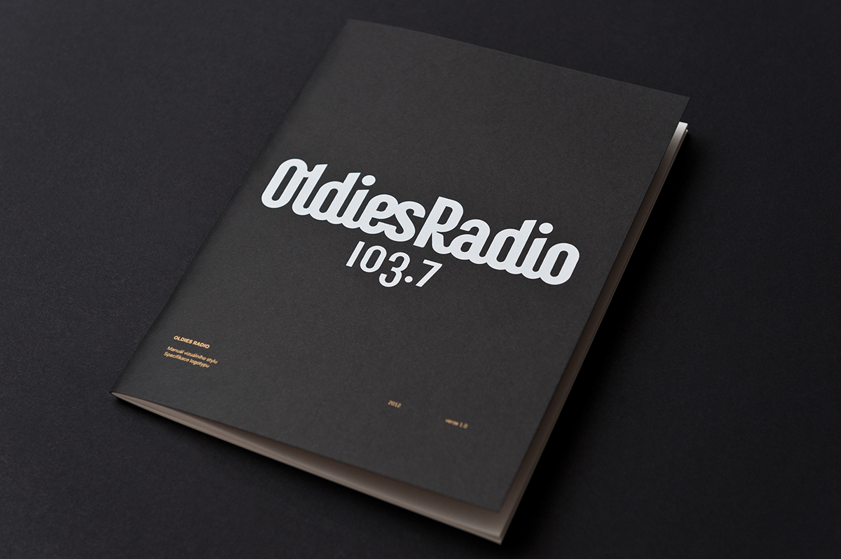

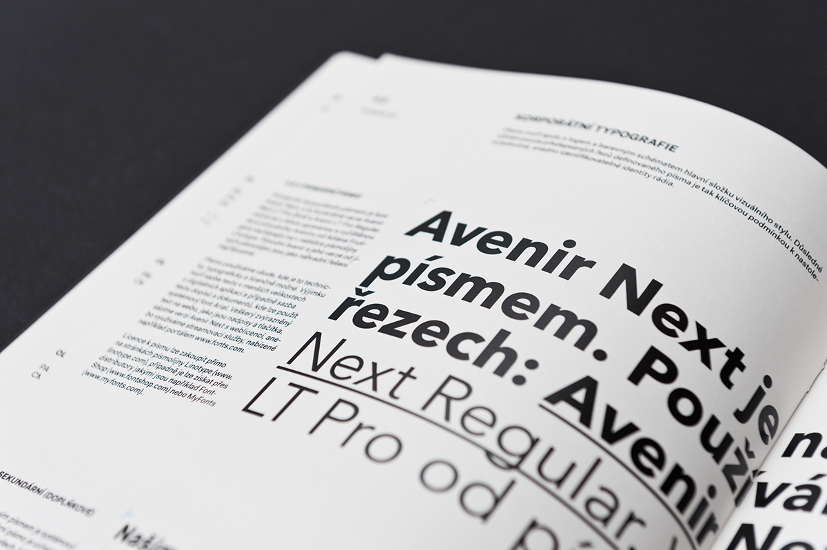
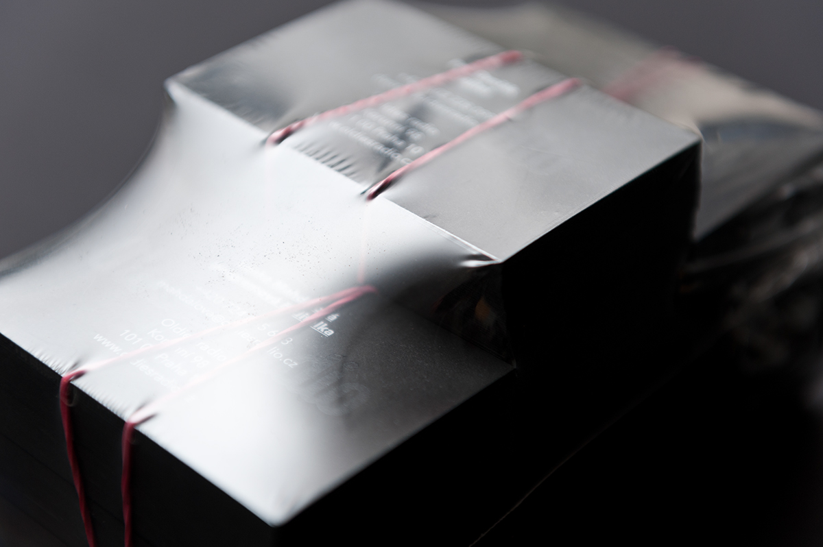
Visual identity guidebook, printed in ten copies for needs of the radio station

Basic concept behind both the logotype and the color key

Bizzare style original logo from before the redesign

More applications and ad campaign comming soon!
Concept & desing by: FRVR - Jan Vranovsky & Dan Friedlaender Photography: FRVR - Dan Friedlaender Additional intern support: Katka ŠlaufováPrint: Arttisk & Paper Jam
Copyright 2012 - all rights reserved
Copyright 2012 - all rights reserved