


When we started working on Botanica Lozen's project we approached the task with the necessary curiosity and pragmatism. The job was rather unique for both sides - team and client - with its concept, scope, relevancy, and planned efficiency. The Arco Vara team tried to outline the initiative as the sole suburban residential who provides a healthy, peaceful and active lifestyle to any modern thinking professional, who seeks to raise his family in a clean and safe environment.

This bold description contains the single most important trait of Botanica Lozen - not just to provide a secure and beautiful home to its buyers but also to cultivate a discrete micro-community that maintains an entirely environmentally friendly lifestyle in all of its aspects. Certainly, the most characteristic feature about Botanica Lozen's approach towards the brand's audience was the intention to keep the company's outspoken and honest demeanor in their relationship with purchasers.
The mutual excitement at the beginning of the workshop was apparent. In this instance, the meeting was quite useful for Arco's lineup as it was more of a quest for the brand's core principles than a usual questionnaire. By clarifying Botanica Lozen's identity through a series of exercises concerning its ideology (the fundamental questions starting with Why, What and How) we came up with the aforenamed guidelines of their existence.


Furthermore, we discovered the set of characteristics that make the brand individual - its reliable culture, the friendly tone of voice that is preferable for communication, as well as the feeling of exceptionality that they'd like to evoke in the client.
A more insightful and thorough analysis helped us to pinpoint the user personas whose traits and peculiarities paved the way towards the better understanding of the brand by the audience and the subsequent and much-needed feedback.
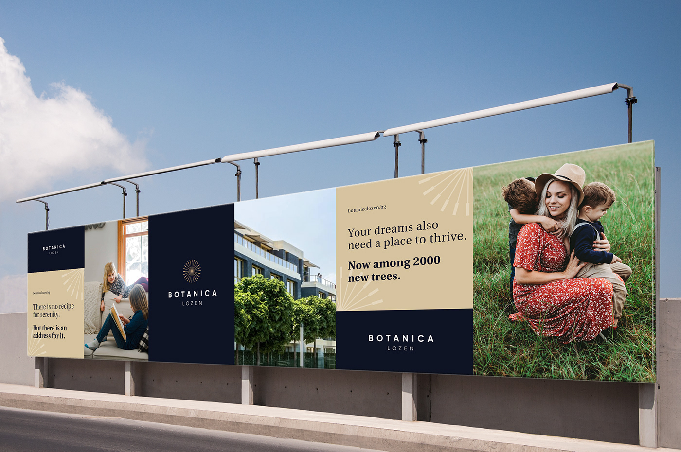
The collective seeking of these characters for a clean and peaceful place to live in as well as their overall appetite for quality products and meaningful experiences served us as a crucial groundwork for finding the proper definitions of Botanica Lozen's design - clean, minimalist, stylish and luxury one - thus adequately responding to their notion of aesthetics.
These details also shaped the image of the brand as not just another ambitious real estate project but as a developing organic-like structure that sticks to its deeply humane principles and its goal to deliver happiness and certitude in the most reasonable way possible.
These details also shaped the image of the brand as not just another ambitious real estate project but as a developing organic-like structure that sticks to its deeply humane principles and its goal to deliver happiness and certitude in the most reasonable way possible.
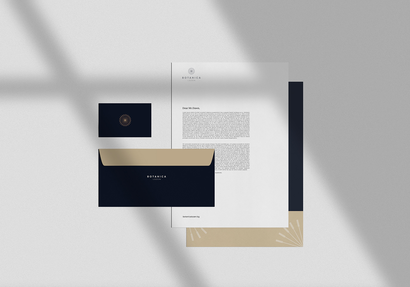
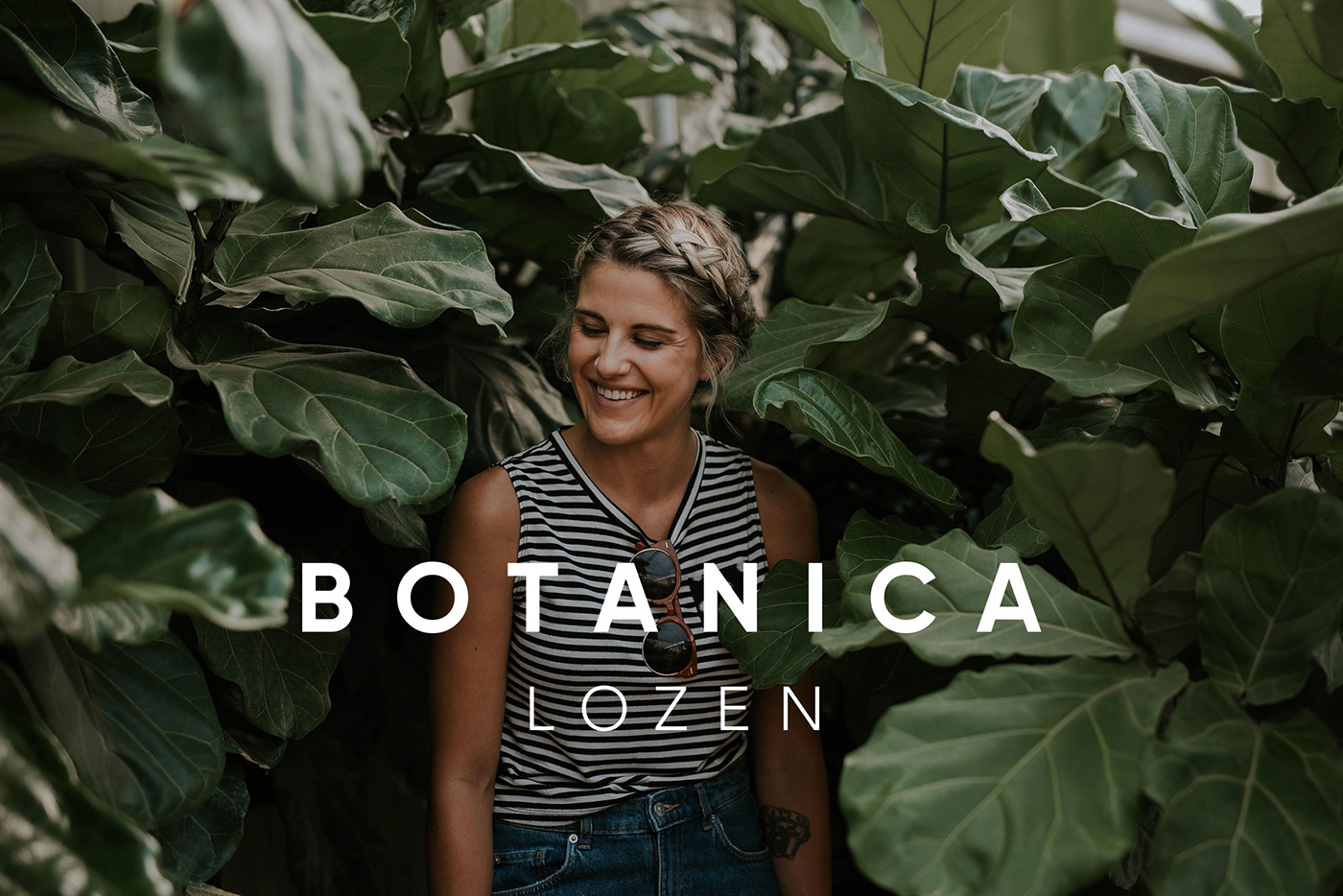
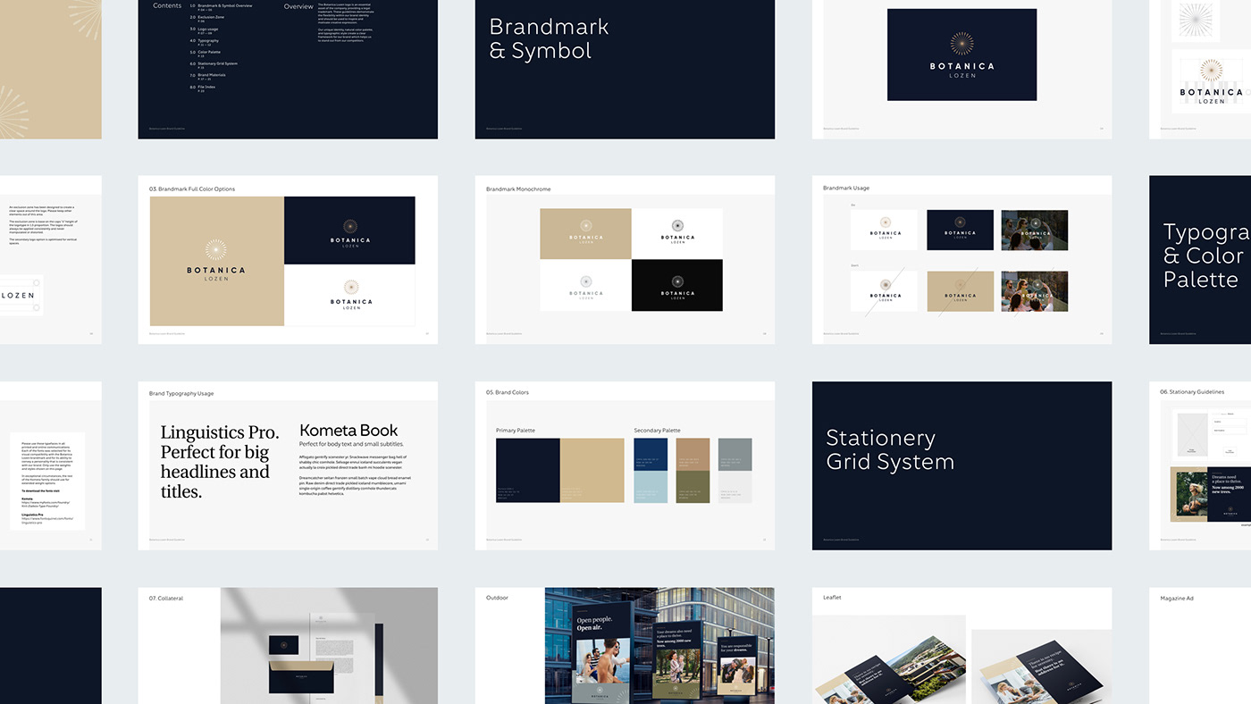
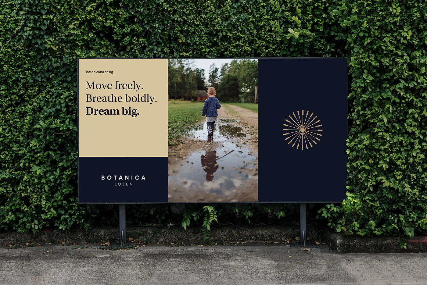
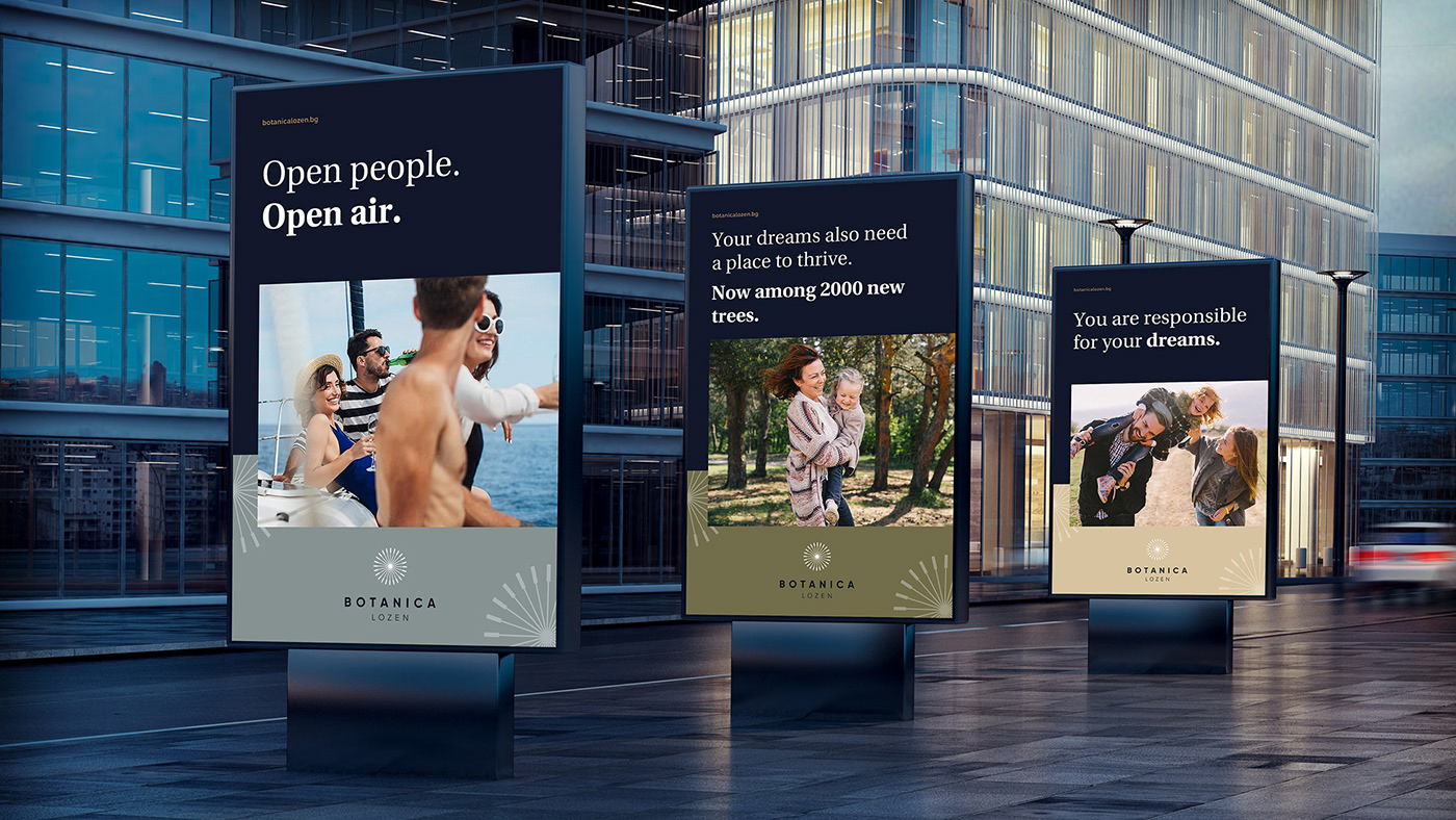
Considering the fact that Botanica Lozen is conceived as a residential containing a micro-society in itself, we crafted its logo intending to represent these ideas of togetherness, empathy, and fellowship. Drawing inspiration from the ancient symbolism of round and simple figures such as the sun, the wheel, and the dandelion we put these concepts into its shape with the bright idea to create a memorable emblem for this community and the rules according to which it will function.

Then, we supplemented this symbol with typefaces Linguistics Pro and Kometa, which correspond to its lightness and elegance. The primary color palette was inspired by the natural vibe and tones of the location by juxtaposing the dominant dark cornflower blue with moderate amber and various hues of green and light blue. The final result could be described as a delicate correspondence between elegance, comfort, purity, and simplicity.


Brand Strategy & Creative Direction — Atanas Teodosiev
Art Director & Graphic Design — Sofia Dimitrova
Copywriter — Alex Gyurov
Art Director & Graphic Design — Sofia Dimitrova
Copywriter — Alex Gyurov
UX Strategy & Account Services — Jordan Petrov
UX & Visual Design — Martin Bonov
UX & Visual Design — Martin Bonov
Thank you!


