


Using geography and topography to make a beautiful contemporary brand for a revolutionary Spanish wine producer.

The Need:
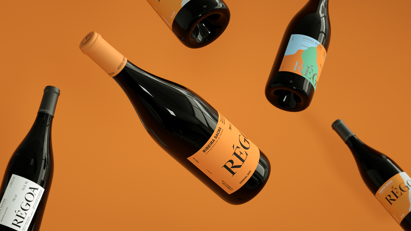
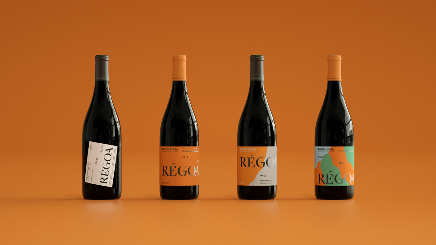
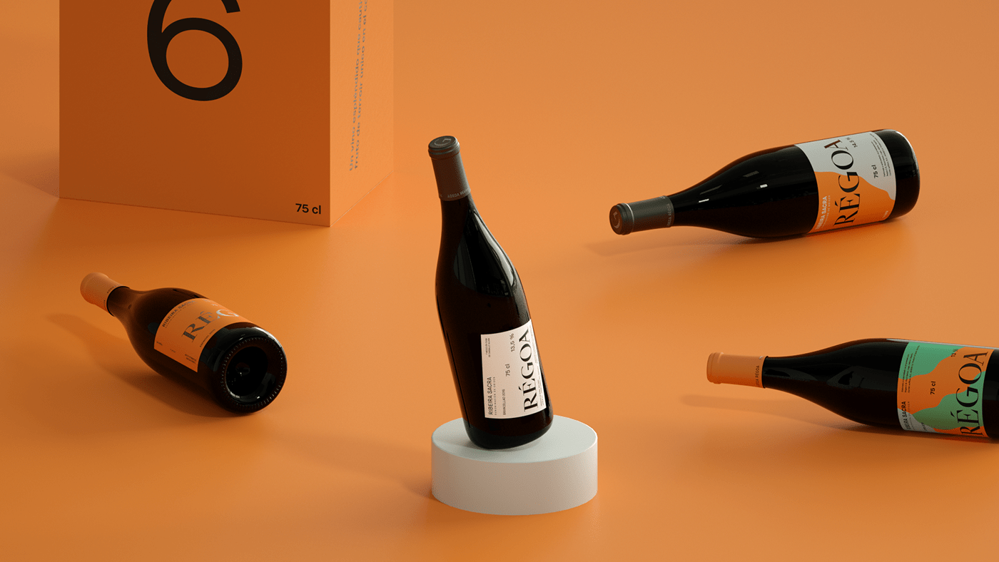
Régoa is a local Spanish wine company with a national and international expansion. Its red wines are made with a flavory and tasty raw material from one of the most enchanted places in the North of Spain. Régoa wanted to update their brand to better express the essence of their unconventional product.

The Proposal:
After visiting the vineyards in the beautiful Ribeira Sacra, we decided to rebrand Régoa using the incredible characteristics of the canyon alongside which local families produce astonishing wines on lands with an incline of 80%, made by Roman vineyards 2000 years old. The territory is so unconventional that the grape harvest is called heroic, for the difficult conditions in which producers collect grapes.

The Solution:
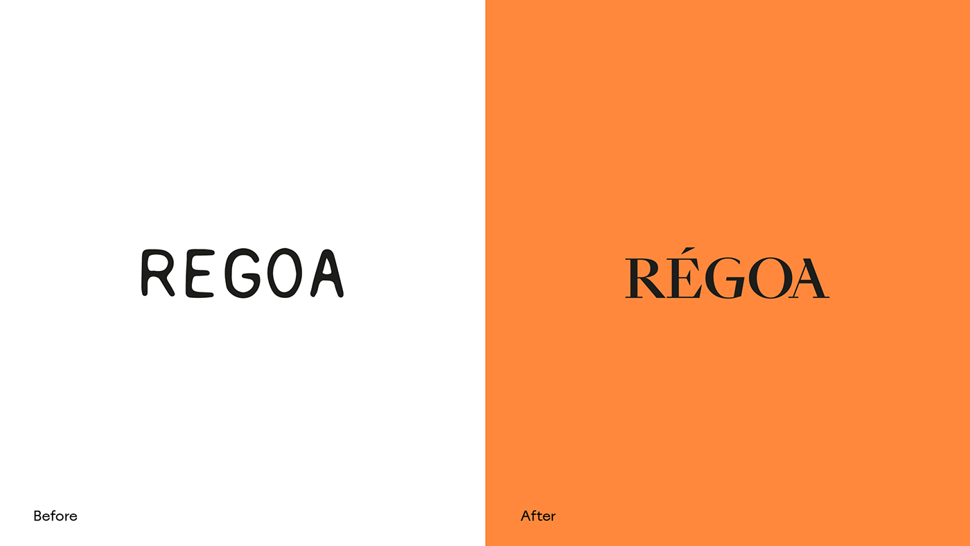
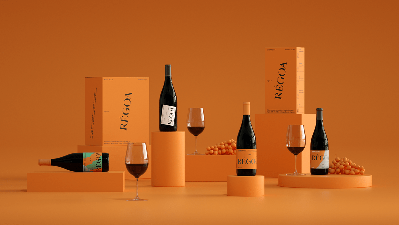
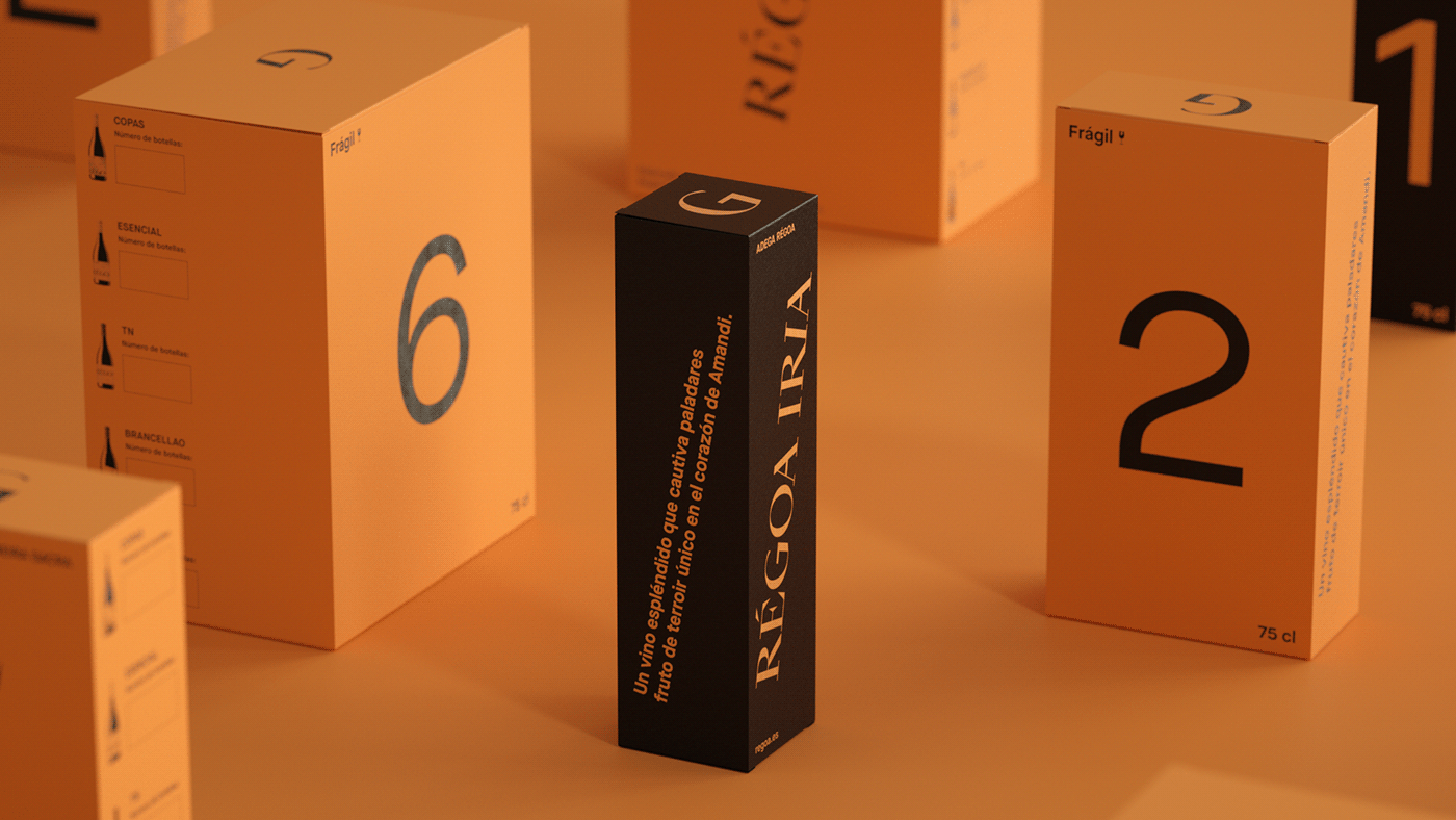
The new system is made by 80º corners that make the new logo structure and the main composition, plus we decided to rename some wines to better enhance the essence of Régoa brand made by risky choices mixed with geographical elements.

The Goal:
We designed the new brand to enforce the high quality of each wine according its quality level with a contemporary vision to better positioning the product on a more international market.


