TASK
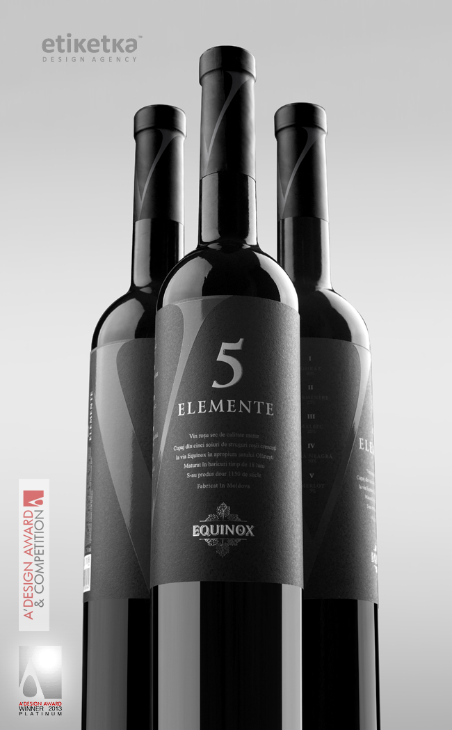
The task was to create TM and label design for exclusive Moldavian wine "5 Elemente"
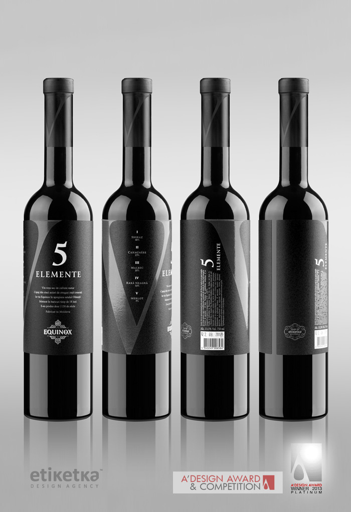
SOLUTION
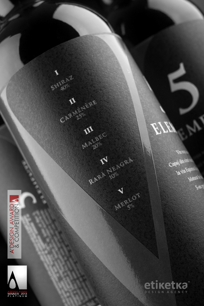
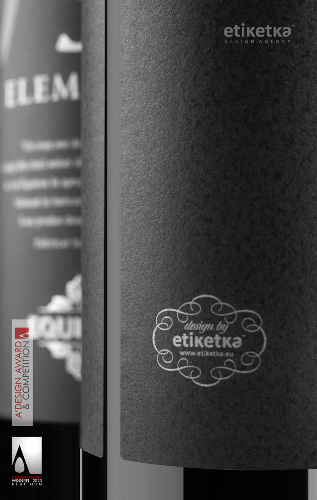
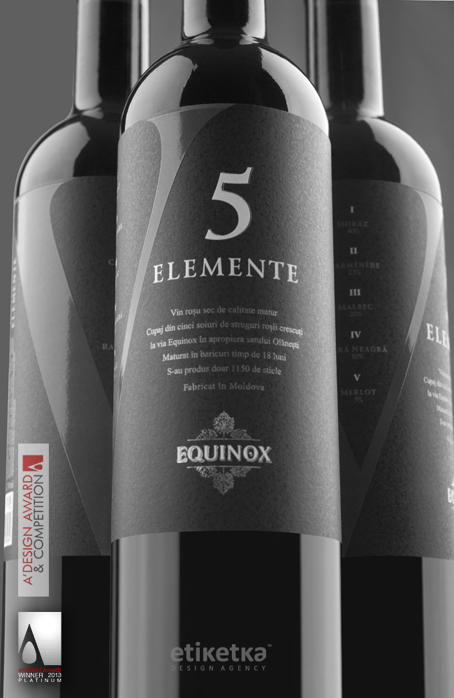
The design of “5 Elemente” is the result of a project, where the client trusted the design agency with full freedom of expression. The highlight of this design is the Roman character “V”, which depicts the main idea of the product – five types of wine intertwined in a unique blend. The special paper used for the label as well as the strategic placing of all the graphic elements provoke the potential consumer to take the bottle and spin it in their hands, touch it, which certainly makes a deeper impression and renders the design more memorable.
At first, there was the struggle to place all the informative and graphic elements in a way that wouldn`t make the label look overstuffed with details. This led to the concept of a label that would cover the entire flat surface of the bottle instead of using the traditional two-piece layout. This, in turn, resulted in the technological challenge as none of the local printing companies had the ability to print the label as it was intended to.
* 5 Elemente Wine Label is Platinum A' Design Award Winner in Packaging Design Category, 2012 - 2013.