
Venetian Maneki-neko
A few weeks ago the good people from Serif contacted me to see if I was interested in creating some artwork for them in my style of photo composite and retouching but using their software Affinity Photo®. I had heard of Affinity before and I had seen some screenshots of the interface but never stopped to really check what it was all about. Up until that point I didn’t feel the need to do so.
I have been a life long Adobe Photoshop® user. Still am. I learned the software back in 1999 using version 5.0 and I remember clearly that while I was taking this Photoshop® class Adobe released the 5.5 version and my teacher was really exited about it. After 20 years I have used every single version of Photoshop® that has been released. According to Adobe I am a “Legacy User” which is simply an eufemism for “users who like to do things the old fashion way”. Like most legacy users I have a keyboard shortcut-based workflow and I don’t like things changing that much in that regard. Not only because it’s hard learning to do something differently after 20 years of doing it a certain way, but also if affects my workspeed considerably due to constant involuntary mistakes while re-learning. I hate that. Like when learning to let go of the mouse and start using the Wacom tablet. Terrible in the begining, worth it in the end. Cumbersome process nontheless.
I’m telling you all this so you know where I’m coming from and also to acknowledge the fact that I was open to the idea of learning a new software from scratch but seriously esceptical about it as well. They gave me a license for me to try the software out and get confortable with it before start working on the commisioned artwork; which appreciated very much.


Getting used to the interface
AFFINITY PHOTO v.1.7.2
Surprisingly it took me very little time to get used to the interface once I had done my homework. This included watching a lot of tutorials and performing various test. Affinity Photo® has a great YouTube channel with plenty of tutorials for anyone to check out and learn the software. They are all very clear and to the point, just the way I like it!
If you are coming from Photoshop®, Affinity Photo® is pretty straight forward. Most things are called the same and are located in a similar way as Photoshop® with the same keyboard shortcuts for them (This is great!). Some things are different though. Like the Color Picker being located by default in a top right window and not at the bottom of the main tools panel at your left. That was weird for me at first because of my reflex to point left with the cursor when choosing foreground and background colors. I recently discovered that you can dock the tools panel as a floating window and then the Color Picker will appear at the bottom just like Photoshop®. This is not an obvious thing but I’m glad it can be done. So, problem solved! Also the D and X keyboard shortcuts work just the same as Photoshop®. Thank god!
Another thing is the different workspaces called “Personas” in Affinity Photo®. Here you have 5 of them. There is the Photo Persona which is your main retouching and compositing workspace. Then there is the Liquify Persona which is the same thing as the Liquify Filter in Photoshop®. Then you have the Develop and the Tone Mapping Personas which are your Raw file development and color grading modules or workspaces and finally there is the Export Persona which is self explanatory. I personally find this structure and the name “Persona” a little strange. I speak spanish as my first language and “persona” means literally “person” in spanish, so the “photo person”, the “liquify person” and so on sounds a little silly to me. If they were called “modules” it would make much more sense but it’s not a big deal. You will spend most of your time in the Photo Persona anyways.
The other big difference -and this is a hard one to get used to- is the layer stacking system, specially with adjustment layers used as clipping masks. In Photoshop® the layer stacking is done upwards as if you are putting adjustments and other layers on top of the main layer you want to affect. In Affinity Photo® the layer stacking is done downwards as if those adjustments belong to the main layer on top or they are “child adjustment layers” who belong to a “parent” layer. This is actually how they call them in the tutorials on Affinity’s YouTube Channel. This is weird I must say. I mean, I understand the logic behind it for someone who is learning this for the first time but it required my brain to recalibrate heavily coming from Photoshop®. The only time both systems stack downwards the same way is when placing layers into groups/folders.

On this subject specifically I have to say I prefer Photoshop’s stacking system better. Not only because it makes more sense to me but also for technical reasons about the interface of this panel. I don’t mind Affinity’s “check” icons on the right side of the panel for showing or hiding layers just like the “eye” icons on Photoshop’s left side. But I do mind how visually homogenous it is. I’m talking about the fact that all layers look the same on Affinity. They are all squares. Even the folders look the same as the layers inside! This can get very confusing, specially when working with complex photo composites made out of dozens of layers and layer groups. In concept it is cool that the layer mask is incorporated into the adjustment layers in Affinity Photo® but it also makes it very difficult to differentiate a simple mask from an adjustment layer at a glance. The extra time you spend looking for the right layer in Affinity Photo® adds up and it gets annoying when you simply can’t spot the right one easily when they all look the same. You have to check on/off to see if it’s the right one. Imagine having to do this on and on during your workflow…
In Photoshop® things are very simple. Folders look like folders. Only actual layers show you the preview of its content and all adjustment layers are differenciated from regular layers by the little black/white circle icon outside their mask. Masks are separated from their layers but linked to them which means I have full control over them independently. I like this system. It is straight forward and effective. I know what is what at a simple glance and I don’t waste much time looking for the right layer to work on.
If your composite has just a few layers, Affinity Photo’s system works well. But as soon as you start scrolling on the Layers panel to find the one layer out of 150 or more, you will waste valuable time doing so. On agregate this can take away easily 10-15% of your working time simply finding the right layer. That's not good, specially for someone like me and in my line of work which often involves dealing with large files made out of tons of layers. I know this is probably a little obsessive compulsive on my part, but I just don’t like wasting my working time unnecessarily.
The things I love
As you would expect, not everything is bad. On the contrary, there are many things I love about Affinity Photo®. The first one being how easy it is to learn the software and to get familiar with it. I know I already stated this, but if you are coming from Photoshop® you will feel at home in no time, this is great because it releaves the pressure of getting used to a new tool quickly.
If this is the first image editing software you are using you should be able to learn it quickly as well because it is very focused. What I mean is that Affinity Photo® doesn’t have all the other bells and wistles that Photoshop® has in terms of animation, 3D integration, video editing capabilities and such which can make the learning process a bit overwhelming for many people. But if you only want to focus on image editing, retouching and compositing, then Affinity Photo® will let you do just that with pretty much the same results as Photoshop®.
As a bonus, if you are coming from Photoshop® you can import all your LUT presets, all your custom brushes or brush packs that you may have purchased for Photoshop® and use them in Affinity Photo® with no problems at all. All the keyboard shortcuts for working fluently with your brushes are the same as Photoshop®. This is very nice, obviously!
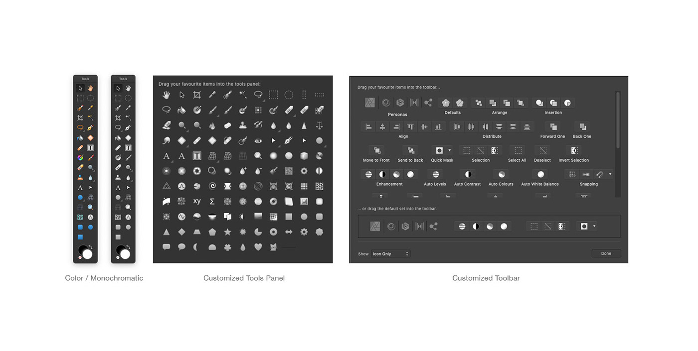
Another thing I loved about it was how customizable the software is in general. You can create your own keyboard shortcuts not only for the tools but for specific actions or filters. I do this a lot in Photoshop® with things like Gaussian Blur of Flip Vertical/Horizontal; you know, the things you constantly use and are cumbersome to access through the drop down menus. It takes a little time in the begining to set all those shortcuts up but you only have to do it once and the software allows you to save those presets.
On top of that Affinity Photo® allows you to customize not only your main tool panel but also the top horizontal bar so you can have access only to the tools you use the most.
This is huge because I know there are things and tools I rarely use in Photoshop® and they are there whether I want them or not. The fact that I can have ONLY my most useful tools and properties on display makes the workspace feel cleaner and more efficient with everything I need just one click away. I can still access the rest of the tools when I need to but they don’t have to be on display all the time. This is awesome. Makes the workspace very personal. Even in the small details like you can set all the tool’s icons to be monochromatic. By default they come in color. I’m sure many people like them in color but I’m not one of them, I find it rather distracting. The fact that you can customize even THAT is great.
Another cool feature in Affinity Photo® is the Haze Removal filter. This is similar to the Dehaze slider in Photoshop’s Camera Raw Filter but it does a much better job in my opinion. It has 3 sliders that allow you to have much more control with better results. The Raw file development module or “persona” in Affinity Photo® is not as robust as Adobe’s Camera Raw but some features do perform a little better. This is certainly noteworthy.
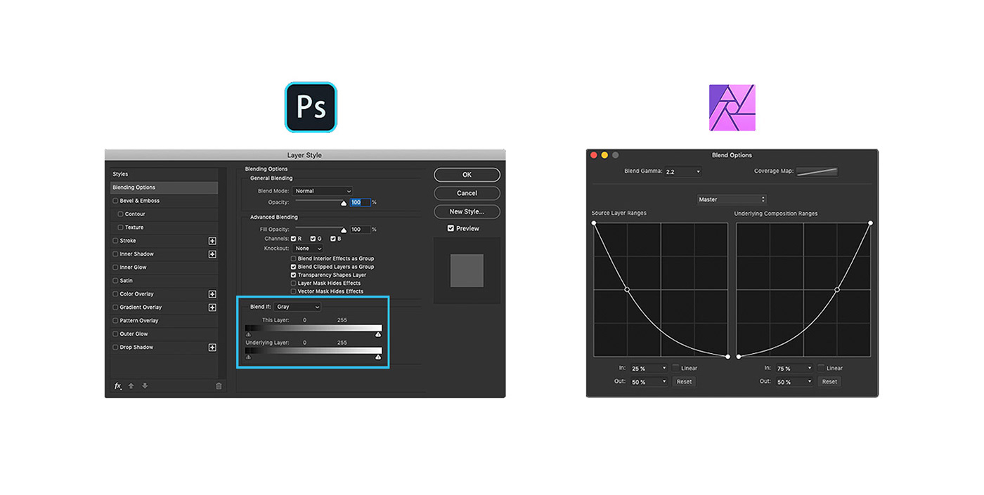
But the biggest hit for me; the feature that I like better in Affinity Photo® than in Photoshop® is the layer Blend Ranges. This is the same feature as the Blend If sliders in the Layer Style panel in Photoshop® but in Affinity Photo® they work as curves which is way better and easier to work with. The blending results appear to be much more smooth because of the control a curve interface gives you for the Shadows, Midtones and Highlights instead of a simple horizontal slider. You can change the overall blending of the layer ( Master ) or you can blend by channel which is always cool. You can use it as linear adjustment if you want by checking the box but why would you? Curves are just better. I really wish Photoshop’s version was like this.
These are all very cool features indeed, but I think the biggest attraction for people who are switching from Photoshop® or learning Affinity Photo® as their first image editing software is the price. Serif charges only US$49.99 for the licence. That’s it. No suscription plan like Adobe’s Creative Cloud and it includes future software updates. It is a pretty good deal I believe.
Performance
Affinity Photo® was good but not great performance wise. Overall the software performed well but it did lagged and froze on me a few times when working on the commissioned artwork, specially in the latest stages where the file got more and more complex with many layers. This also happened once during my initial tests as well. I visited the Affinity Photo's Help Forum on Serif’s website and apparently this was a popular issue with the latest version of the software. I used the recommended performance settings and it worked better so I was confident I would be able to finish the job.
I admit this was dissapointing because it is not something that happens to me often when working with Photoshop®. I work on a 15” Macbook Pro with 16Gb of RAM which is double the recommended for Affinity Photo® and it drained the memory like crazy.
The fact that I was recording my screen at 2.5K resolution during the creation of the artwork probably didn’t help things either I supose. But the composite for the commisioned artwork is a rather light file, it’s only +300Mb file. I have worked with +3.5Gb files in Photoshop® with no problems whatsoever. I was not recording my screen when dealing with those huge files though. But again, I was not recording my screen either during my initial tests with Affinity Photo® and the software did crashed then; so…
However, I must state that I was using version 1.7.2 during my learning process and also during the creation and screen recording process of the artwork. Since then Serif has released version 1.7.3 which did helped making the software much more stable than the previous version. This is cool because it shows that Serif actually listens to their users and works hard in order to improve their products constantly.
So, based on my experience I’m afraid I cannot praise Affinity Photo® on its performance nor its reliability. But I will give it the benefit of the doubt. I am aware there is not such thing as a perfect image editing software. Photoshop® can also be buggy sometimes, specially when big changes have been made on a newly released version. I am sure Affinity Photo® will continue to improve and in a very near future will be just as stable and reliable as its main competitor which has been working on those things for way longer so it is naturally further down the line in that department. After all, this is why Photoshop® is the industry standard worldwide. Affinity Photo® is clearly the closest thing to it and a very good alternative.
My conclusion
Having used the software for both simple practice and a complex surreal photo composite on commission, I can honestly say that I very much enjoyed my overall experience with Affinity Photo®. However, I have my reservations.
SO, SHOULD YOU BUY IT?
If you are just starting out as a photographer / retoucher, a designer, a hobbyist in the industry or a freelancer who is not comfortable with a subscription based software, Affinity Photo® might be just what you are looking for. It is easy to learn, easy to use, it is very customizable and for the most part it will perform very similar to Photoshop®. Sometimes better with specific features. All that for a very affordable prie. Go for it! You will not regret it.
However, if you are a seasoned professional who depend on your hardware and software for top performance and reliability, you should stay with Photoshop® as it is still the industry standard for a reason. Most professionals speak in Adobe’s terms. All those years of research and development Adobe has invested in their software count and they manifest in how their products perform which is why most professionals have embrace them.
I personally would not feel comfortable leaving Photoshop® and switching completely to Affinity Photo® because of how used to Photoshop® I am; but also because of the other services my Creative Cloud plan allows me to have, like access to other Adobe applications like Illustrator, Premier, AfterEffects etc. I also have access to storage space, Adobe Fonts, Adobe Stock and Adobe Portfolio which is where my portfolio website is hosted and synchronized with my Behance profile. All these things add up and make the suscription worth while. At least for me and my needs. Obviously I cannot speak for yours.
Now, if you can afford having both Photoshop® and Affinity Photo® that would be the perfect setup because you can choose to use one or the other depending on what features you need in order to achieve the best results possible. This is exactly what I will do.
I hope this information was helpful to you.
Best regards,
Carlos J.

