


The joy of eureka moment
Japanese has been the most popular second foreign language in Taiwanese learning market. As one of the early established brand, Cola Neko has enjoyed long-term reputation from its 300K fans online. Before it celebrates its ninth anniversary, the founder wanted to rebrand Cola Neko to have a more consistent and clear brand strategy to follow in the future.
After several interviews and focus groups, we found that Cola Neko’s unique teaching method, which uses easy and interesting associations for students to get the points instantly. Therefore, we turned the experience into brand value “the joy of eureka moment,” meaning that when learning from Cola Neko, you will feel accomplished with happiness.
After several interviews and focus groups, we found that Cola Neko’s unique teaching method, which uses easy and interesting associations for students to get the points instantly. Therefore, we turned the experience into brand value “the joy of eureka moment,” meaning that when learning from Cola Neko, you will feel accomplished with happiness.


Logo Design
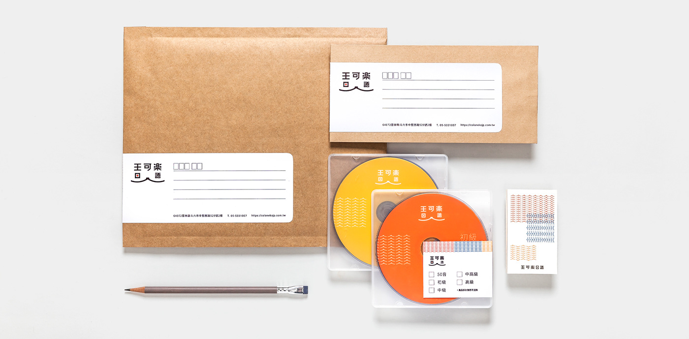
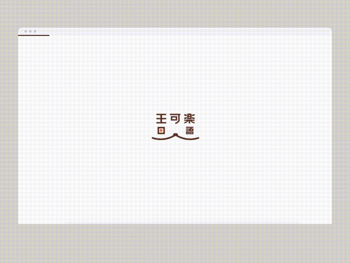
Cola Neko positioned itself as a friend rather a teacher. To deliver such approachable atmosphere, we incorporated their house cat Cola, the books and a smile to form a professional and friendly look of the brand. Isn’t it heart-warming and joyful to study while a cat is there with you? The red dot also symbolized the Japanese flag, bringing more Japanese flavour.


Application Design
To make the learning experience more fun, we extracted the smile and designed eight different cat characters alongside some conversational lines. They can be found in textbooks. For posters and ads,
we kept it simple to echo with the easy-to-learn ideas.
The smile is also applied into brand pattern. It can be used for name card, stickers, textbooks and ads.
The smile is also applied into brand pattern. It can be used for name card, stickers, textbooks and ads.


Textbook Design
We applied brand palette and geometric images in textbooks for four different levels. By doing this,
the students can realize their learning stage and look forward to advance.
1. Beginners level: Square meaning basics
2. Medium level: Rounded rectangle meaning more grammatical learning
3. Intermediate level: Oval meaning deeper understanding
4. Advanced level: Round meaning smooth and skilled
1. Beginners level: Square meaning basics
2. Medium level: Rounded rectangle meaning more grammatical learning
3. Intermediate level: Oval meaning deeper understanding
4. Advanced level: Round meaning smooth and skilled
The first aim
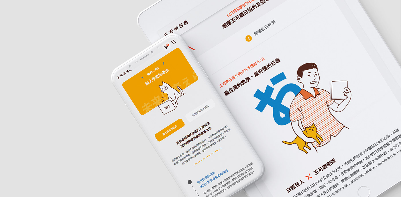
The website was redesigned to enhance UX and to build a sustainable learning platform. The structure integrated brand values, class information, free resources and membership, which were in different channels before. By applying brand identity and photos in website, we realized the learning experience while students are browsing so that they can enjoy the time with Cola Neko easily.


Brand Image
We took “Neko” (cat) as a tour guide in website. It does not only echo the brand name but also can be identified by the students.
We also applied patterns which is shown in printed textbooks in the website so that people can have a cohesive experience both in offline class and online learning.
We also applied patterns which is shown in printed textbooks in the website so that people can have a cohesive experience both in offline class and online learning.
UI and UX
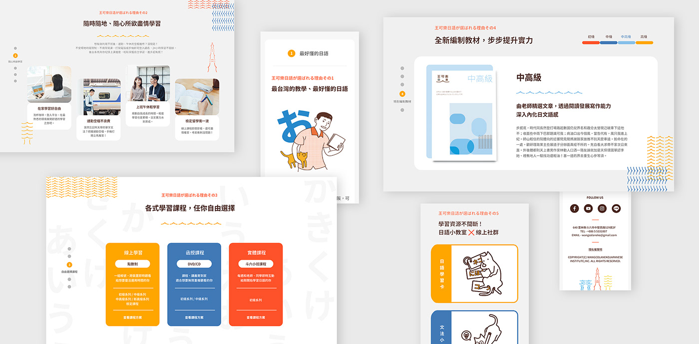
We also redesign the whole structure of the website. There were five major sections: faculty, online classes, materials and free resources. People can find what they need quickly.
Except for improved UX, we also try to offer clear information about the classes so that students can compare and purchase without worries. Meanwhile, Cola Neko has been active on various social platforms, so we integrated all the resources in one places, i.e. the website. This website is a learning hub providing everything a person who is learning Japanese need.
Except for improved UX, we also try to offer clear information about the classes so that students can compare and purchase without worries. Meanwhile, Cola Neko has been active on various social platforms, so we integrated all the resources in one places, i.e. the website. This website is a learning hub providing everything a person who is learning Japanese need.
Workscope
Brand strategy development : Lynn
Branding design : Ting
Illustrator : Ting
Web design : Ying Chu Chen
Agency : think™品牌顧問
Web design : Ying Chu Chen
Agency : think™品牌顧問


