


PILI Multimedia
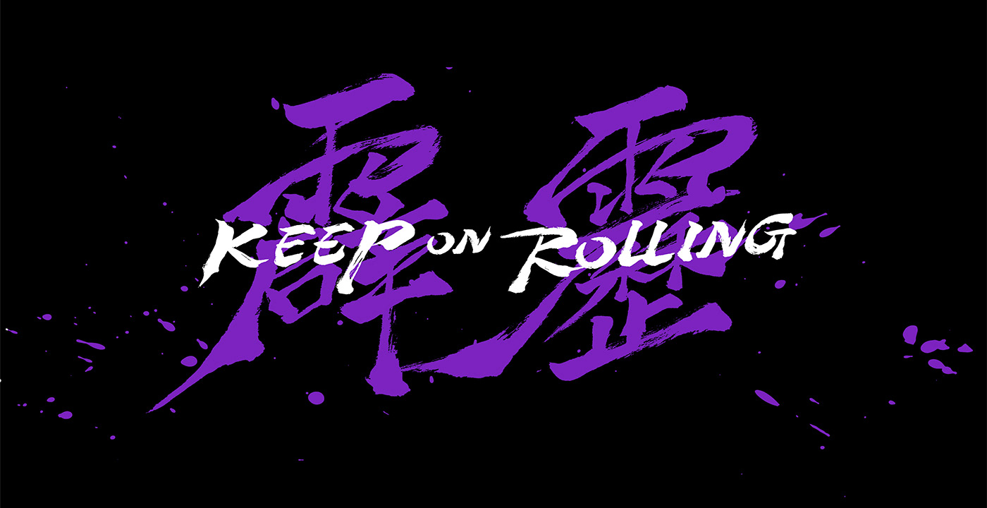
Keep on rolling
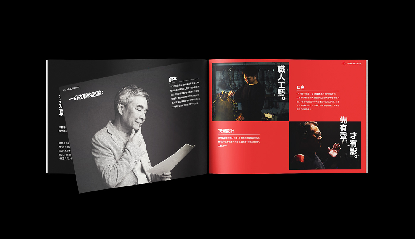
PILI International Media is an iconic media company that has been revolutionizing puppetry into contemporary and entertaining TV series and movies. Responding to the trend of global streaming, PILI on its 30th anniversary was seeking for a new visual interpretation of its history and vision. We were honored to work with PILI to renew its brand image.
The key Maderian message “Play with New Ideas” was created. “Play” referred to the origin of puppetry, dated back to the time when the show was a street performance and a part of people’s life, offering fun and playful entertainment. On other hand, “New Ideas” meant the spirit of PILI’s teams, who were so passionate and dedicated that puppetry was elevated to such a level of public recognition and reputation.
In the global market, PILI was rather a new face to the international audience. Therefore, we used the filming term “rolling, ” and came up with “ Keep on rolling” to show them that PILI was a media firm which made cool movies. This direct and clear message could build up the brand image instantly.
Keep on rolling
PILI International Media is an iconic media company that has been revolutionizing puppetry into contemporary and entertaining TV series and movies. Responding to the trend of global streaming, PILI on its 30th anniversary was seeking for a new visual interpretation of its history and vision. We were honored to work with PILI to renew its brand image.
The key Maderian message “Play with New Ideas” was created. “Play” referred to the origin of puppetry, dated back to the time when the show was a street performance and a part of people’s life, offering fun and playful entertainment. On other hand, “New Ideas” meant the spirit of PILI’s teams, who were so passionate and dedicated that puppetry was elevated to such a level of public recognition and reputation.
In the global market, PILI was rather a new face to the international audience. Therefore, we used the filming term “rolling, ” and came up with “ Keep on rolling” to show them that PILI was a media firm which made cool movies. This direct and clear message could build up the brand image instantly.
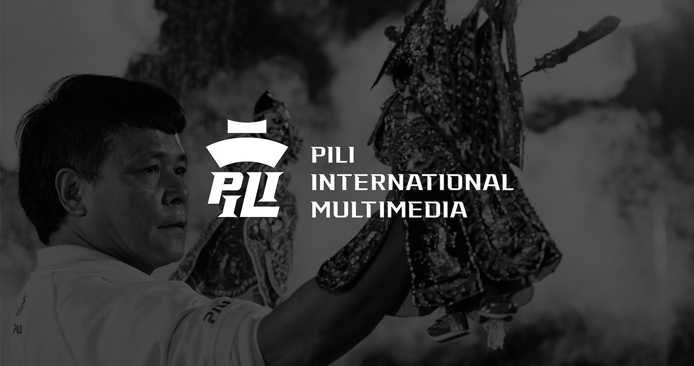
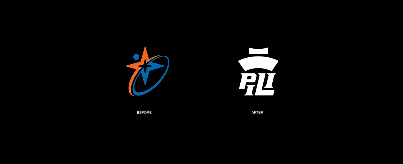
Logo Design
The previous logo was designed decades ago when PILI was mainly broadcasting on TV. However, since it aimed at streaming technology nowadays, the designer applied flat design and changed the logo into a modern look combining both Chinese characters and English letters.
First, the designer extracted the outline of the top of the logo “雨” and transferred it into a theatre roof and paper roll to indicate PILI’s history and story-telling. Then the bottom part “辟歷” were technically replaced by English letter “PILI.”
Designer also applied the features of italic type and the fighting scenes to deliver the look of motion and filming industry


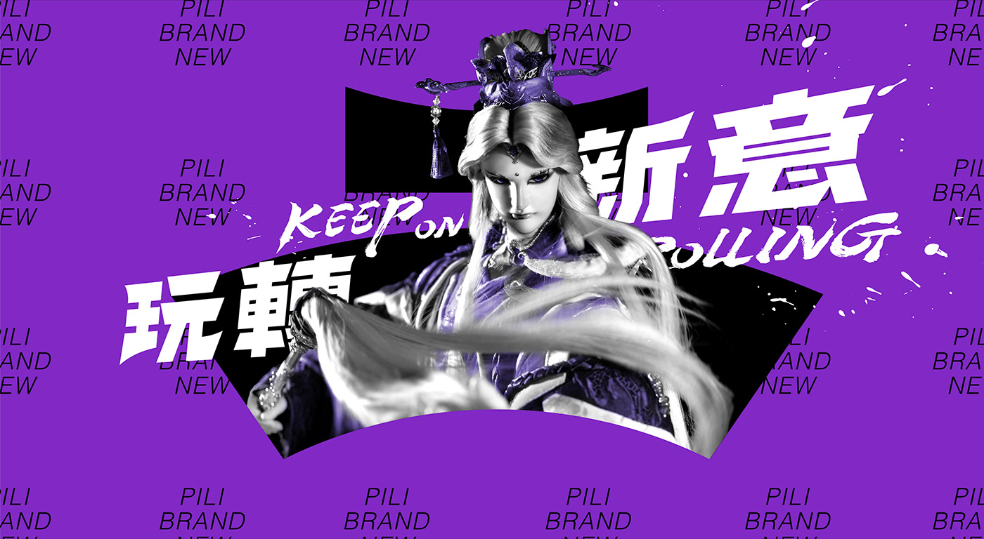
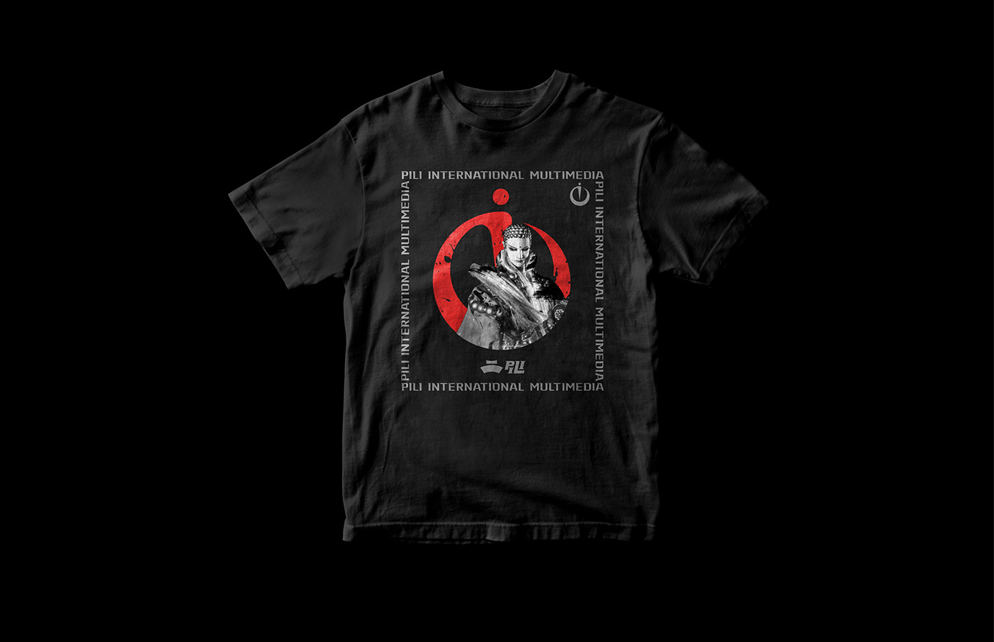
Design Extension
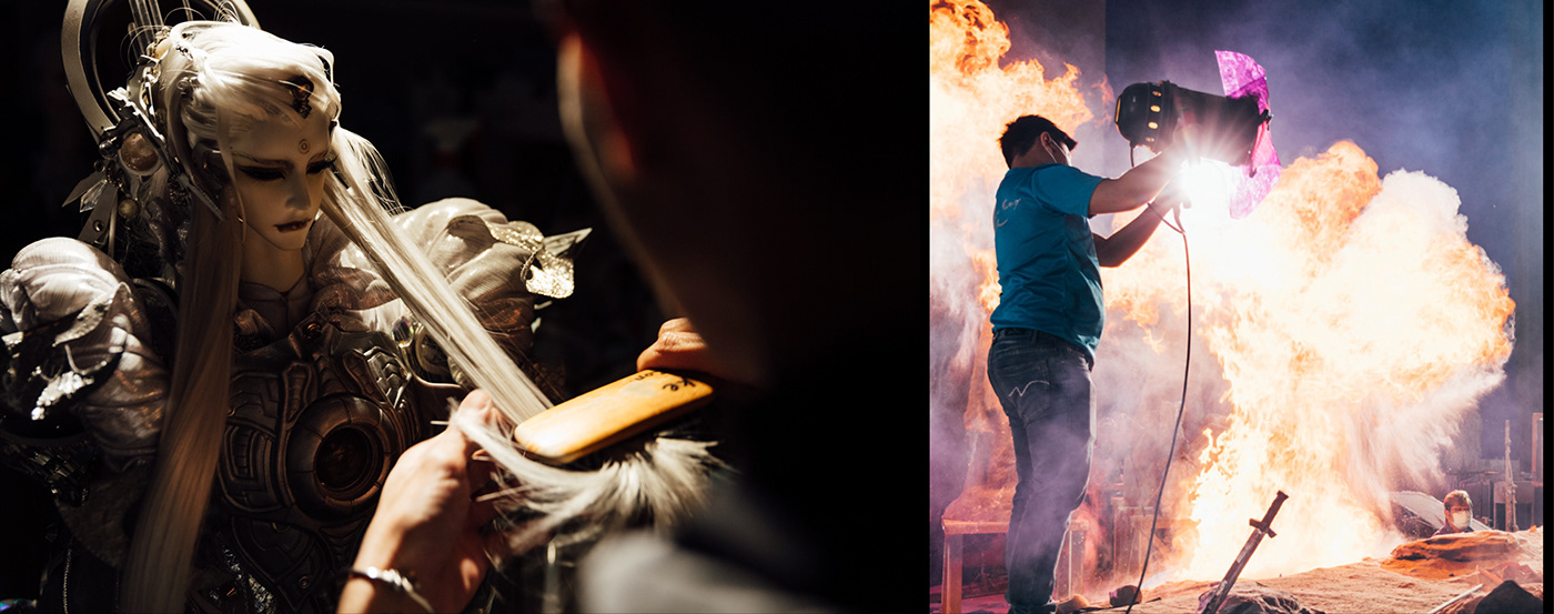
Speaking of PILI, the “actors” a.k.a. the well-designed puppets were definitely the most important things to the audiences. Therefore, the puppets could be applied together with the logo, as if they were acting on a stage. This playful application also represented the values of PILI that it was bold enough to break the limits.
Speaking of PILI, the “actors” a.k.a. the well-designed puppets were definitely the most important things to the audiences. Therefore, the puppets could be applied together with the logo, as if they were acting on a stage. This playful application also represented the values of PILI that it was bold enough to break the limits.


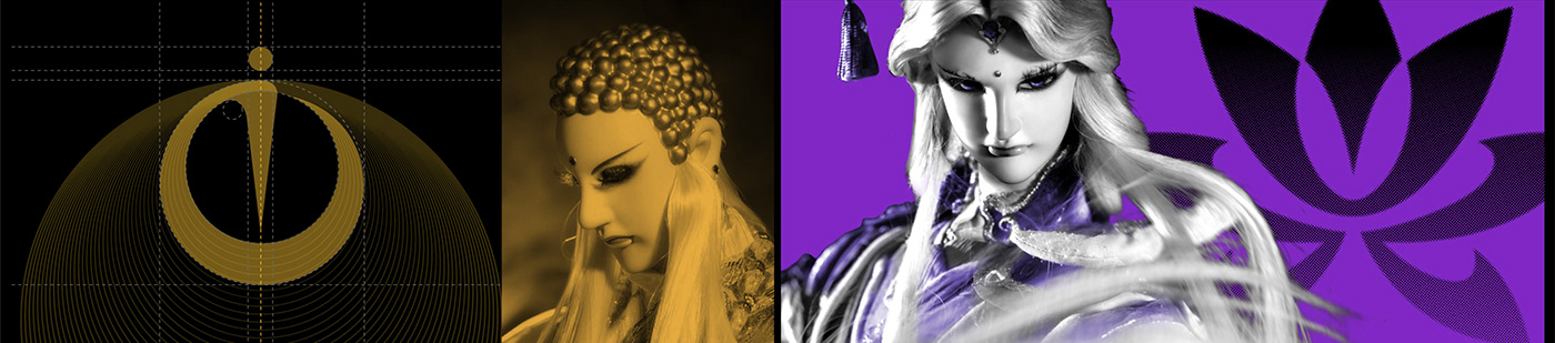
Crest Design
PILI had been creating its storyline for 30 years and introduced over four thousand characters and respective ideology and unions since. If they could be visually systemized, it would be easier for new audiences to get to understand the universe. Moreover, it also helped to develop diverse merchandise. Thus, we designed symbols for each key category.
For the top three actors, the designer selected their key image and weapons to draw the symbols : lotus, sword and whisk. The concept of unions in PILI referred to beliefs and ideology in Chinese society, and had evolved into PILI’s own definition. That being so, based on people’s first impression to those beliefs and ideology, we applied the same designed details as logos’ to create PILI’s exclusive crests.


thinkers were very honored to work with our clients to rebrand it corporation. We hope that our creativity could help the brand to expand its future in the domestic and global markets.


