


Evolution of visual language
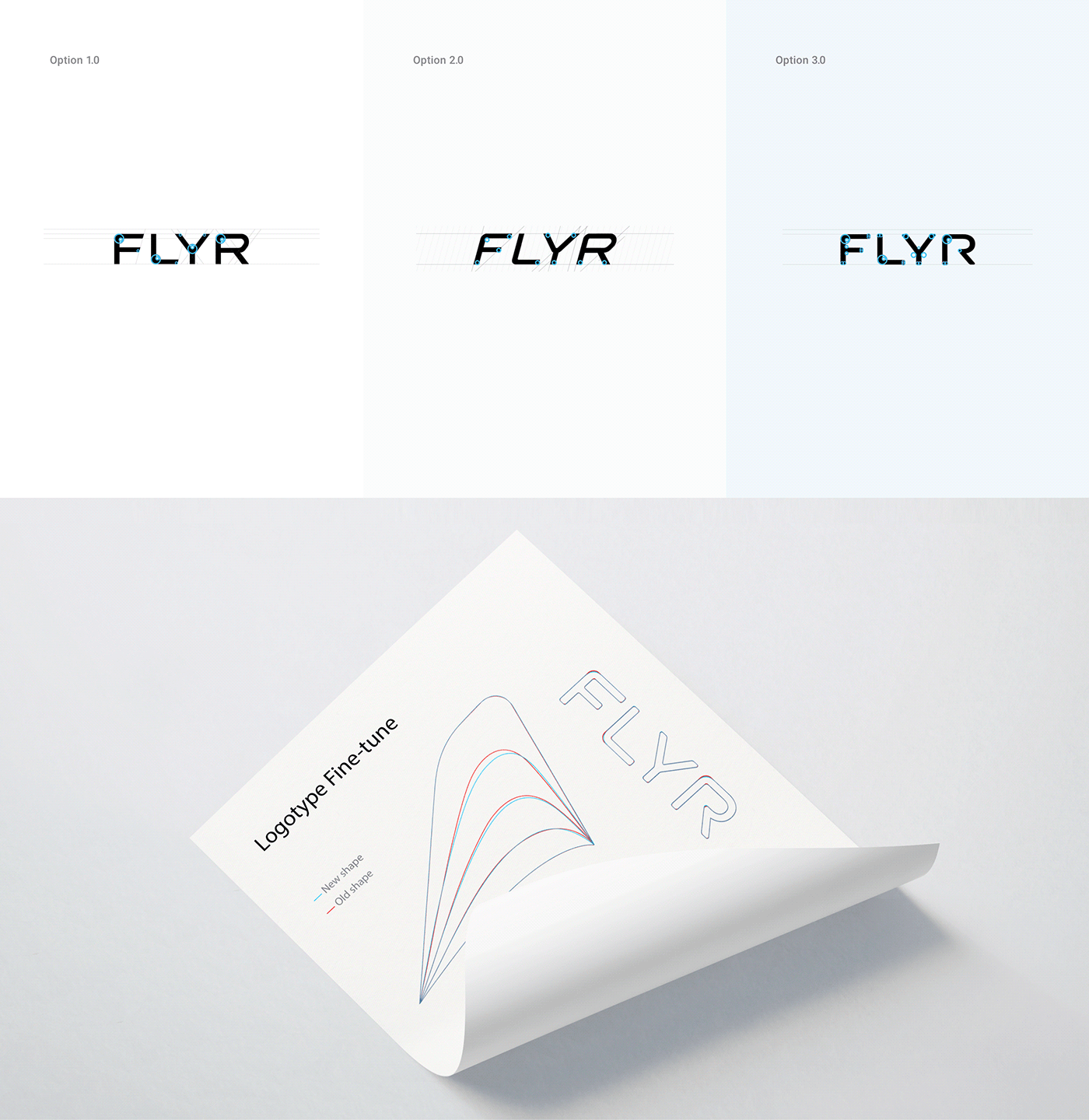
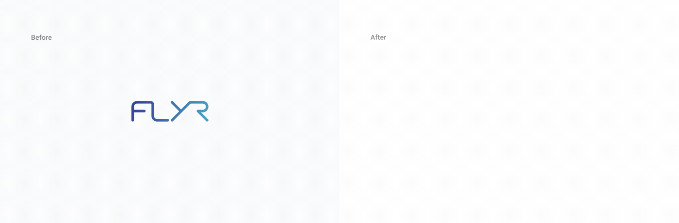
Our collaboration with the Flyr team began with logo fine-tuning and refreshment. The team
was open to color exploration and experiments on an additional mark that would complement the
existing logotype. Considering we were tasked with evolving the brand, anything that had
already become familiar to users needed to be carefully treated to maintain unmistakable brand
recognition.
With that in mind, our goal was to come up with a new, fresh and modern mark that
was representative of the business’ look and feel. To do this, we started at the beginning.
During the first phases, we discussed the key aspects of the business, collected attributes, and
prepared mood boards to find the right feel and inspiration for further work.
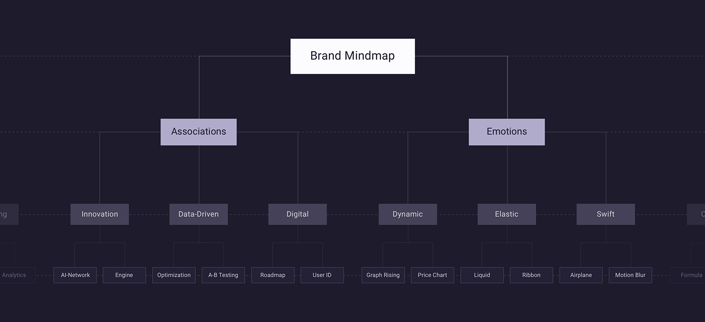
Brand mind map
During one of the first exercises, we created a large word list comprised of nouns, adjectives, and
verbs that we felt best described the company. We then widdled the list down to 10-15 nouns that
were the most relevant.
The goal of this step was to develop a comprehensive list of nouns that depicted the business. It’s
tricky to come up with a visual representation of trust, but there are always common associations
linked with that word.
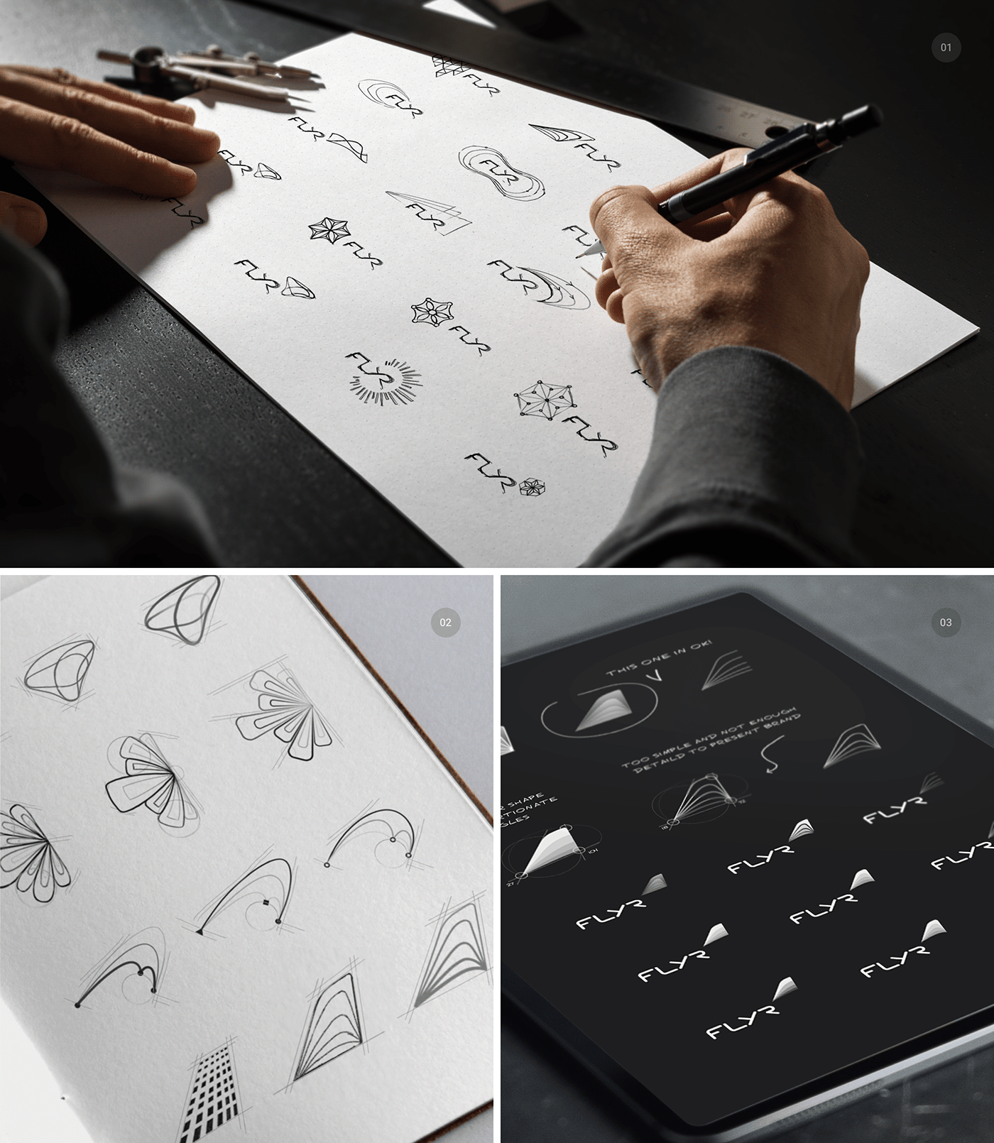
Sketches
Based on these attributes, we started working on sketches. At this stage, we mostly worked with
simple hand-drawn shapes and objects. We combined various nouns and metaphors with business
aspects and prepared a number of sketches to examine further.
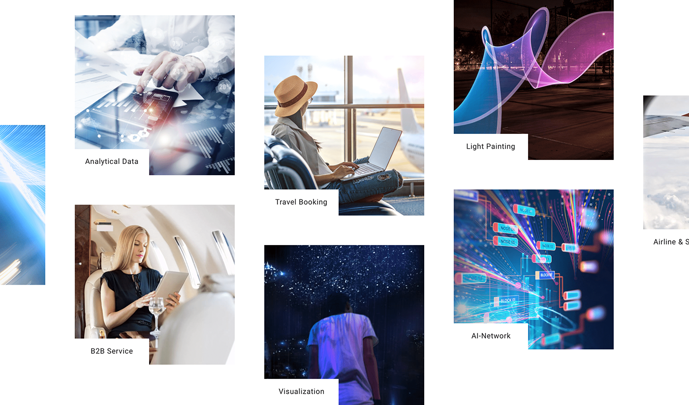
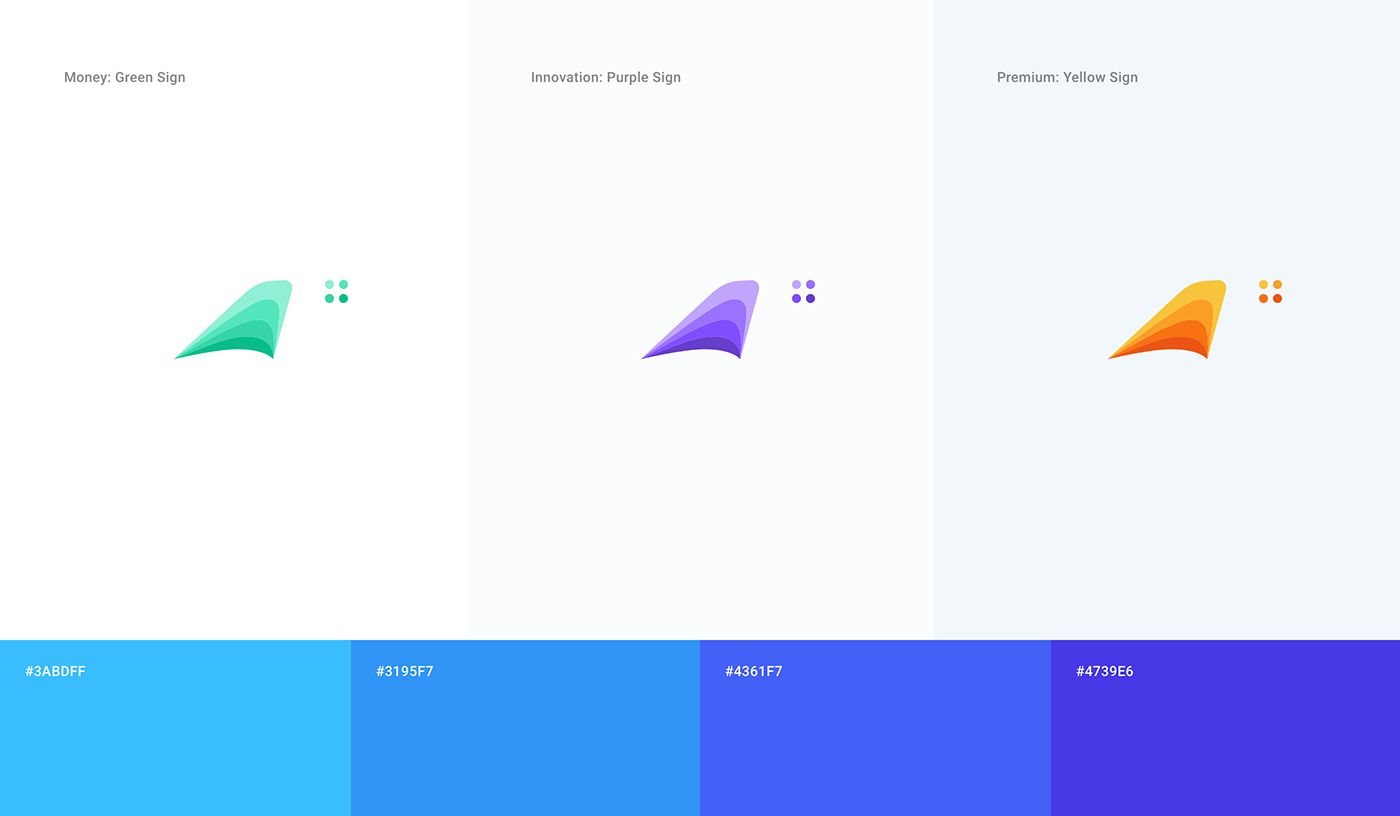
Color system
When it came to the colors, we chose several blue tones and purple shades. This proposed color
range was brighter and fresher than the previous brand colors and was mostly adapted from the
earlier logo. It was highly tech-oriented.

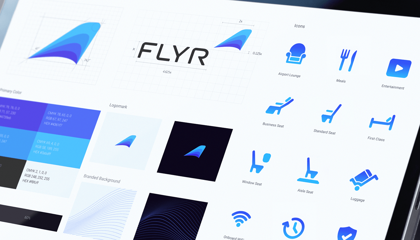
Visual identity guidelines
To finalize our work, we created a visual asset guideline, color palette, recommended typeface,
patterns, use case recommendations, and more. In this case, we also created several icons for future integration.

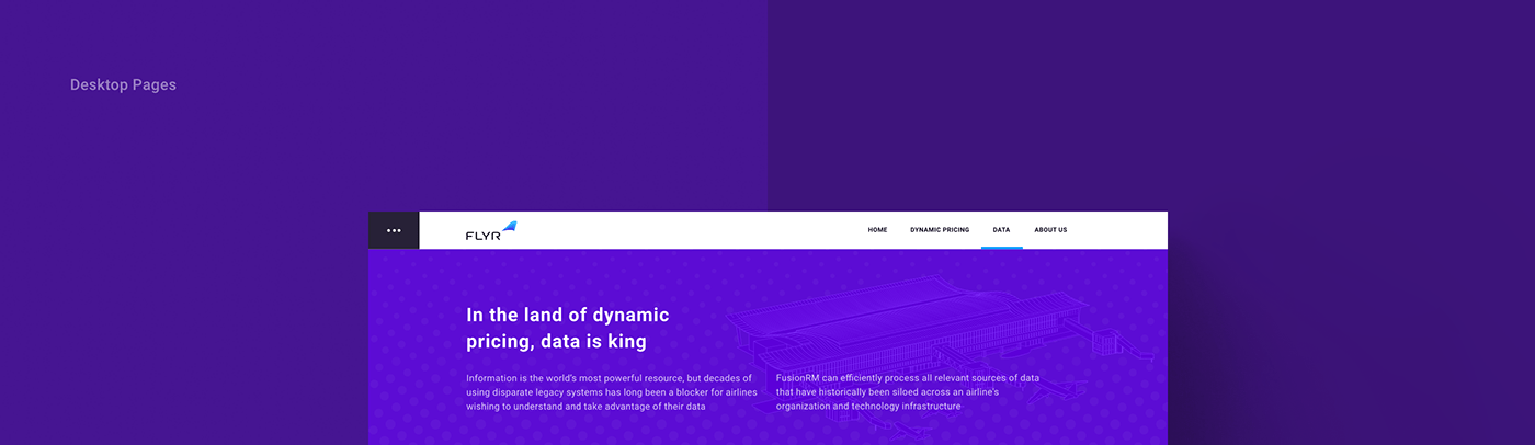
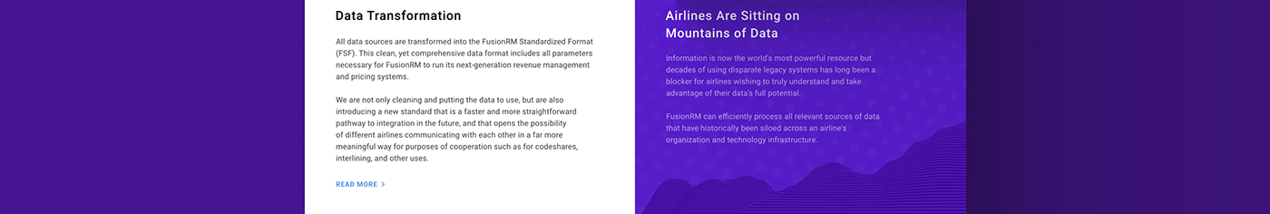
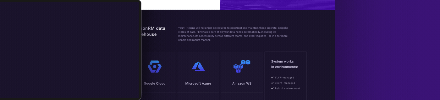
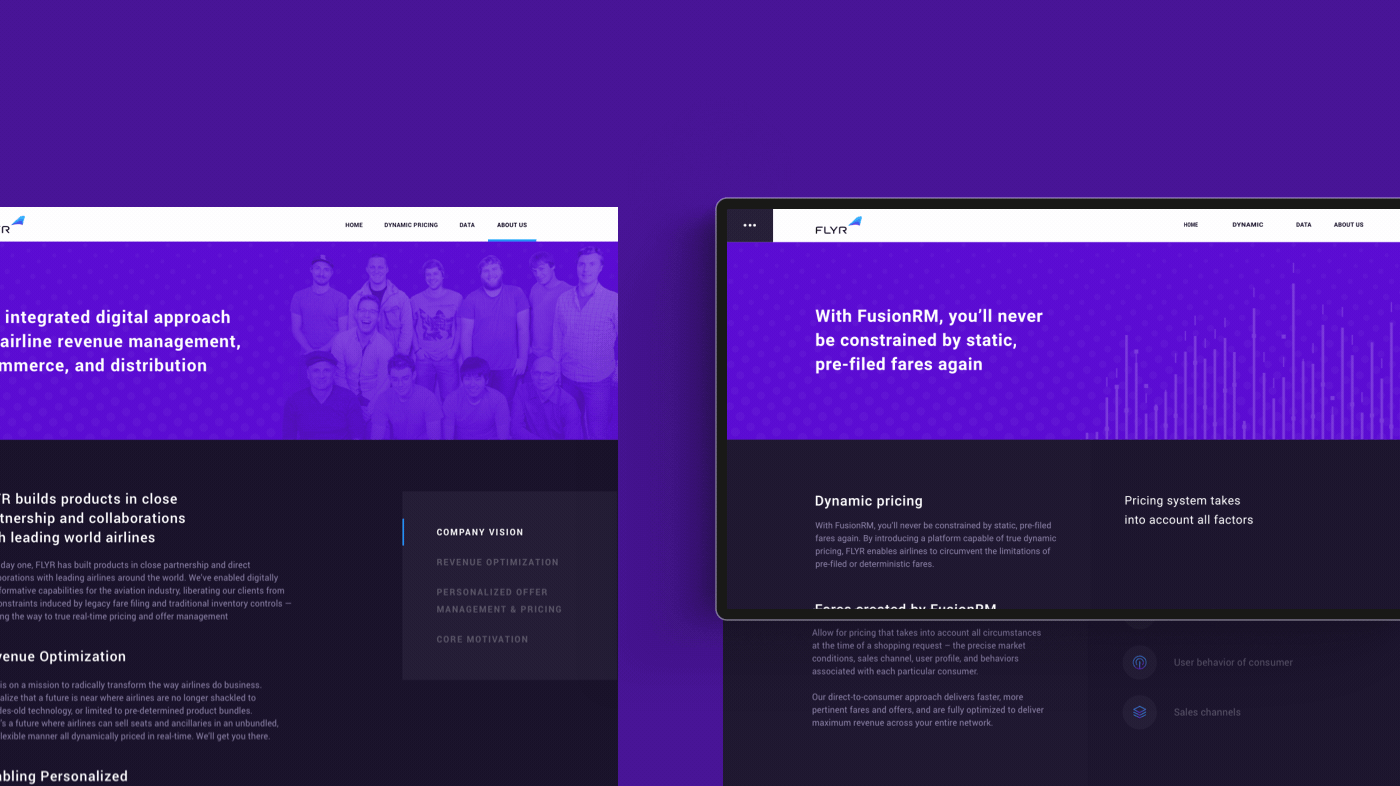
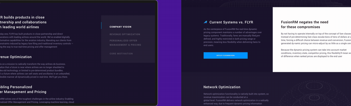
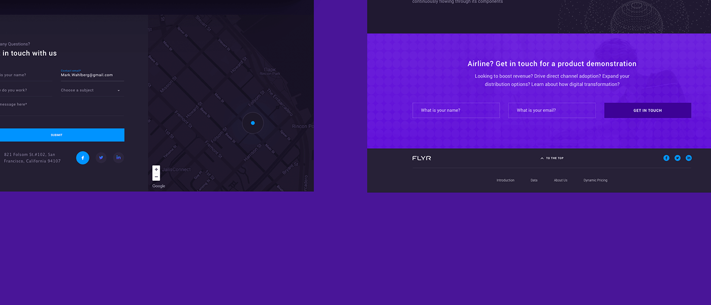
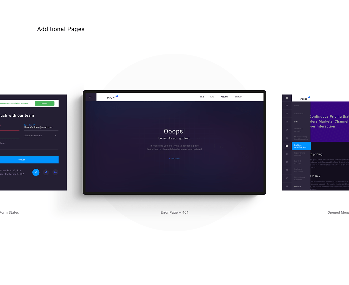
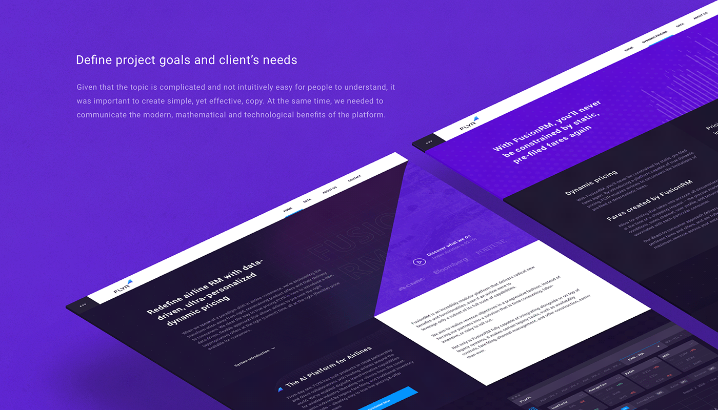
Website design
Starting with website structure and information architecture, we went through several conceptual
iterations and were pretty brave with proposals. However, we landed on a balance between crazy
full-screen animations and a privacy policy page type design. We kept some animations and
effects but got rid of lots of complex proposals that would have caused delays in development.

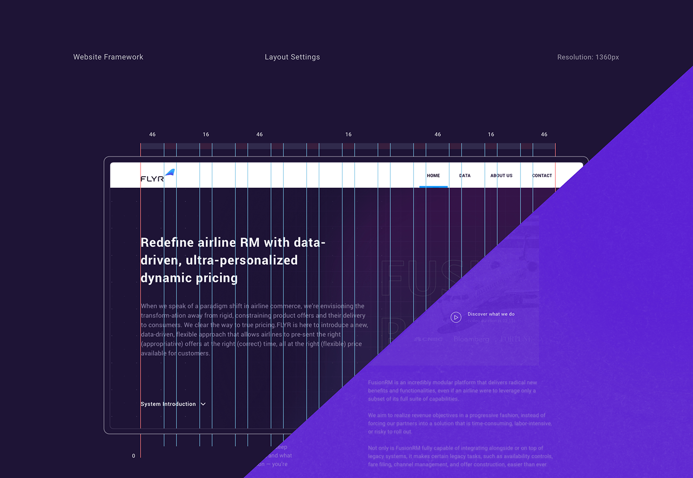
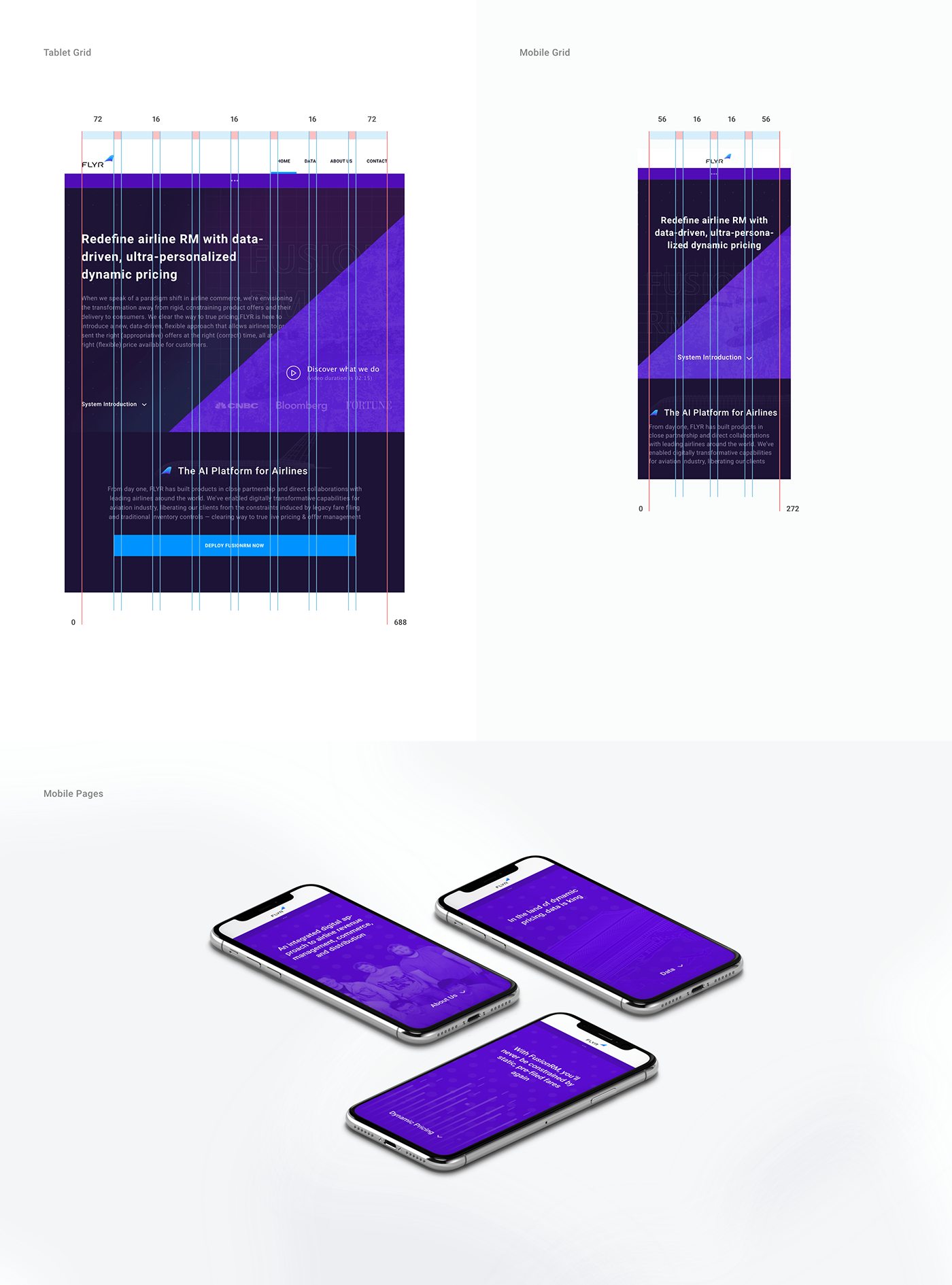
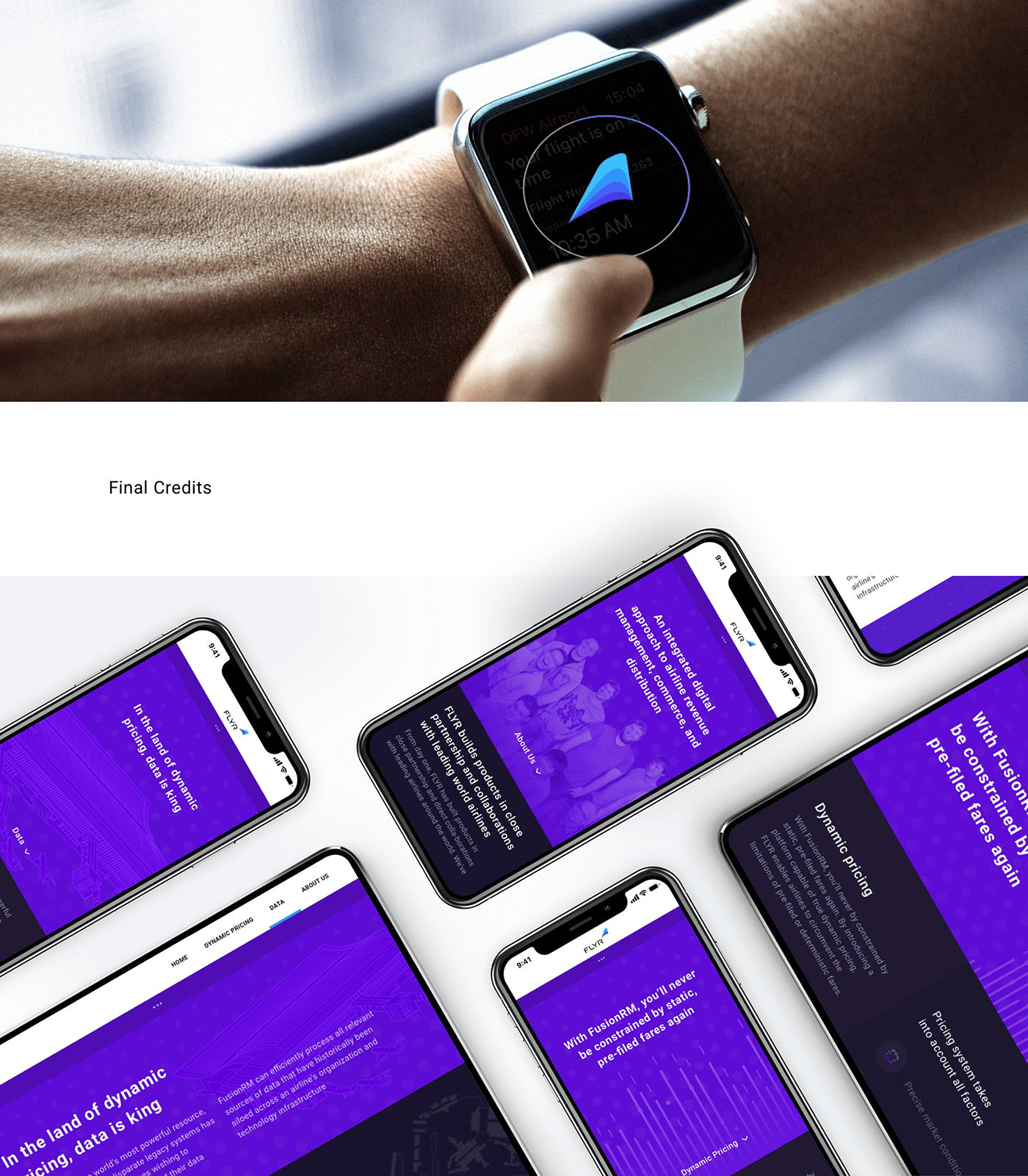
Responsive layout
Digital design requires a lot of attention to detail, as well as maintaining consistency throughout
elements within the interface. To provide a better experience, we used an 8px grid which
elevated readability for the main layout units and enhanced the overall design hierarchy.