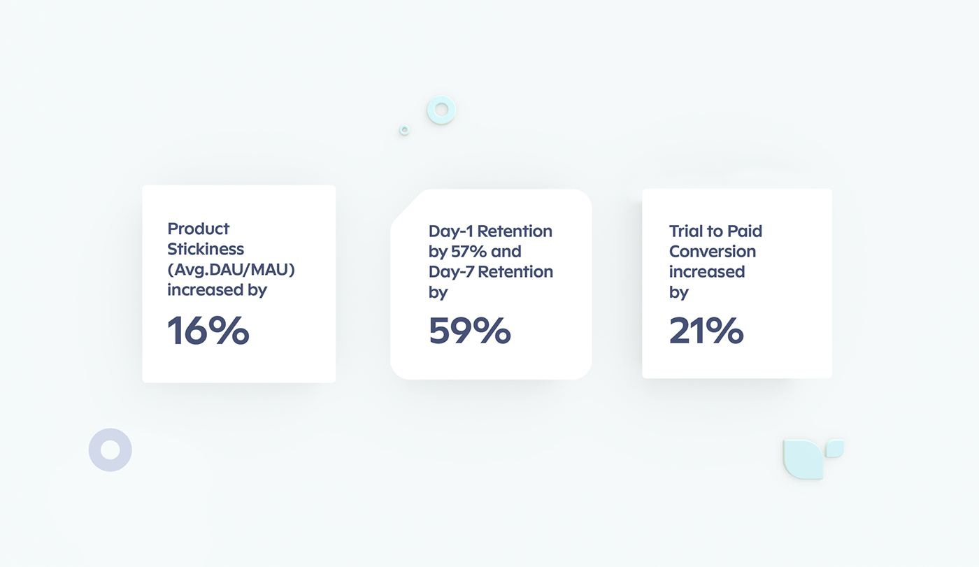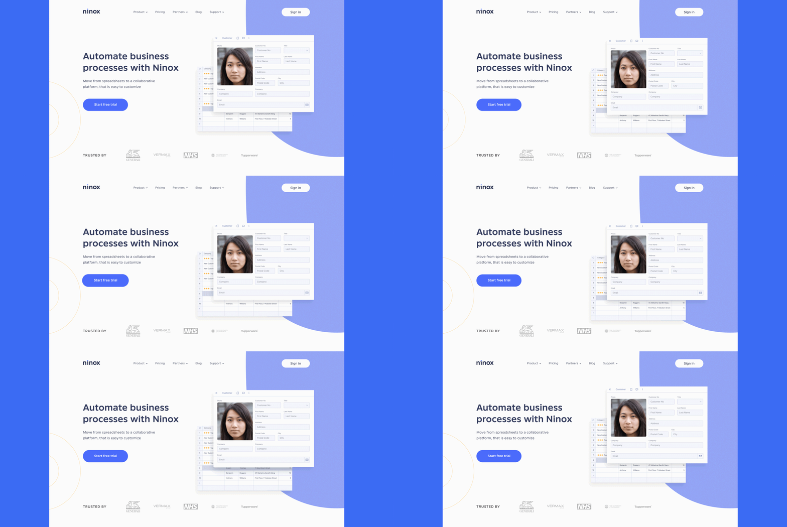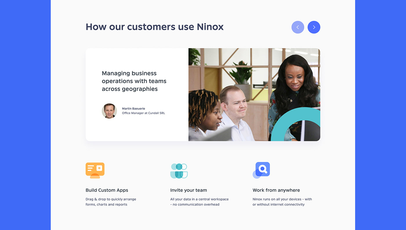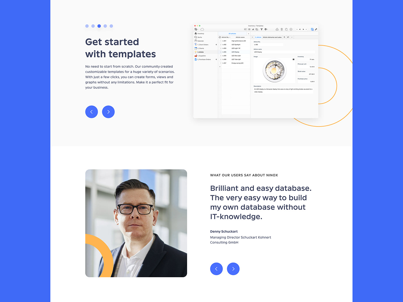
Ninox is a company that invented a digital automation solution for all kinds of business processes. Thanks to that, it is now easier to organize different business tasks. Throughout our active collaboration, we worked on project assignments that resulted in significant improvements in product KPIs.
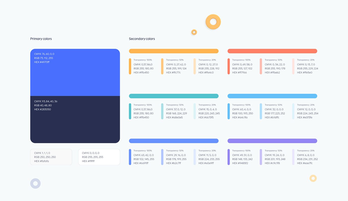
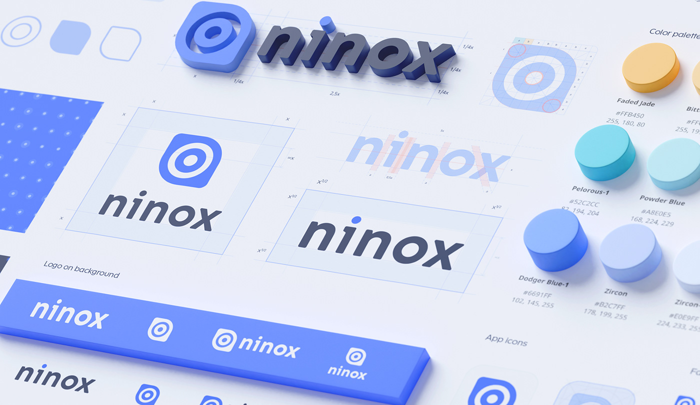
The first task was to redefine the Ninox action plan and refresh their target audience’s social behavior patterns. And that’s what our team has done in our first personal meeting as together we developed a business roadmap. Along with that, another primary achievement was the analysis of 12 archetypes, where we conducted research with the Ninox team and identified to which archetype their company belongs. That way, we laid out a solid base for developing a strong visual identity and visual style, which applied to every digital carrier. As a final result, we increased most of the product metrics that our teams are proud of.
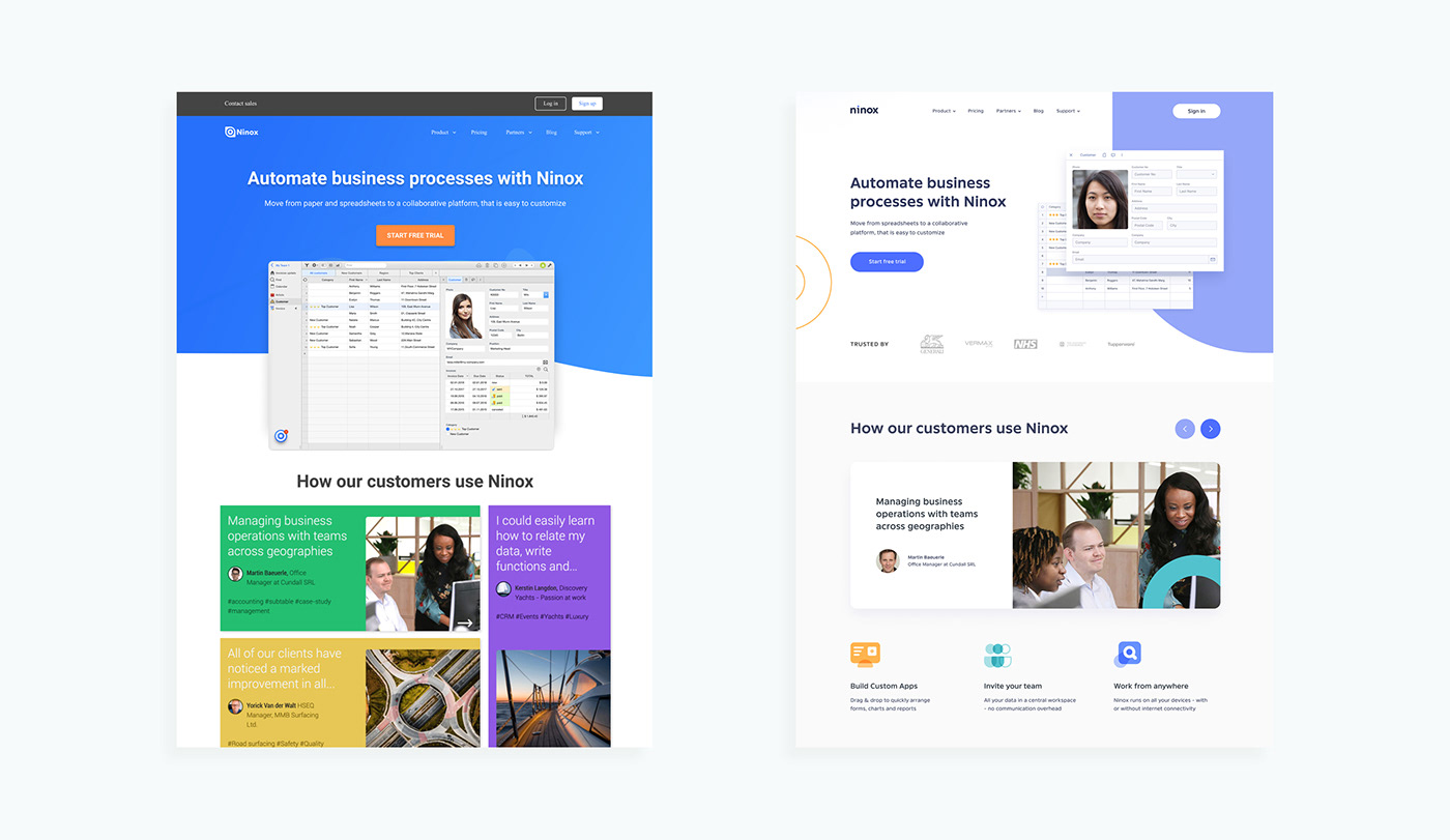
The process of revising and testing the Ninox product was significant to enhance the user experience. The design of the digital product was constantly changing as our team was creating a new platform layout based on the feedback of Nixon's target audience. As a result of these tiny user interface improvements, the constructed theories and hypotheses got proven.
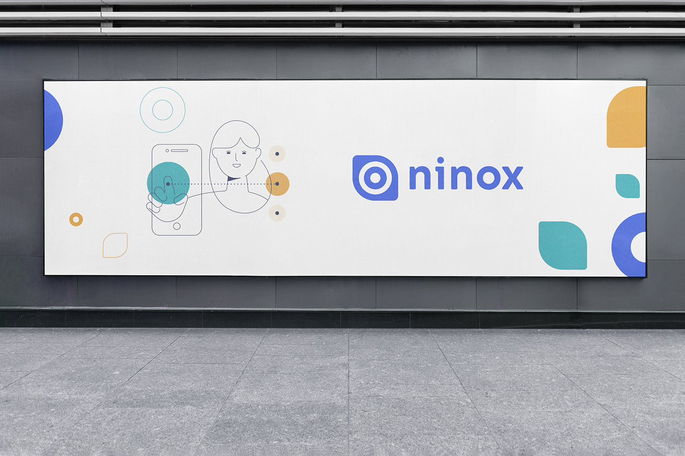
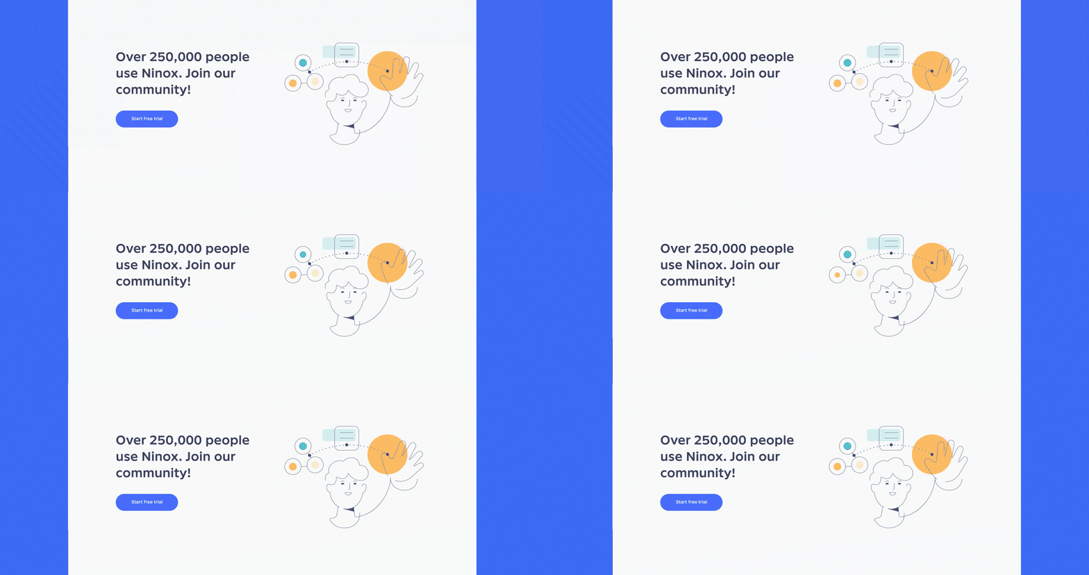
The last thing our team has produced was the creation of the illustration style guide. The guide was filled with lots of different abstract elements and user-friendly objects. Due to the flexibility, the majority of its stylistic components were used in the Ninox marketing website.
