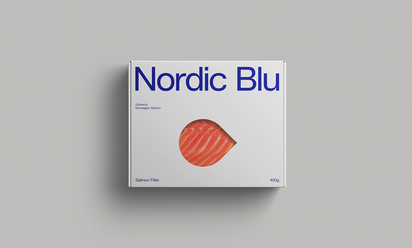
Nordic Blu
Nordic Blu is the Greenest farmed Atlantic Salmon in the world, raised in the Skjerstad Fjord in Northern Norway above the Arctic Circle. The location is close to unique in an aquaculture context. The fjord is connected to the open sea via the world’s strongest tidal stream, Saltstraumen. The high freshwater content caused by the many rivers that runs from the mountains into the fjord, and the great water circulation caused by the colossal tidal stream, ensure optimum conditions for the salmon.
When developing the identity for Nordic Blu, we aimed to communicate its Norwegian origin trough a modern, yet typical Scandinavian visual language. With a strong, no nonsense logotype paired with a sans-serif type and generous white space, the identity aims to emphasize the confidence Nordic Blu has in the superior quality of their product. Utilizing an abstract pattern inspired by classic, Scandinavian design as it is known around the world, the brand stands out in a category where quality usually is visualized with clichés like black packaging adorned with expressive type printed in gold.
The result is an identity which communicates superior, Norwegian quality with confidence and a distinct and unique tone-of-voice.