

Project description/briefing: create a new visual identity, strategy and website for the Laby, data recovery services. The new identity has to sustain a new brand architecture with new products and services. Some of these services are already provided and they need a sub-identity of their own, and some of them will be created in the future, according to the needs of the fast-changing digital tech market. The challenge is to create a brand that meets the needs and attracts two types of clients: one-time purchasers and big accounts. The brand aims for excellence in its field, as they want to incorporate an Academy, for future partnerships for formations and researches with Universities. The rebranding extends offline: Laby is moving its headquarters to a bigger office where we need to implement the new image.
Approach & solution: after careful research of the data recovery industry, analysing the target, researching the market and taking into consideration the business goals by applying our methodology, we created the concept of “we make data live forever” that supports the new strategic brand vision and mission. Tagline: forever data
Mission & vision: The new brand vision incorporates all the key4user aspects that we detected in our research and states clearly the implication in innovation and investment in research and creating future professionals in the industry.
Mission: Help everyone recover and save their important data. Vision: We understand the importance of digital data: emotionally, business wise and legally. We want to help people maintain their important data forever by recovering critical files and creating a community of experts in data recovery. We invest in innovation, partnerships with software and hardware premium developers, we work with constant feedback and we offer training for interested parties. We are friendly, professional, trustworthy and accountable. We do our best to recover information and we put customer service at the top of our behaviour inputs.


Brand architecture & statement
Information architecture & organization
Values, vocabulary, voice & tone, strategy
Laby is constantly introducing new services and products, result of an up-to-date vision of the market needs and the brand’s experience in the field, also renewing and upgrading existing ones, but staying true to its core values, purpose and visual identity. New companies that are acquired are redesigned based on the Laby matrix and work as sub-brands. Laby human 2 human approach, either for the business 2 clients services as for the business 2 business ones.
We organized the services & products according to the bossiness goals and in a flexible way: Data Recovery, Forense, Academy and Online Back-up.
Every service emphasises the key4user aspects: from excellence in customer support, to legal validation, pricing, security, confidentiality and efficiency - concepts that build Laby’s values. In terms of values, innovation and constant growth are represented by The Laby Academy that stands also for need to form professionals in an active-real environment. The Lab, Partners and Clients were also given an important role, in order to create trust and transparency.
Some of the products have an identity of their own with their own avatar, to gain more strength when presented to the specific target. Direct call to action and specific questions in forms/staff support will be designed to help optimize the process and deliver a great client experience through all brand touchpoints. Voice, tone and vocabulary are friendly, but proving professionalism, knowledge and empathy.


Logotype, icons and key visuals: All the visual elements of the brand are fresh, simple and clear.
Logotype: By aligning the brand values with the key4user aspects, we developed the new symbol for the brand, a symbol that is sympathetic, “techy” and works as an icon. As a natural organic consequence in the alignment of the brand and through its communication, the symbol became a “character” ( person ). To back-up it’s strength we chose a strong, clean typography for the name and a simple, easy-to-read one for the tagline. The talented designer Vlad Radu, managed to capture perfectly the brand essence: data and technology for everyone.
The main color gets a revival by up-toning it a bit and giving it more life and vitality, yet keeping it vibrant and transmitting passion and strength by working with two tones of blue and developing a color palette for the brand.
The icons and avatars that build the visual playground are designed for the brand, creating graphic resources that share consistency, regardless their different mean.

Website:
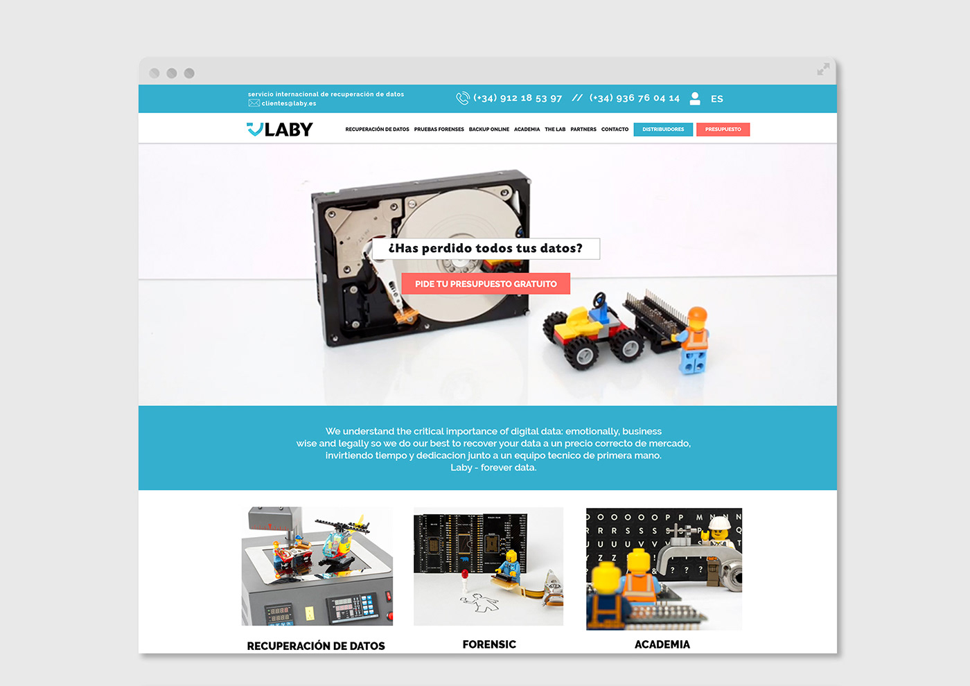
By previously studying and understanding carefully the different user roles and organizing the information in order to deliver efficiency and fluid user-flow with a clean and easy browsing experience and, at the same time, highlight the key4user points and showcase the brand added values we designed Laby’s new web.
Impeccable functionalities and an intranet access were build to optimize organisational tools and deliver a very transparent and private experience for the client, distributor or partner. The powerful intranet works as a complete secured space for different operations.
Clear and visible call to actions, together with easy to use forms with specific questions are implemented in order to optimize the user experience. To the functional and navigation part, we added the new brand image and the result is a fresh, friendly, practical and SEO-friendly web that delivers information and generates leads.


Art direction: artworks, photo + video
With the clear mission in mind to approach and familiarize the general user to somehow abstract concepts from “it/data/hard/software” we needed to create visuals that are easy to understand, sympathetic and are aligned with the brand’s friendly, yet professional approach to these concept.
Artworks: Comic-like fanzines
Humorous comic like artworks were introduced to explain certain processes. The Laby symbol turns not into a character that helps bond even more the connection between tech and humanity. The use of emojis and the humorous tone of voice
( with cynical touches ) reinforces this link.
With a humorous touch we created fanzine/comic-like stories for some of the Laby processes:
1. Client experience: the data recovery process 2. The office relocation


Photos + video:
Data rescue mission In order to explain and introduce in a visual friendly way delicate parts of hardware, especially hard drives and special equipment that help manipulate, measure and restore these special pieces, we recreated “rescue” scenes at their real scale. We applied this concept through the whole brand, also for products like the Academy and Forense services.
We created a stop-motion video of a rescue mission and key-photographs depicting specific scenes according to the product/service. Together with photographer Jordi Toiran we developed an easy-to-understand concept for all users on a not-so-easy topic.


OFFLINE: PRINT
We developed various informational materials for Laby: general portfolio, presentation brochure trifold, informational material for the courses and possible partners, Happy Holiday Cards, stationary etc.


Campaign FOREVER DATA
key visual
That picture from the 90s? Forever. Aiming to show the brand’s commitment to rescuing all type of that: from the most valuable to the one that you don’t really want to have forever, we created a series of strong visuals that trigger different emotions but state clearly that Laby will recover it and it will stay, like the brand promises, forever.

OFFLINE: Office branding & signalization
Concept: THE LAB
The LAB is a space that responds to different needs of the brand: receiving clients, offices, tech-laboratory for data recovery, hdd storage, student aula. Is a place for innovation and research that has to be at the same time private enough for the delicate work and welcoming and transmitting trust for the client that comes by. In such a context, to accompany the clever interior distribution design, we played with artwork printed on translucent hi-end materials or opaque ones to create both privacy or visibility where it was needed.
Facade: The LAB had to be very visible for the people that pass by walking or driving. We created a strong visual presence by using the two big windows as displays. One part is a is a block of Laby’s corporate color with the symbol in large scale and the other one is a resume of the services we give. Playing with scale allows us to create curiosity, impact and gain maximum visibility. We printed on micro-perforated vinyl: you can see the street from outside, but you can’t see inside from the street. Which results very interesting and curious for the visitor once inside the lab - element of surprise. During the night, the outside label is illuminated making it easy to read and spot “Laby - forever data”
Interior: For the interior we created a theme for the spaces, together with specific artwork.
Reception: Behind the reception desk where people are welcomed you can find the the logotype and the tagline “forever data” in 3D printed. As a client, you can only see a bit of what is happening in the private office, through a cut-out semi-transparent vinyl in the form of the symbol that covers the door between the spaces and through the glass that separates the impressive hdd storage from the waiting room. The artwork placed on this glass is inspired in the circuit of a motherboard and is aimed to create a mysterious feel about what’s happening inside “the lab”. On one of the walls we have an illuminated 3D printed large scale logotype.
Corridor: A large corridor divides the private space. On the wall to the left we created an artwork showing a sketched plan of The Lab, with the concept of every area + a manifesto and on glass separating the corridor from the working space we illustrated different hardware pieces and we played with the logo symbol scale. As on the other side we have shelves, the elements seem placed there.
Office: the director’s office has a 3D printed logotype that brings power and elegance to the space.
Alumni Aula: the alumni aula features on the white brick wall the 3d printed motivational phrase + symbol: “Research, innovate & learn everyday.Let’s make data live forever.”


