
FLASH
RU / Серия итальянских ароматических игристых вин
EN / Product series of aromatic Italian Sparkling Wines
Перед нами стояла задача создать модный, глянцевый, современный образ для серии ароматических итальянских вин. При этом. Необходимо было найти сочетание между актуальной современностью, применением новейших печатных приёмов и узнаваемой итальянской классикой. При взгляде на этот продукт должен ощущаться стиль, дух и славное дизайнерское наследие итальянских продуктов.
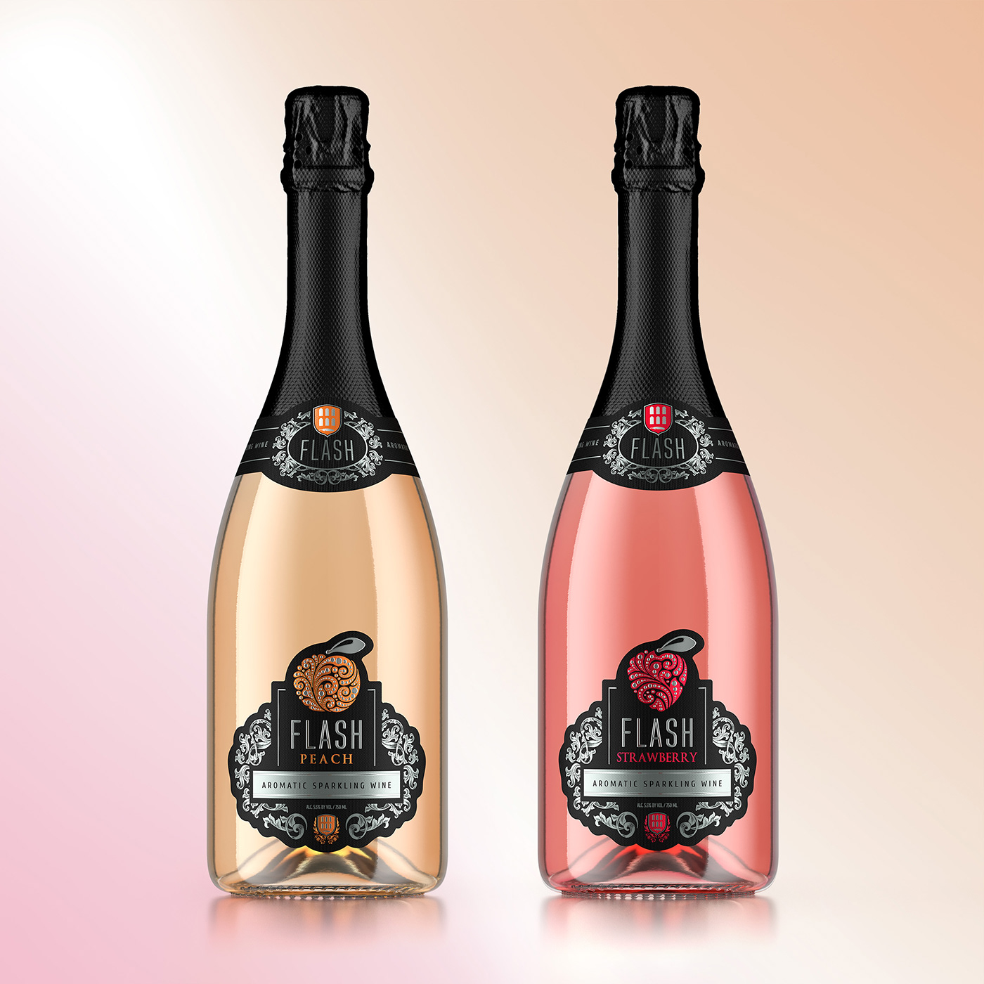
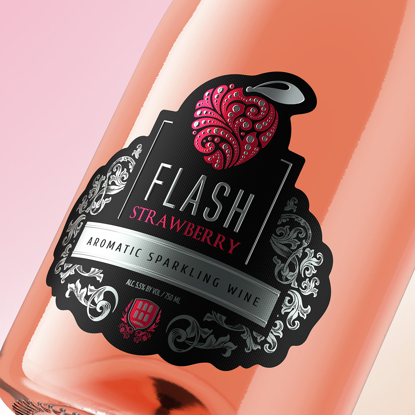
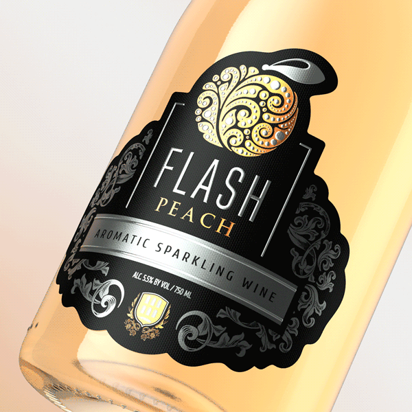
Отличительной особенностью данного проекта является конструкция этикетки. Мы нашли решение, чтобы одна и та же форма применялась для всей продуктовой линейки бренда «Flash» и одинаково подходила для всех вкусов. Стилизованные, проработанные изображения фруктов являются центральным элементом этикетки.
Мы особенно тщательно проработали каждое изображение и нашли такие изобразительные и технические приёмы, которые сделали их неотразимыми, привлекательными, стильными и статусными.
The task was to create a trendy, glossy and modern look for a series of aromatic Italian wines. Furthermore, it was necessary to find the best combination between the current trends, the use of the latest printing techniques and recognizable Italian classics. When looking at this product, you should be able to feel the style, spirit and glorious design heritage of Italian products.
A distinctive feature of this project is the label design. We found a solution that allows applying the same shape to the entire “Flash” product line and is equally suitable for all tastes. Individually designed and styled, crafted images of fruit are the core of the label elements.
We carefully edited each individual image and found such visual and technical techniques that made them irresistible, attractive, stylish and statutory.
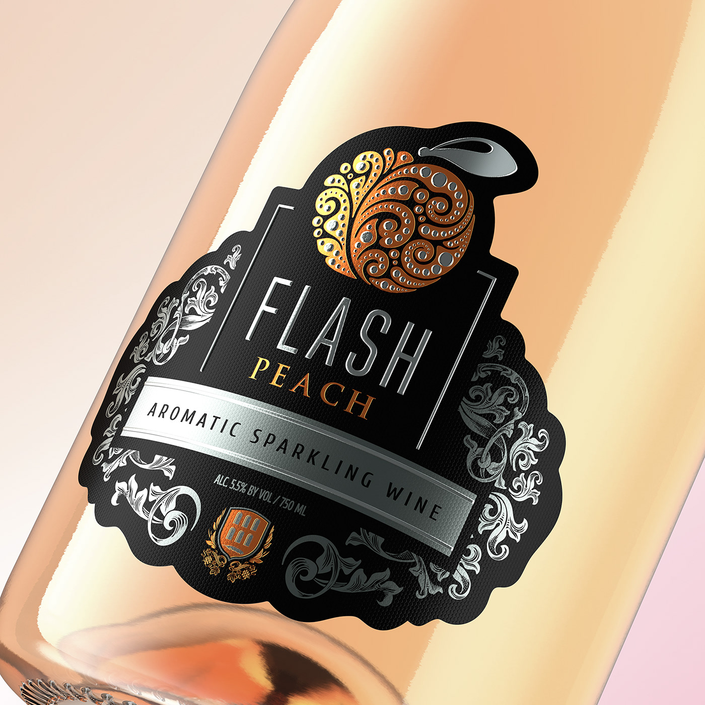
При разработке данного оформления было предусмотрено использование современных печатных и пост-печатных технологий, таких как тиснение, конгрев и нанесение специального тактильного лака. Печать производилась на высококачественной бумаге, что, в сочетании с применением целого спектра техник, позволило добиться идеальной реализации визуального оформления и обеспечить приятные тактильные ощущения при непосредственном контакте с продуктом в магазине.

During the development of this design, we made full use of modern printing and post-printing technologies, such as embossing, stamping and special tactile polish. Printing was executed on high-quality paper, which, in combination with the use of a whole range of techniques, made it possible to achieve a perfect accomplishment of visual design and to deliver pleasant tactile sensations at the direct contact with the product in the store.

Этикетка выполнена на специальной непромокаемой перламутровой бумаге, которая предназначена специально для игристых вин. Она не промокает в холодильной камере, в ведёрке со льдом и сохраняет свой привлекательный вид на всём протяжении использования продукта.
The label is printed on special waterproof pearlescent paper, which is designed specifically for sparkling wines. It does not get wet in the refrigerator or in a bucket with ice and maintains its appealing look all through the use of the product.

Branding, identity, packaging design & post production by SHUMI LOVE DESIGN (TM)
3D visualization by Maxim Kulikov


