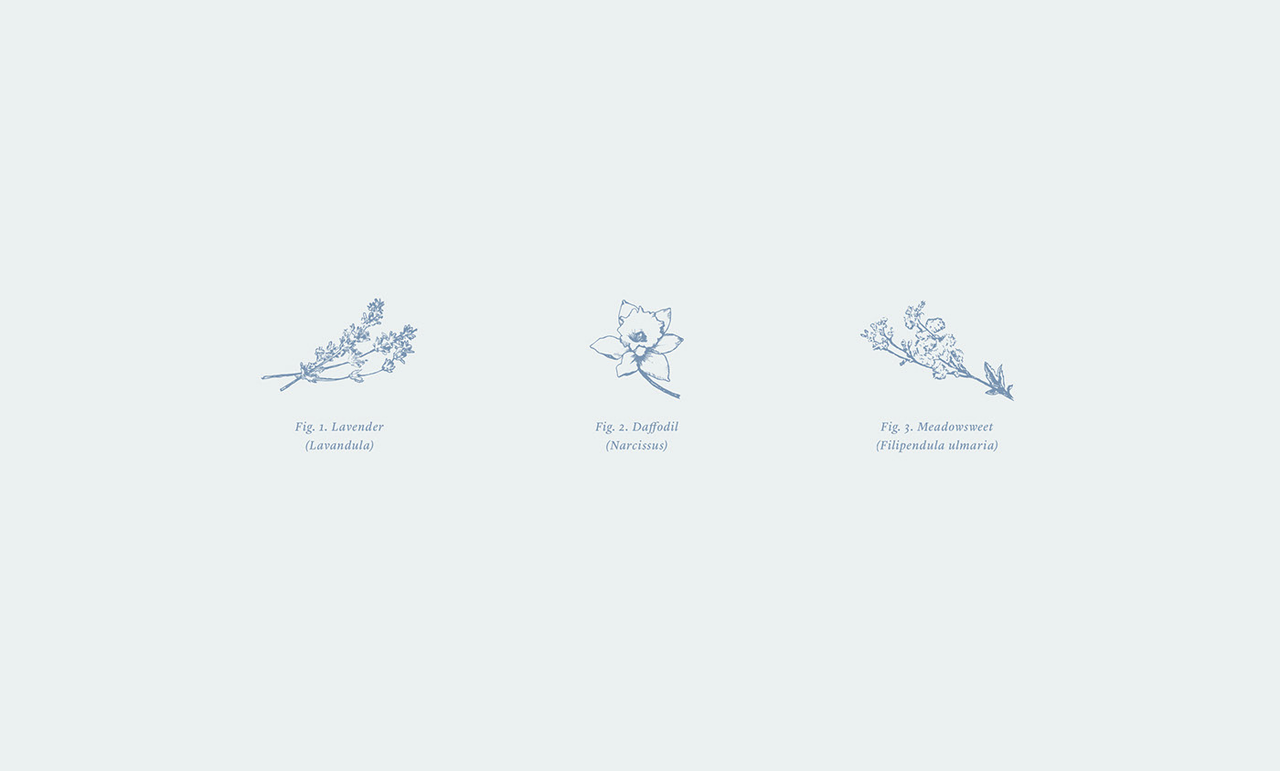
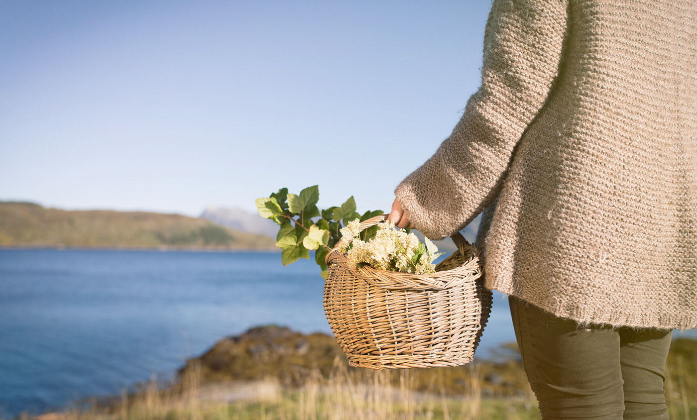
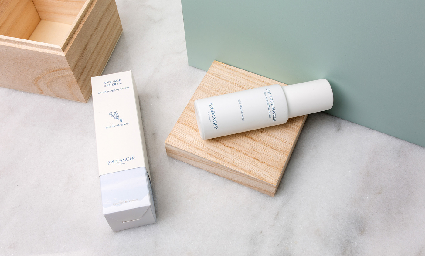
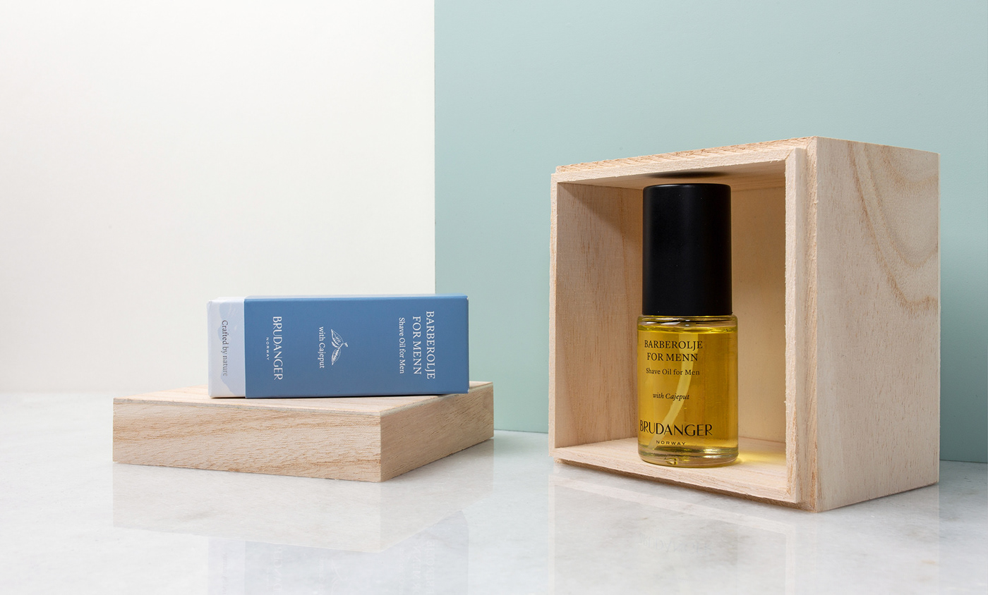
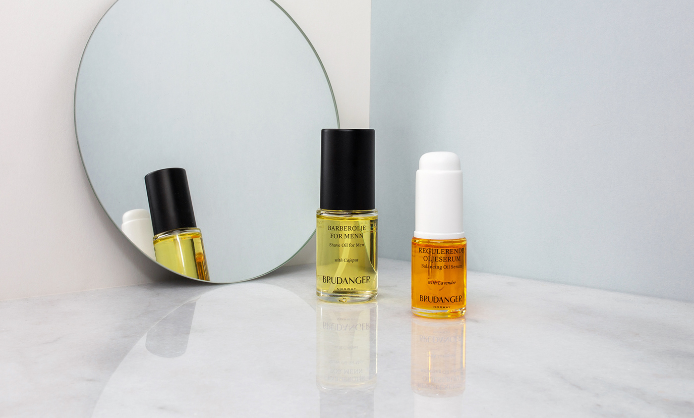
Brudanger makes natural, high-end skin care in the small village of Sørfinnset in Nordland county, Norway. All products are organic, made from local herbs and flowers harvested by hand in the picturesque surroundings. By North was commissioned by Hege Granberg, the founder and general manager of Brudanger to develop a name, visual identity, packaging-concept and online retail space for the new brand. It turned out that the perfect name already existed in Hege’s family, Brudanger is the name her father gave his farm years ago, and hails back to when Vikings reigned in the area.
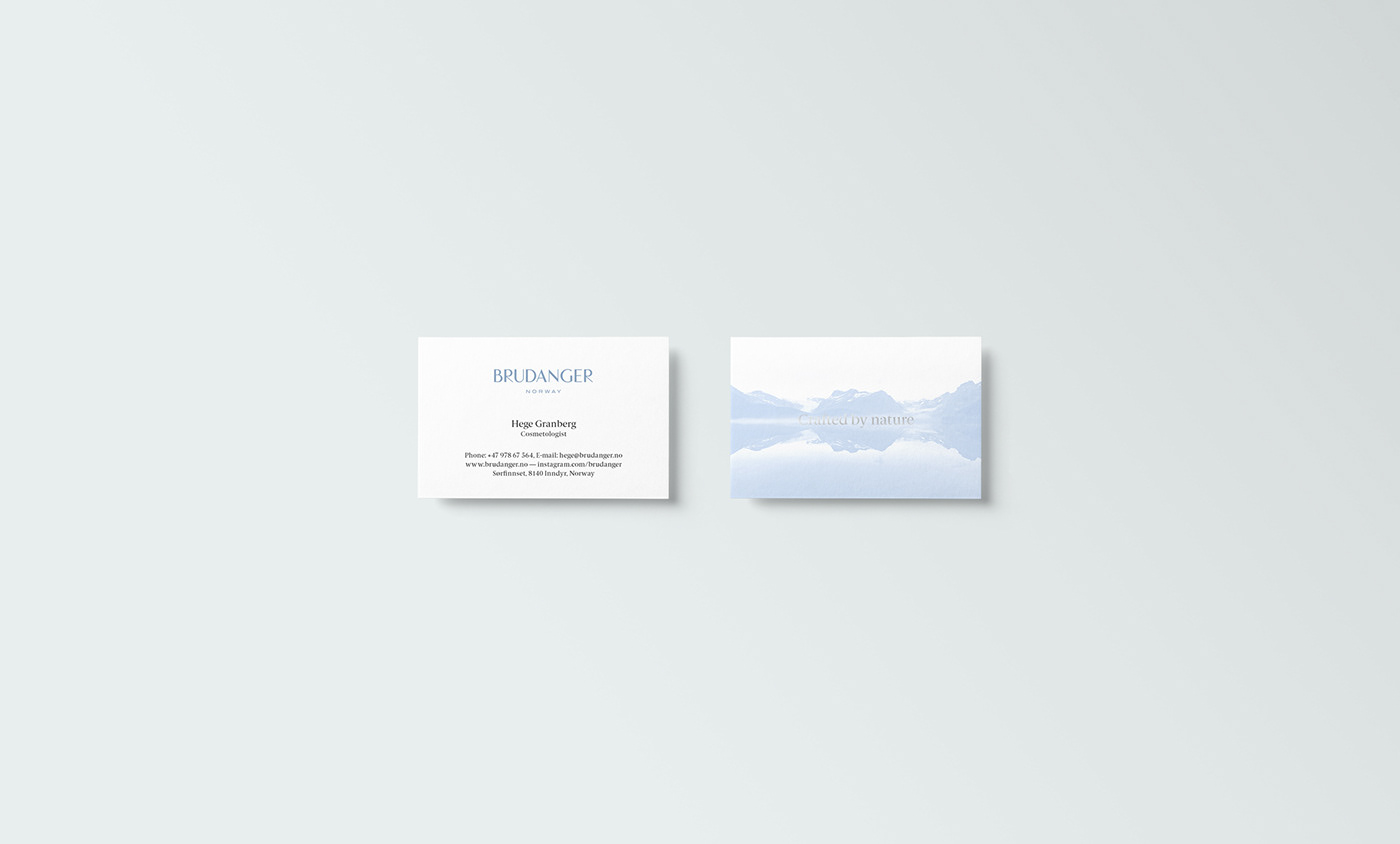
We developed an identity evoking the feeling of the unique and beautiful surroundings of Brudangers facilities. Fjords, mountains, glaciers, silence and an abundance of fresh air. The identity revolves around a bespoke logotype, a restrained, crisp, color palette and classic typographic solutions.
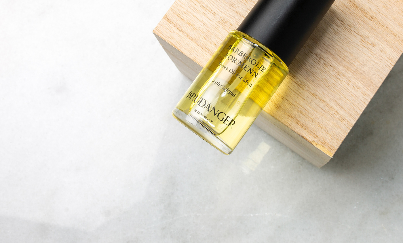
Starting a high-end skin-care line from scratch involves many considerations, with the packaging as the main asset when taking the product to the market. We collaborated with Link produktdesign to find the right bottles and containers for each product, and to develop secondary packaging for these. This involved reviewing samples from multiple vendors, trying out pumping mechanisms and other technical solutions, as well as doing long-time tests to see how the products would react to light and temperature in different containers. Next step was prototyping secondary packaging, iterating sizes and other parameters until everything fit perfectly.
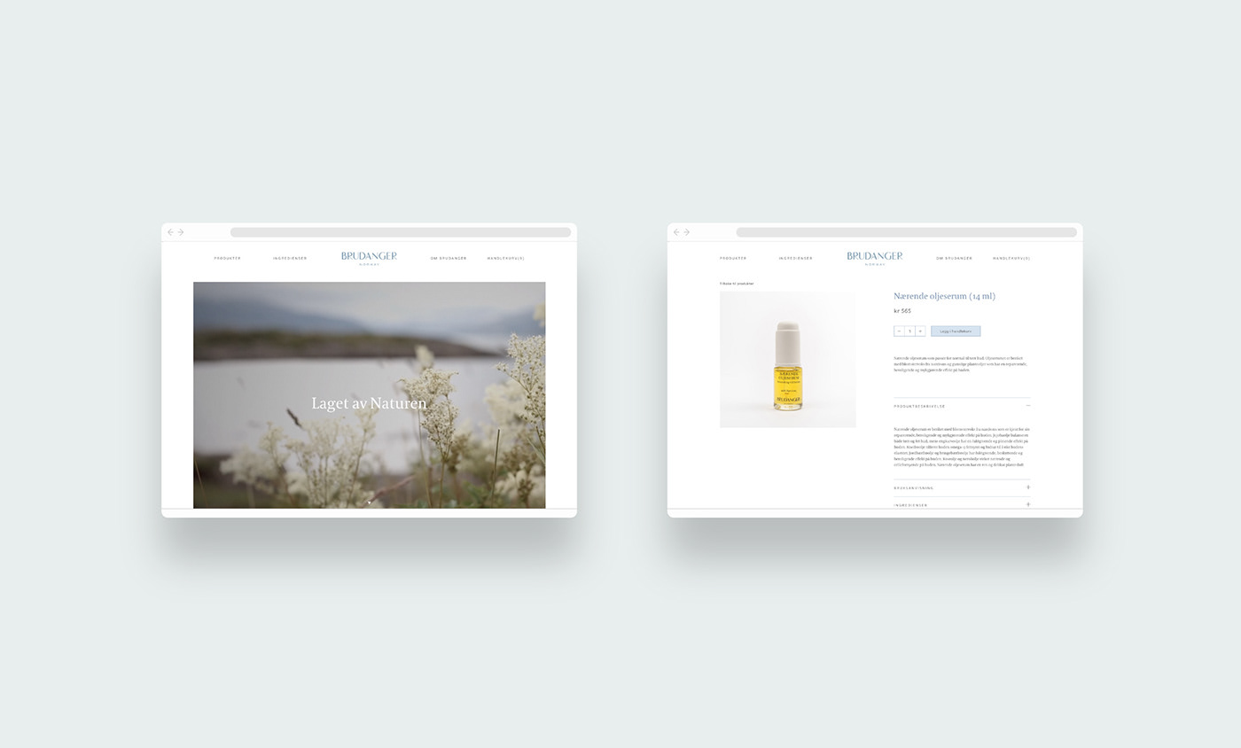
We also developed a web-shop which includes a library containing information on all the natural ingredients used by Brudanger. The web-shop was launched with three products, another twenty products are to be launched in 2019.