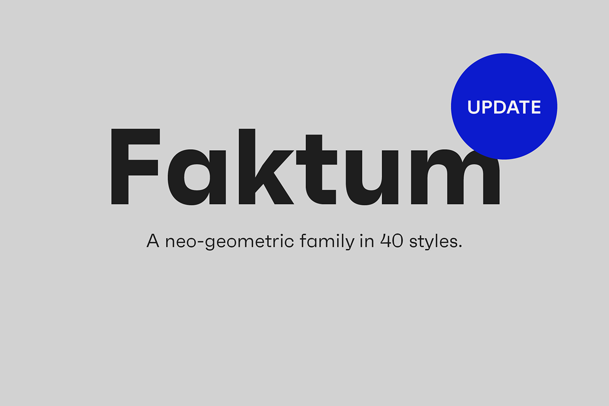
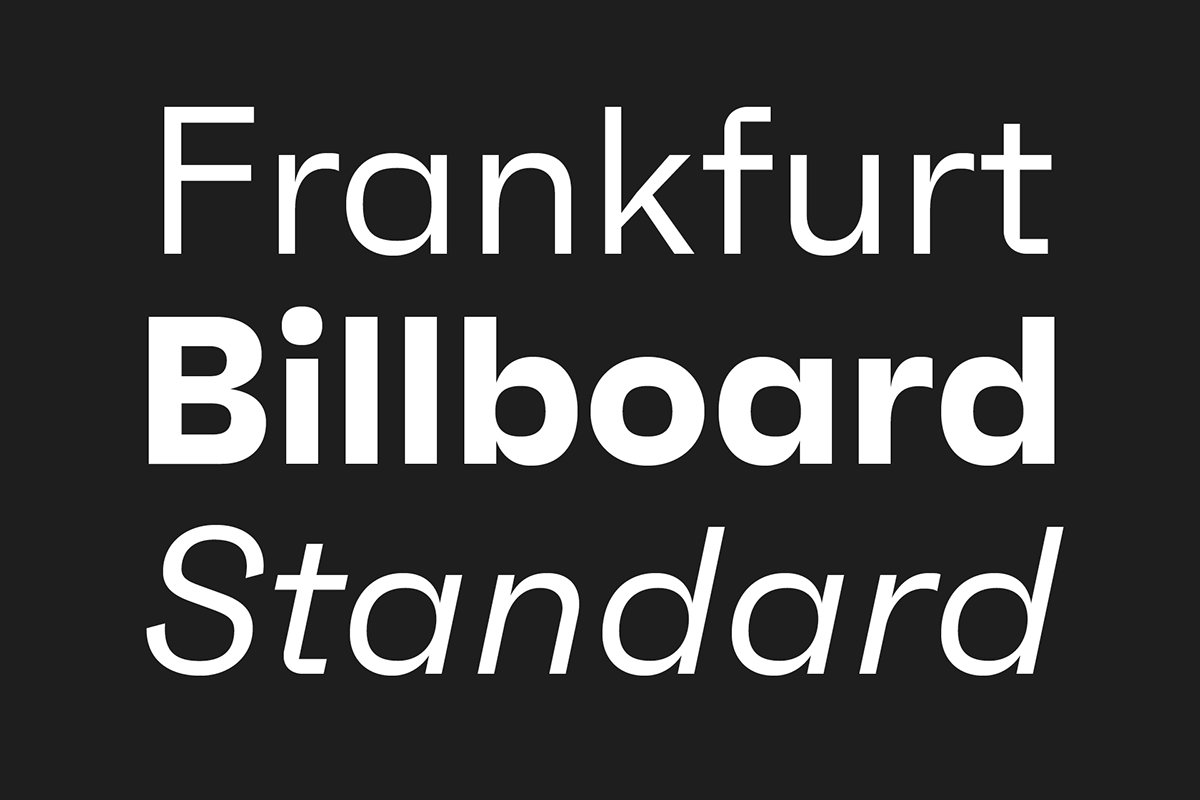
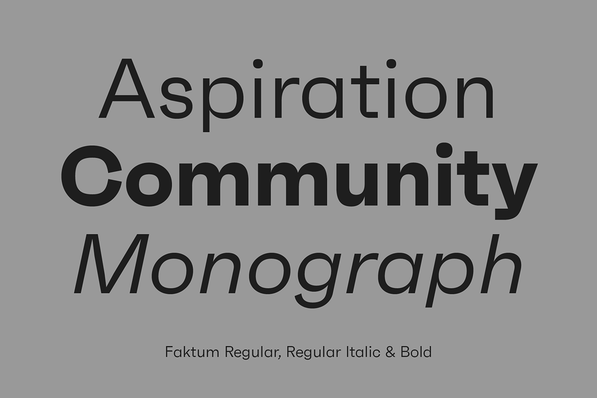
Faktum is an exploration into the geometric sans genre, inspired by Mid-century modern architecture and interior design. It is available in 40 styles, combining clear lines, organic curves and geometric shapes into one contemporary design.
Characteristics
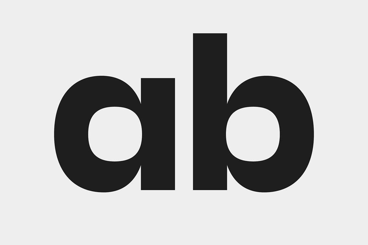
Faktum isn’t a typeface bursting with expressivity at first glance. In fact, its characteristically interplay between clean lines and organic curves reveal maybe only at third sight, which is exactly what its supposed to do: stay in the background when in use as a tool to transfer information and provide character when used in headlines. This becomes visible when looking closely at the slightly squarish counters of many upper and lowercase characters and glyphs where sharp corners meet round elements.


Alternates
During the design process, multiple variations of one character come and go. Only the ones that match my overarching concept best, make it into the final selection. But what if someone else decides differently? Or a specific task requires a different design? That’s what the alternate characters are here for! Choose from 12 different alternative characters the ones that match your design best.


Languages
Bonjour, gracias, hallo. It’s all there.
Plus more than 80 other languages.


Opentype Features
Want to make sure that numbers blend in seamlessly in your text flow? Or certain symbols align properly with text set in all caps? Opentype features are your go-to solution! Make sure to find the opentype panel in your favorite Adobe Application and use all additional glyphs with ease. Did I mention tabular numbers, arrows or discretionary ligatures?


Weights
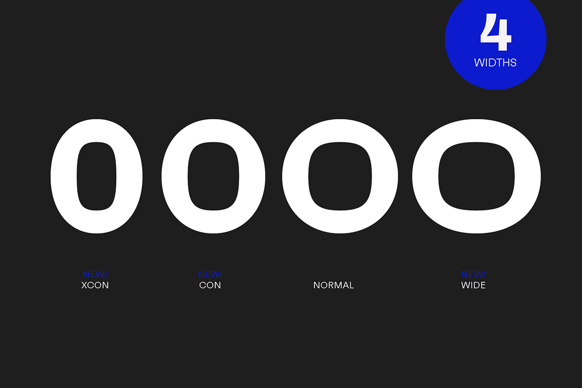
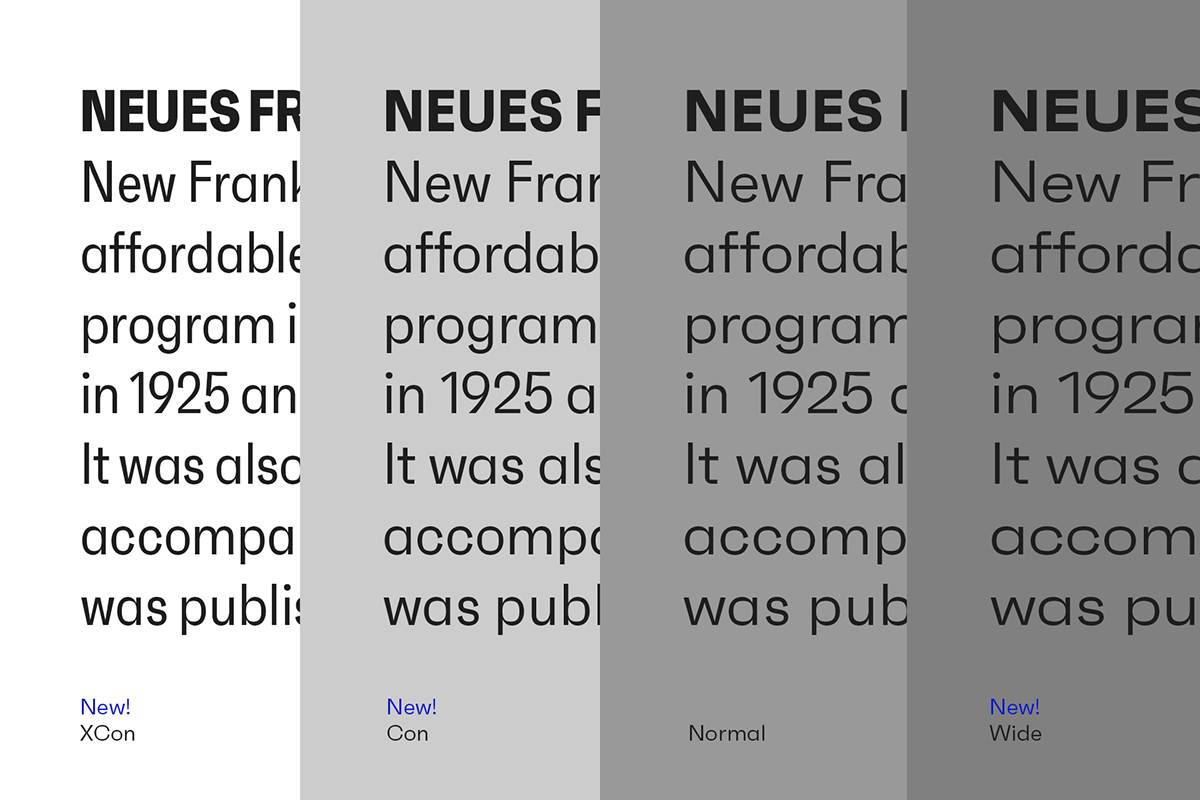
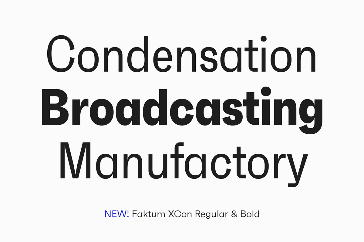
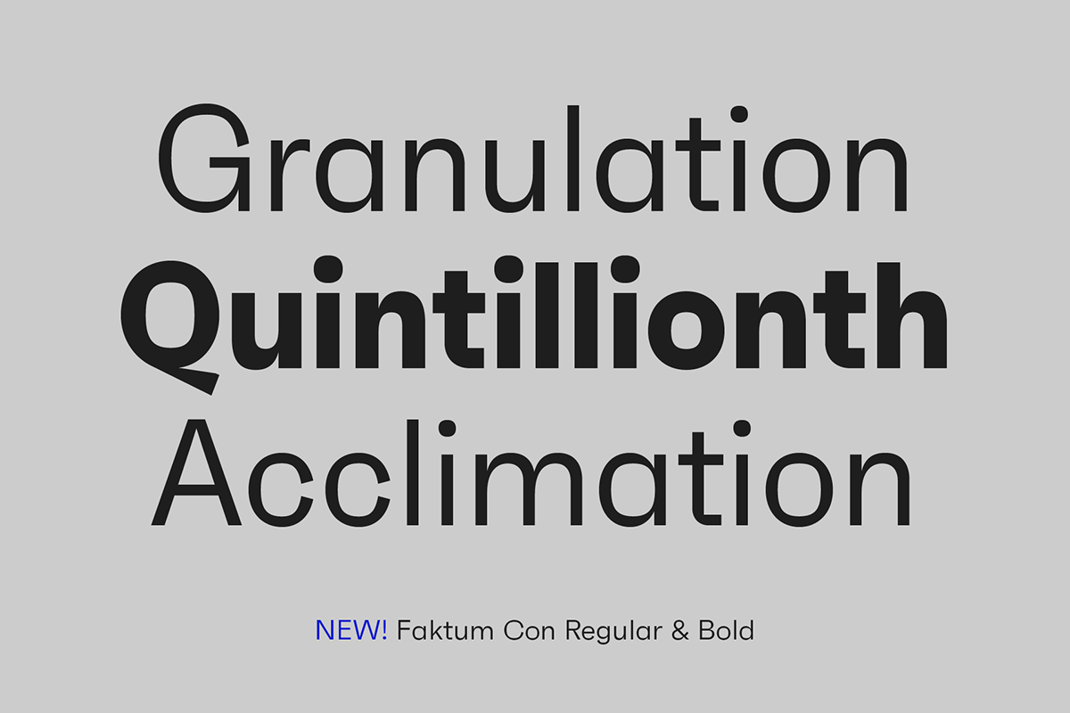
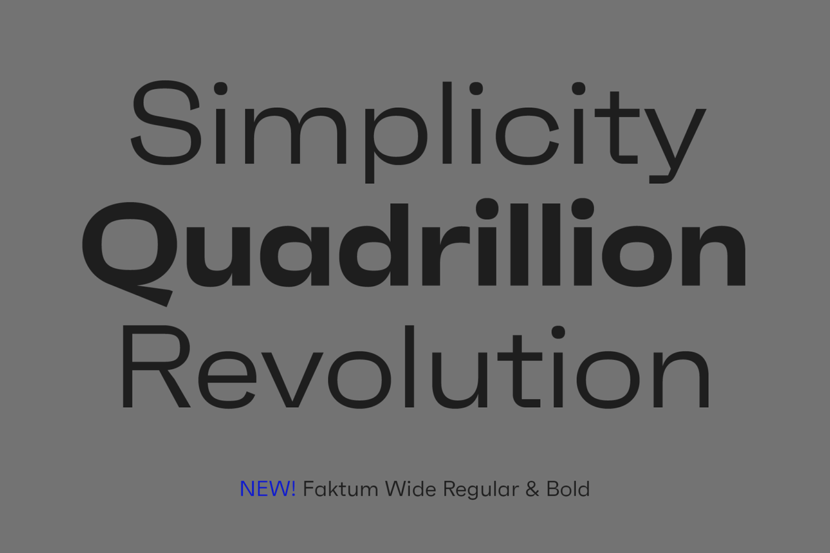
The Faktum family comes in 4 widths and 8 weights, containing more than 500 glyphs per style. While the regular widths function perfectly in long paragraphs, the extremes like XCon or Wide are either space savers or add a little drama when set in large text sizes.


