


Client: Calma Ventures
Year: 2018
Creative direction and desig: Ana Vañó (UVE) frances, Cristina Toledo
Project by nueve estudio
CALMA VENTURES:
Calma Ventures is a company devoted to the creation and management of hotel, gastronomic and cultural projects with an international scope.
Calma Ventures is presented as a new way of doing business by developing projects with soul.
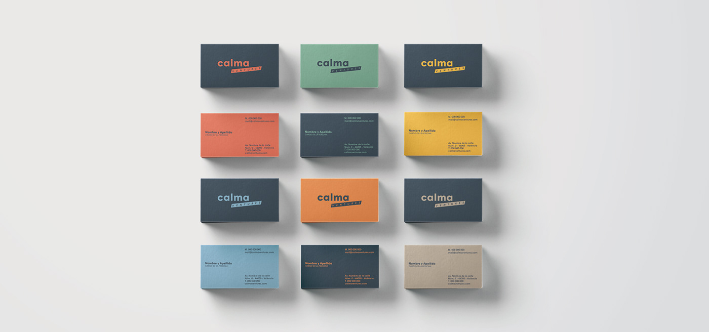
We worked on its brand architecture and based the development of its logo by analysing the name of the company. Beforehand, this would seem quite antagonistic, due to the meaning of each one of the words that make up the naming: CALMA (Spanish for "calm, quiet") and VENTURES.
The word calma (in lowercase) reflects the company's working approach: unhurryedly developed and well thought projects. On the other hand, ventures (in uppercase, italics, on a oblique box) refers to the action of enterprise, one that always involves risk and movement.
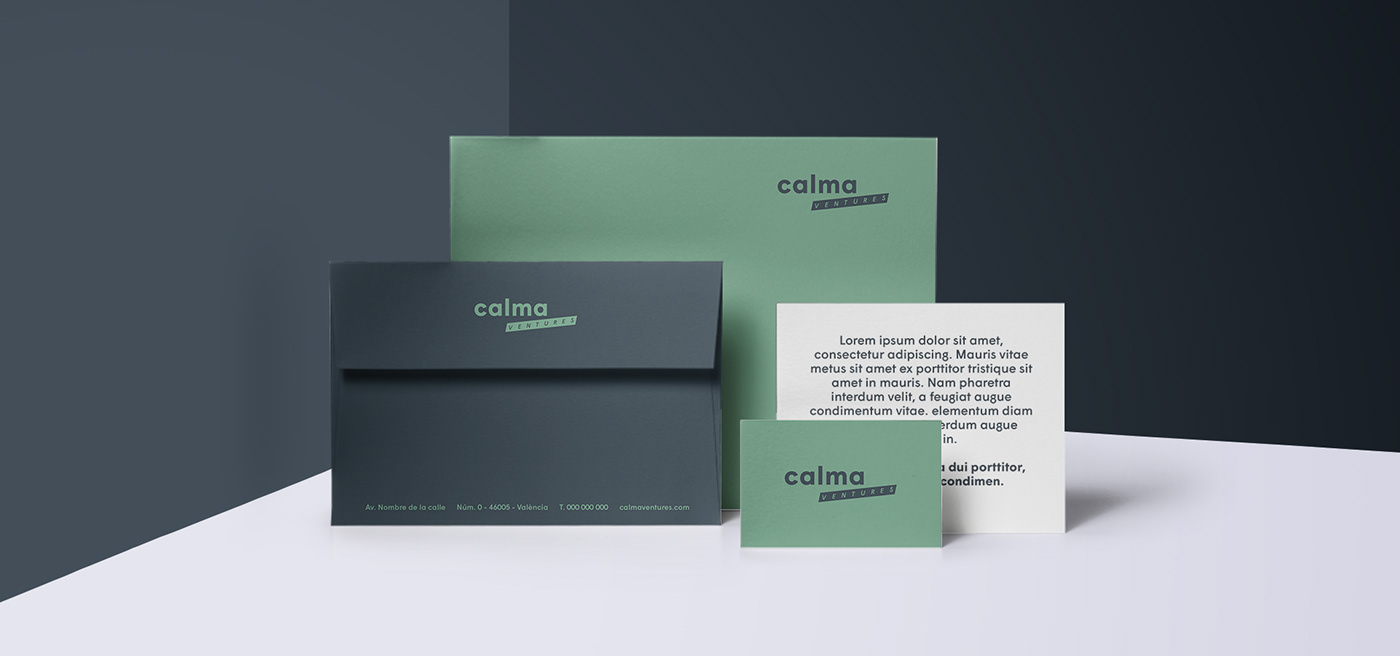
To reinforce the brand we used a bluish black for the main color as a reference to the values of CALMA, and another range of secondary colors for VENTURES.
The typeface chosen is Wigrum, from Production Type, a geometric, neuter and flexible type, able to adapt to all corporate applications.
In addition to the brand we designed a pattern based on the logo's oblique box that serves as a complement of the brand in the different applications of brand extension.


thanks! for watching


