


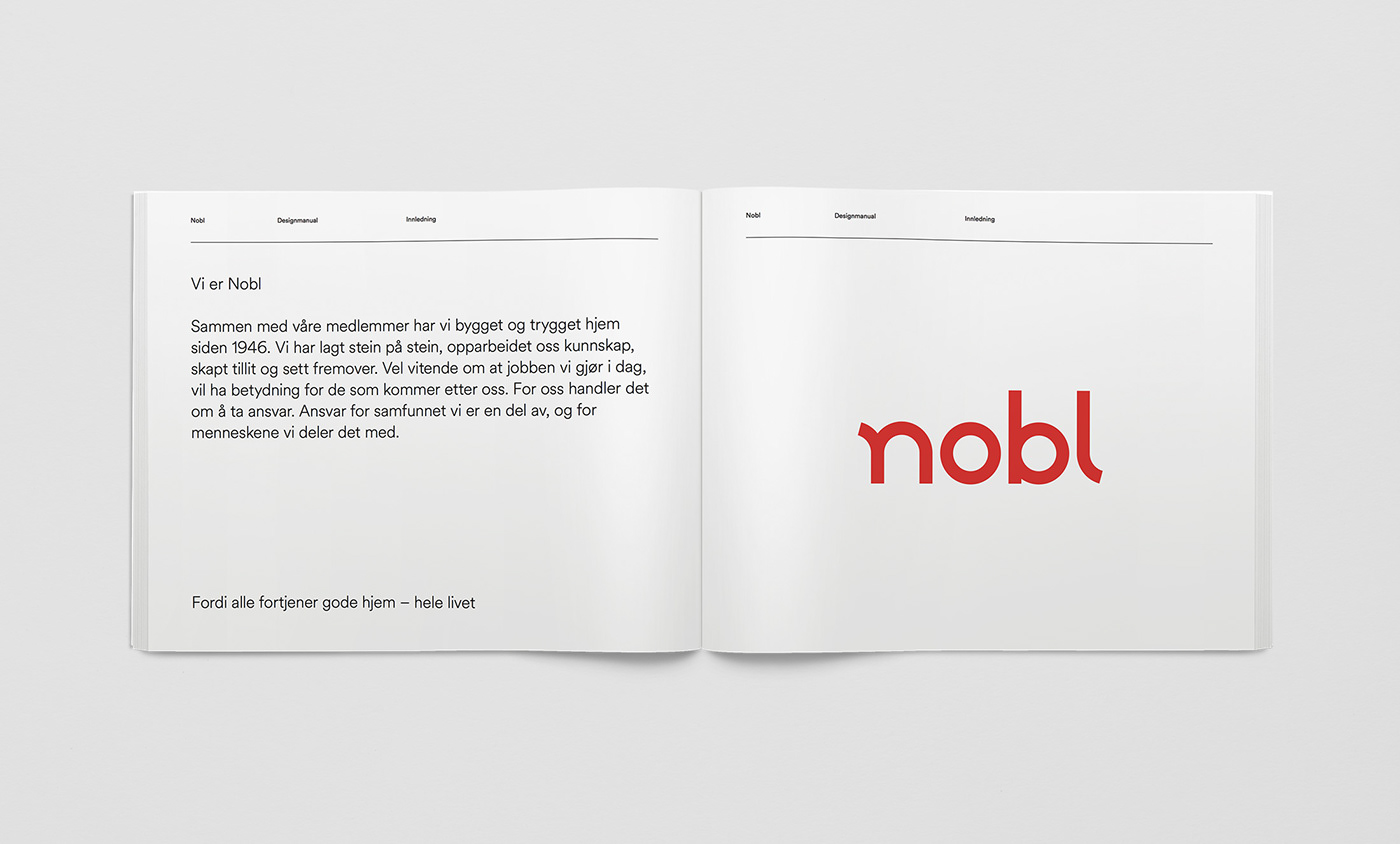
Nobl was established under the name Bodø Boligbyggelag (BBL) in 1946. As a housing cooperative, its mission was to build affordable apartments and small houses in Bodø, a necessity after the heavy bombing of the town during WW2. Over the years BBL has grown, today they have more than 16.000 members all over Nordland, and provide financial, technical and juridical expertise to their own housing cooperatives as well as stand-alone entities. They are also building and developing real estate in all of Nordland County.
Due to the growth and geographical expansion over the years, BBL saw the need to iterate their brand strategy and change their name, after experiencing that the connection to Bodø in the name BBL, could be seen as distancing instead of including in other parts of the country.
In the winter of 2016 we facilitated a series of workshops together with BBL. Starting with the brand strategy we re-worked and adapted this to todays situation, as well as developing a brand story to make sure that BBLs history was at the core of the new identity.
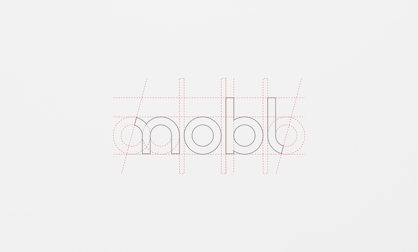
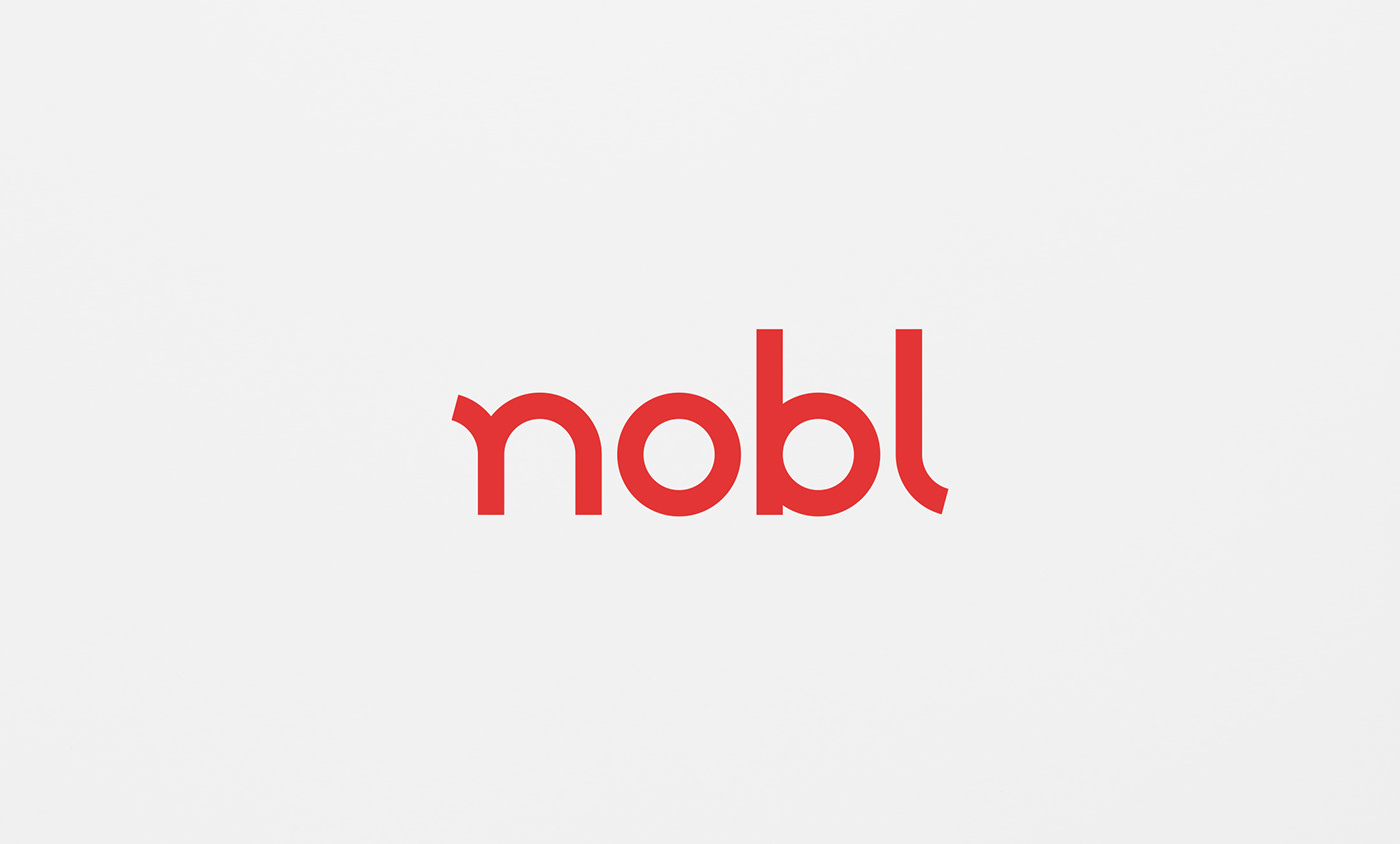
We then proceeded to develop a new name. After several workshops, prototyping and research, we landed on the name Nobl. As well as being an abbreviation of Nordland Boligbyggelag, Nobl is pronounced as “Nobel” in Norwegian, which translates to “Noble” in English.

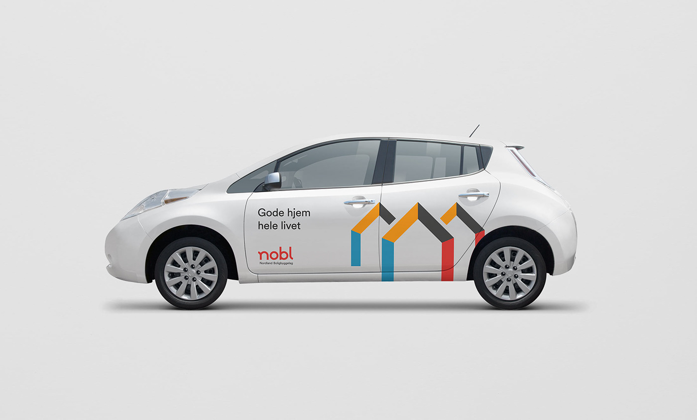
For the identity we wanted Nobl to stand out as professional, approachable and modern. At the same time we saw the need to keep some kind of visual reference to the old logo and identity. We solved this by building the new logotype from shapes derived from the old symbol. These shapes also became the starting point for Nobls service icons, and also gave a clear direction for how the icons would animate.

The video shows the transition from old to new logo.

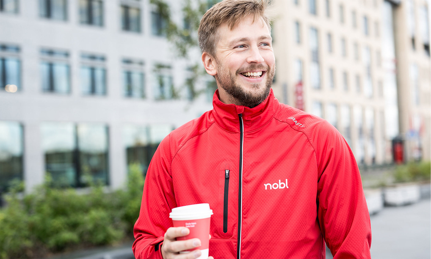
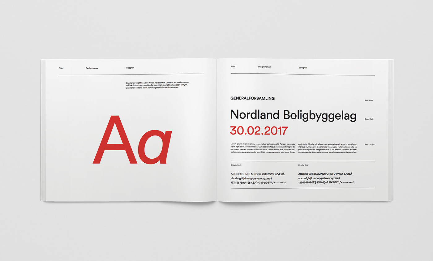
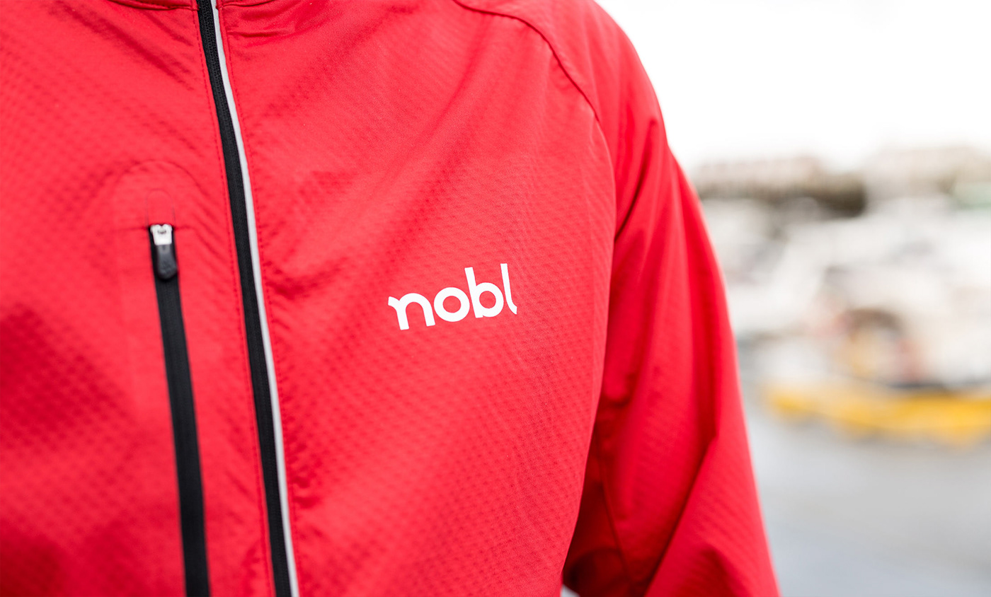
With a clear color palette, a modern sans serif and a photo treatment based on the shapes derived from the logotype, the result is a modern, approachable and flexible identity system that allows future growth. We also built a library of brand photography, featuring employees, real people and known settings in an honest and unstaged tone-of-voice.


BBL was one of the most recognized local brands in Bodø, so together with the team from Nobl, we planned a launch to make the new name and identity known as quickly as possible. In addition to a traditional print-campaign in newspapers across the county, we also produced a digital campaign to communicate the transition from BBL to Nobl. Stragiht to the point, this centered on an animation where the old logo morphs into the new logotype.
On the day of the launch, employees in Bodø took to the streets in the morning, offering coffee to commuters and telling them the story behind the new name and logotype. The campaign was a success, establishing the new name in record time.