Oblik is an initiative to sell photos printed on paper.
The platform focuses entirely on the art, called photography. More specifically on its end - printing the photo on paper. This is the stage where everyone can touch the photographer's work.

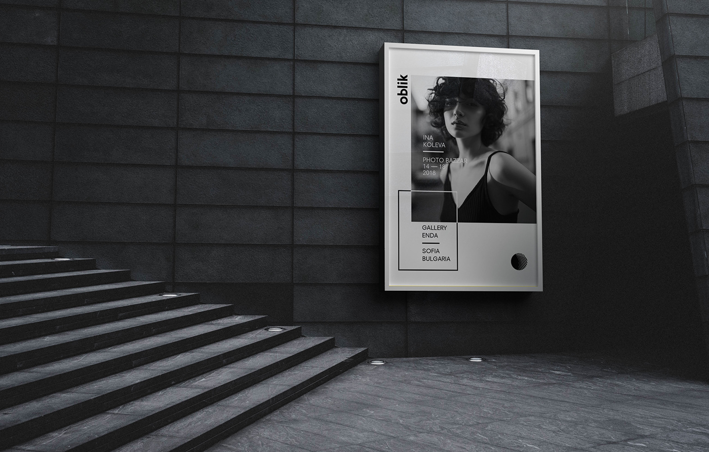
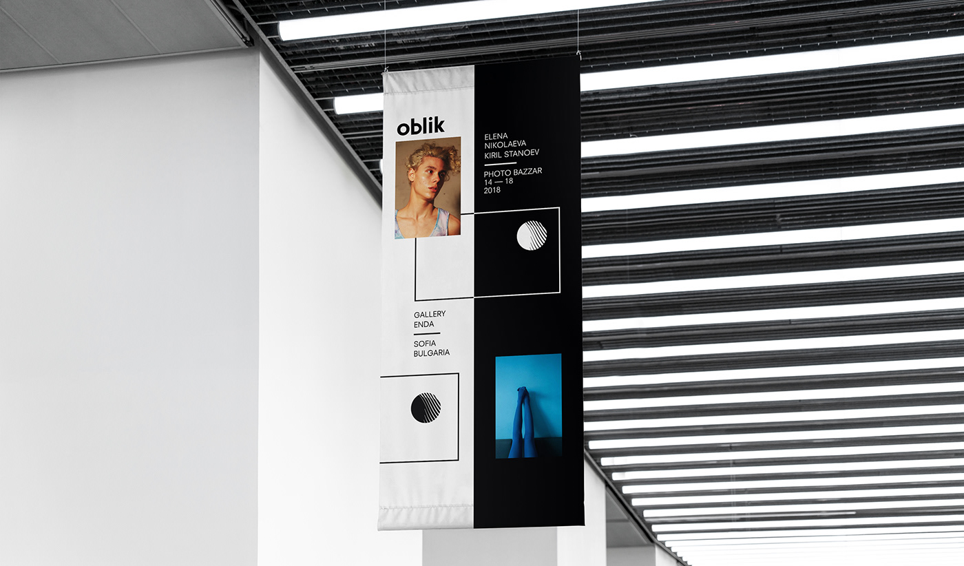
We created a visual identity to suit Oblik's ideology: a clean, simple and timeless logotype combined with a black and white aesthetic to allow for the photo to stand out.
The platform itself has the "less is more" approach to photography, which results in extremely minimalistic geometrical pieces. Our goal was to achieve a very minimalistic and clean look, reflecting the nature of light - the key element in photography.
The platform itself has the "less is more" approach to photography, which results in extremely minimalistic geometrical pieces. Our goal was to achieve a very minimalistic and clean look, reflecting the nature of light - the key element in photography.


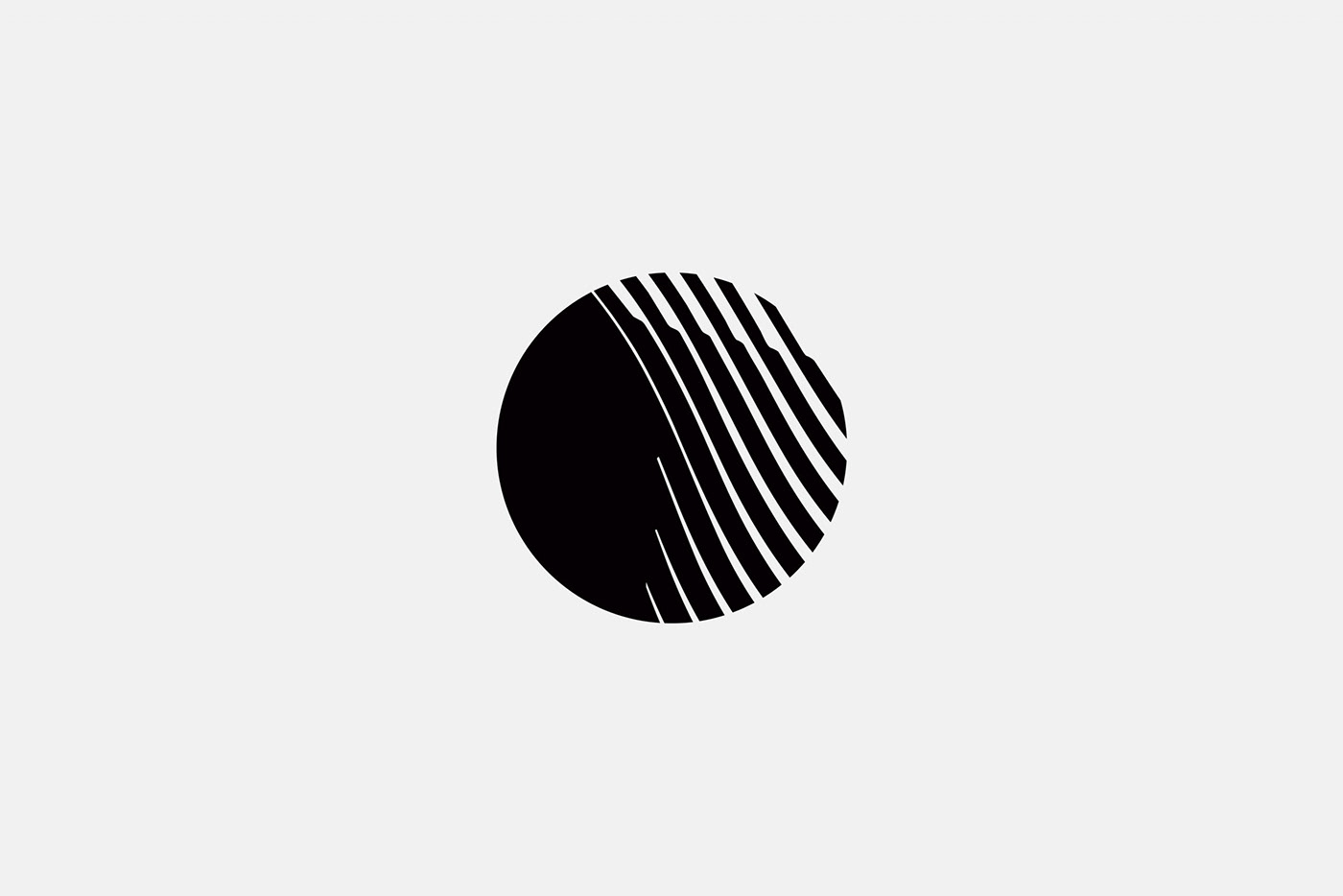
This sign and logotype combine simplicity and modernism. Combined, the logotype and mark create a minimalistic, modern and unique identity.