Nihonshi
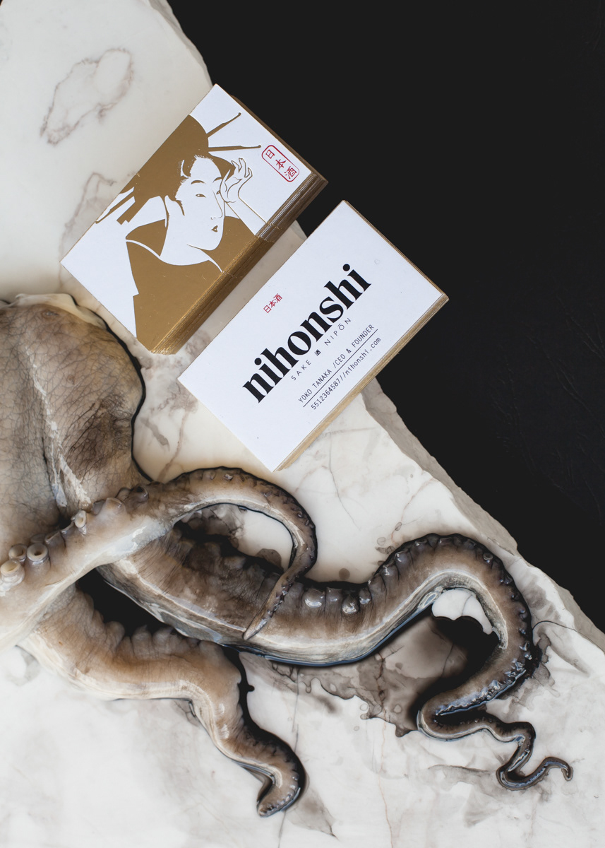
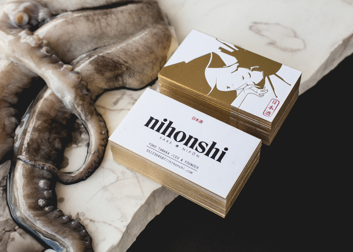
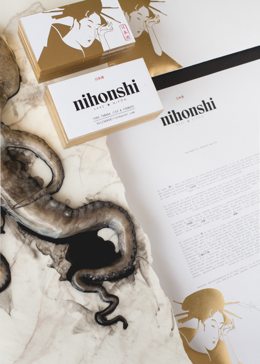
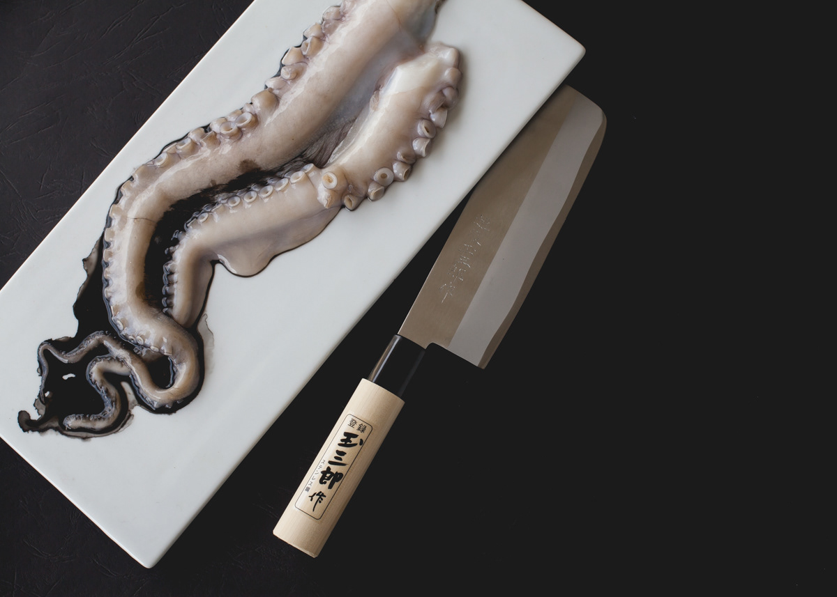
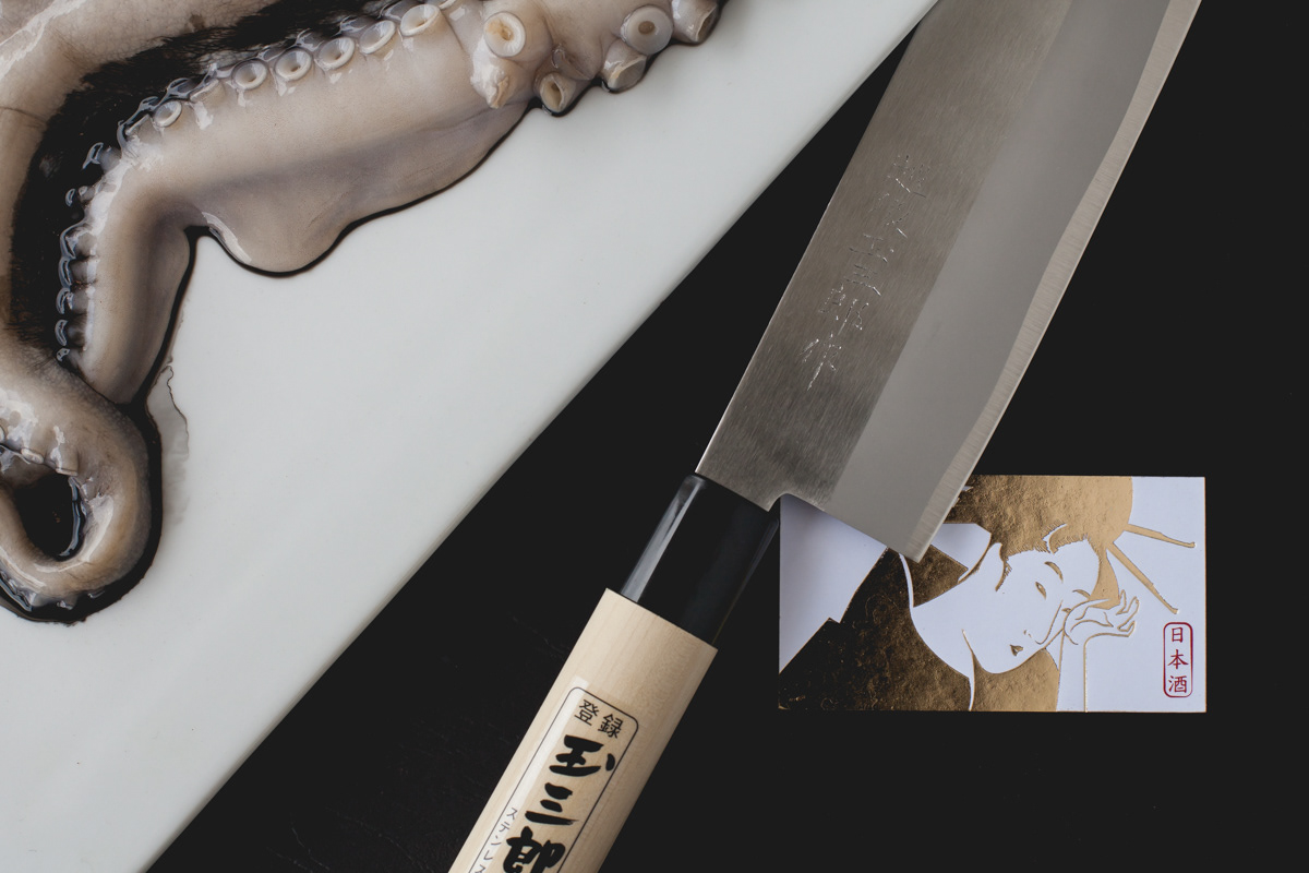
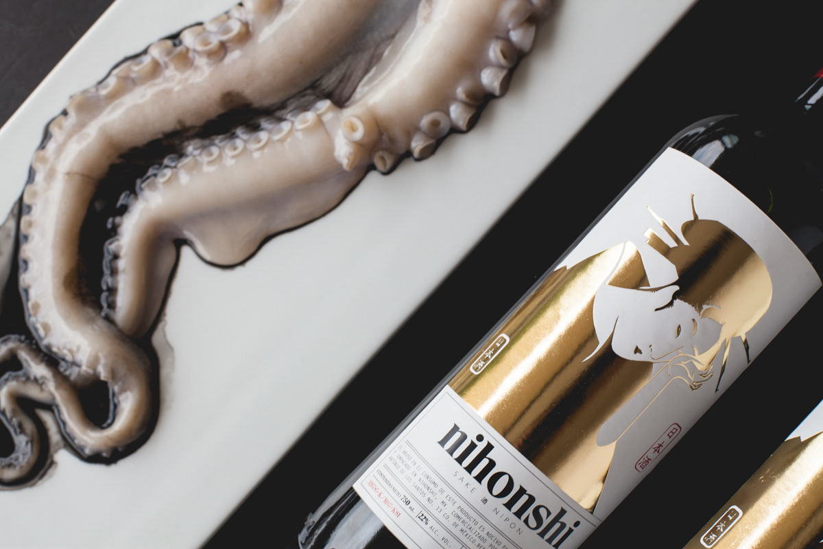
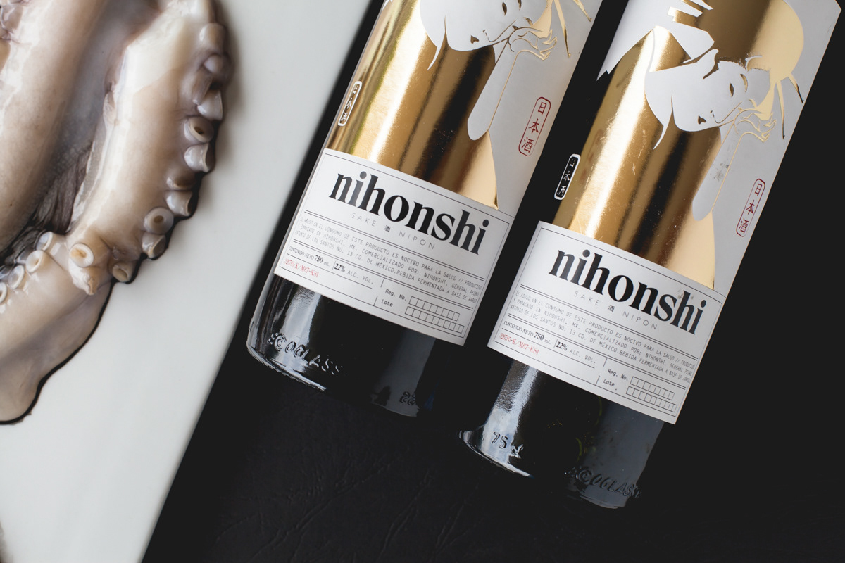
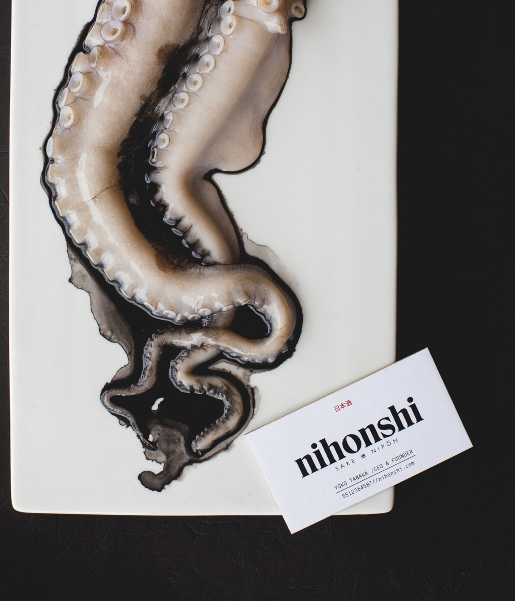
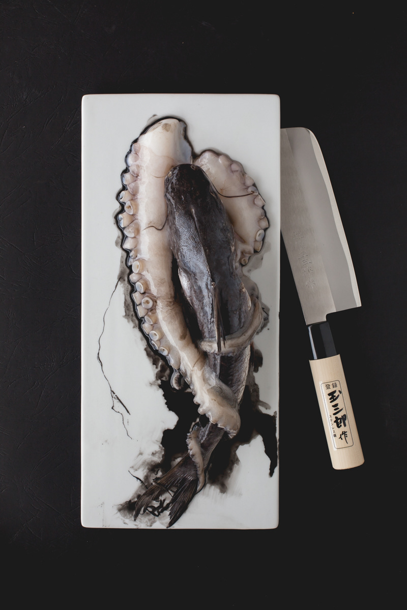
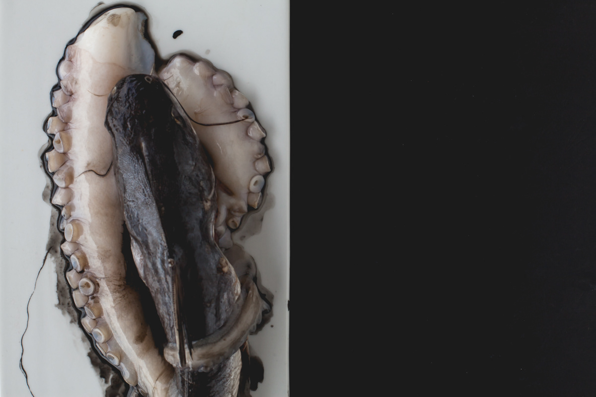
Corporate identity design for a Japanese sake brand. The name nihonshi came from nihonsh, a japanese word means wine or alcoholic beverage. Traditional elements of Japanese culture were used, such as calligraphy, the ukiyo engravings of the Edo period. We took as inspiration the elements of japanese sea & animals, like octopus, octopus ink,used in japanese calligraphy too. We want reflect the beauty of japan folk art & culture in all brand elements.
