Naar Kaapverdische Eilanden (To Cape Verde Islands)
visual identity, webdesign
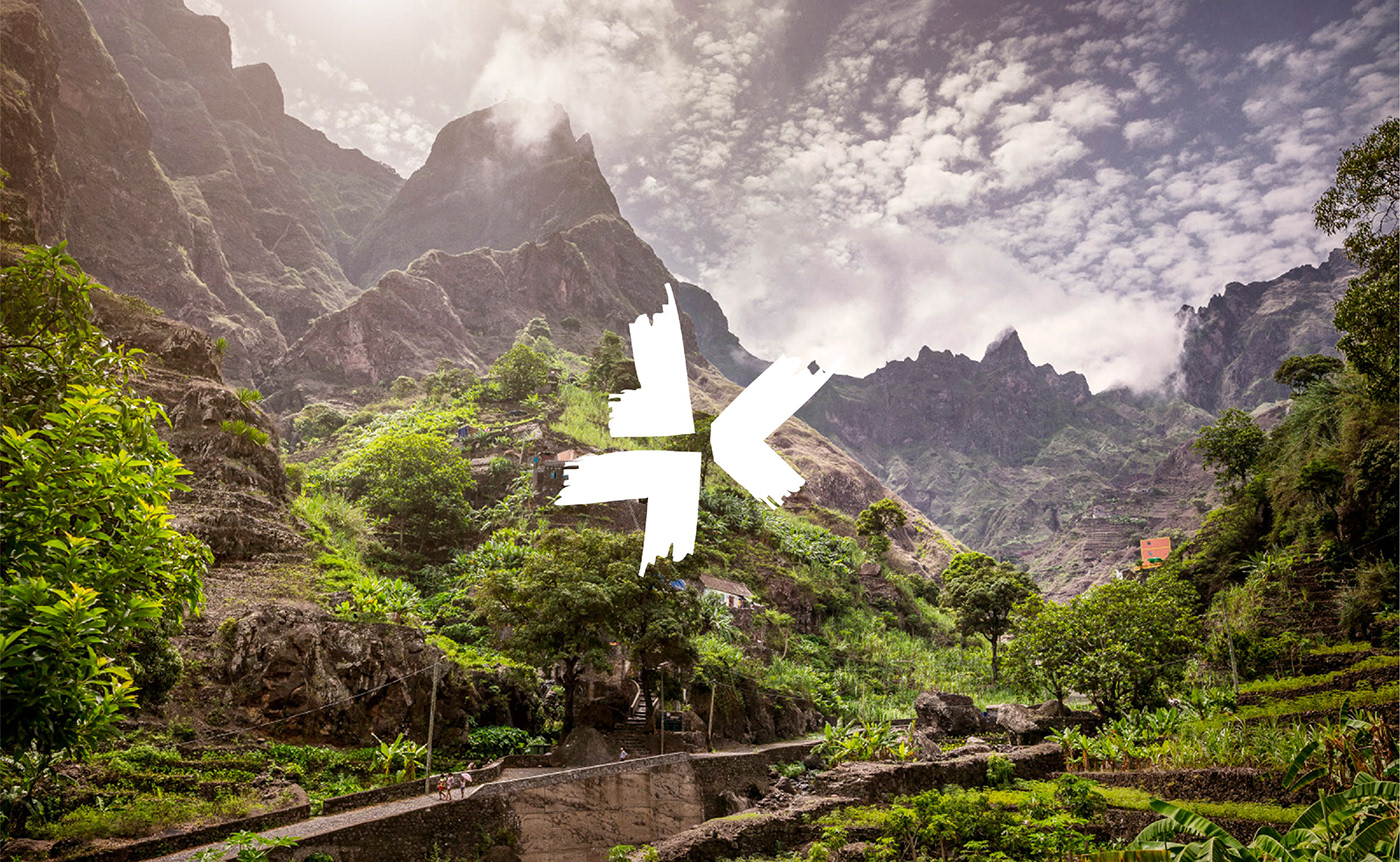
Sailing the seas on a long journey passed exotic islands. To many a dream, to Joshua, founder of To Cape Verde Islands, daily business. His great love, Cape Verde, had to be placed on the map and made known to an audience of travelers that favor authenticity above anything else. Transferring the unique atmosphere and beauty of each of the ten islands was a must.
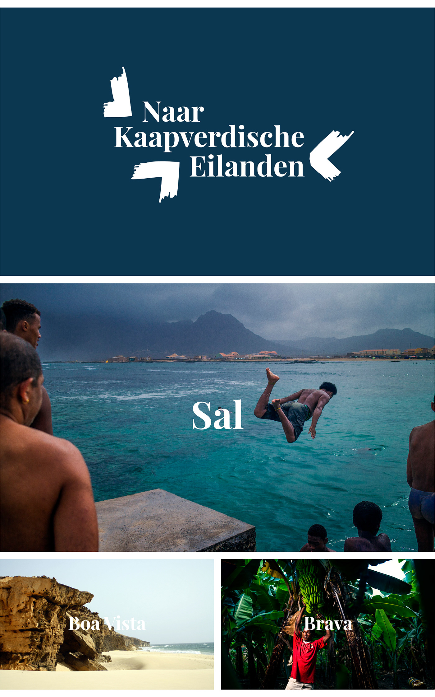
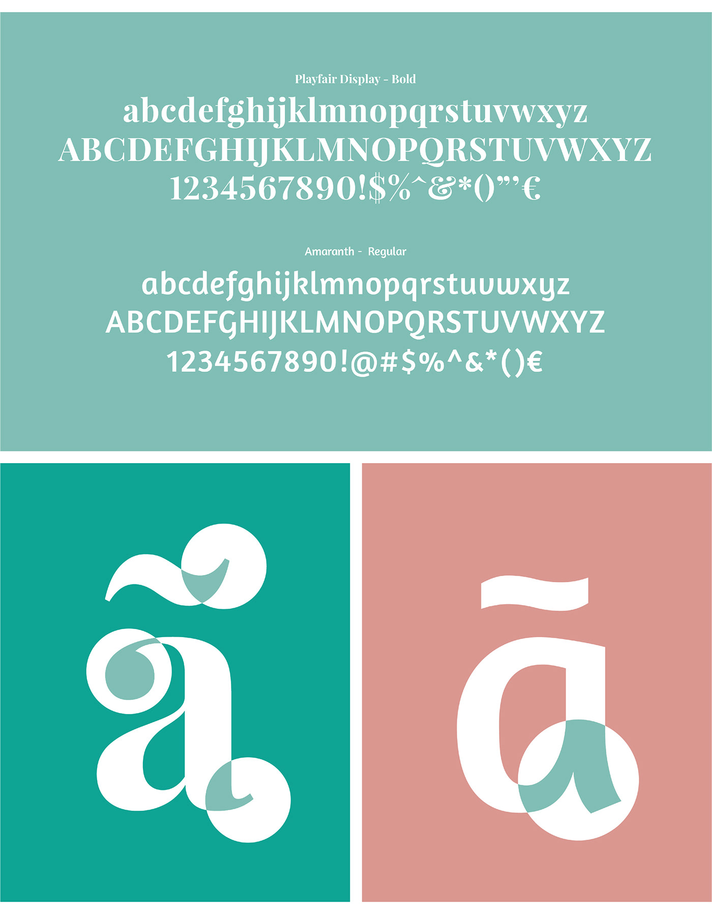
The abundance and depth of the archipelago shows itself visually in a color palette that is derived from the natural materials and resources on the islands. A dynamic system of signage represents the geographical placing of the islands graphically, while also triggering ones sense of traveling the map. The icon of each island tells you exactly what direction to sail to.

Adventurously discovering
The visual identity had to ensure the character of each island was expressed, but also the archipelago as a whole. With ten islands in total, no easy task. Luckily the islands provided the answers.
Variations in nature, culture and location are the inspiration behind a color palette that paints the islands’ personalities accordingly. Each island has an arrow as icon that reflects the actual location of the island, while also reflecting the true identity: a map of discovery.
Credits:
Photography: Sjors Massar
Photography Boa Vista: Joshua van Eijndhoven