


What is Vyta
Vyta is an iOS application that provides you with the best personal trainers, yoga, and boxing instructors on demand at a time and place that is most convenient to you throughout London zones 1-3.

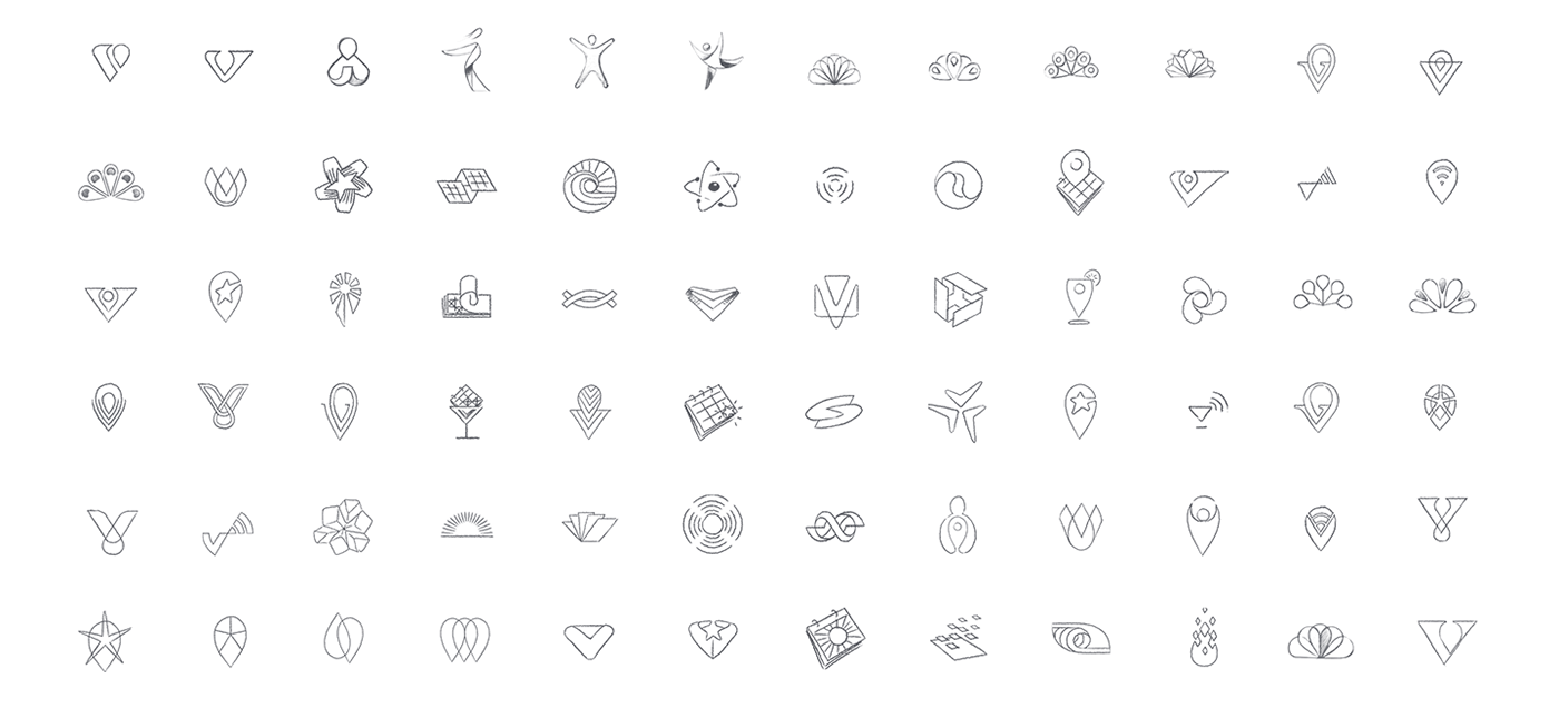
Exploration
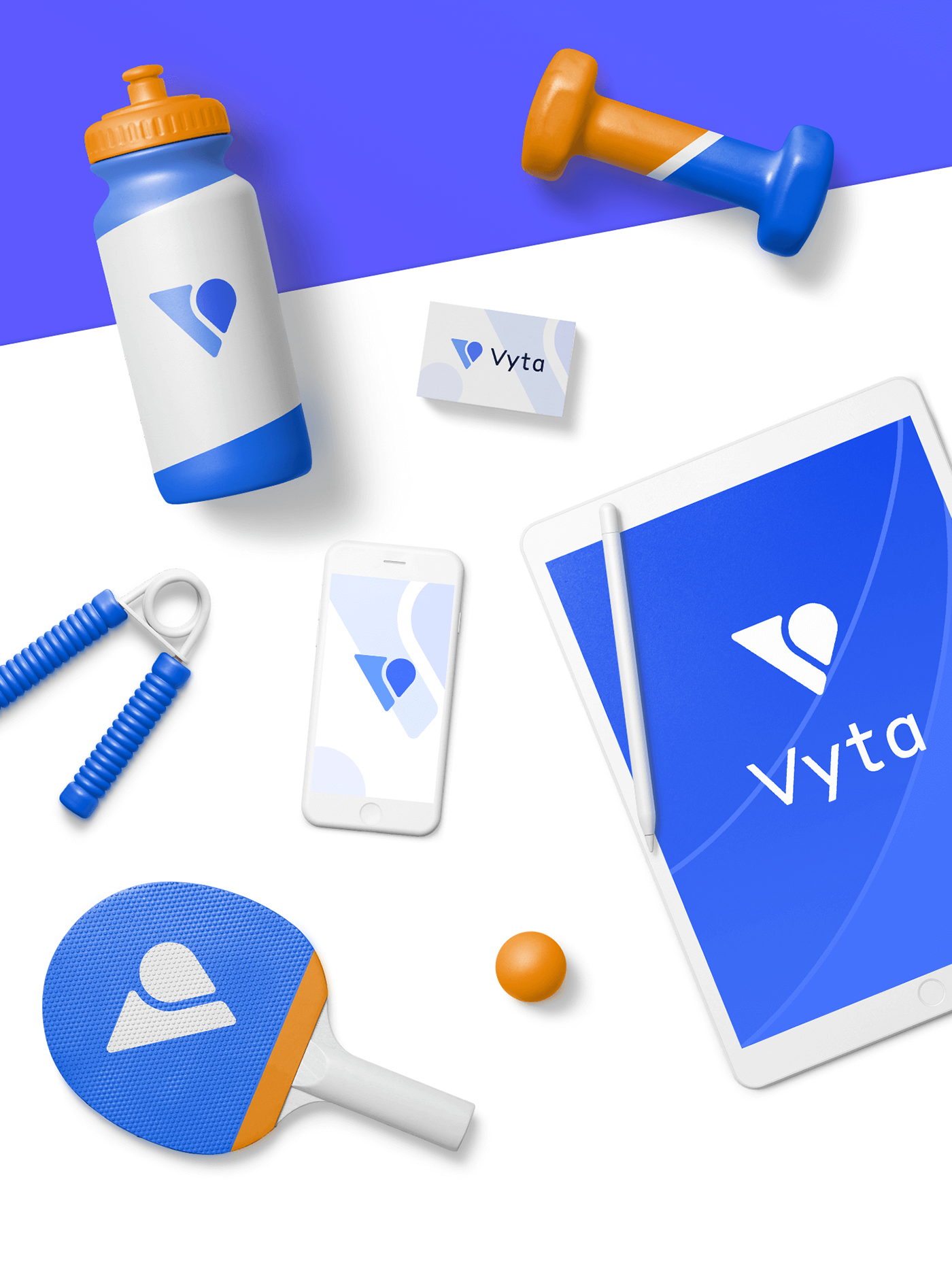
During the exploration stage, our goal was to find a shape that feels static and dynamic at the same time. We started with more literal metaphors such as a human figure, but then moved towards an abstract direction. Vyta is a location-based service, so that's why we have a location pin shape.

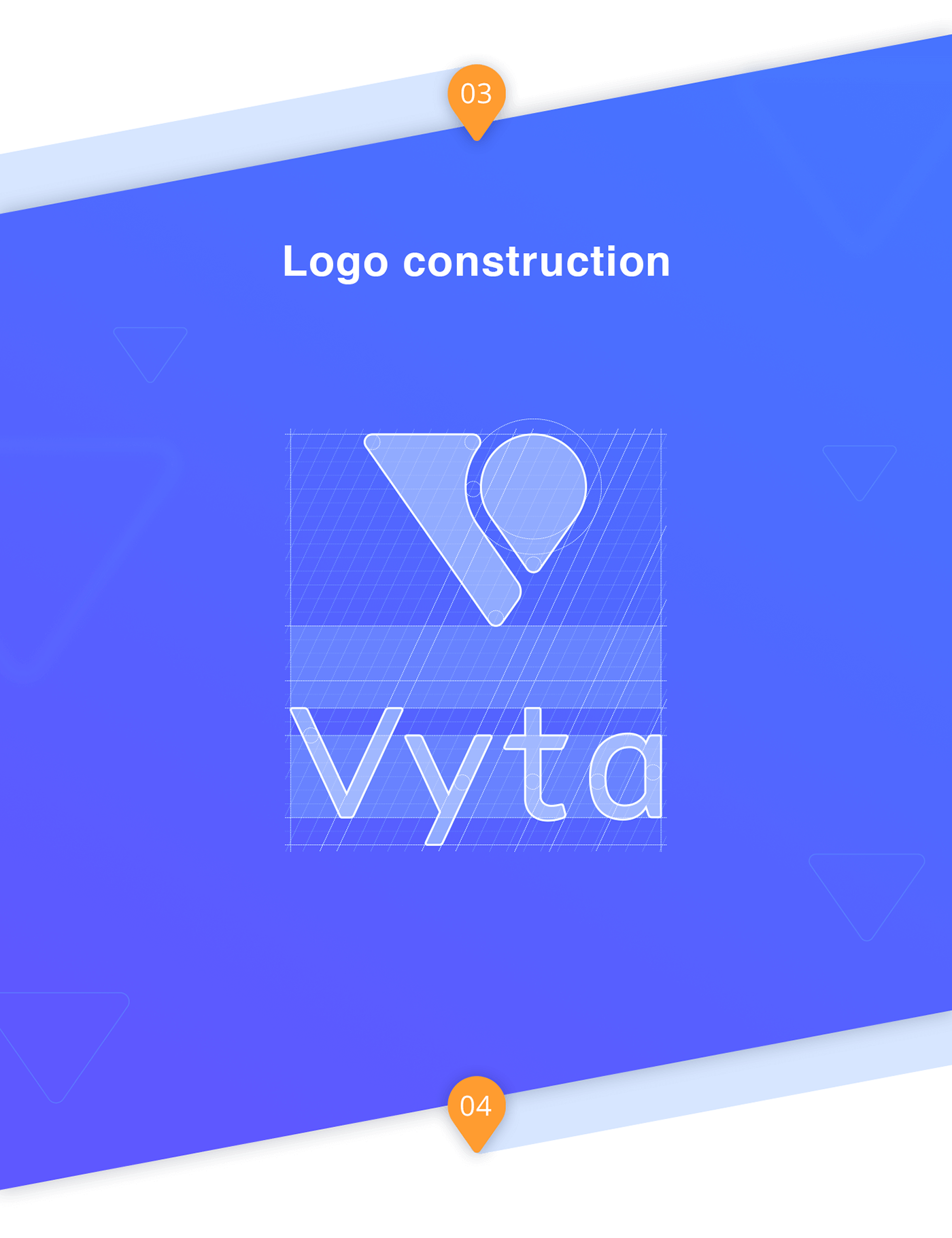
Finalizing
Poor quality of the final rendering could ruin any design, even if you have a strong metaphor as a base. A user can't know how good your product is until the moment he tries it. However, the level of attention you apply to every single pixel in your logo partially shows your approach to the product in general. Be pixel perfect.

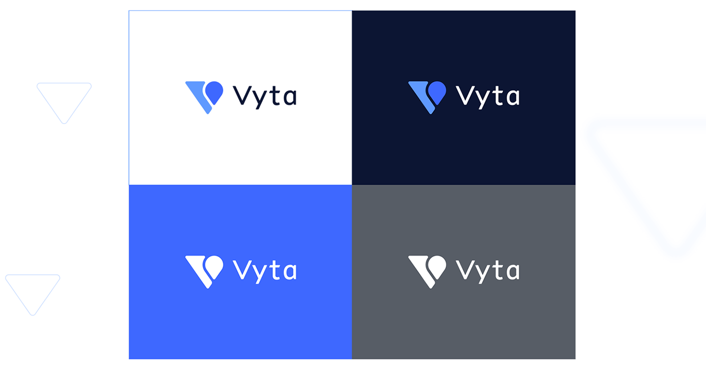
Clear spaces

Background usage
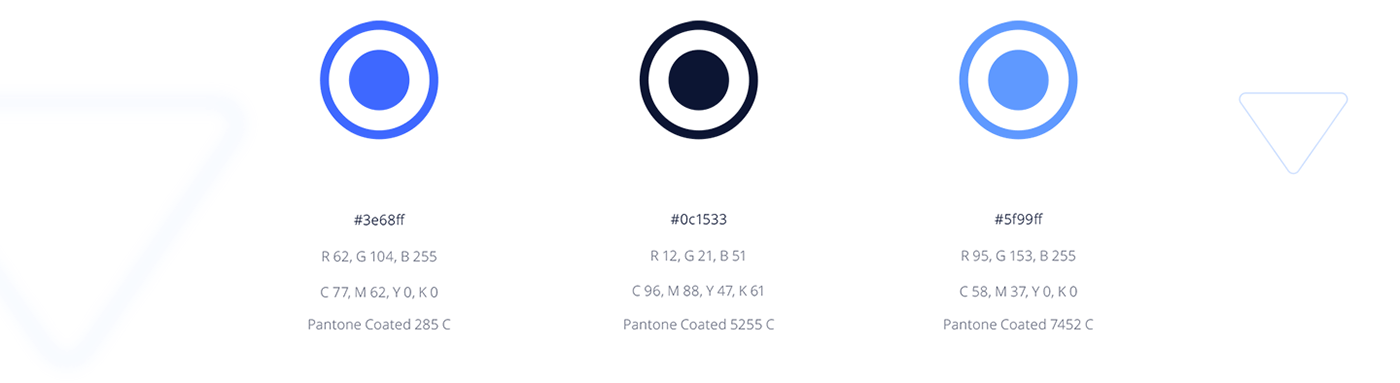
Primary сolors
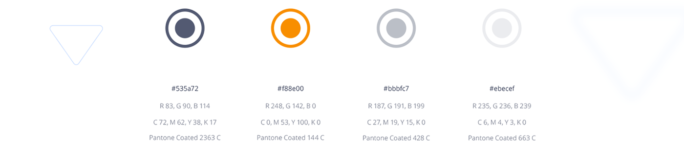
Secondary colors
Fonts

App icons
iOS

Android

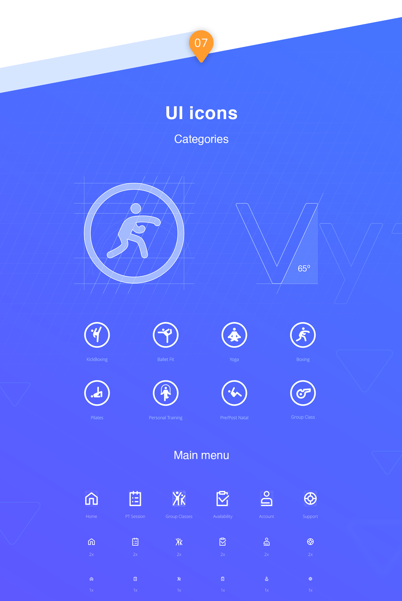
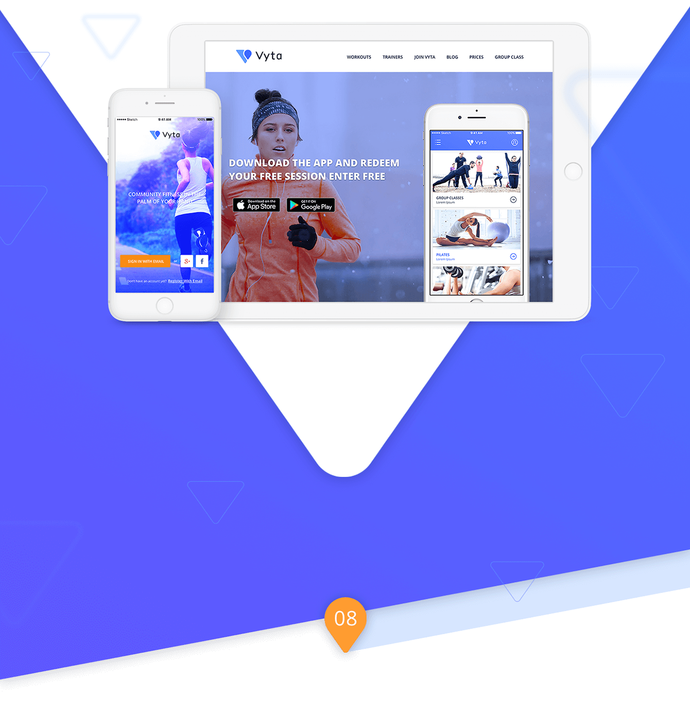
Website and UI
When you create a brand identity for a digital product, you should always think how to apply this visual language to all ecosystem components including the marketing website, actual iOS or Android application, marketing emails, etc. Fortunately, we designed the UI/UX for the Vyta iOS application and marketing website, so we had a chance to make sure that all design elements work consistently and align correctly.
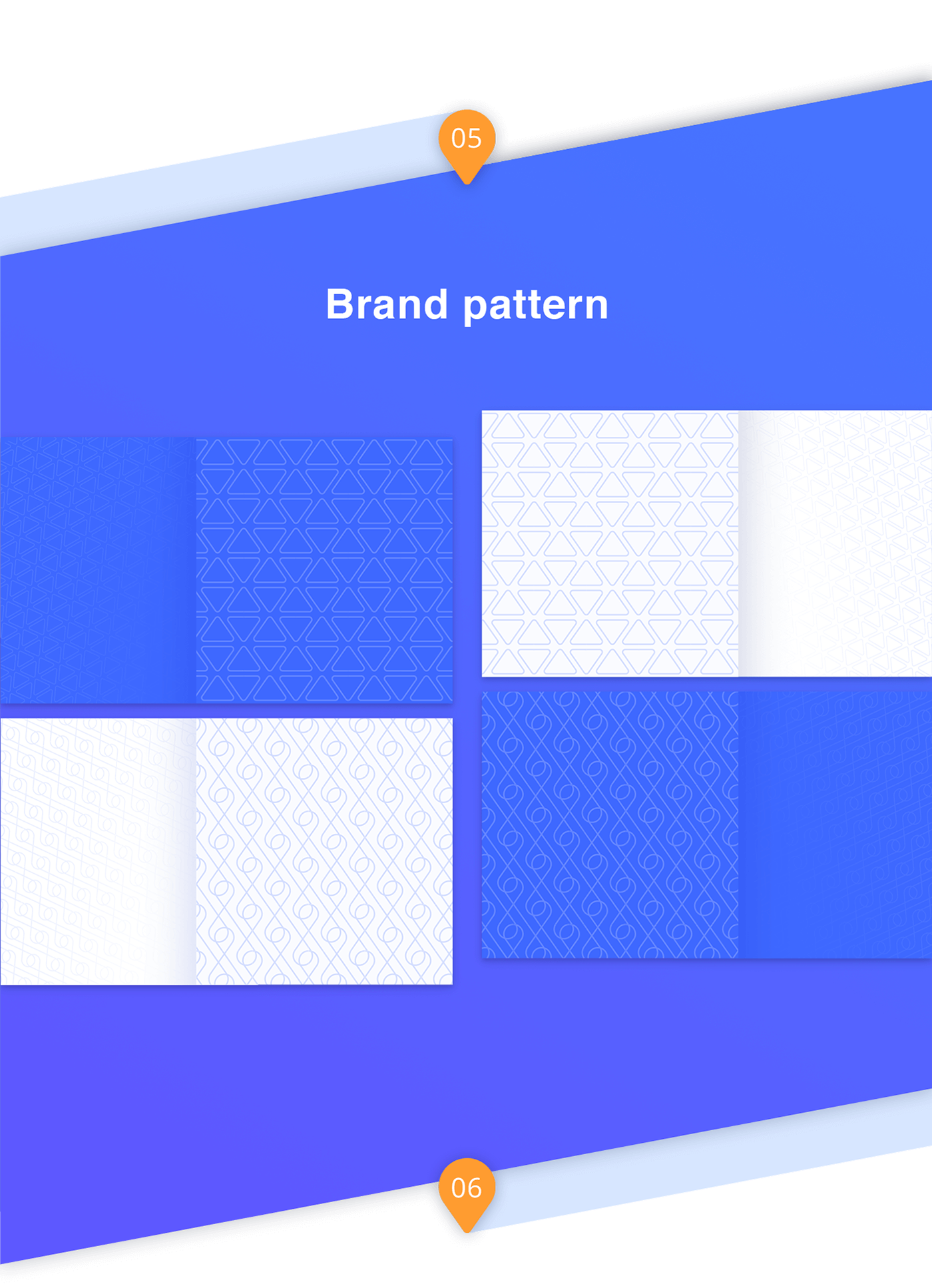
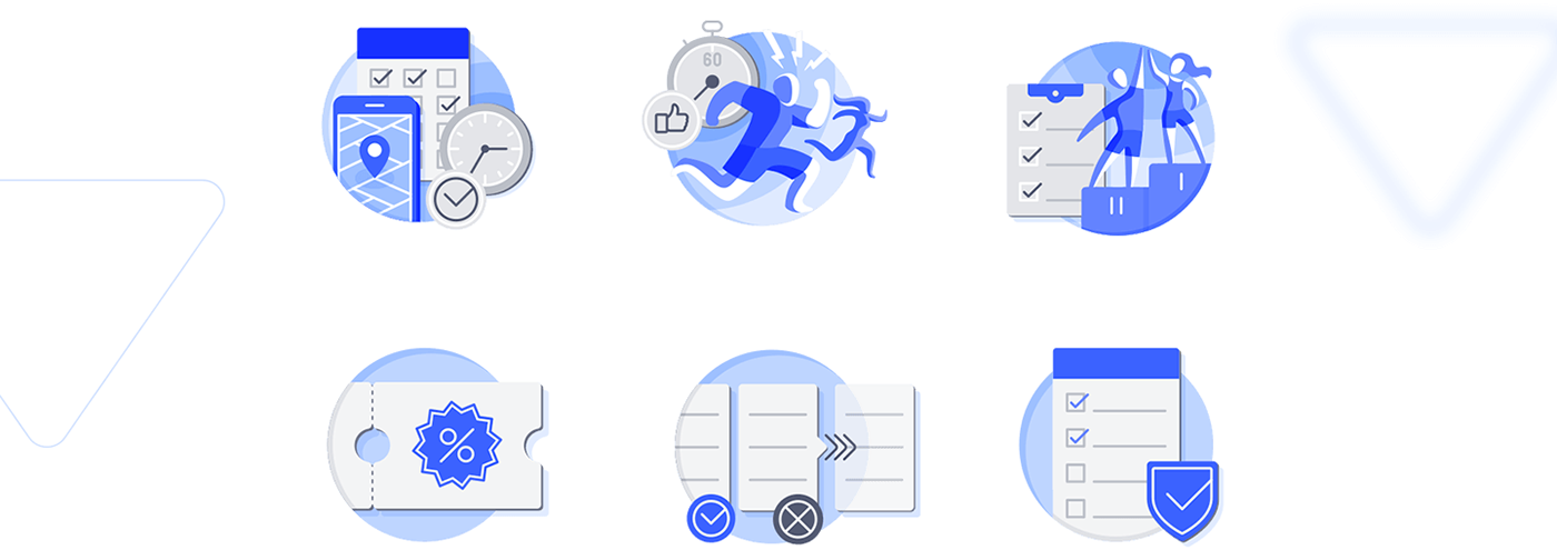
Identity Illustrations
We believe in identity illustrations. Visual content has a substantial emotional impact on users that helps set up the right tone for the product on a marketing website. In the Vyta logo sign, we were keen to achieve a static and dynamic feel, so we used the same approach for illustrations.


Mobile App
There are two products in the Vyta product line: an application for trainers and a separate app for athletes. To make these two applications visually consistent yet make them different at first glance, we chose different color palettes.
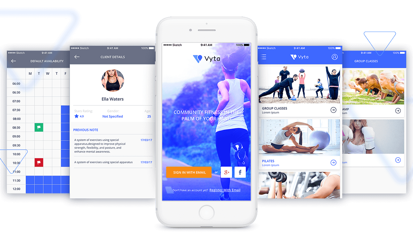
Athlete app

Trainer app


