LOGO • WEBSITE • UX
The Site
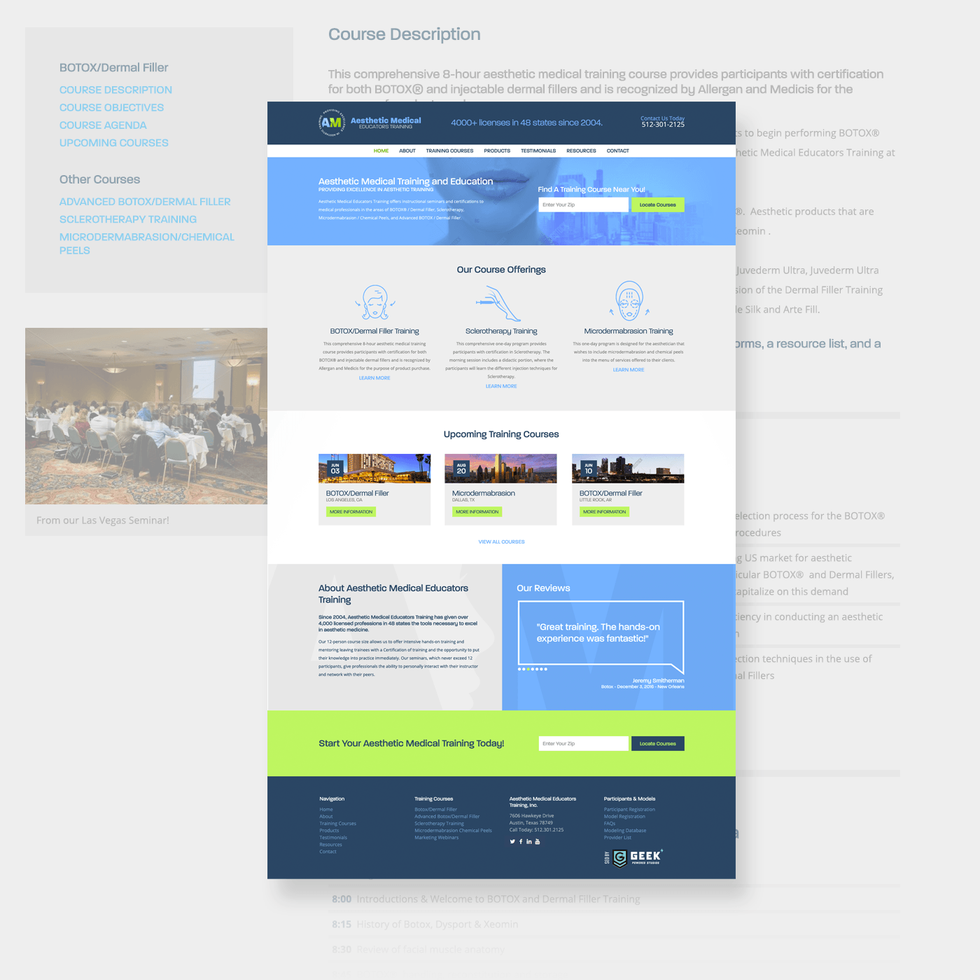
The site was a little challenging from a functionality perspective. The client had multiple types of tickets and users. In the end all were achieved using various Wordpress plugins. Challenges aside this project was successful at improving the clients user experience. The site feels official and trustworthy.

Logos
The client came to us looking for an "official" feeling logo. They mentioned it representing a certification stamp/seal. After multiple iterations we landed on the "AM" inside of the circle with the negative space face on the "M." Below is the logo mark, the horizontal and vertical versions of the logo.