Overview
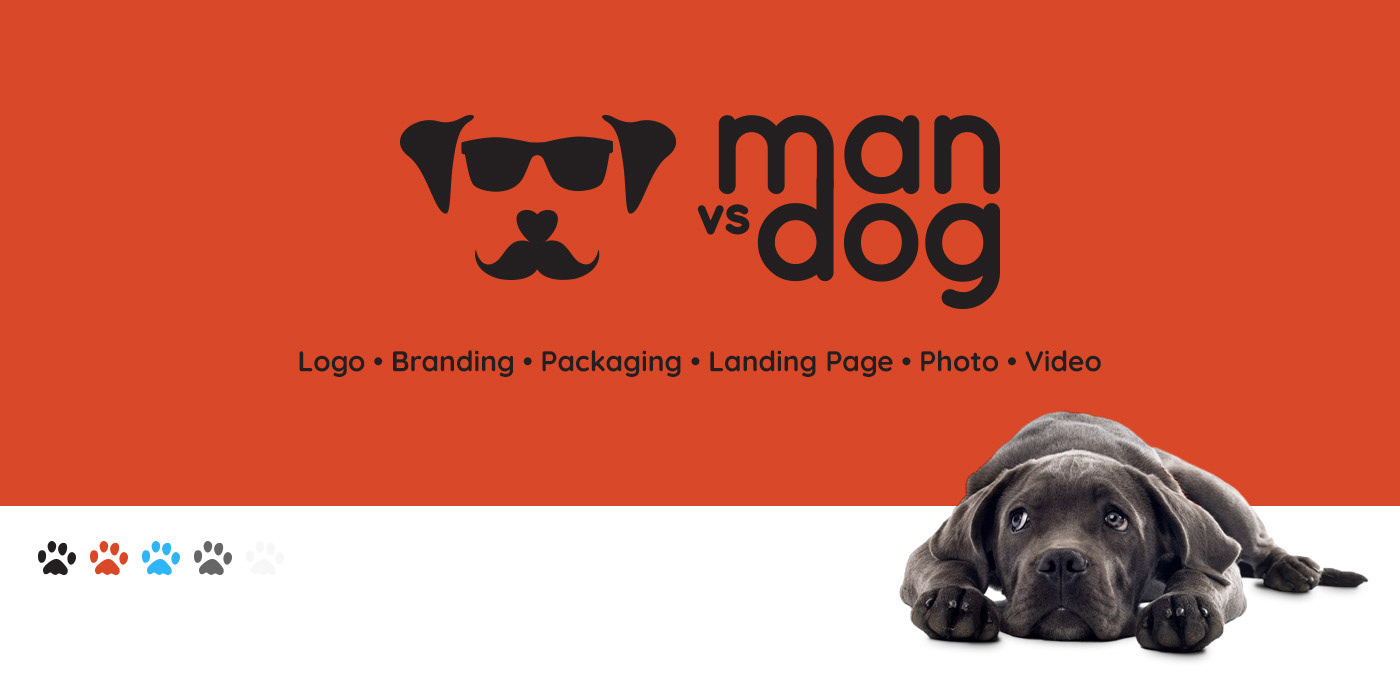
The goal of this project was to brand and create assets for a new subscription box service. The service would sell human and dog treats together. A little for the man and a little for the dog. The client wanted a fun and somewhat trendy logo and aesthetic for the brand. I feel the chosen color pallet definitely speaks to that.
The Logo
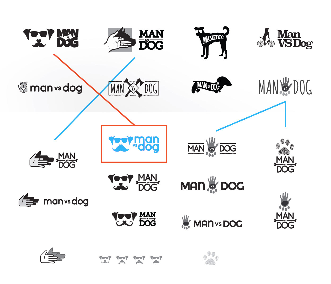
As you can see the logos started off pretty varied in style as the client wasn't totally sure of the direction to take. After the first round I got a little insight into what the client likes and was able to narrow down on the final design. The glasses, the 'stache, the font... It all came together in the end!
Photography & Packaging
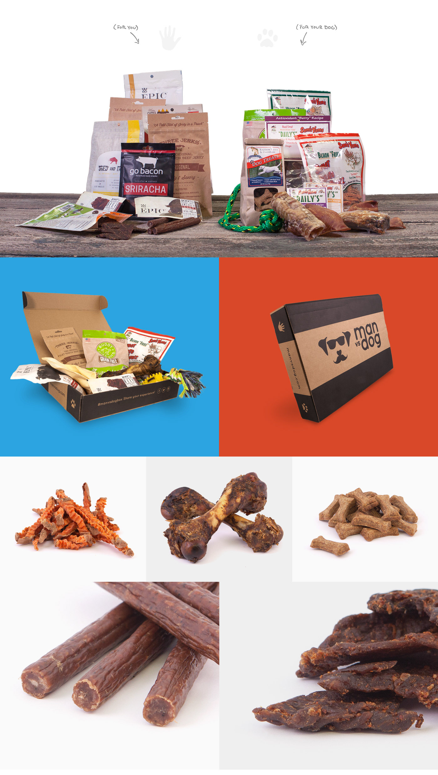
The photo shoot for this project was a lot of fun and a little tasty (lol, no I didn't try the dog treats)! The client wanted both packaged and non-packaged product photos. I used an old fence for the "table" and a white lightbox as a backdrop. The only thing that could have made this better would have been photographing the dogs too!
Landing Page
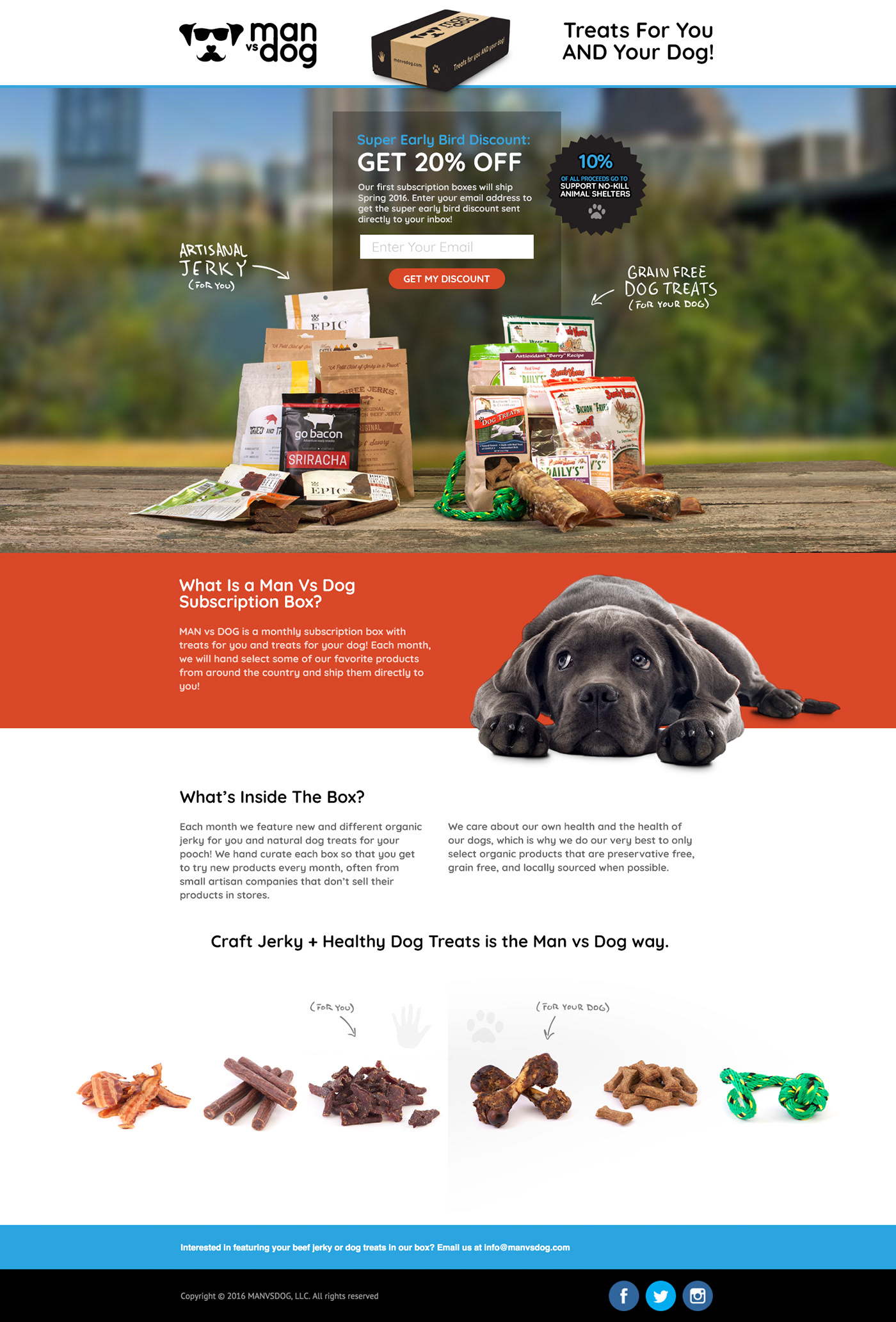
Here you'll see the landing page with which we launched the campaign. I really like how the colors and product photos work together to create a clean and fun look for the client's product. The goal of this page was only to inform users of the product and collect an email list to remarket when the full project is ready to launch.
