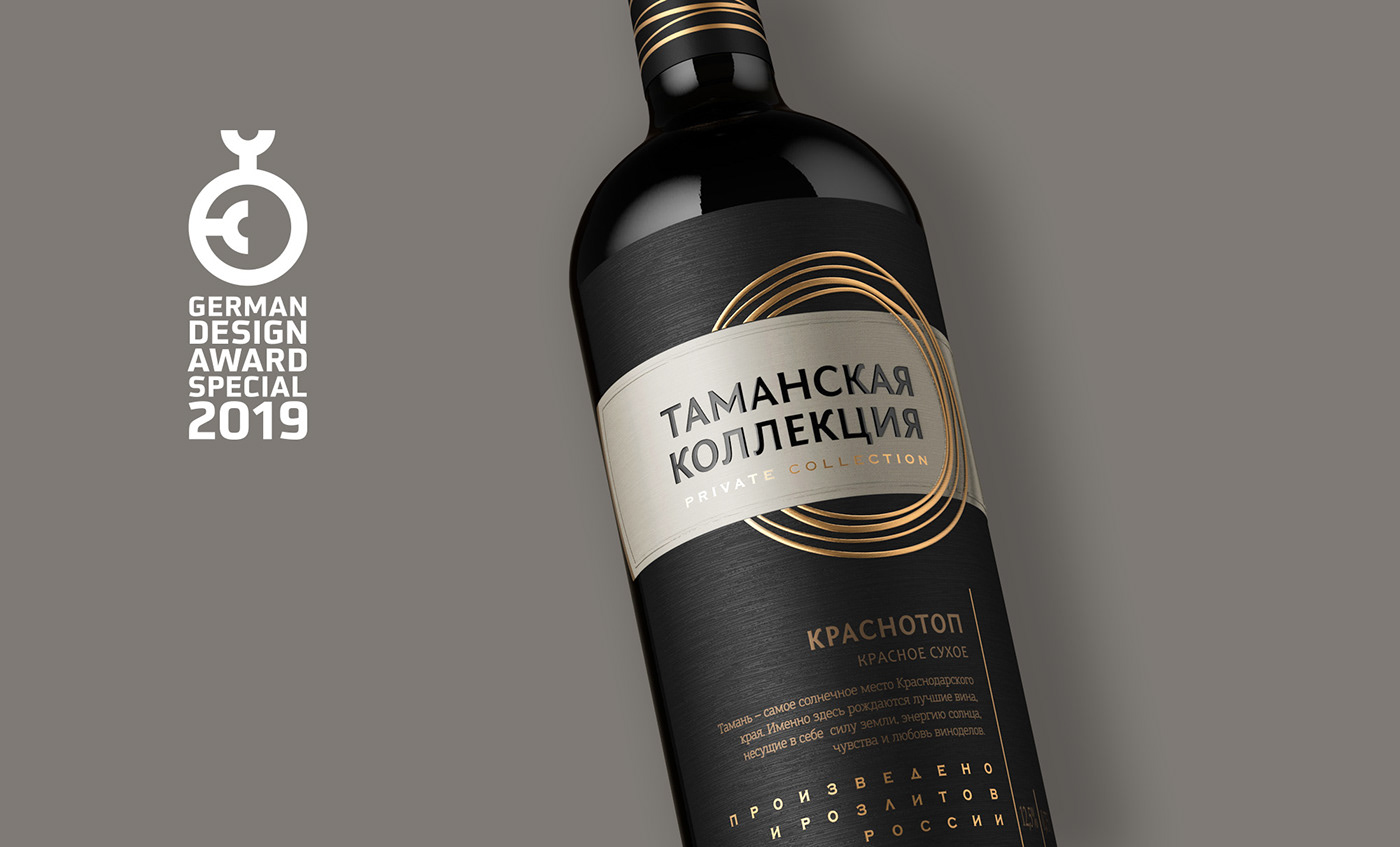
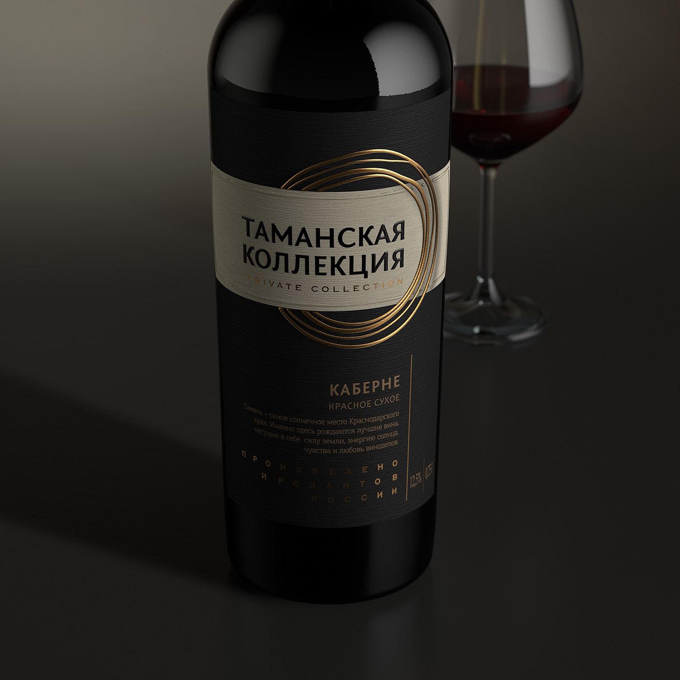
Taman Collection
This project set ShumiLoveDesign agency with the task of creating a contemporary and attractive design aimed at someone living in a big metropolis. In order to make the product look original on the shelf, the visual lexicon had to exclude the traditional images of vineyards, fields, castles and other common elements used in wine packaging design.
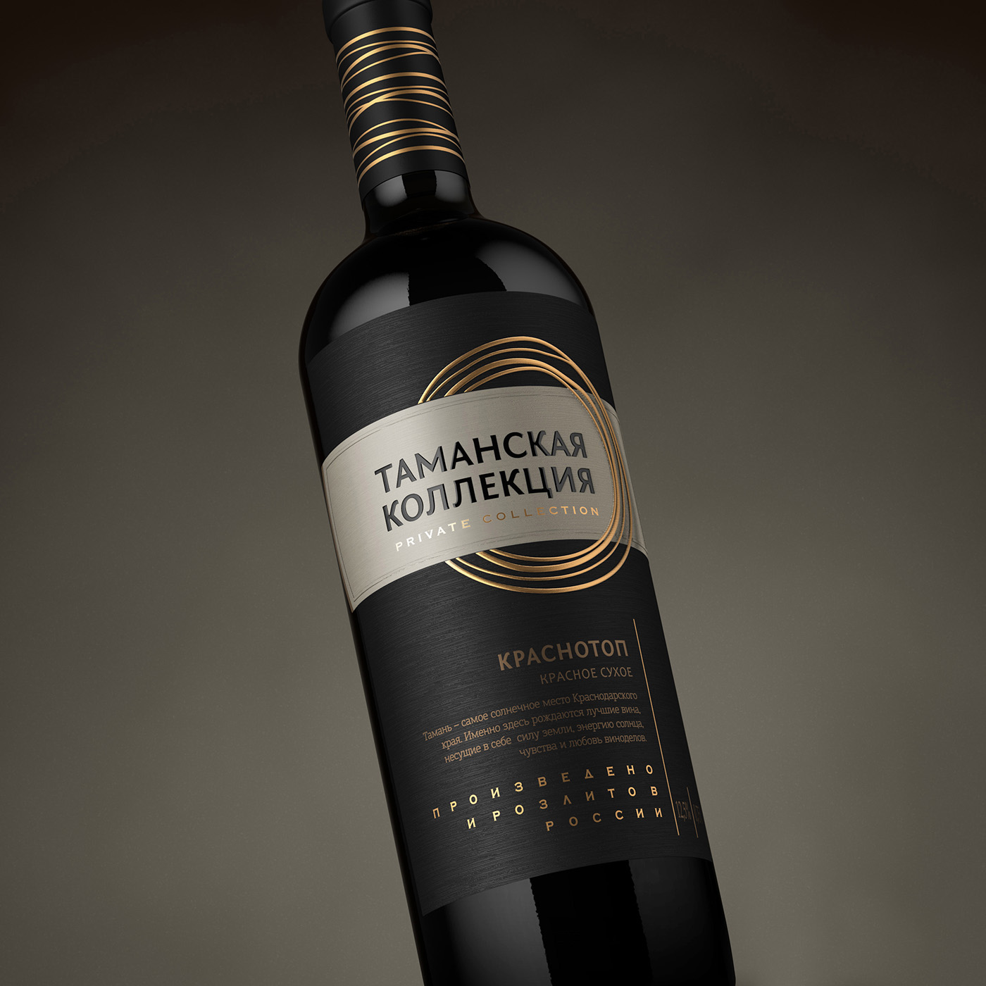
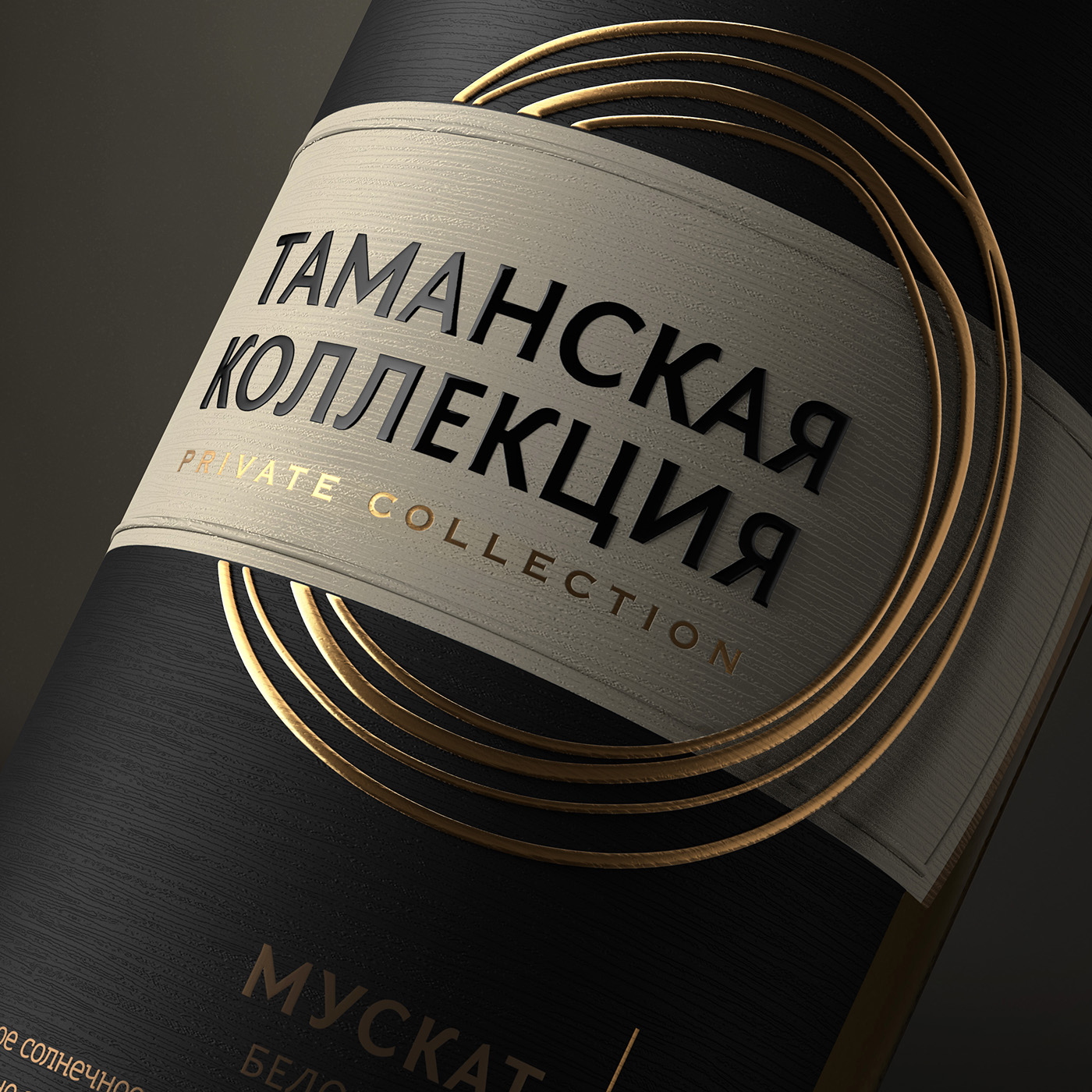
The solution presented by the agency was executed in a modern style, which allows setting the product apart from the majority in its price segment. Strict graphic blocks in mostly black, special type font solutions, and the overall temperance of the composition underline the status of quality wine, which can be appreciated by the potential buyer. The main eye-stopper in this label is the series of golden rings stylized as hand painted strokes, which twine around the label’s central element. The ring theme is repeated in the bottle cap design, which makes the bottle more attractive and brings completeness to the entire composition. Thanks to the use of special artistic paper and particular post-printing techniques, the label looks very modern and voluminously.

В рамках данного проекта перед агентством была поставлена задача разработать современный и привлекательный дизайн, адресованный жителю большого города. Чтобы сделать продукт максимально оригинальным на продуктовой полке, требовалось исключить из визуального лексикона традиционные изображения виноградников, полей, шато, и прочих характерных элементов, столь часто используемых в оформлении винной продукции.
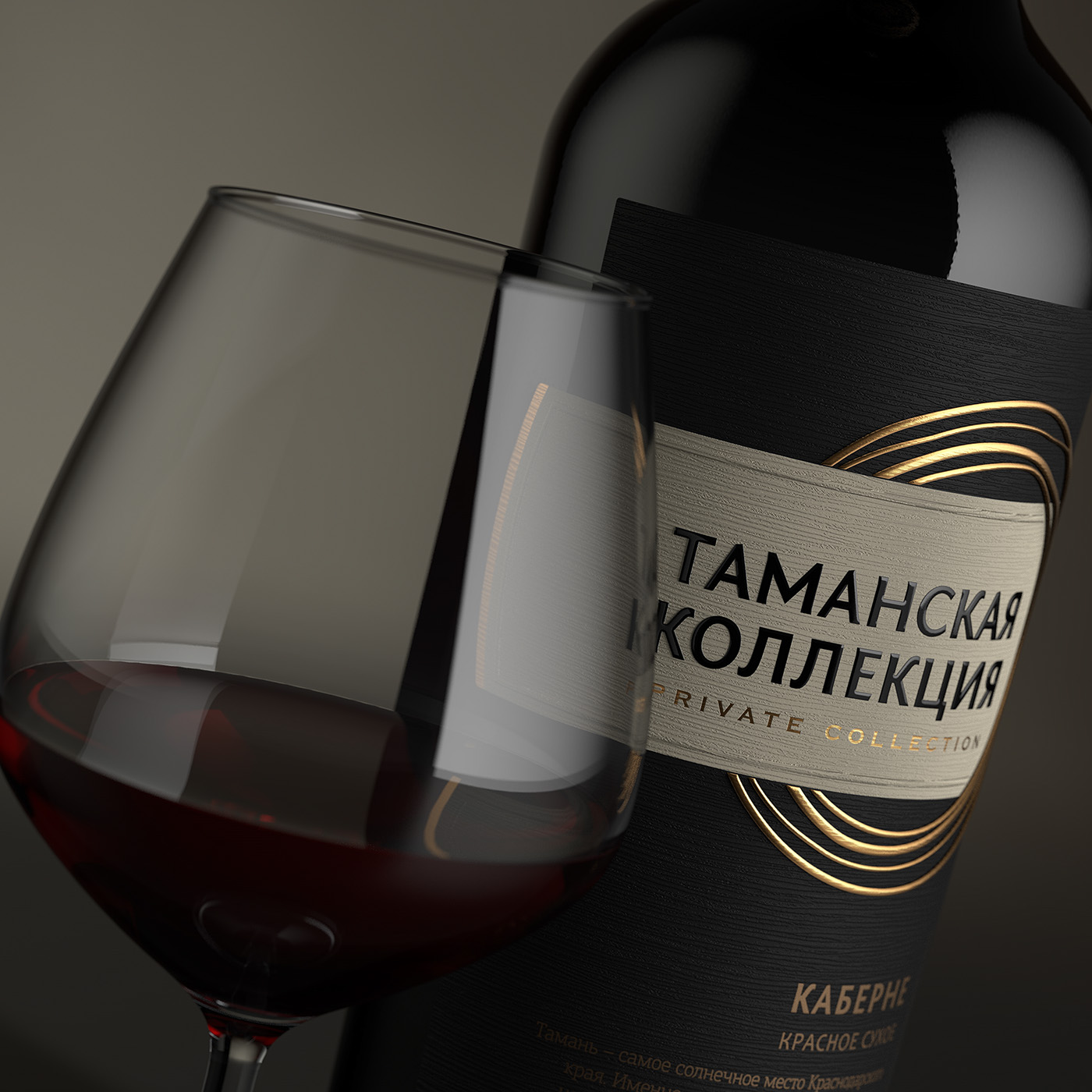
Представленное агентством решение выдержанно в стиле модерн, что позволяет выгодно отличить продукт от большинства конкурентов в данном ценовом сегменте. Строгие графические блоки, в которых преобладает чёрный цвет, особые шрифтовые решения, и общая сдержанность композиции подчёркивают статус качественного вина, которое будет оценено потенциальным потребителем. Главным ай-стопером этикетки выступает серия золотых колец, стилизованных под рукописные штрихи краской, которые обвивают центральный элемент этикетки. Тематика колец также повторяется в оформлении термоусадочного колпачка, что делает бутылку ещё более привлекательной, и придаёт завершённости общей композиции. Благодаря использованию специальной художественной бумаги и особых пост-печатных процессов, этикетка приобретает объёмный, современный характер.

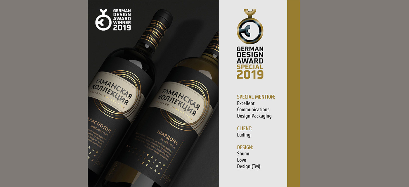
AWARDS:
SPECIAL MENTION:
Packaging / Excellent Communications Design
Jury statement:
Here, a graphic element winds itself around a label and the neck of a bottle like a copper wire, making the otherwise clear and minimalist design unmistakable and giving it an exclusive look and feel.
3D visualization by Maxim Kulikov


