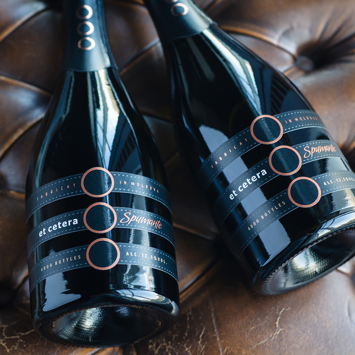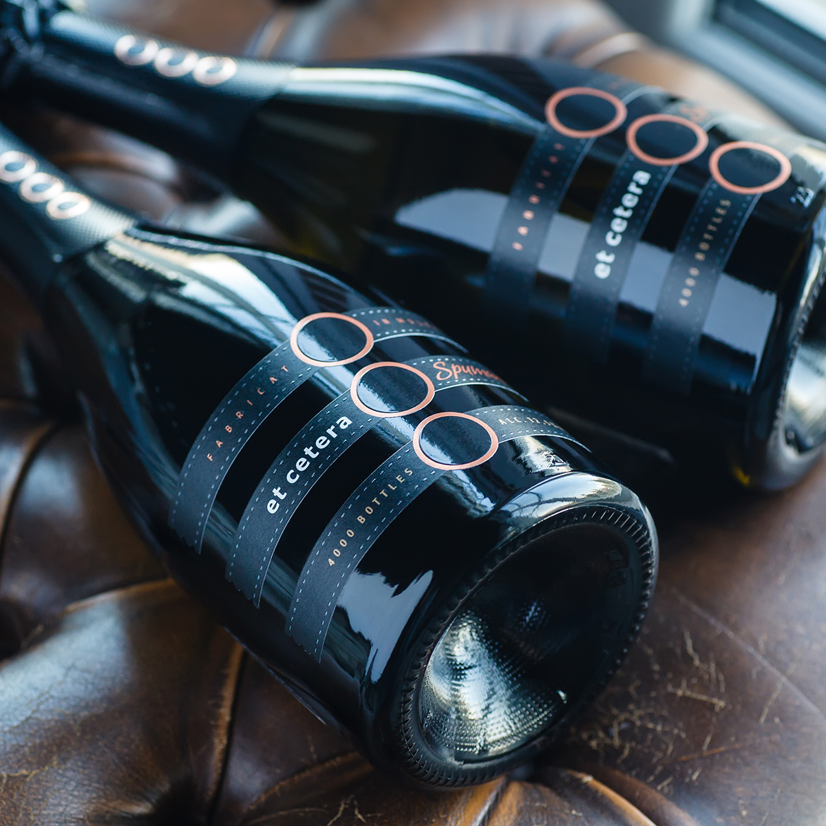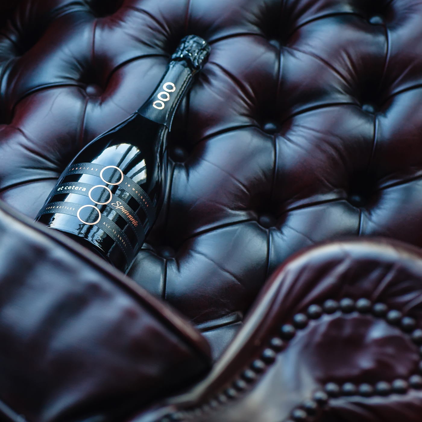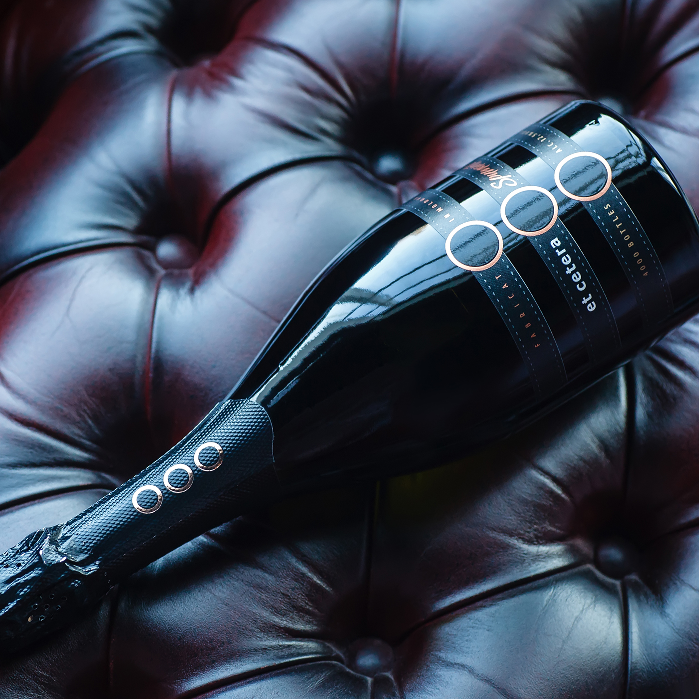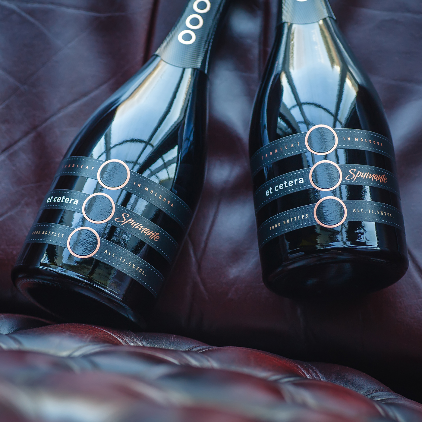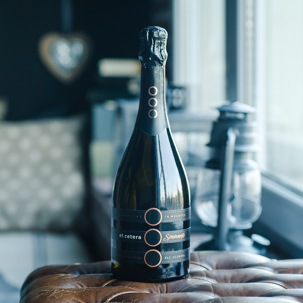
The elegance, refinement and noble feel of the product was embodied in the exclusive packaging design created by ShumiLoveDesign agency. In order to reflect the unique character of the solution, a special visual approach was required. This is why this project is highlighted in an additional photo set.
Since this was the very first sparkling wine produced by an established local winery, the packaging solution had to be both daring and confined to the common brand style developed for the company. The common ellipsis sign still acts as the highlight of the visual composition, yet it’s the three-part label construction that makes the whole packaging look different from the other products in the range.
The fine interplay of the dark textured lines of the label and the dark glass required a different approach for presenting the project to its maximum visual capacity. That is why the bottles were shot using natural light only, which made the packaging look the closest to its typical handling environment as possible.