Global Bank Transfers,
Faster than Email
Wyre is an enterprise-level API which allows companies to instantly send funds worldwide without taking on any price volatility and for a fraction of the cost.
The ultimate task was to re-brand Snapcard as Wyre and design a dynamic branding language yet reflecting a trustworthy and stable feeling.
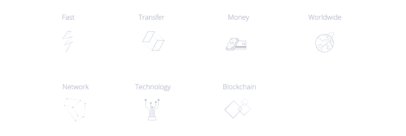
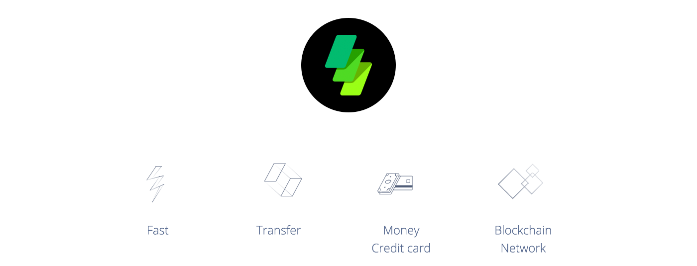
Brand Attributes
Each branding process starts with an understanding of a product's uniqueness and value.
To help a client figure out core values that need to be reflected in branding, we do an exercise with attributes. We brainstorm and write down as many attributes as possible and then select a few items that work the best.
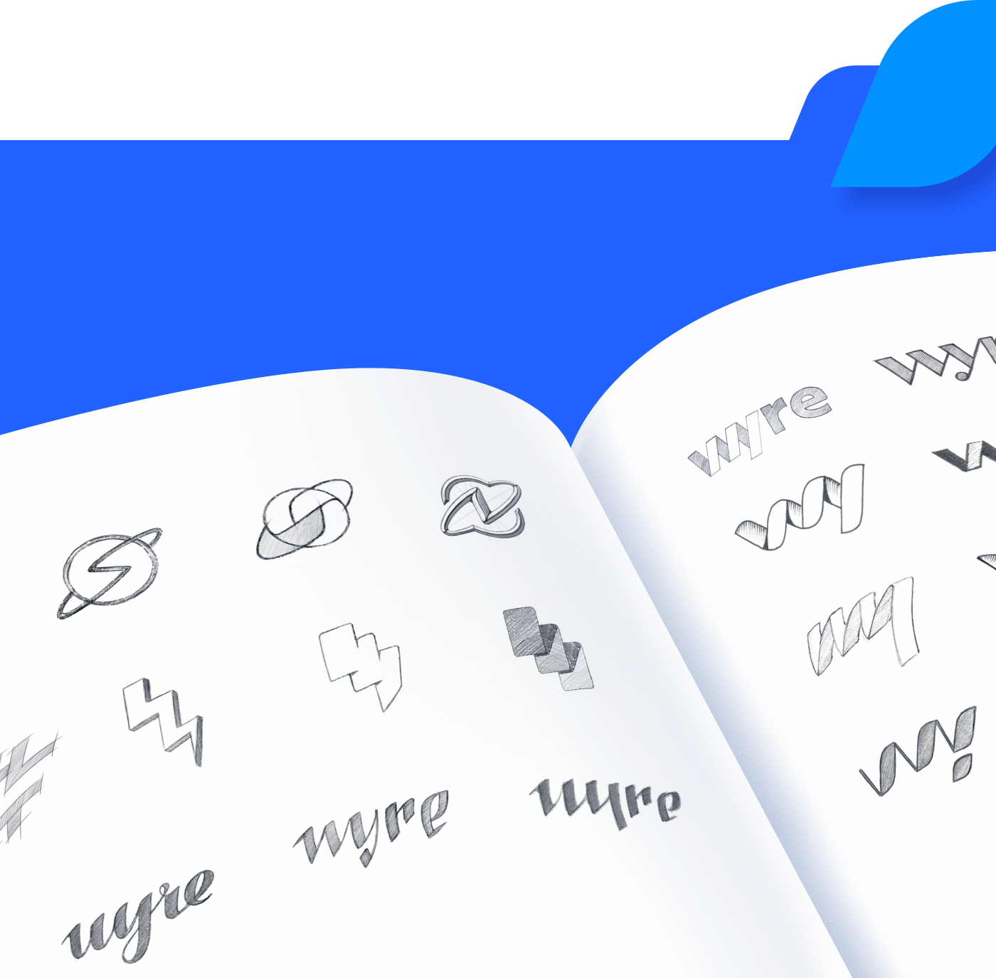
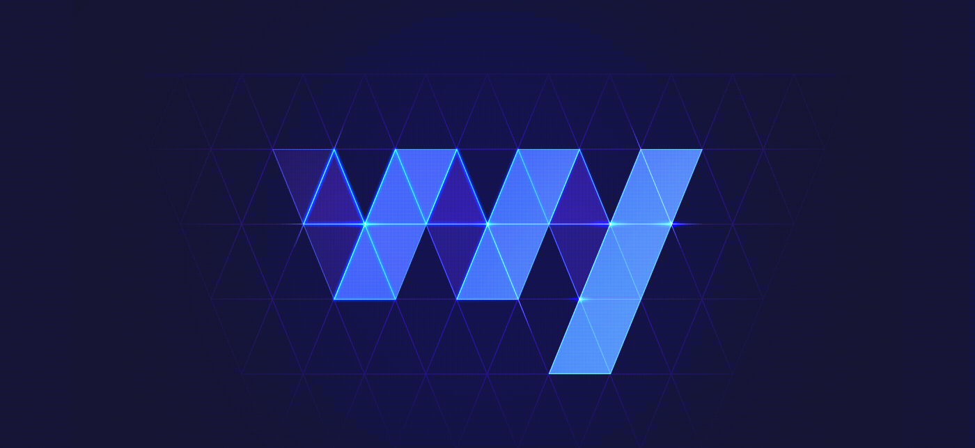
Exploring Directions
We quickly found a few promising directions. Next, we spent time exploring a few selected directions, testing them to make sure our final decision was justified.
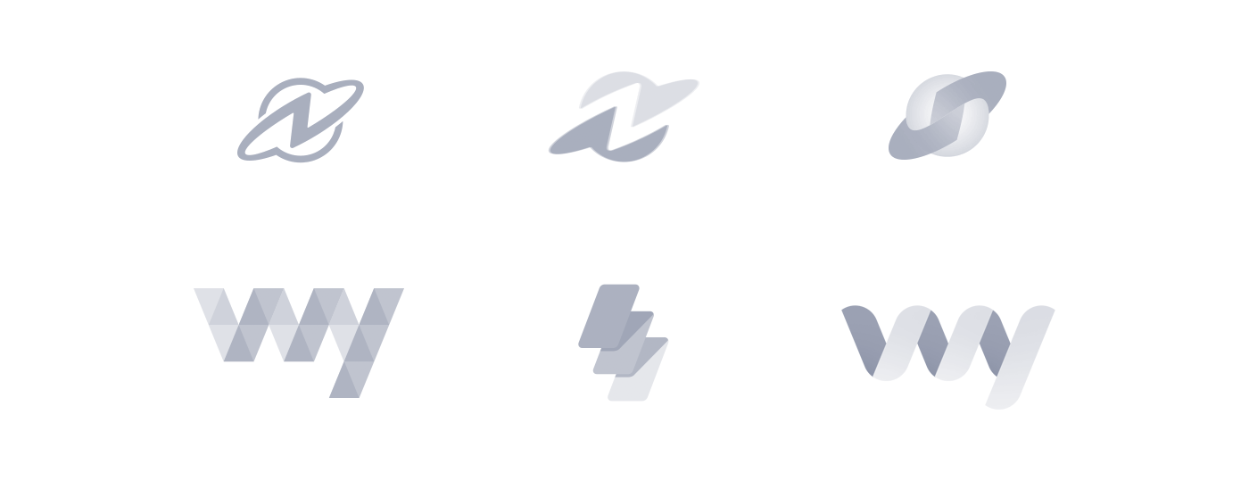
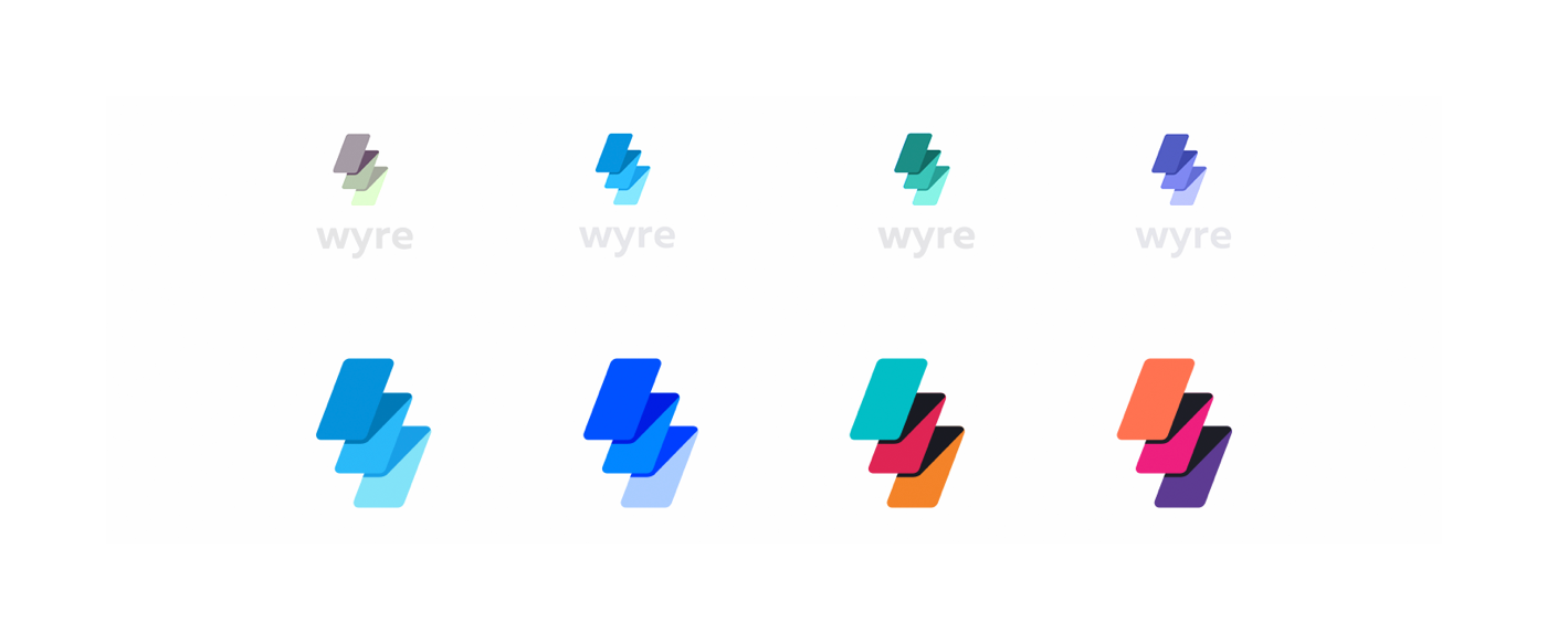
Evolving the Chosen Option
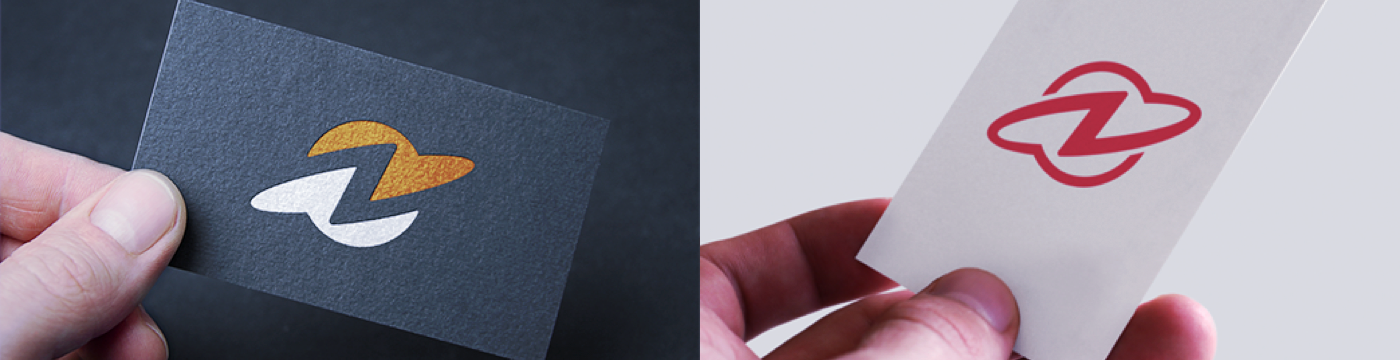
After all testing and discussion, we made a important decision to evolve the direction with a stack of cards. This option had the best potential and reflected the logic of how the product works. This is the most crucial moment in each branding process.
Color Palette Explorations
Shape Polishing

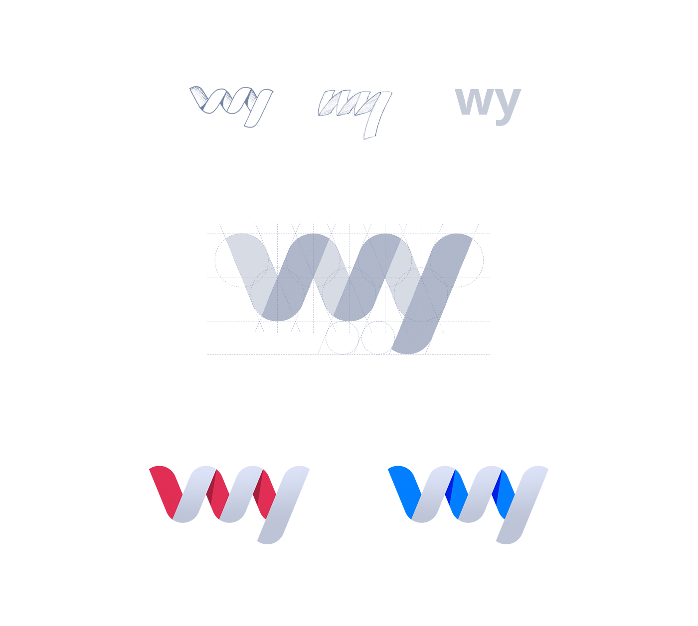
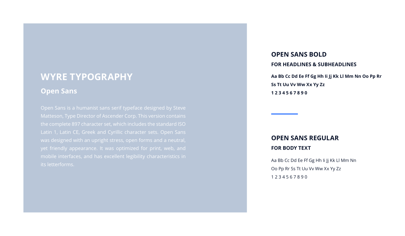
Typography Research
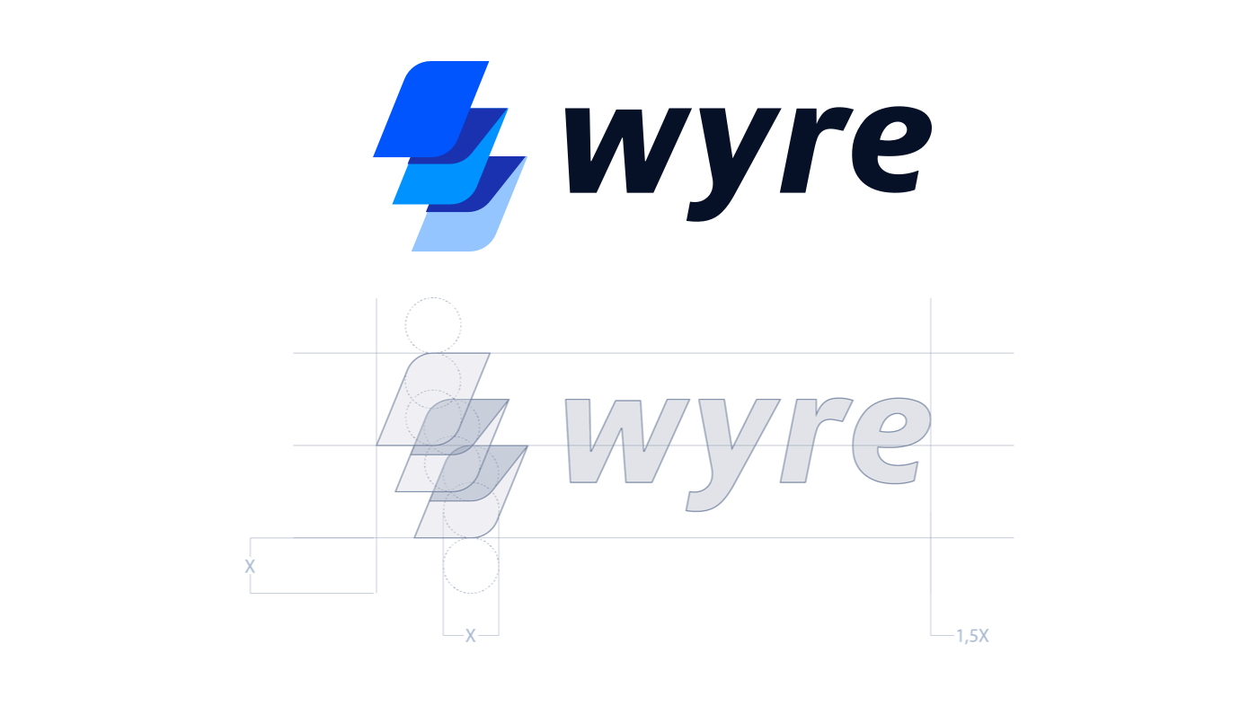
After the logo sign was ready, we started working on the word mark. On this step it's important to maintain consistency between the sign and the word mark elements. Everything matters: the roundness of corners, incline, and rhythm.
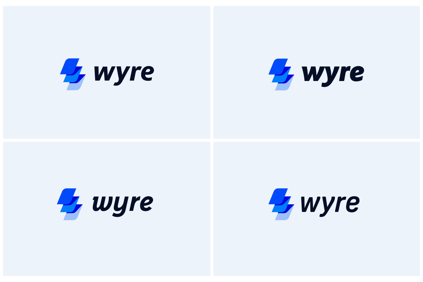
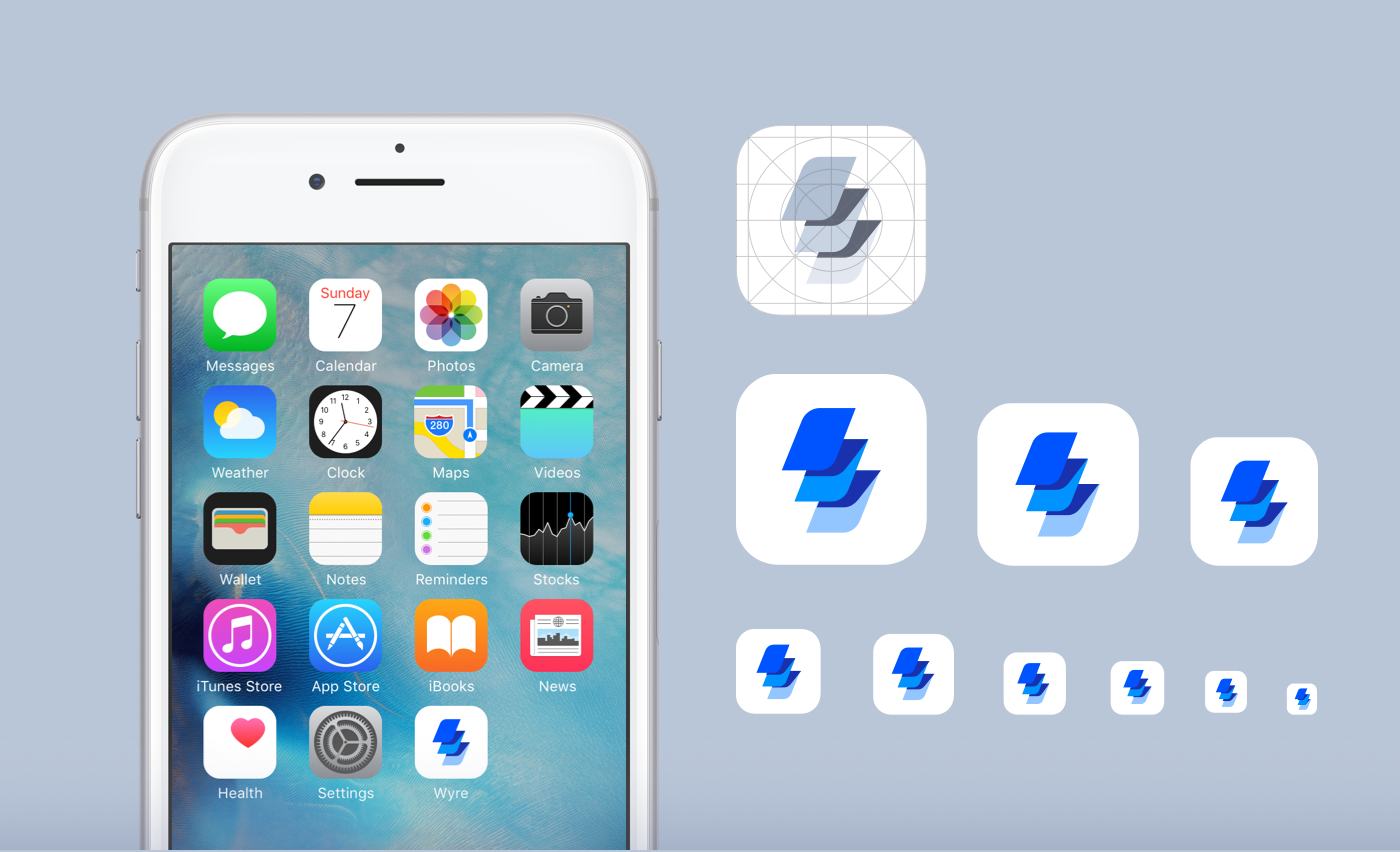
Finalizing the Logo
Final polishing is one of the most meticulous steps in our branding workflow.
We use our own grid system, based on the Fibonacci sequence that always leads to high quality results.
Brandbook Stage
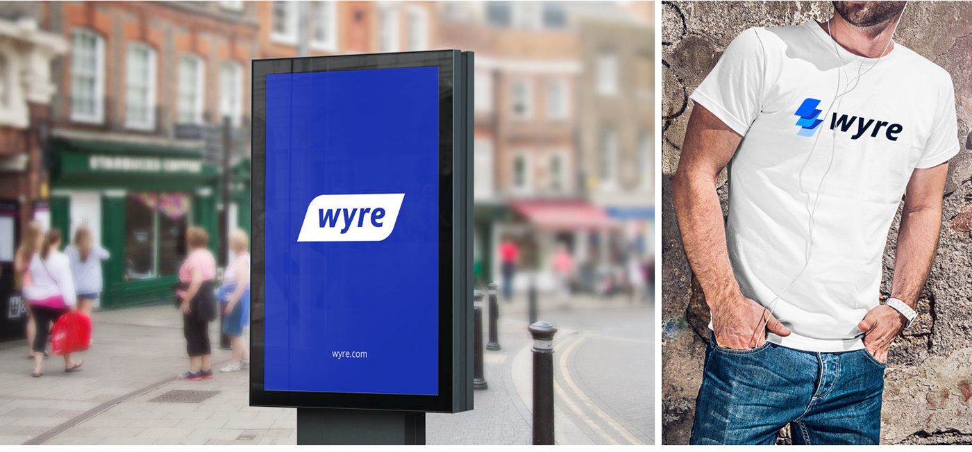
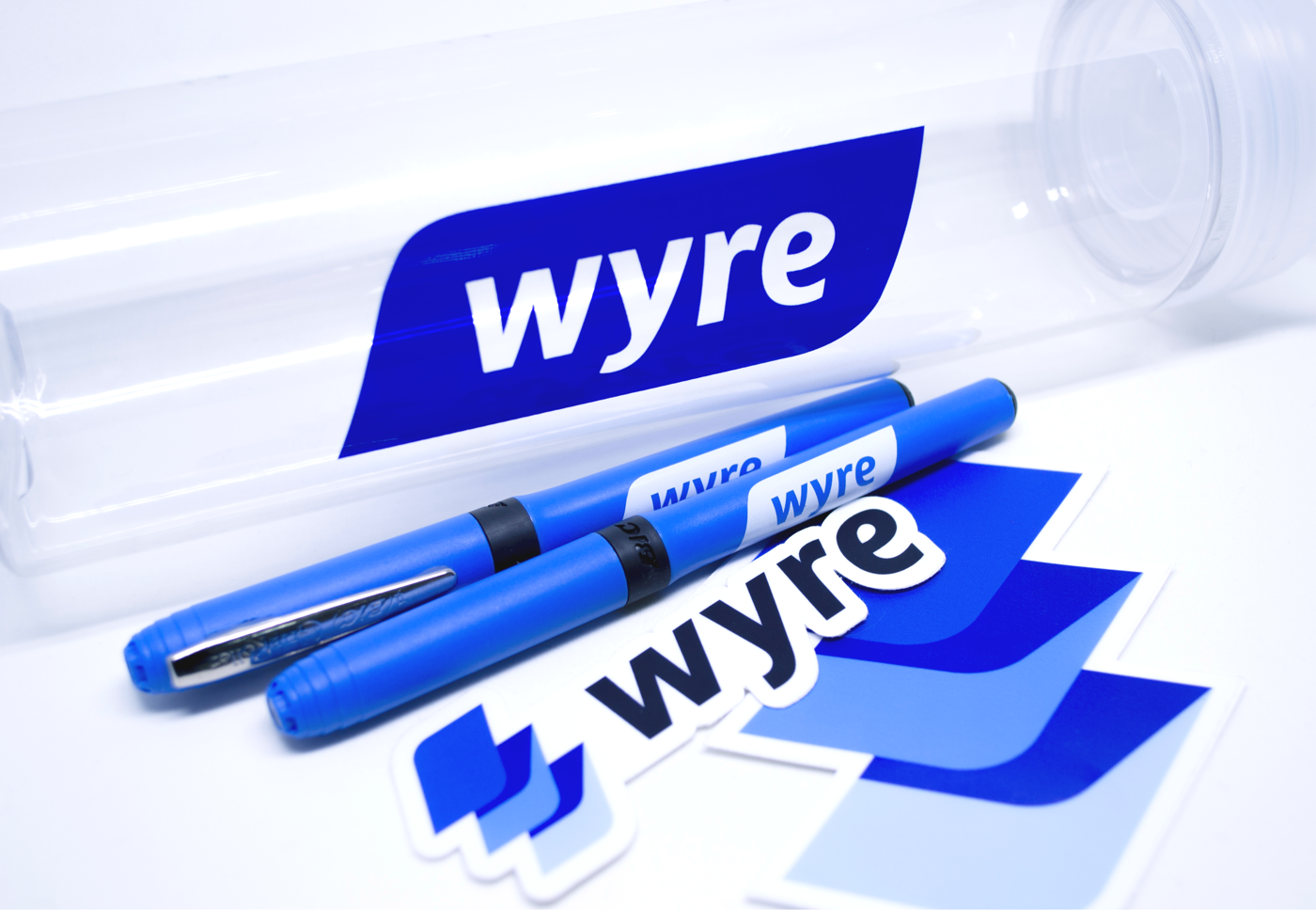
As a final step, we prepared a brand book and style guides. We believe that branding language is a powerful marketing weapon. However, the stronger the weapon is, the more important it is to follow the rules for using it.
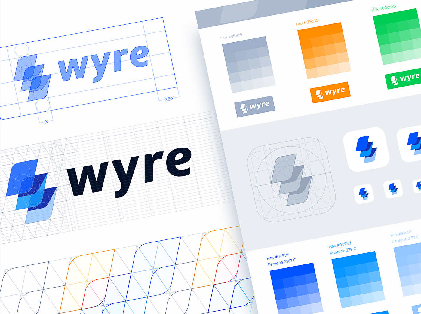
Wordmark Single Usage

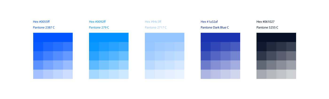
Colors and Sub-tones
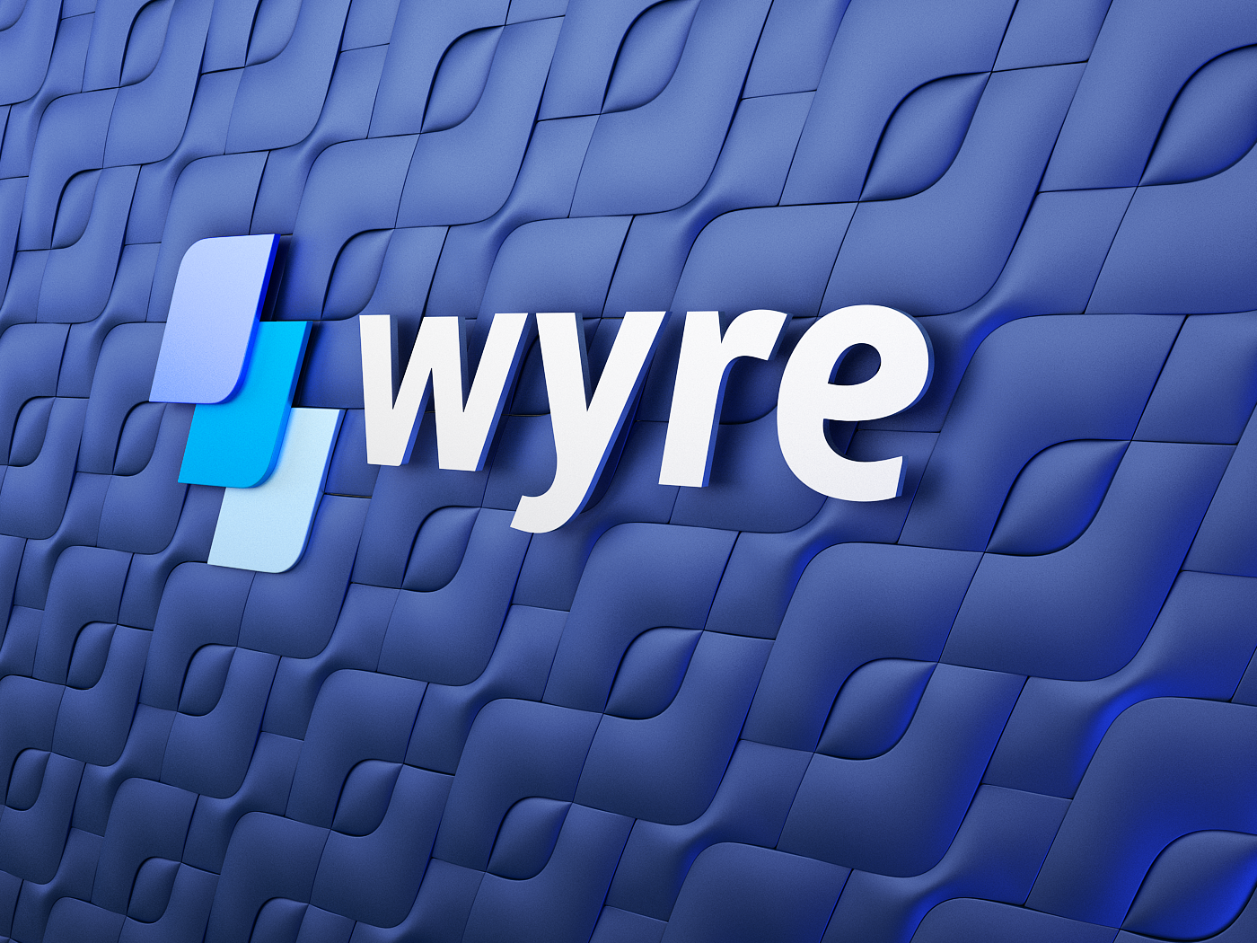
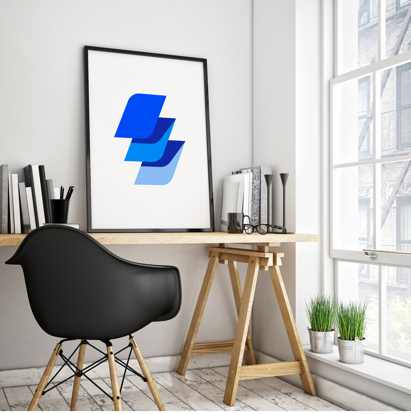
Application Icon
Recommended Typeface
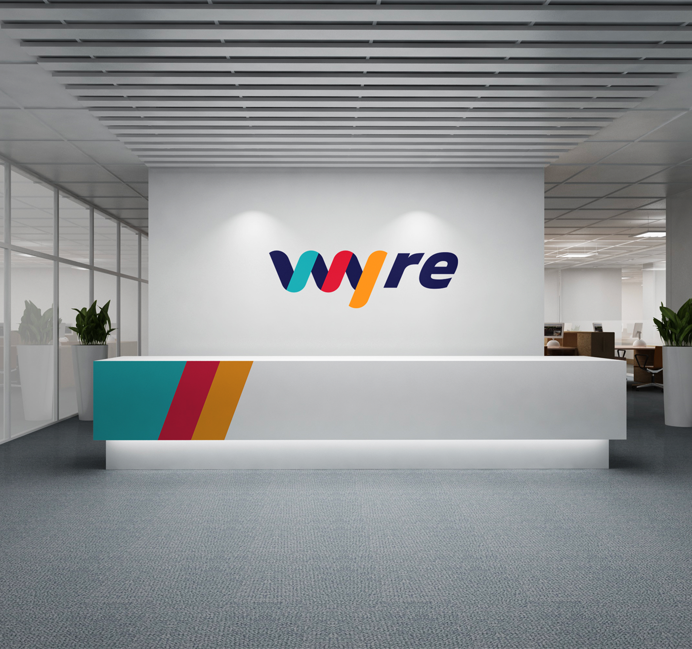
Examples of Branding Usage