E T C E T E R A P R E M I U M
Complex redesign of Et Cetera trademark / design concept development / label design / pre-press

This brand was developed by the agency’s specialists in 2008 and since then has garnered notoriety both on the domestic and international market. Back at that time, the trademark looked original, premium, and different from everything presented on the product shelves. However, since then the market has seen the introduction of many new players in the signature wine niche, characterized by bright and attractive visuals, which made the Et Cetera brand somewhat lost in the competition. So the agency’s task for this project was to create an original, vivid and attractive design, relevant to the current competitive environment, while retaining the recognizability, the brand’s DNA.
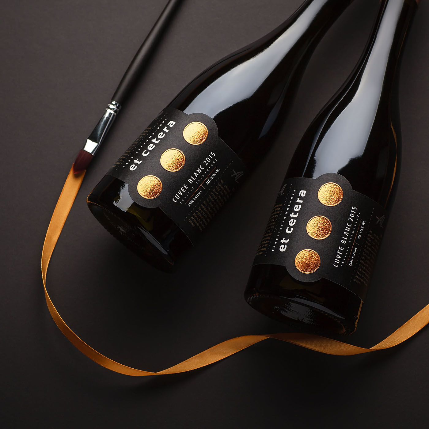
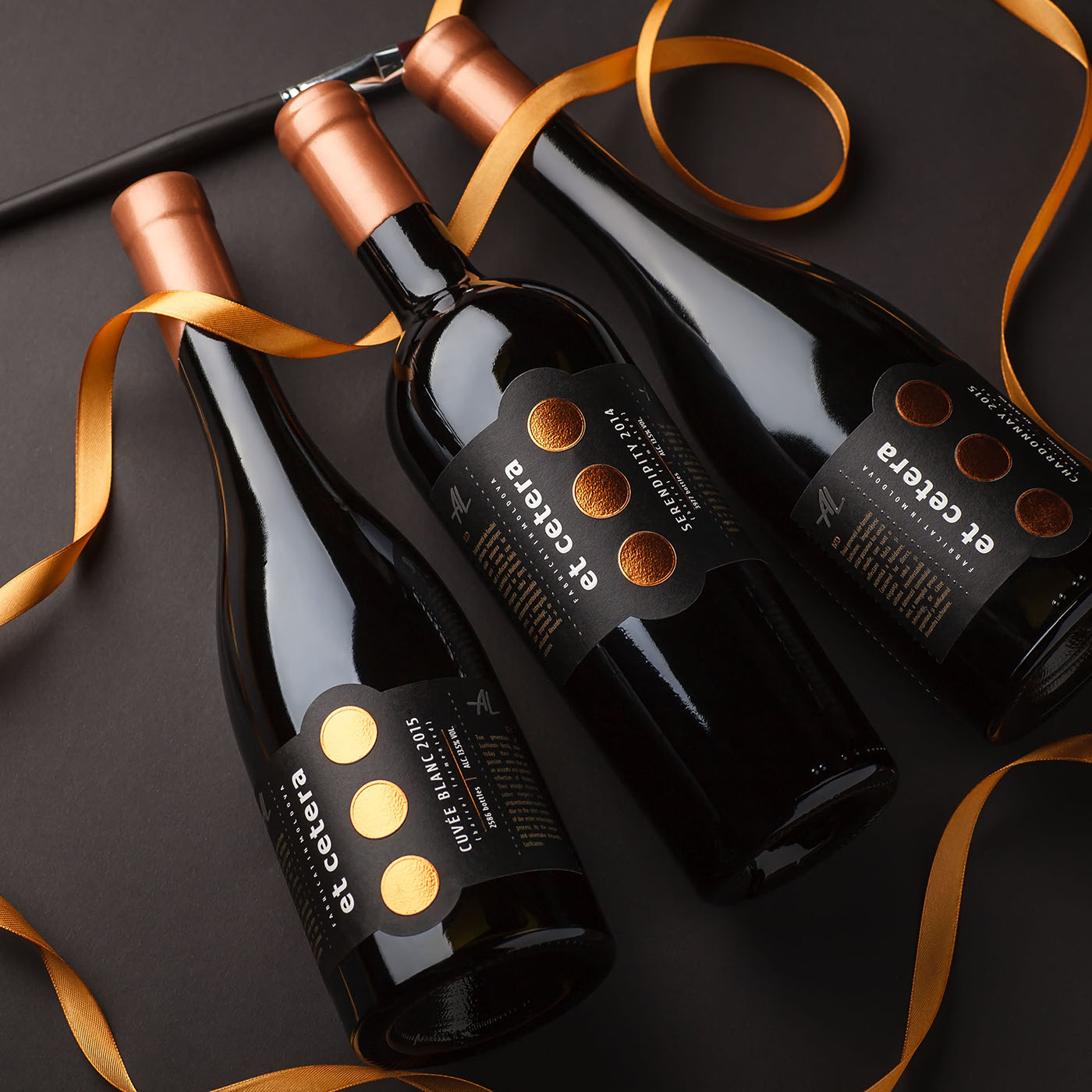
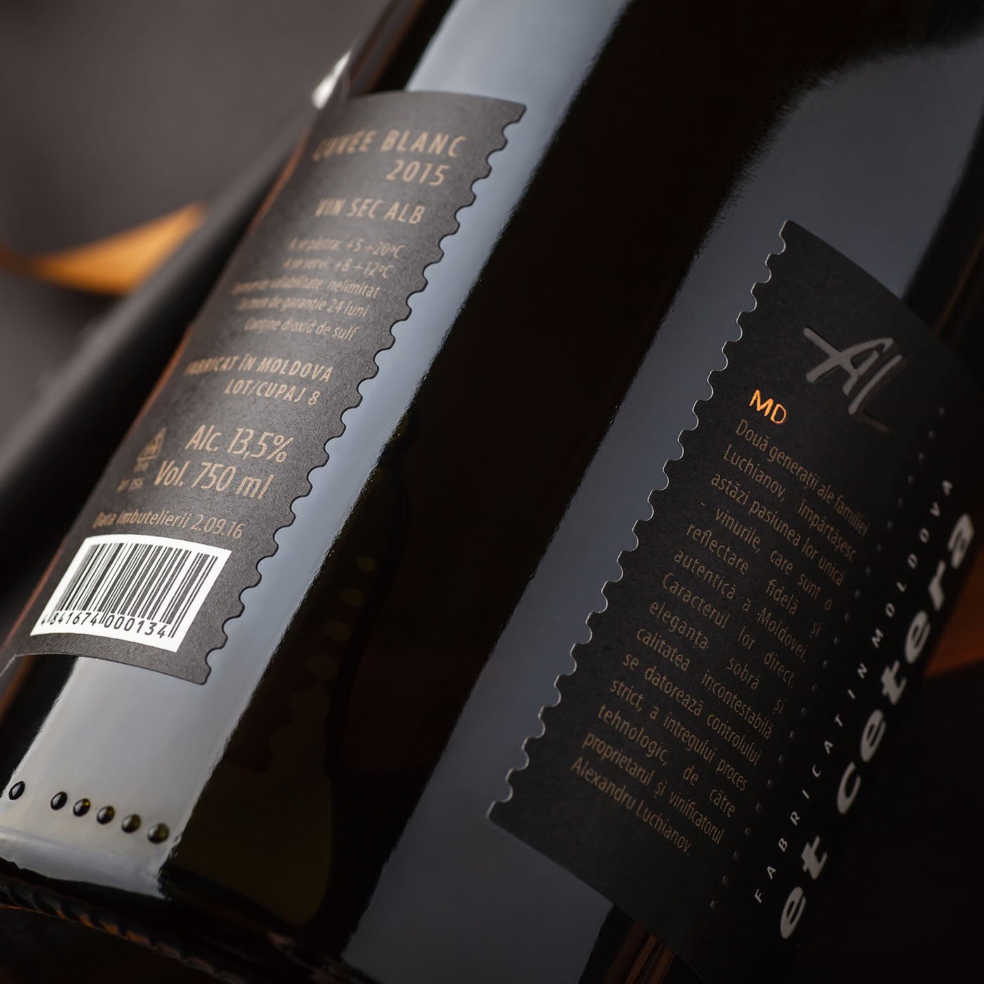
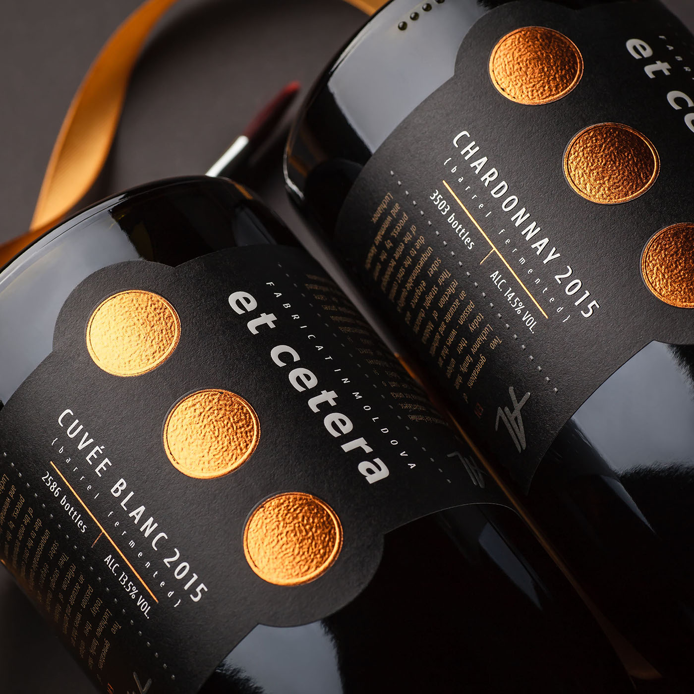
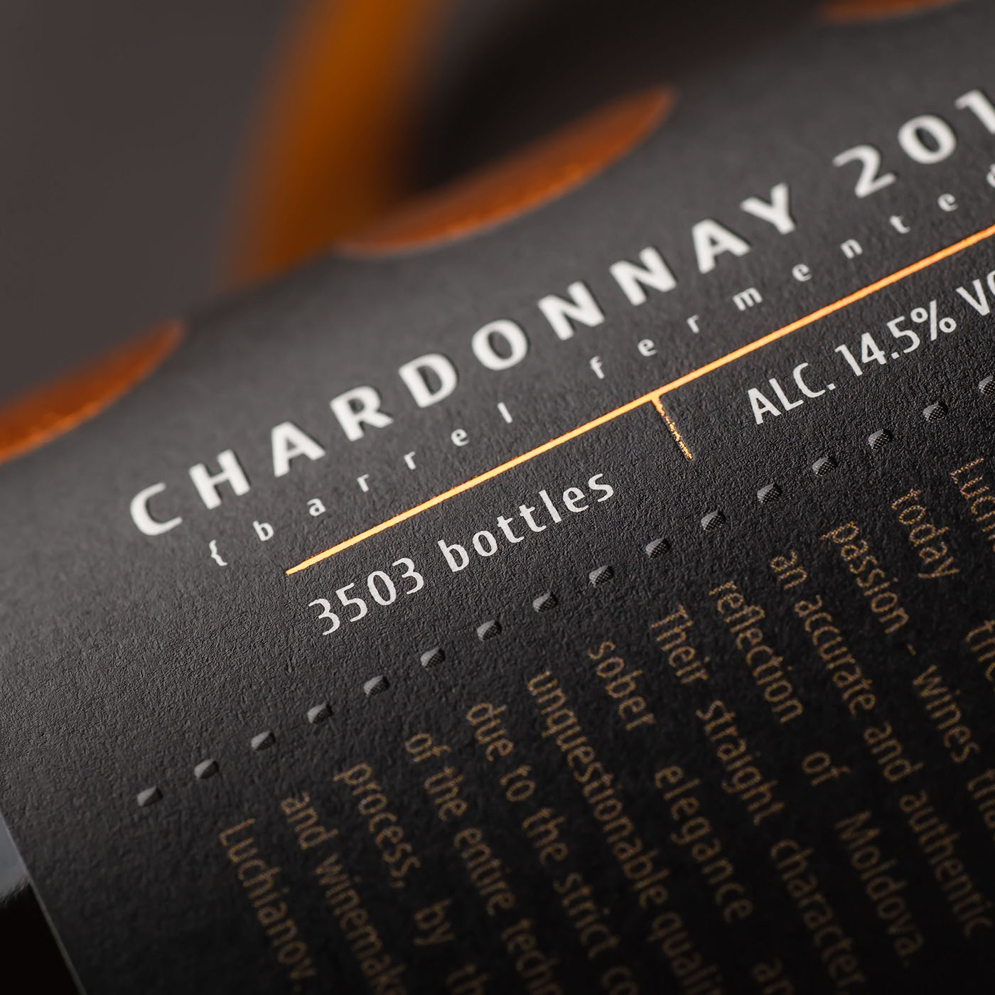
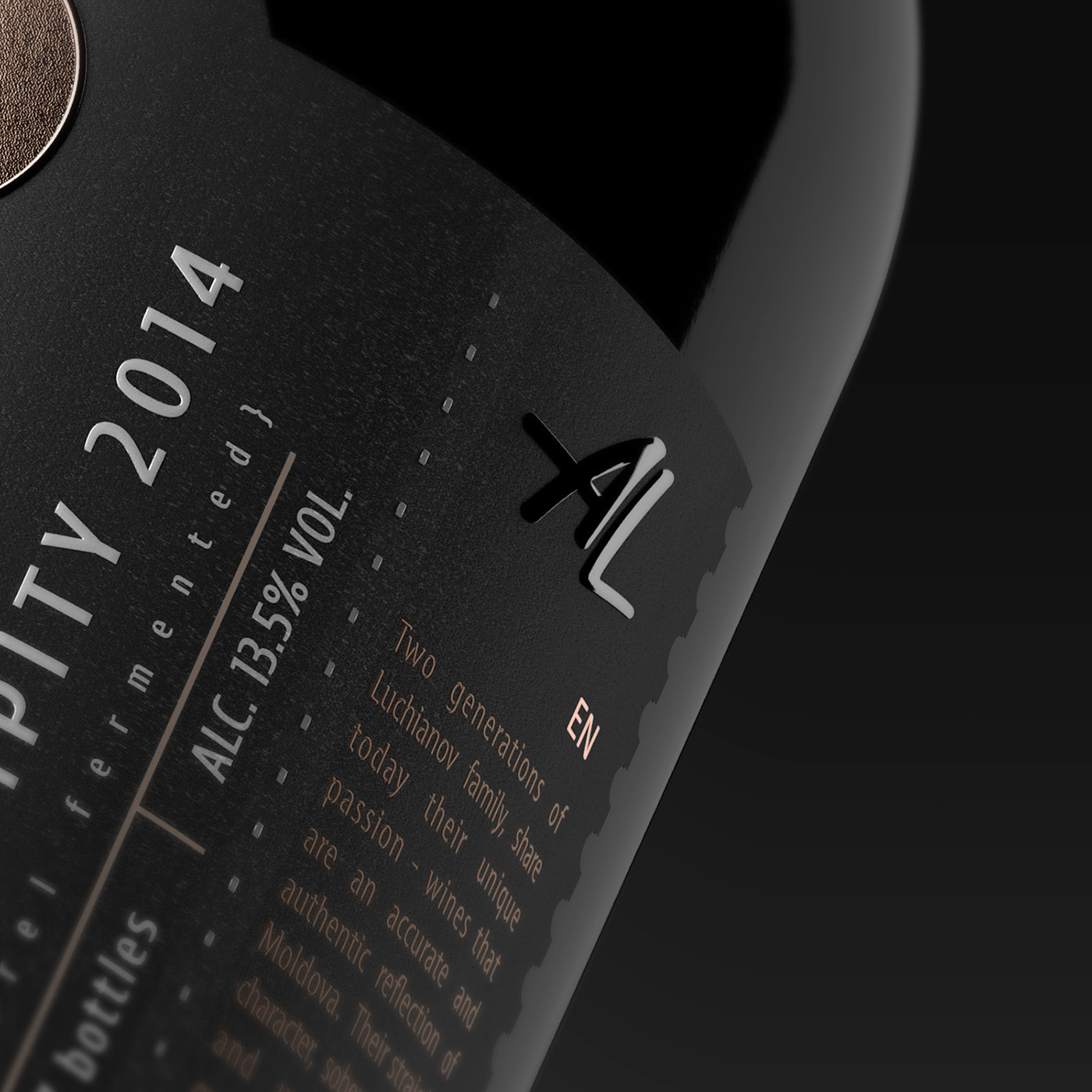
The main step in the brand’s renewal was the change in bottle form and an original corking with wax, which make the product stand out and attract the consumer’s attention. The label design was also subject to substantial changes. First of all, one should note the new color scheme – black field and bronze elements – that looks temperate, stylish, and gives an instant impression of the product’s high level. While the label doesn’t wrap the bottle entirely, still the front and back labels are merged into one, which allows the label to work effectively regardless of the side the bottle is facing at the moment.
The main visual accent was placed on the style-forming element of the trademark – the ellipsis sign – which was enlarged in order to emphasize the brand identification. The employed printing and post-printing techniques as well as the choice of artistic paper, all emphasize the product’s premium level and its exclusivity.

Представленный бренд был разработан специалистами агентства в 2008 году и с тех пор заслужил признание, как и на местном, так и международном рынке. На время разработки, торговая марка выглядела оригинально, премиально, и выгодно отличалась от всего, что было представлено на продуктовых полках. Однако, с тех пор на рынке появилось немало игроков в категории авторских вин, с ярким и привлекательным оформлением, и с визуальной точки зрения бренд Et Cetera начал теряться среди конкурентов. Создать оригинальный, яркий, и привлекающий внимание дизайн, актуальный для нынешней конкурентной среды, при этом сохранив узнаваемость, ДНК бренда – таковой была задача агентства в этом проекте.
Главным шагом при обновлении бренда в целом стала смена формы бутылки и оригинальная укупорка сургучом, которые сразу же выделяют продукт на полке и привлекают к себе внимание потребителя. Дизайн этикетки так же претерпел кардинальные изменения. Прежде всего стоит отметить новую цветовую гамму – черное поле и бронзовые элементы – которая выглядит сдержано, стильно, и сразу даёт понять о высоком уровне продукта. Хотя этикетка и не обхватывает бутылку полностью по окружности, тем не менее лицевая и контр-этикетка соединены в одно целое, что позволяет этикетке работать одинаково эффективно независимо от того, какой стороной повёрнута бутылка.
Главный визуальный акцент был поставлен на стилеобразующем элементе торговой марки – знаке троеточия – который был увеличен с целью ещё более яркой идентификации бренда. Используемые печатные и пост печатные техники, а также подбор художественной бумаги, подчёркивают премиальность и дороговизну продукта.


Branding, identity, packaging design & post production by SHUMI LOVE DESIGN (TM)
3D visualization by Maxim Kulikov
Photography by Kirill Zmurciuk


