D O N C H I K U
T E Q U I L A
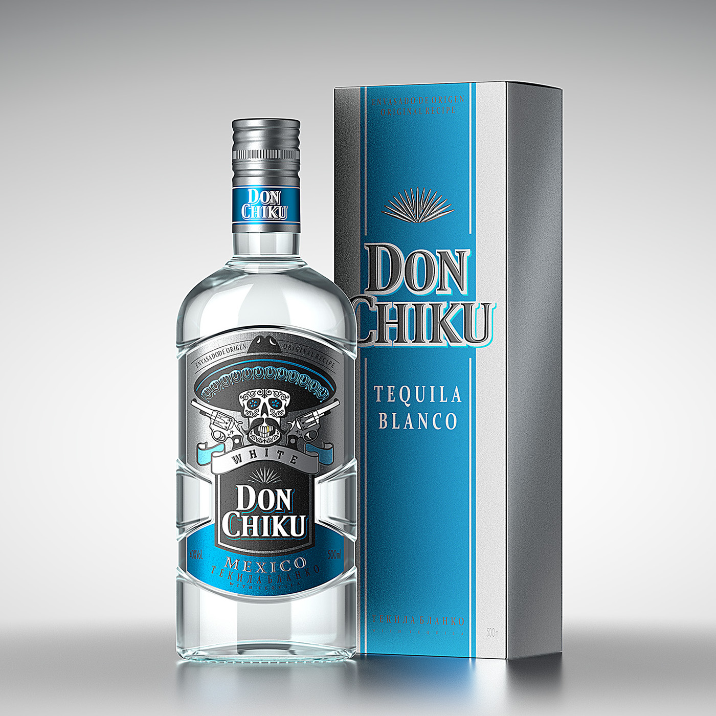
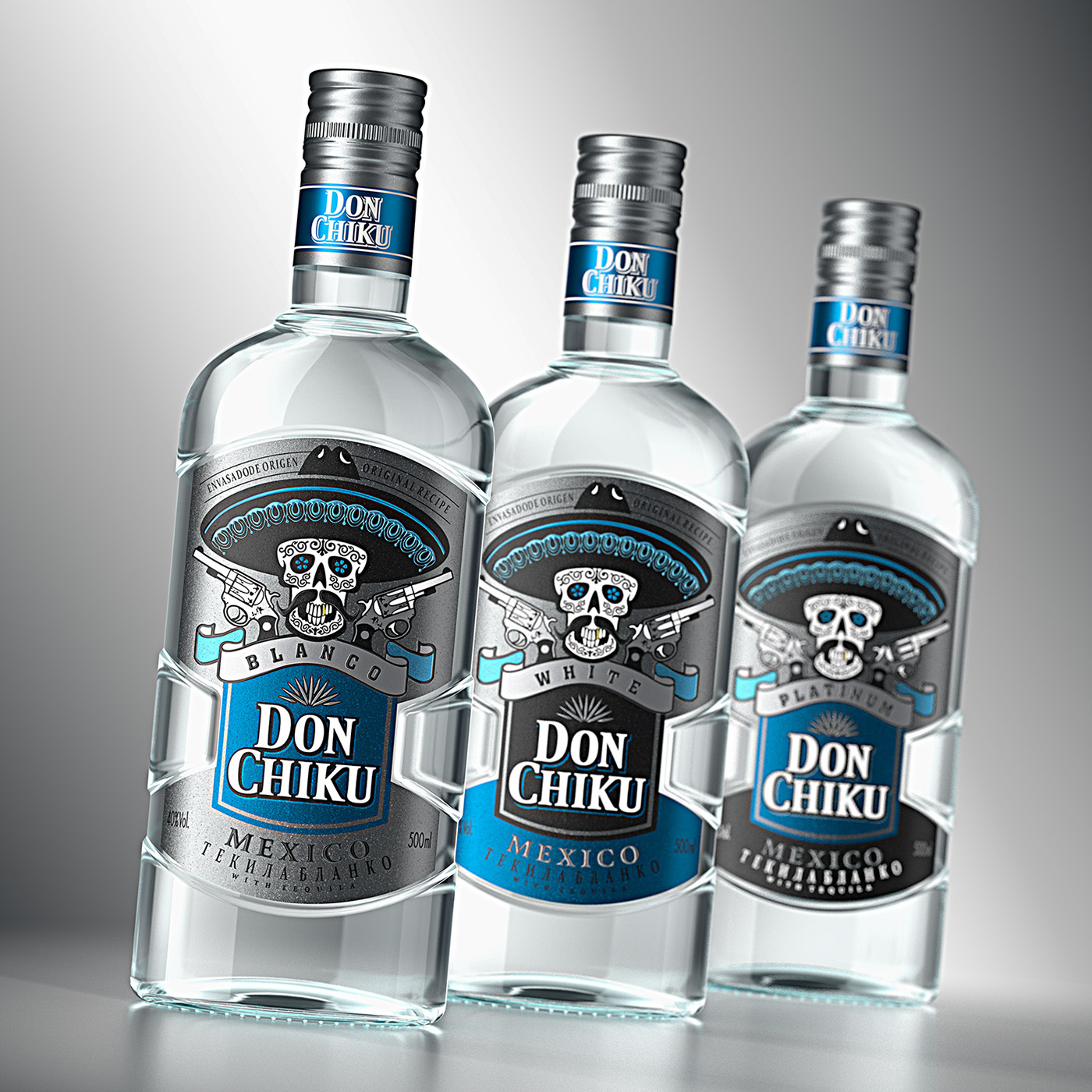
While working on this project the specialists in ShumiLoveDesign had to consider the special attitude towards tequila, especially among the people making up the target audience. It’s a drink for those, who desire vivid experiences and tickling emotions, a drink for bold and brave. Taking this perception of the product into account, the specialists have created a design concept based on the style of the Mexican death cult and its recognizable aesthetics.
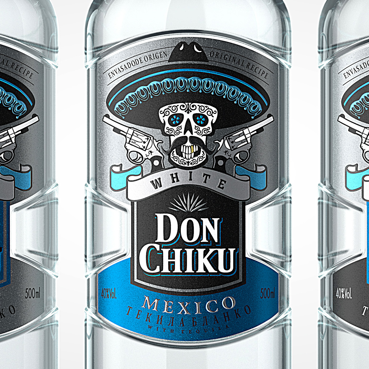
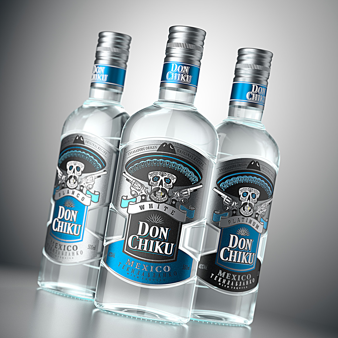
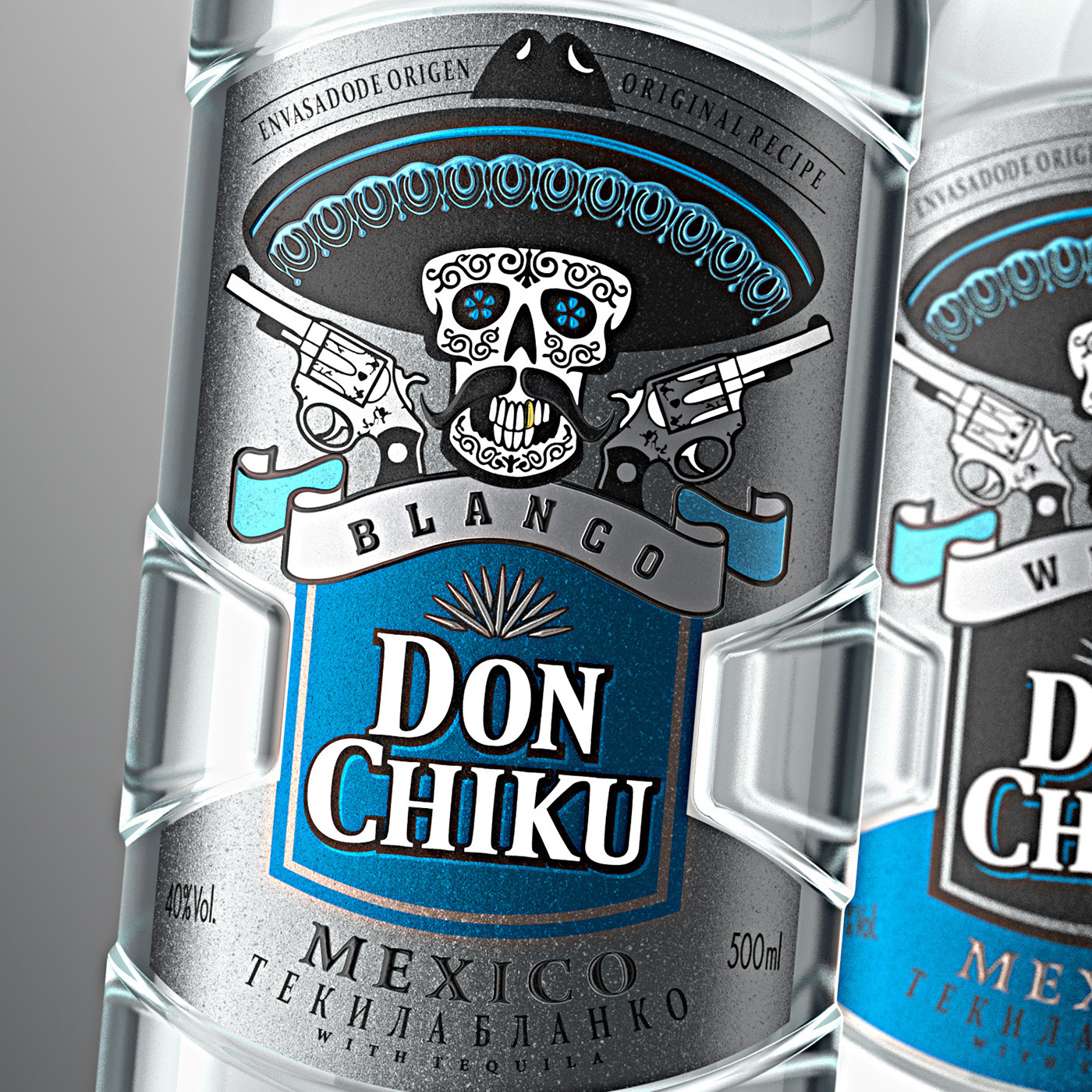
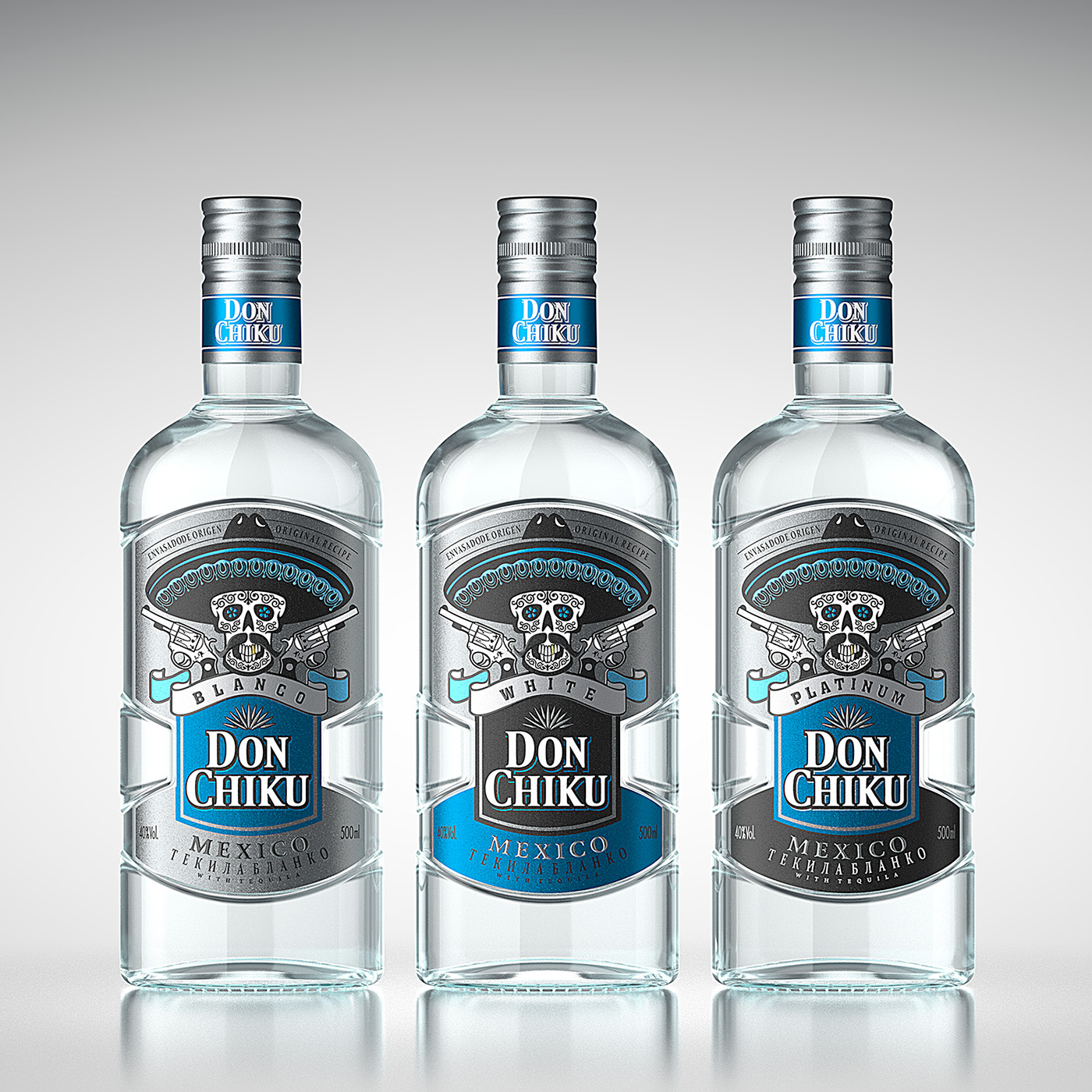
The main graphic element of the label is the stylized image of a skull in a sombrero hat with two guns, executed in a way reminiscent of the Mexican Day of the Dead illustrations. This image embodies the tough spirit, which the consumer wants to enjoy while drinking this tequila. The name of the trademark is also emphasized visually and placed in the center of the label for better product identification. The color scheme based on shades of silver, blue and white emphasizes the drink’s general category known as white tequila (tequila blanco).
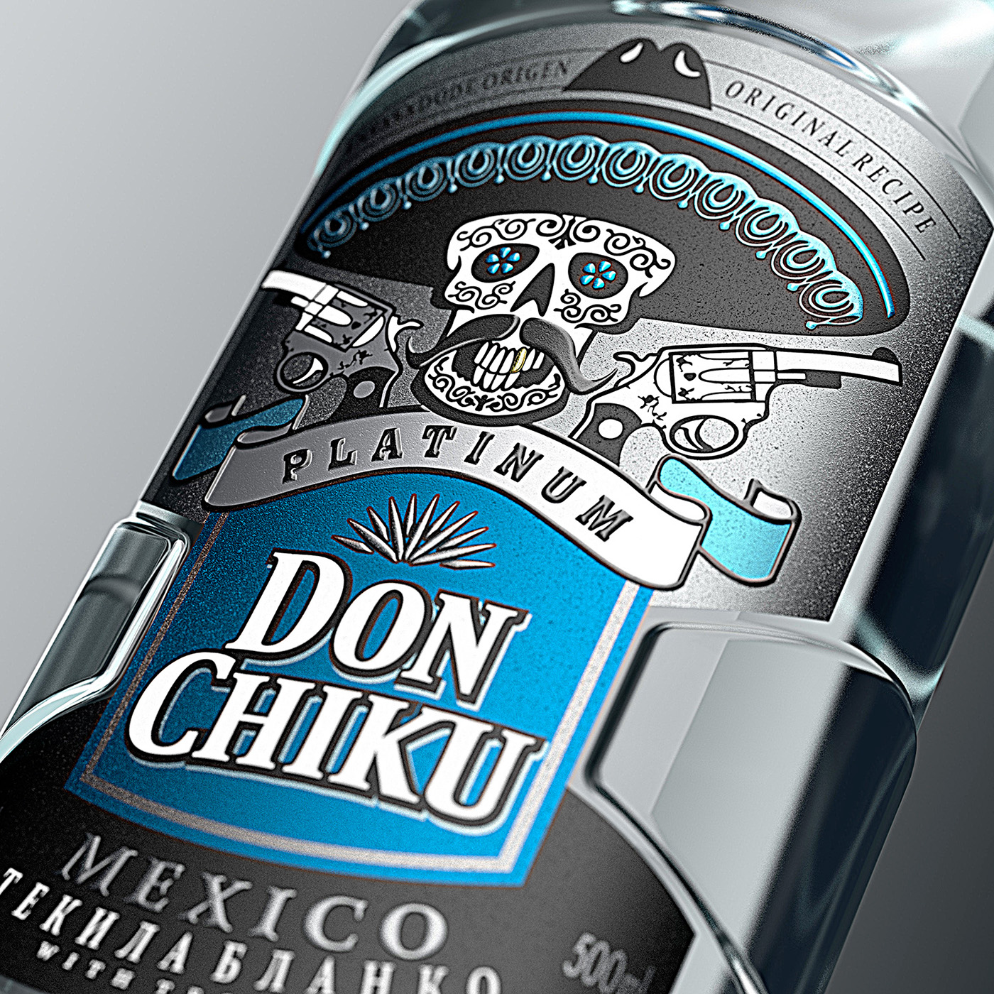
During this metalized label’s production, several post-printing techniques have been employed, such as the application of tactile varnish. This helped in adding volume to some graphic elements and making the general composition more attractive.

Работая над данным проектом, специалистам агентства необходимо было учесть особое восприятие такого продукта, как текила, особенно среди целевой аудитории. Ведь это напиток для тех, кто хочет ярких впечатлений и острых ощущений, напиток для храбрых и дерзких. Исходя из этого восприятия продукта была создана дизайн концепция, построенная на стилистике мексиканского культа мёртвых с его узнаваемой эстетикой.
Главным графическим элементом этикетки является стилизованное изображение черепа в шляпе сомбреро и двумя пистолетами, выполненное в манере, характерной для мексиканского Дня Мёртвых. Эта иллюстрация олицетворяет дерзкий бандитский дух, который потребитель хочет ощутить, выпив эту текилу. Название торговой марки также выделено визуально и расположено в центре этикетки для лучшей идентификации. Цветовая палитра, построенная на оттенках серебряного, голубого и белого, подчёркивает принадлежность данного напитка к категории так называемой белой текилы (tequila blanco).
В процессе производства этой металлизированной этикетки были применены такие пост-печатные техники, как тактильный лак. Это позволило придать объём некоторым элементам и сделать общую композицию более эффектной и привлекательной.

Branding, identity, packaging design & post production by SHUMI LOVE DESIGN (TM)
3D visualization by Maxim Kulikov


