We were giving our eye teeth for clients like this: The task was to come up with a new name and a Corporate Design for an orthodontics practice in Switzerland, which is owned and run by an orthodontist, who wanted the brand to stand by itself rather than only together with her name. Possible branches or more practices were a prerequisite as well as the fact that most of her »clients« are rather young – children!
Our inspiration sprang both from the architecture of the ancient house the practice is located in as well as the very modern feel of the practice from the inside.
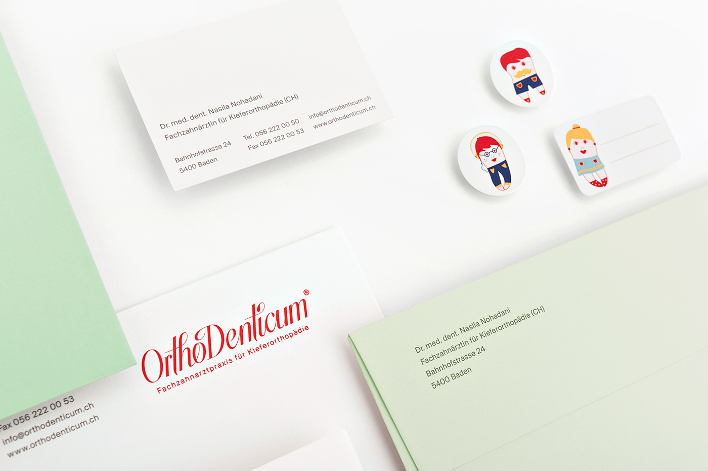
We went for a contemporary and clean look, integrating playful parts to form a very strong, self-confident yet elegant image. The basis is set by the new brand name, »Orthodenticum« in a hand lettered striking red, which is complemented by the other main colours Mint and White, giving everything a rather ‚fresh taste’. We added illustrative elements that recur both on the boxes for the dental braces and vanity bags but also on unique, studio-made tooth-figurines that are planted throughout the practice.