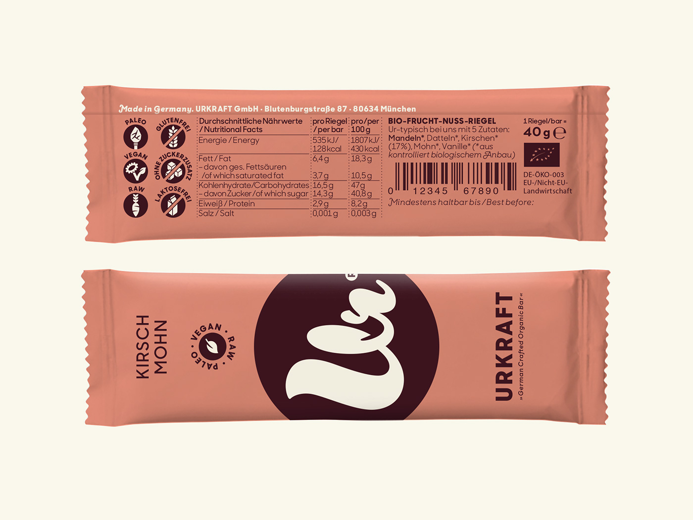
The organic snack bar Urkraft consists solely of fruits and nuts.
I created a logo and identity including the packaging design and some icons that express the german-made product in a modern and naturally friendly way.
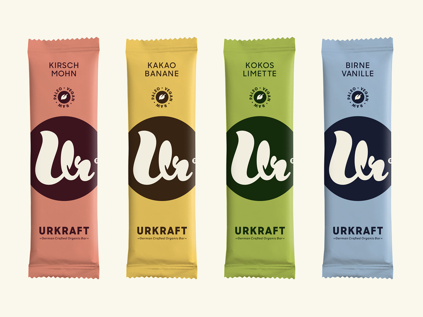
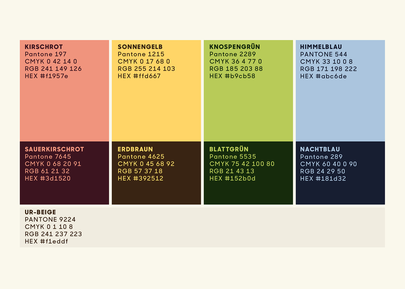
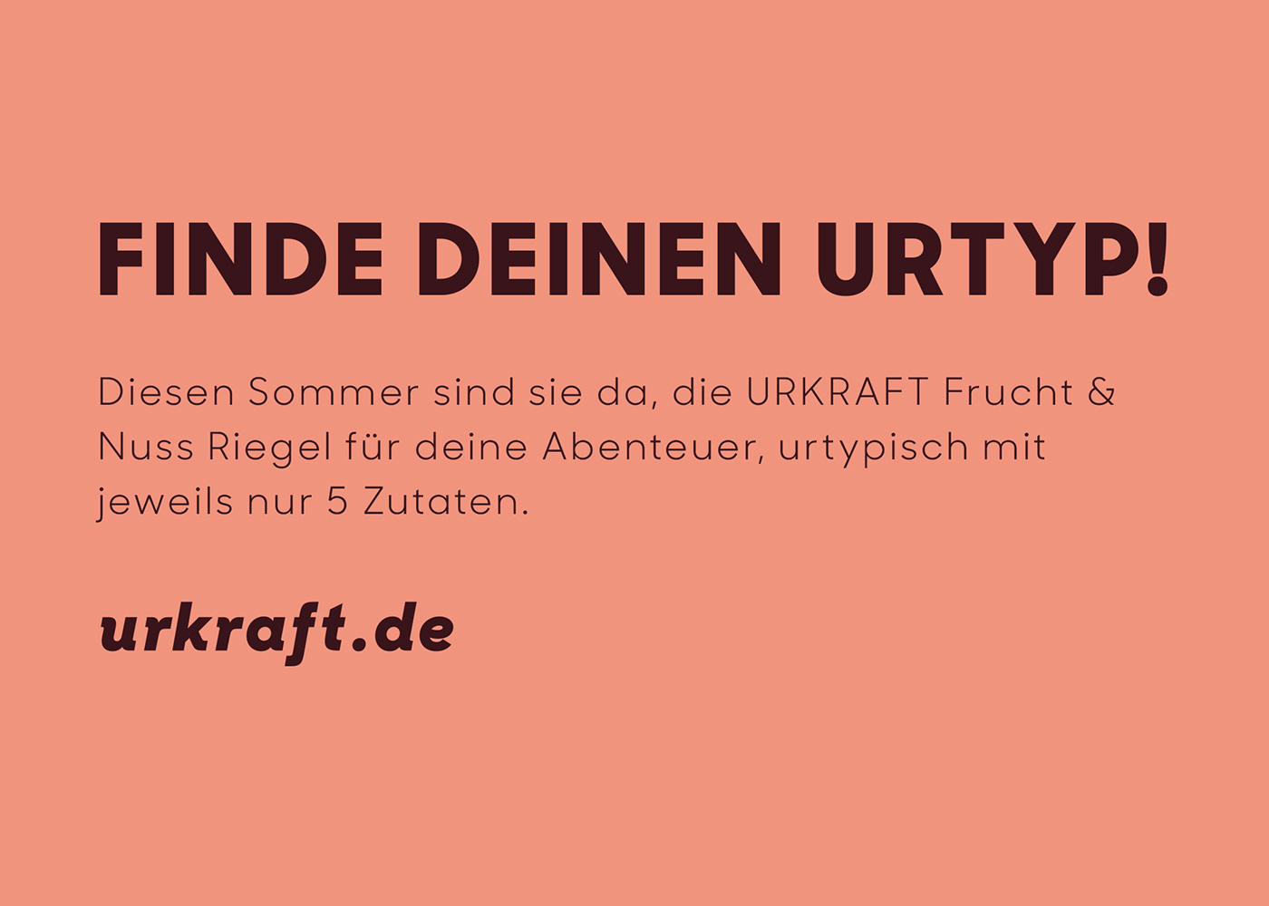
The Urkraft colours are inspired by the snack bar’s flavours.
In the brand communication they can be used in combination with each other to create a powerful visual impact.
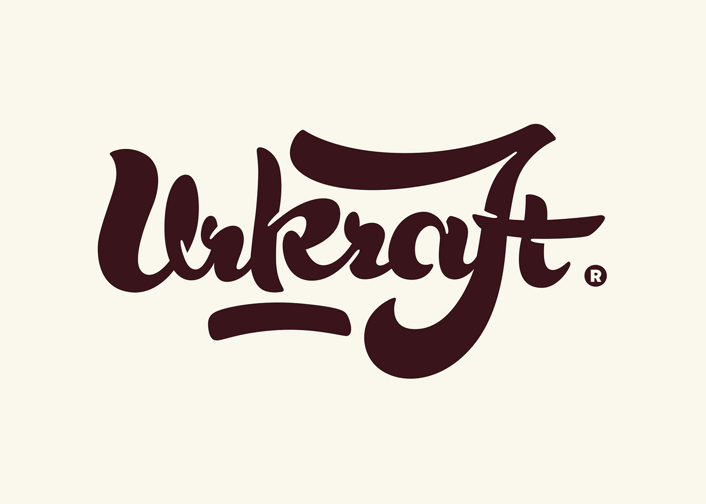
The script version of the logo explains the origin of the „Ur“ symbol on the products.
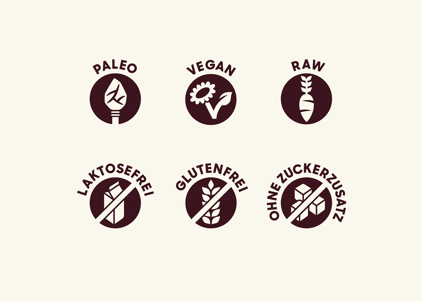
Simple but playful icons highlight the snack bar’s benefits.
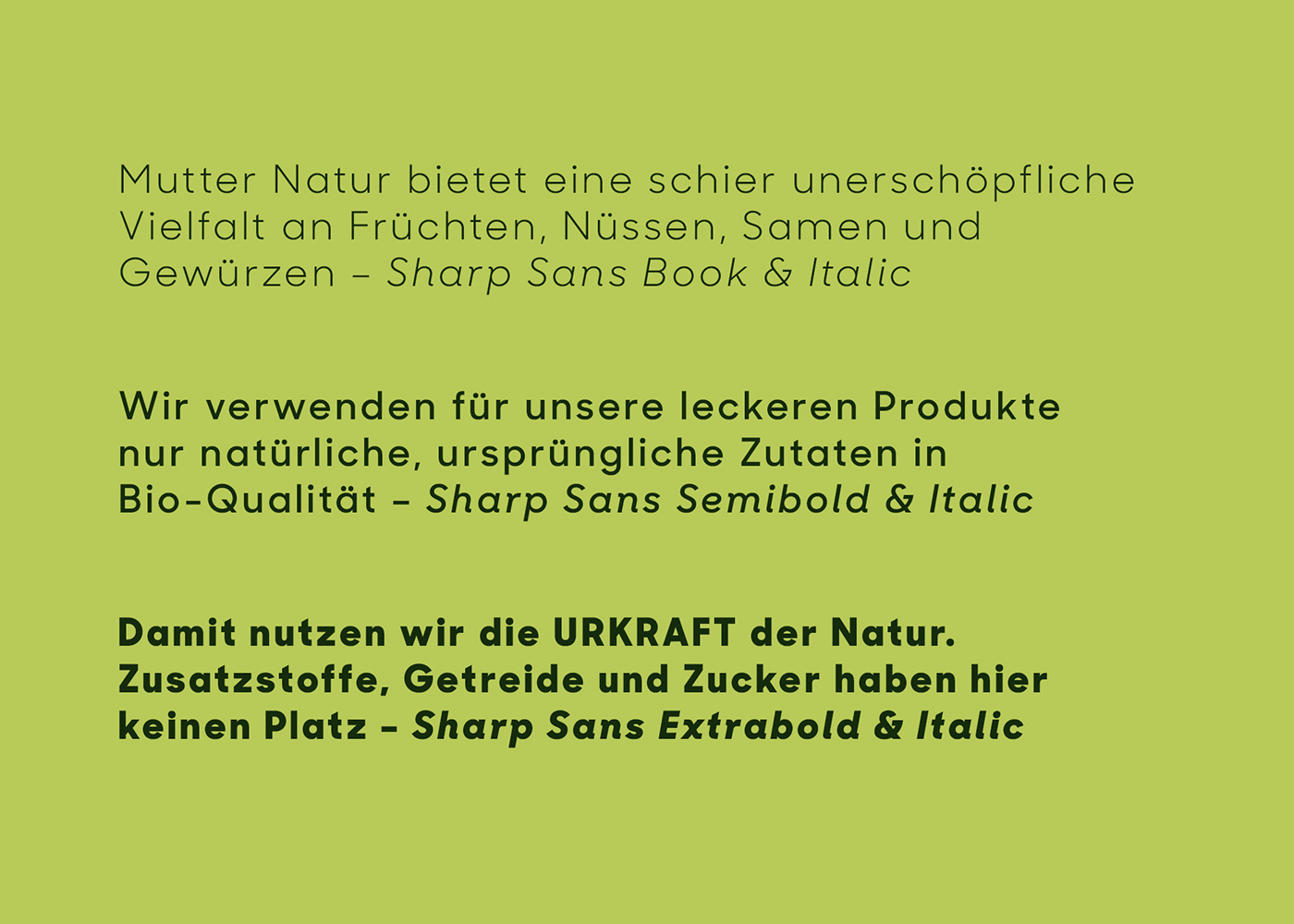
The brand typeface Sharp Sans No.1 has a minimalistic look while being playful in the italic cuts.
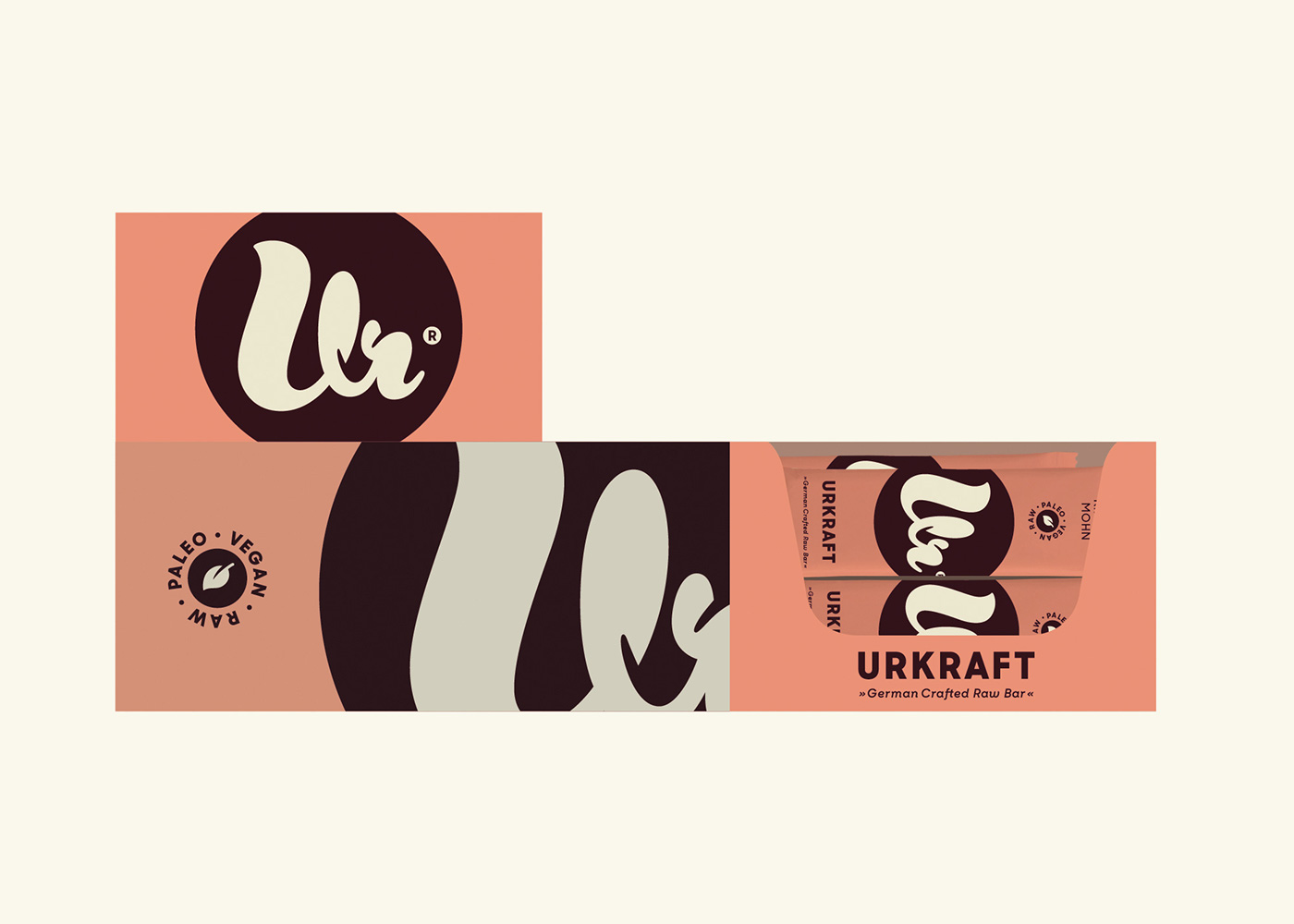
The display packaging design plays with a largely scaled and cropped „Ur“ symbol.
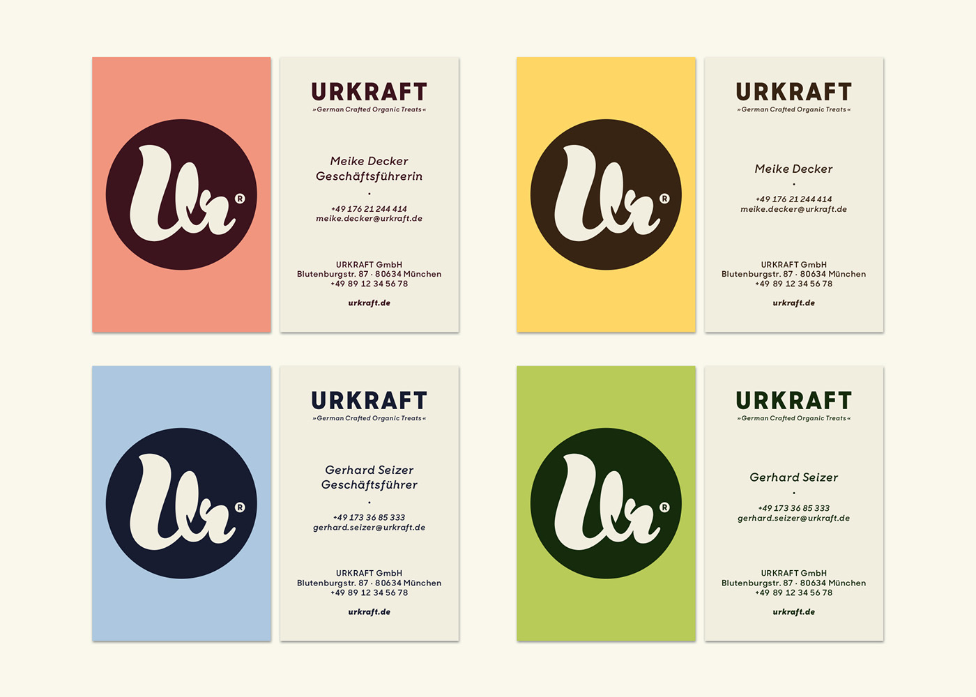
The business cards use the different colour ways of the Urkraft flavours.
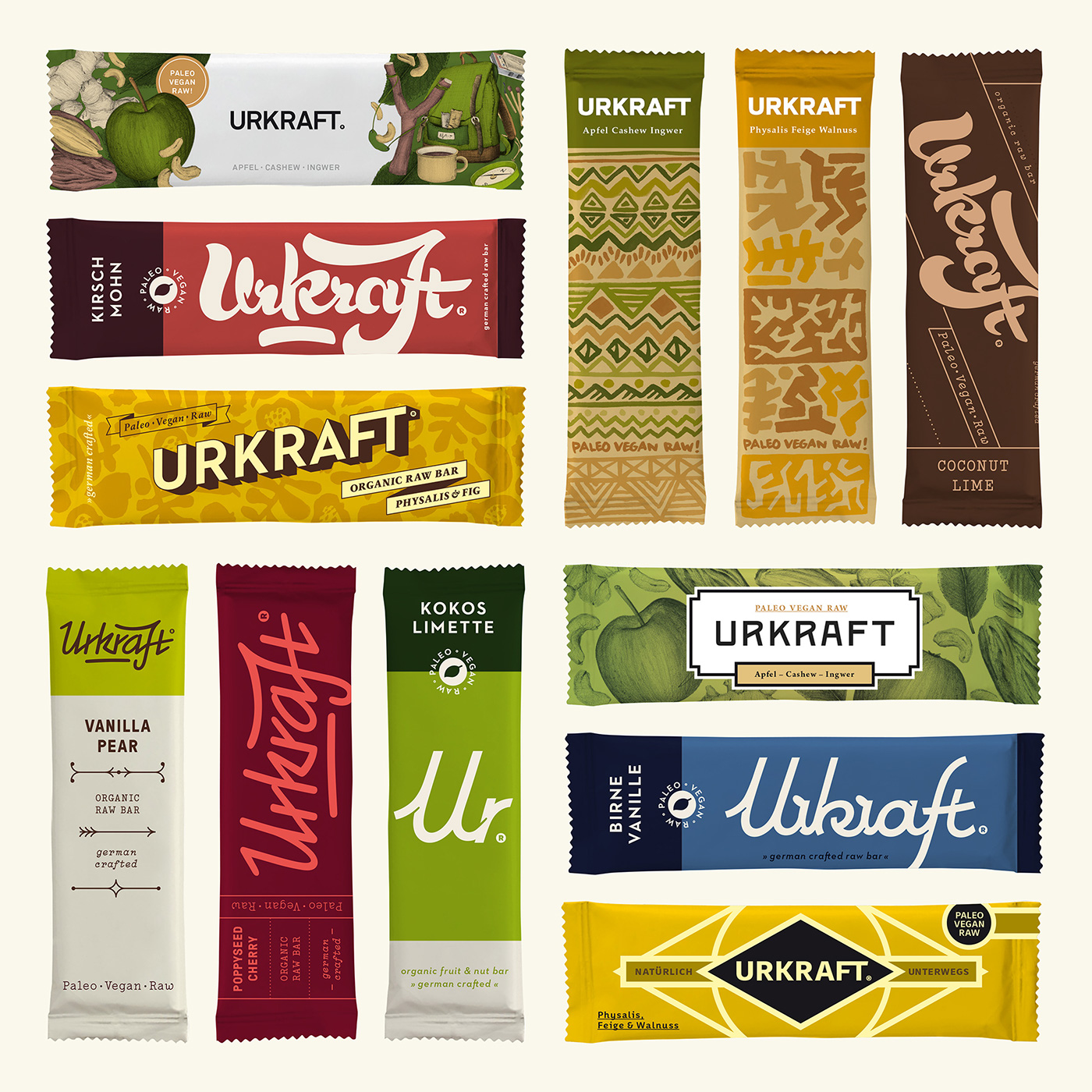
A lot of different style directions were explored during the design process.
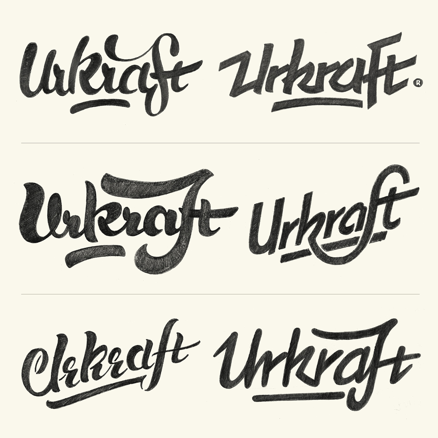
Some of the Urkraft script versions from the design process.


