

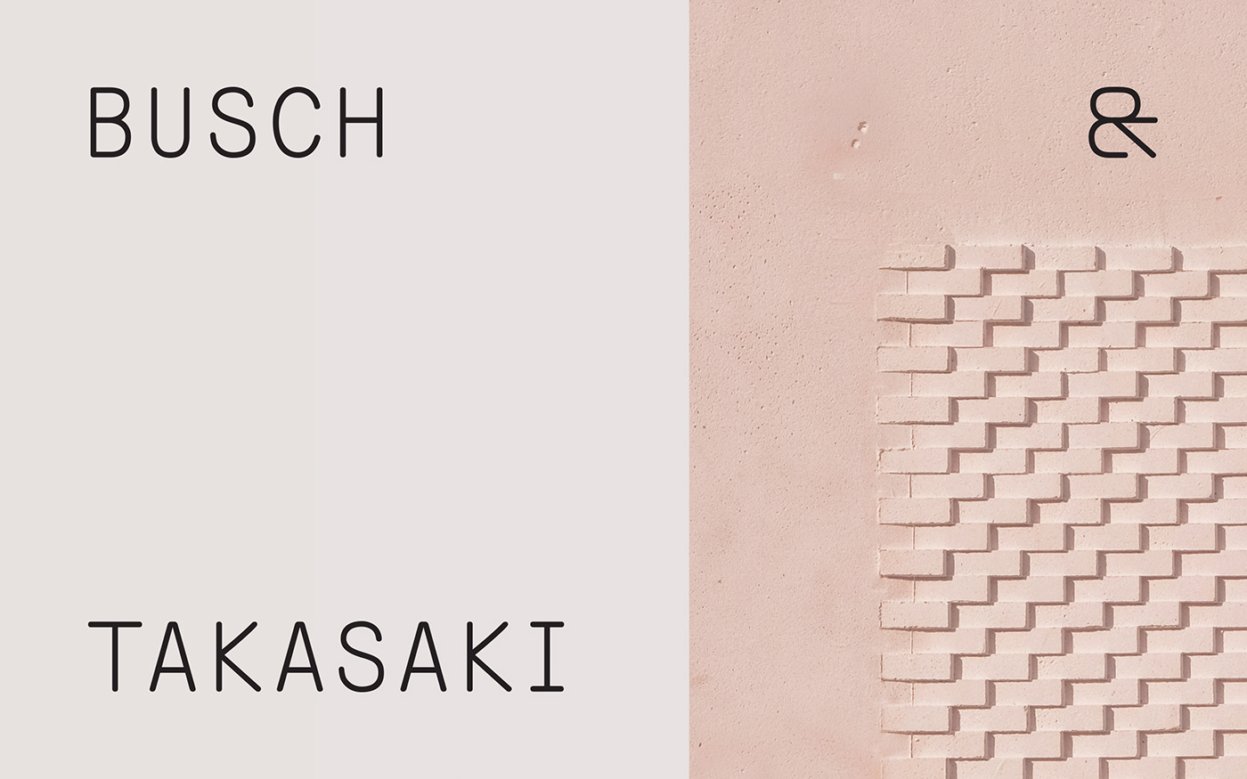
Visual identity for Busch & Takasaki Architects in Berlin.
The ampersand symbol combines graphical elements of letters of both of the founders names. The logo also works as a framing element for architectural images and close-ups of the architects' minimalistic building models.
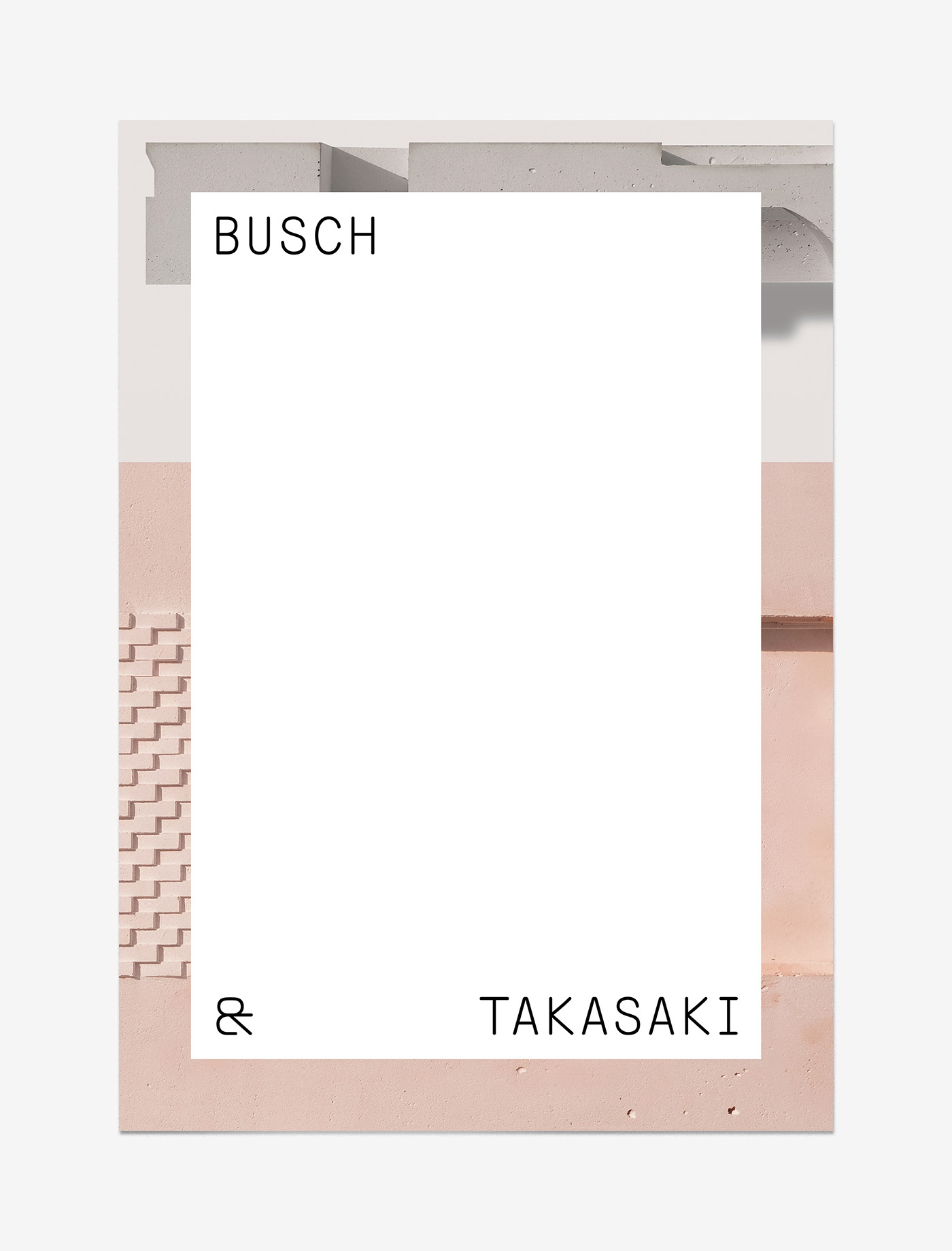
For this promotional poster design the architects’ models work as a backdrop with a blank slate on top that represents infinite possibilities.

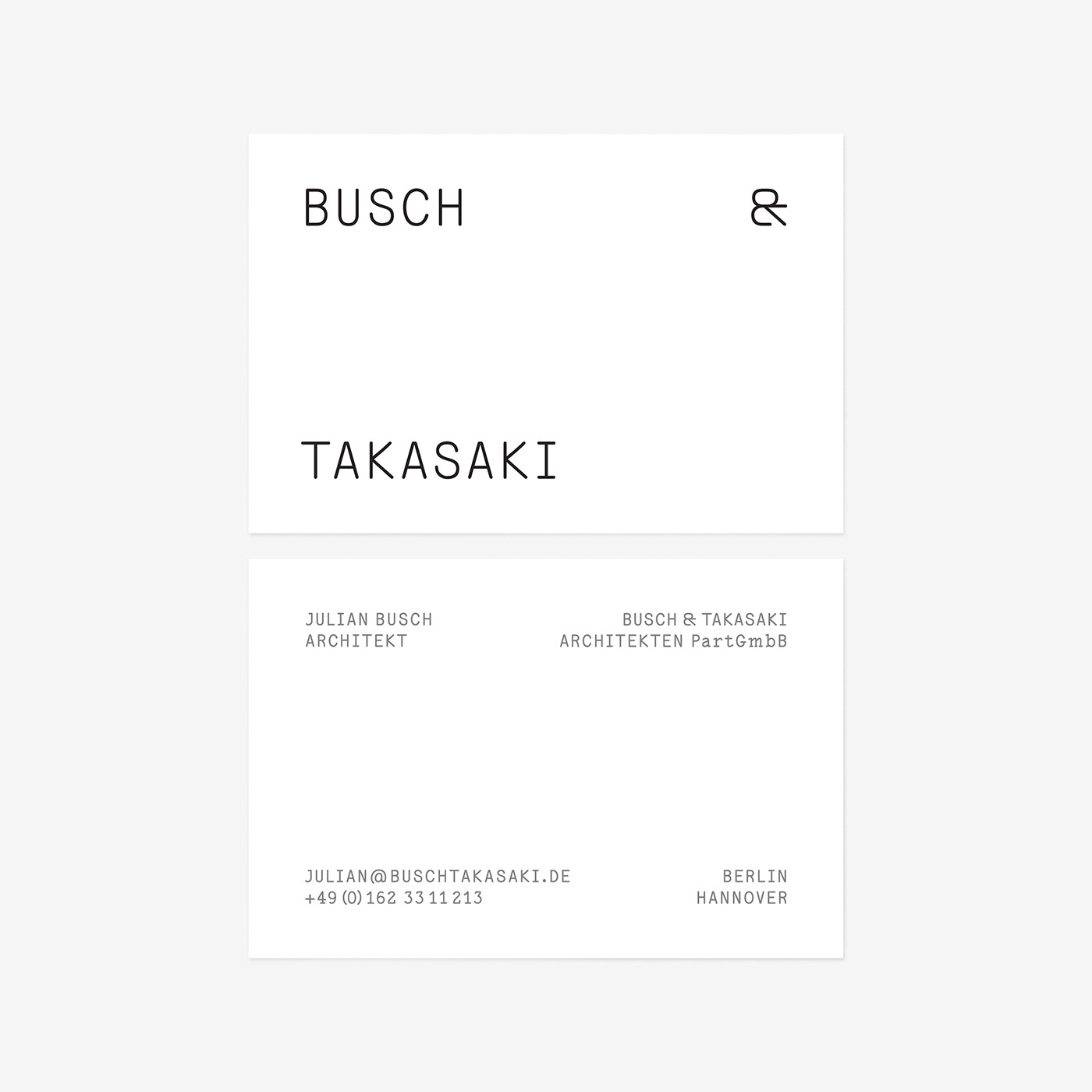
Busch & Takasaki Architecture business card design
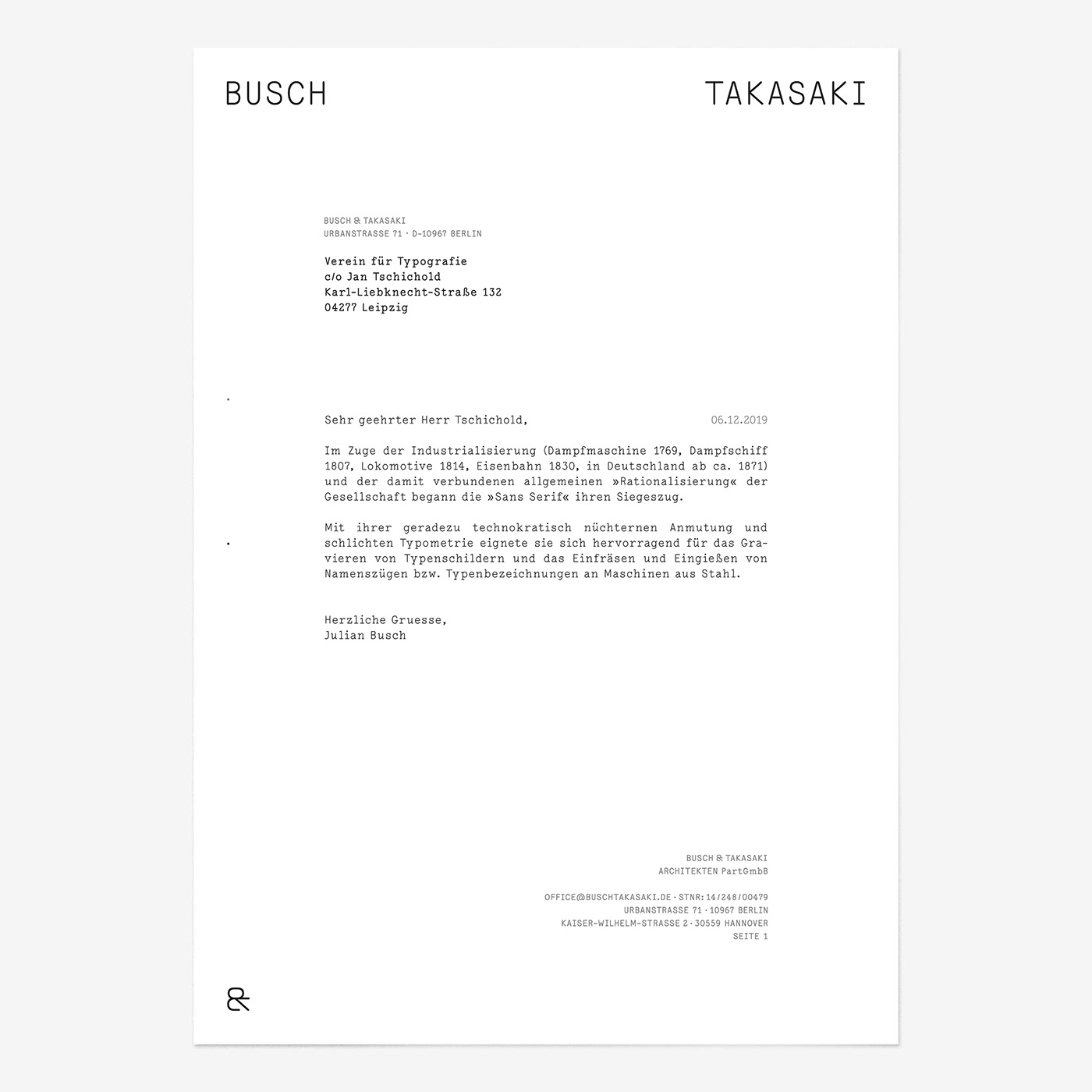
Busch & Takasaki Architecture letterhead design
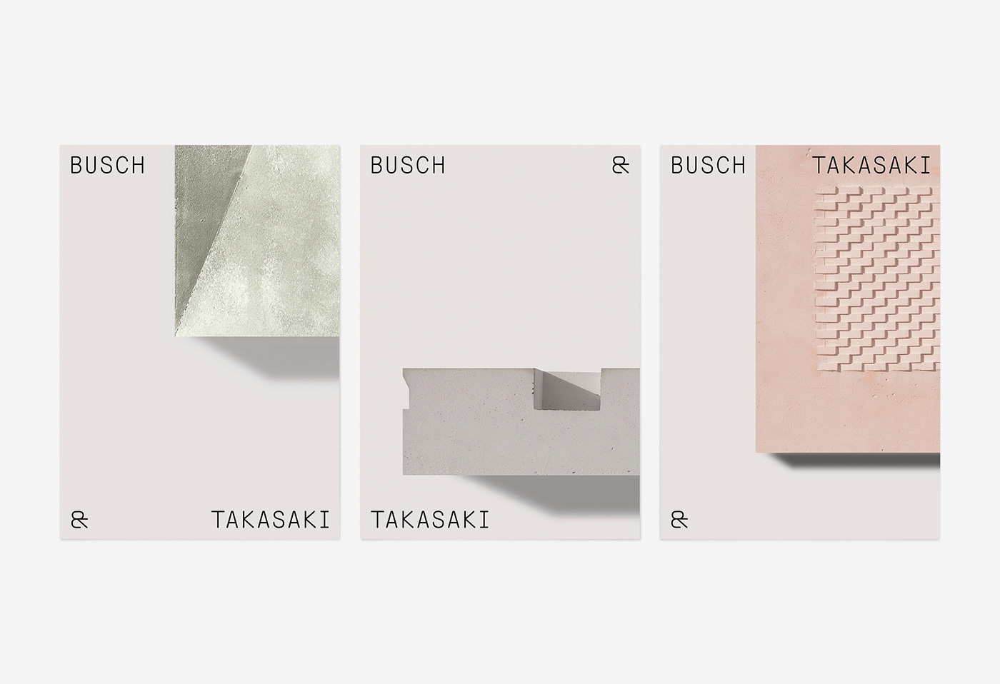
Postcard designs – the logo works as a layout element framing architectural images.
The layout concept for printed matter is flexible and playful, while providing a minimalistic stage for Busch & Takasaki’s architectural images.

The brand identity includes two versions of the logo. One is expressive, the other one for a more conventional use.

The ampersand symbol combines graphical elements of letters of both of the founders names. It is part of their wordmark and also functions as a logo on its own.


