


SUMMARY
Complete marketing suite for Riley Tractor parts
• 766 Page Parts Catalog
• 176 Page Price List
• 3 Ring Vinyl Binder
• Monthly Direct Mail Postcard System
• Product Packaging
PROBLEM
Riley Tractor Parts was using an eight year old catalog for the bulk of their business and the addition of several thousand new parts to their product line had rendered it mostly obsolete. Their item based, monthly sales mailer lacked a strong visual presence which negatively impacted monthly sales. As a wholesale operation trying to break into selected retail markets, the company needed a representative line of packaging to support their brand and drive sales.
SOLUTION
The updated parts catalog includes a complete restructuring of the layout and photographing and processing thousands of new part images. The updated catalog features colored page edges that correspond with their brand offering and allow customers to locate products more efficiently. A separate price list and 3-ring binder to house both catalogs,
as well as supplementary material made a strong impression on their customers and boosted global sales by 32%
TOOLS
Adobe Photoshop (image editing)
Adobe Illustrator (icons and illustration)
Adobe InDesign(layout)
Adobe InDesign(layout)

766 page Parts Catalog, showcasing the complete Riley Tractor Parts product line.

Master Table of Contents and first section Contents.

Engine Oil parts spread from the Ford Agricultural product line.

Mufflers spread from the International product line.

172 page Dealer Price List.

3 Ring Binder to house the catalog suite.
SOLUTION
A complete redesign featuring a half sheet postcard format printed 4/4 on heavy cardstock with UV gloss coating on both sides. The introduction of a strong color scheme reinforces brand consistency and the gridded layout helps establish a compelling direct mail piece that has resulted in positive customer feedback and boosted monthly sales 21%.
TOOLS
Adobe Photoshop (editing)
Adobe Illustrator (illustration)
Adobe InDesign (layout)

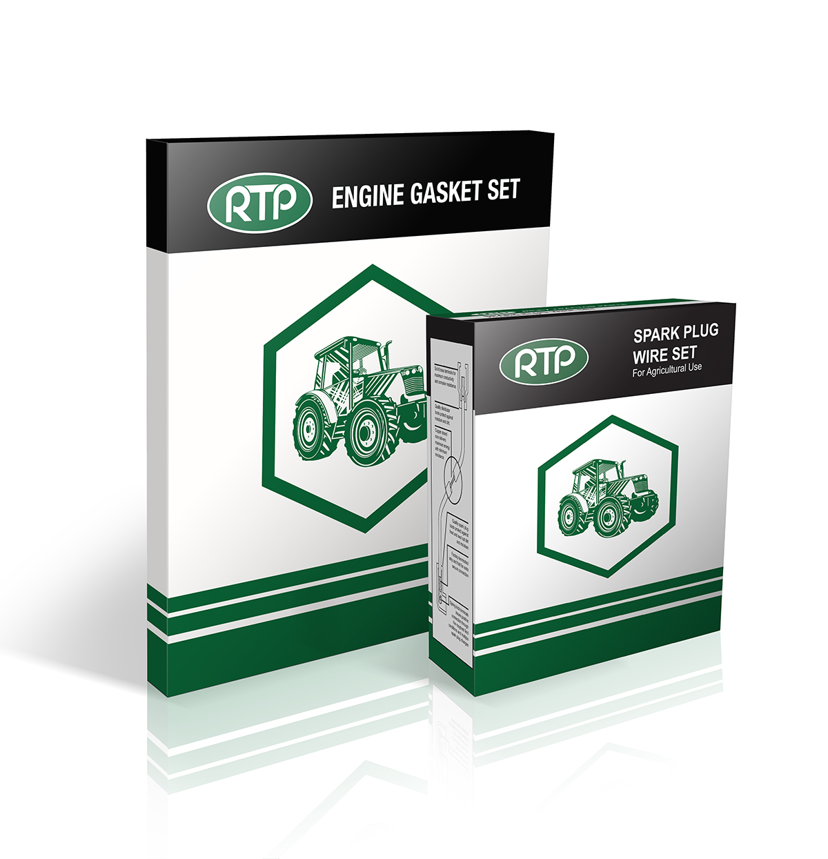
SOLUTION
A compelling packaging design that scales to various sizes while clearly and consistently promoting the Riley Tractor Parts brand. The result conveys more value than the competitors’ packaging and delivers a strong shelf presence. The initial design has since been expanded into a growing line of retail products.
TOOLS
Adobe Illustrator (illustration and layout)
When Riley Tractor Parts was incorporated in 1984, their distribution was regional in Ohio. Their logo reflected this distribution with a hand drawn RTP inside the outline of Ohio with a dot marking the company location. In 2008, the state of Ohio outline was replaced with an oval to signify their expansion into national distribution. (leftmost logo)
In 2009, the original letterforms were updated to reflect a smoother profile with consistent line weights and spacing, while maintaining the style and intent of the original logo concept. (center logo) For 2014, they introduced a special 30th anniversary logo on all marketing materials to celebrate three decades in business. (rightmost logo) Throughout the process of bringing the Riley Tractor Parts brand into a more unified and consistent messaging, a Brand Standards guide was created and implemented to structure future growth.


