


Covered International, established in 2013, is a faith-based outreach and support group for women in the adult-entertainment industry, including victims of commercialized sexual exploitation and trafficking. Their mission is “to walk with women through their journey until they are empowered, clothed with strength and dignity, and can laugh without fear of the future.”
Covered originated as a Toledo-based nonprofit, but has since expanded internationally, with a chapter introduced in Toronto and additional new chapters in the planning phases. Their rapid growth necessitated an updated identity which better reflects their values, relates to their audience and reinforces their mission statement while including scalability for future growth.
Covered originated as a Toledo-based nonprofit, but has since expanded internationally, with a chapter introduced in Toronto and additional new chapters in the planning phases. Their rapid growth necessitated an updated identity which better reflects their values, relates to their audience and reinforces their mission statement while including scalability for future growth.
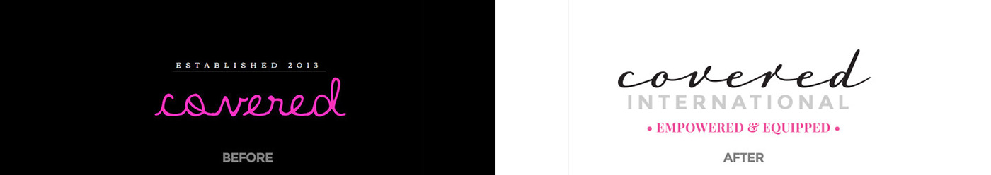
We shifted the focus from youthful and unpolished to mature and elegant.

Horizontal version of the word mark.
THE ELEGANT SOLUTION
We began the process by surveying various luxury markets, which the commercial sex industry mirrors in its appeal and presentation, including fashion, cosmetics as well as high-end automobiles and hotels. From the results of our survey, we determined several benchmarks to use as the foundation for a new identity. We conducted some brand identity exploration to find the six most concise descriptors of Covered's mission and determined their authentic communication style. Lastly, we dug deep into the archetypal patterns that the organization connected to in living out its vision.
The research led to a typographic word mark that was similar to the original, but included a touch of elegance. We replaced the “Established in 2013” tagline with their more powerful anthem, “Empowered & Equipped.”
THE LOGO MARK
Covered refers to the women they serve as “Pearls.” For the sake of privacy, it is integral to protect the identity of each woman. The pearl was chosen because it is produced from an oyster resulting from the invasion of a parasite. the oyster protects itself by layering the irritant until out of pain and suffering an object of great beauty is formed. The value of the pearl lies in the immense cost paid for it.
The finest quality natural pearls have been highly valued as gemstones and objects of beauty for many centuries. Because of this, pearl has become a metaphor for something rare, fine, admirable and valuable.
As the typography and logo icon came together, a polished and restrained identity emerged, which served as a bold and vibrant authentic solution to their graphic identity.

We compiled and summarized our research for Covered International into a Brand Manifesto that summarized the key values and outlined the voice and archetypal patterns that guide the organization.


