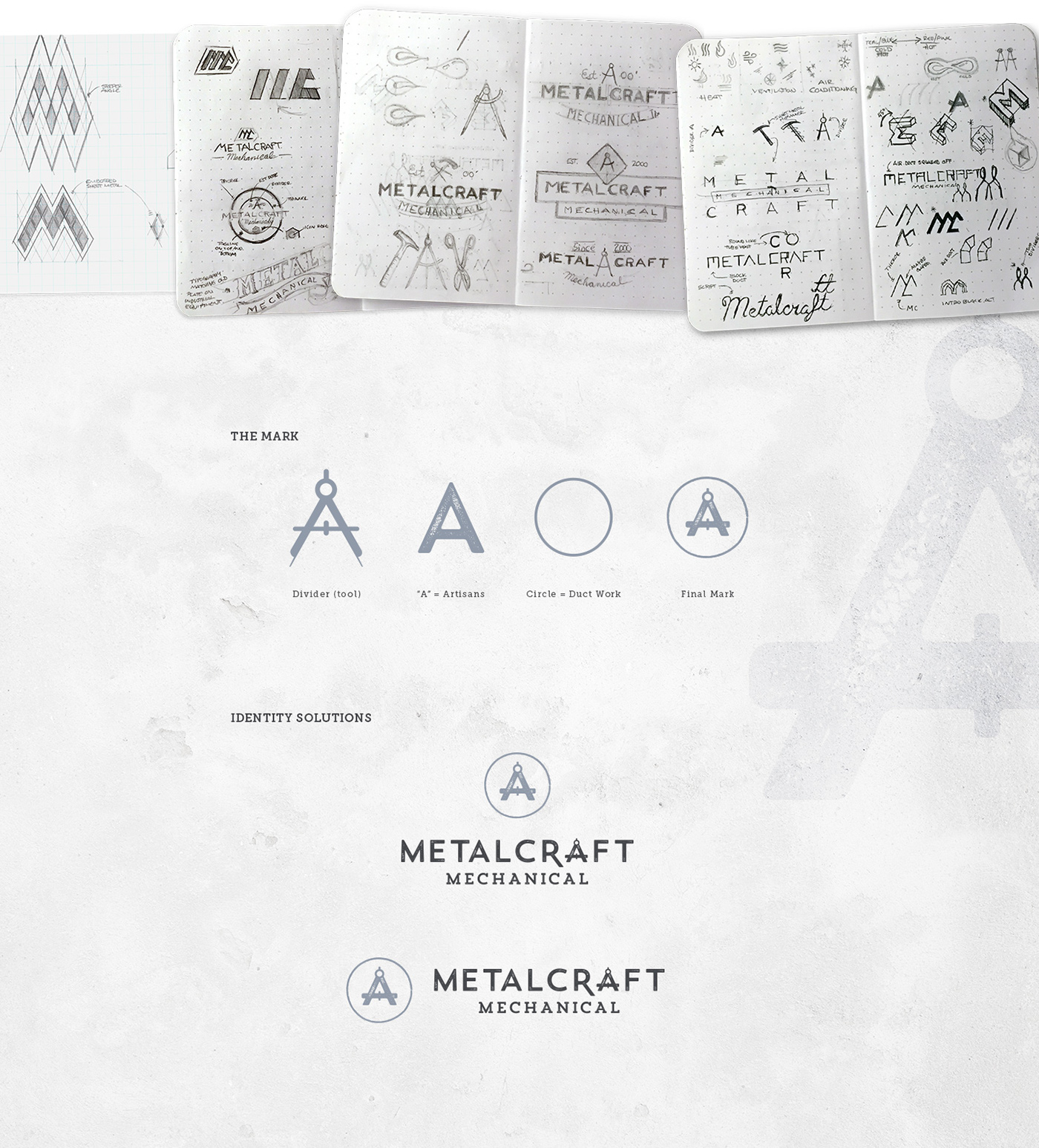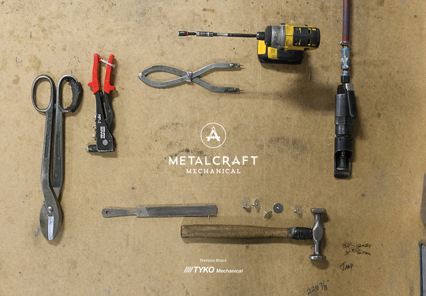
Metalcraft Mechanical’s sheet metal artistry is built on 15 years of experience. The goal was to create a brand experience that communicates the history, passion, and skills of its artists. The original company name TYKO Mechanical was replaced to help focus the company's positioning around its skilled artisans.
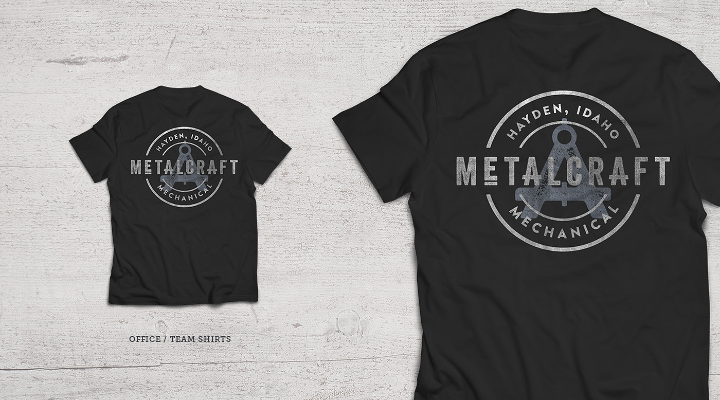
The brand mark pays heed, via the “A”, to the idea of Metalcraft as “Artisans.” Completing the overall concept are two design elements: the divider, one of the primary tools used in the craft, and the encompassing circle, which represents the circular duct work that is fashioned out of the sheet metal. The logo typography is comprised of modified Trend Rough Sans One and Slab One. Both fonts feature a naturally distressed treatment, delivering a vintage look and feel.