
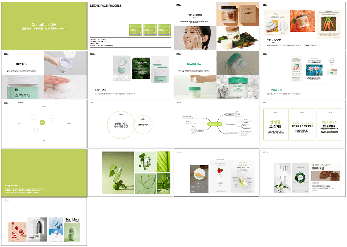
Green Pore Pad, a collection of Dongkuk Pharmaceutical's technology.
It's cost-effective to use a pad for dual care Detailed page with differentiated technology
Construction has been carried out.
Key visual
Use minimal images representing experimental elements as the brand's core visual images. The brand's design identity is a design grid tag that is positioned on the right side of the package, signage, and branding elements, and branding elements.


design represents the detailed pages of skincare products for mobile screens. The brand name and product name are large at the top, and the green and purple color schemes are used in harmony overall. The two colors make the product's image stand out even more and emphasize its natural ingredients and skin-friendly image.
In the center of the page, there are images showing the various uses of the product. These images help consumers imagine what it would be like to use the product by simulating its actual usage environment. In addition, text that highlights the features and advantages of the product is placed together to effectively communicate product information.
At the bottom is a space where you can place user reviews or recommended messages, which helps increase product reliability. The overall layout is neat and intuitive, and information is provided sequentially to facilitate the user experience.
The page is designed around elements that help you understand the product and lead you to purchase. All factors seem to have prioritized user convenience while maintaining the brand identity.


