

FOOTBALL CLUB SHINNIK OFFICIAL REDESIGN
Black and blue style for the main club of the Yaroslavl region
ART DIRECTOR AND DESIGNER. CREATOR OF CONCEPT—EMBLEM—SUBEMBLEMS—SUBELEMENTS—KITS—FONTS—PATTERNS—BUS—MERCH—GUIDES. DECEMBER 2022–JANUARY 2023
The football club was established in 1957 under the “Yaroslavl Tyre Plant” (YaShZ). During its 66-year history, the club has had many landmark moments, including participation in the UEFA Intertoto Cup in 1998 and 2004 with an epic victory against Valencia in a flooded stadium after a downpour.
A delicate work on updating the style was carried out for Shinnik: an updated logo, a system of convenient and flexible sub-signs, corporate lettering, patterns of different types and much more. But, most importantly, Shinnik returned its history — the new logo is based on the rich heritage and connection with the plant, as well as the symbolism of the city of Yaroslavl. The project was realised in close cooperation with the management of FC Shinnik, ensuring a deep understanding of the club's history and values.
Photo: Yaroslav Neelov, FC Shinnik archive
SIGN RESEARCH
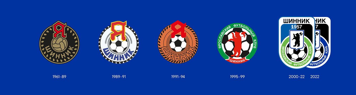
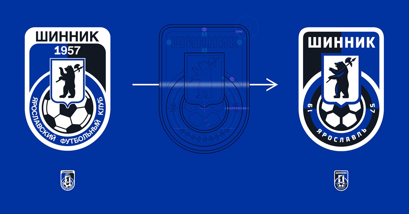
If we trace the history of the sign, we can see how gradually, step by step, the original sign with a wheel, a ball, the logo of “Yaroslavl Tyre Plant” and a large inscription “Shinnik” was transformed into the current emblem — the central element (wheel) was simplified to a regular circle, and unique elements were replaced by standard ones.

Heraldic sign
Images in the heraldic tradition are described in words and do not assume a specific graphic embodiment — this means that the figures do not have to remain inviolate, but can be modified depending on the task. For example, the Liverpool bird on the city's coat of arms is very different from the version on the Liverpool logo, while the eagle of Frankfurt am Main has also been redesigned for the Eintracht sign. Shinnik has a bear with an axe on its shoulder above the wheel on the shield — exactly the same as on the coat of arms of Yaroslavl.

Evolution of detail
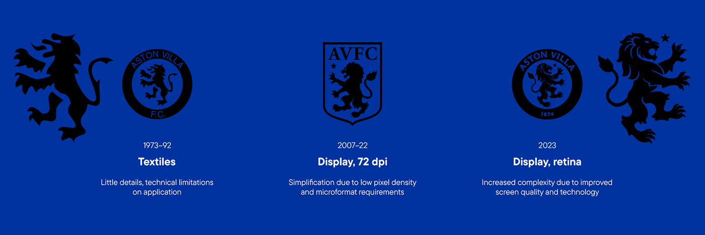
In the current version, the bear image is not clear enough for the small size and has excessive detail around the edges. This leads to the question of the evolution of detail in sports symbol design. In the past, due to technical limitations, old logos were simple: they were applied to clothing by applique or embroidery, and complex design was ineffective due to poor TV quality.
From 2005 to 2020, in the era of the proliferation of smartphones with small screens and as users eventually switched to them, pixel density and other technical limitations of the screens had to be taken into account. This led to simpler and more expressive logos, stripped of unnecessary detail to display well and clearly on even the smallest screens.
After 2020, the advent of high quality screens and improvements in technology have made it possible to use more detailed images. Modern logos are once again becoming more complex.
Summary
It can be seen that at the moment none of the components of the Shinnik emblem is unique and cannot be used separately. In addition, the logo has lost touch with history and its roots.

SIGN DESIGN
The work process involves sequentially analysing and re-evaluating each element to bring them together in a single graphic space and ensure consistency of scale, line thickness and angles.
Updated heraldic bear
The bear has been given a more massive and balanced form. The sign has two variants — with and without volumetric light shading.

Circle — wheel, ball — spokes
The circle now symbolises the wheel again, as it was in the original design of the Shinnik emblem. The volumetric shadows of the tyre give it uniqueness and harmonise with the light shade of the bear. The central part of the emblem simultaneously resembles a ball and a five-spoke wheel disc.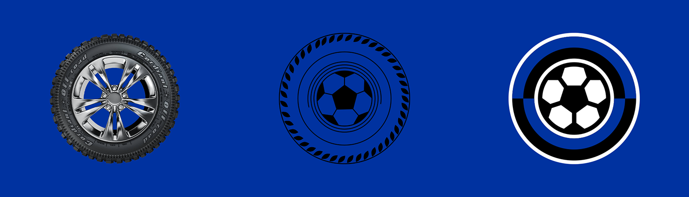
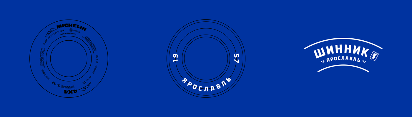
The name of the city and the year the club was founded are placed in accordance with the traditions of tire marking.
The iconic emblem
Despite the fact that for more than 20 years the emblem with the letter “Я” is not the main sign of the club, it enjoys great respect among the fans. At the moment this symbol is in no way connected stylistically, graphically or philosophically with the logo of modern Shinnik. It lives outside the current image of the club. In the new graphic system of the club it was decided to return the iconic sign to its rightful place.
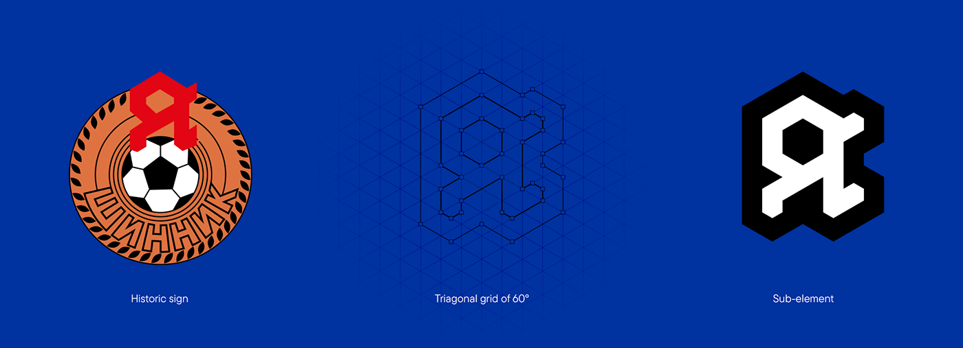
Exclusive club font
The triagonal grid used in the “Я” sub-element, in a rotated form, was also used in the design of the font. The letters are deliberately simple, as the lettering is part of the logo and can overload it with excessive details.

Not blue-black, but black-blue
Like other football clubs, Shinnik has its nicknames: “tyre”, “bears” , as well as “black and blue”. On the previous version of the emblem, the colours were arranged in a different order — first blue, then black. In the updated emblem design, it was decided to correct this discrepancy so that the club would more accurately reflect its nickname.
Updated emblem components
Thanks to the elaboration of each element separately, the new ones are united by the same rules and plasticity, and each of them is now unique. The club has got its own bear, the ball and circle have become what they were before — a wheel. All lettering is now in the club font.

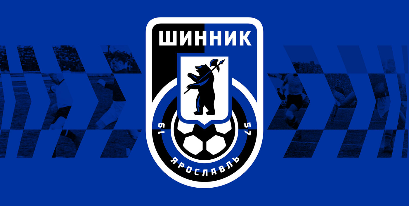
NEW EMBLEM OF FC SHINNIK
The logo has retained its original look, but every element has been thoroughly rethought and redesigned in line with a unified graphic style. It now has a more solid outline, simplified text and a large coat of arms, and thanks to clever thicknesses, lines and balance of the elements, the mark is perceived as a whole. The emblem works better in microformat — the small range of the scale bar.

Sub-elements
The main feature of the emblem is its modularity, allowing the creation of many different sub-elements.

Tread patterns
Made in the form of geometric and abstract patterns, repeating the plasticity of the main sign and additionally emphasising the image of the wheel.
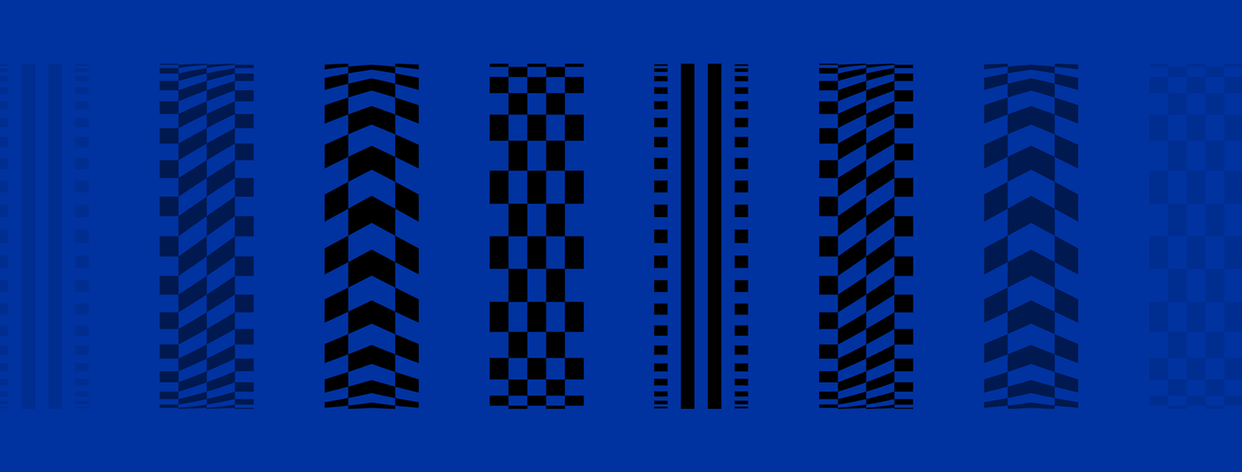
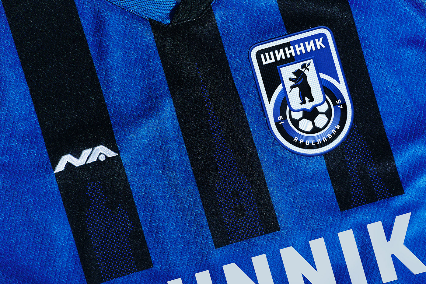
The traditional Shinnik uniform is black stripes on a blue background. Replacing the classic stripes with a tread pattern allows to bring novelty to the generally accepted standards of sports uniforms, emphasising the meanings and history of the club.
The “Я” emblem is placed above the players' names. It forms a logical link with the player's surname, demonstrating the fusion of club and personal interests.

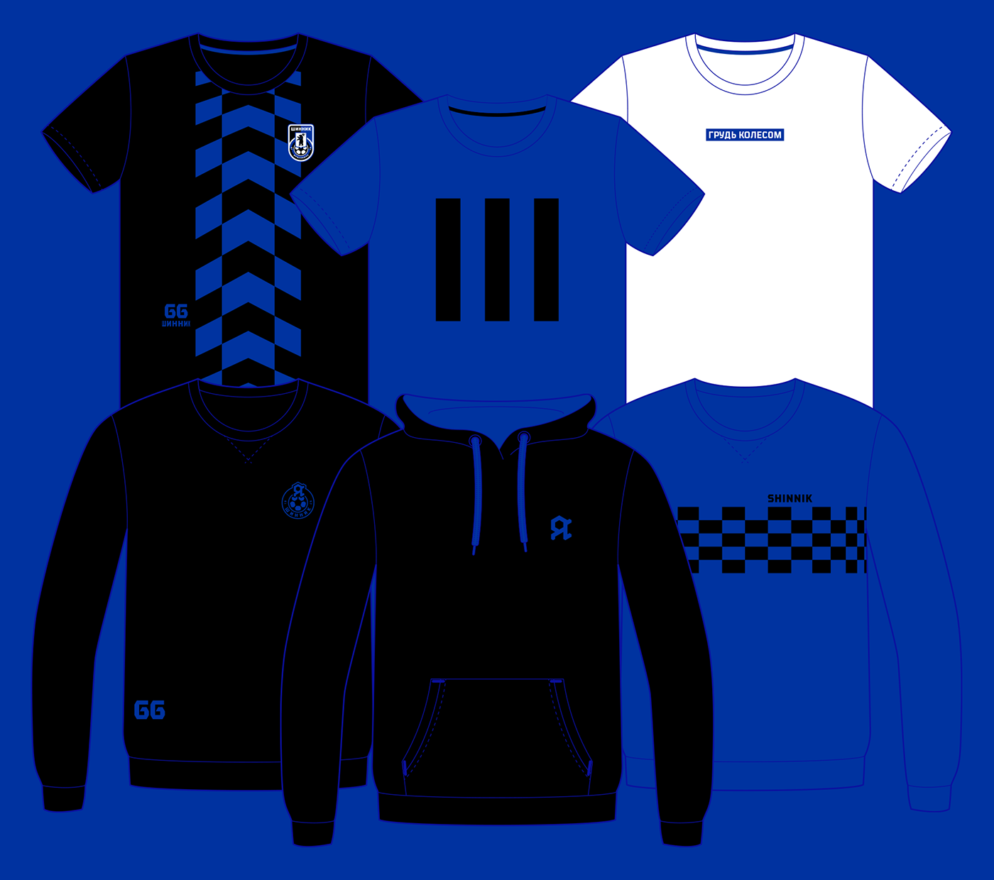

Uniform design 2022/23
The club's kit has retained a classic style — black stripes on a blue background — however, the design incorporates well-known architectural symbols of the city, including the monument to Yaroslav the Wise and the chapel depicted on the thousand-ruble note.