


Beewise is an app that helps people to invest in funds, starting with very little amount and managing everything from their smartphone.
The idea is that you don’t need a lot of money to start, and you can reach your life goals (like buying a house, a car, retirement etc) by investing little by little and making your savings grow.
During December of 2020 the guys from BITMAMA asked us to illustrate the universe of Beewise by creating characters elements to illustrate different parts of the app.
Illustration system
Illustrations will enrich the user experience in different ways throughout the app. Sometimes they will have a bigger impact, sometimes they will be just a little nice touch in the user interface. The brief from the guys at BITMAMA was to have three illustration categories,based on their complexity level:
Main illustrations,intermediate illustrations and Functional illustrations.

The bee
The BITMAMA team imagined having a (wise) bee as a recurring element in the app. The character will appear in the situations not as a main protagonist, but as a companion of the people represented, like a little nice touch in the illustrations.
The bee on the other hand could be the protagonist of the functional elements of the UI, where we can play a little bit more: i.e. the loading animation.
The bee on the other hand could be the protagonist of the functional elements of the UI, where we can play a little bit more: i.e. the loading animation.

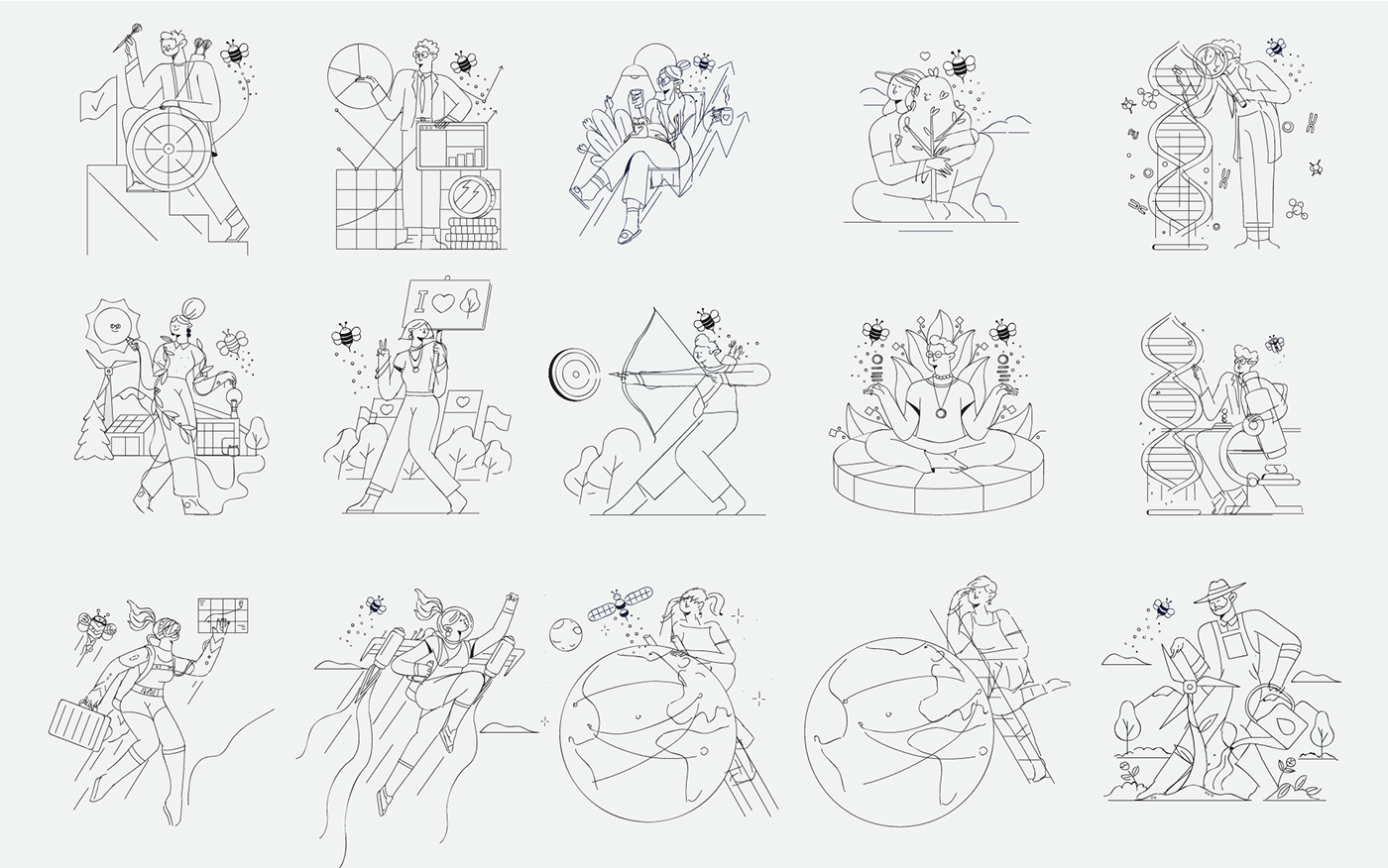
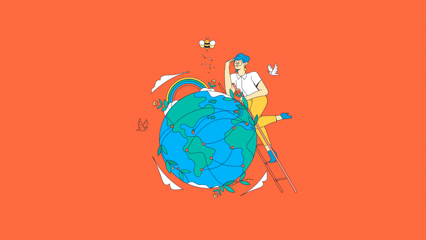
As per BITMAMA’s brief, the Main illustrations are the illustrations which are most focused on building value and storytelling in the app. We have people as protagonists while doing an action. We want to be inclusive in terms of ethnicities and gender, but without exaggeration. We do not want to put all the attention on diversity per se.
Our users will be able to choose between 5 different portfolios , each one with a “theme”. They will appear in a horizontal carousel, each one with its title and short description. We have little scenes, each one related to the following topics:
1) Transformative Technologies // Technology for humans Companies that are empowering new technologies which are innovating all the other sectors. Examples of these technologies are: artificial intelligence, robotics, IoT, digital economy, cybersecurity, cloud computing, ntech innovation etc.
2) Breakthrough Healthcare // Research for healthcare Companies that are empowering new technologies to push the boundaries in medical treatment, providing alternative cures for genetic diseases, cancer and illnesses for which we still don’t have a cure
3) Environment & Clean Energy // Care for the planet Companies that are working on solutions for food waste, scarce resources, clean and renewable energy, e cient recycling, forestry etc
4) Smart City // Innovation for our cities Companies that are reshaping the way we live in big cities: transportations, new services, infrastructure (including social infrastructure and communication networks), energy efficiency etc
5) ESG // Sustainable nance // Responsibility for the future Companies that have a positive impact on the environment and the community, according to ESG (Environmental, Social and Governance) criteria.

Below is the color palette of the user interface. We wanted the illustrations to remain as consistent as possible with this overall direction, but we came up with some more colors whenever they are necessary for some details.

*Color pallet


According to the brief we got from the BITMAMA team these illustrations should occupy a smaller space within the interface compared to the main illustrations and be a little simpler in terms of elements.
They represent “milestones” of the experience within the app.
Typically, they go together with: A message inviting them to complete the next important task.
A message to celebrate one of these important tasks when you complete them or reach an achievement.
They represent “milestones” of the experience within the app.
Typically, they go together with: A message inviting them to complete the next important task.
A message to celebrate one of these important tasks when you complete them or reach an achievement.


Functional illustrations APPLICATION:
These are functional illustrations meant to be repeated in the flow every time there is a certain action to highlight. The statuses need to be generic enough to work in different topics, here we imagined that the bee could work as a recurrent protagonist
Some examples:
1. Success to celebrate >
2. OK/done/updated >
3. Failed >
4. Deleted/removed/canceled >
5. Pending/waiting >
6. You’re all caught up >
7. Loading > small animation while loading screens


Credits:
Client: Beewise App, a brand of Azimut Investments SA All rights reserved.
-
Illustration Studio: Odd Bleat
-
Illustrations direction: Yannis Zoumakis, Manos Gerogiannis
Additional illustrations: Spyros Loran, Aggela Patsiada
2d Animation: Spyros Loran, Aggela Patsiada


