Our task was to to design a corporate identity and set of packaging for a Japanese restaurant O’bento. The name “O’bento” derives from the Japanese word for lunch-boxes.
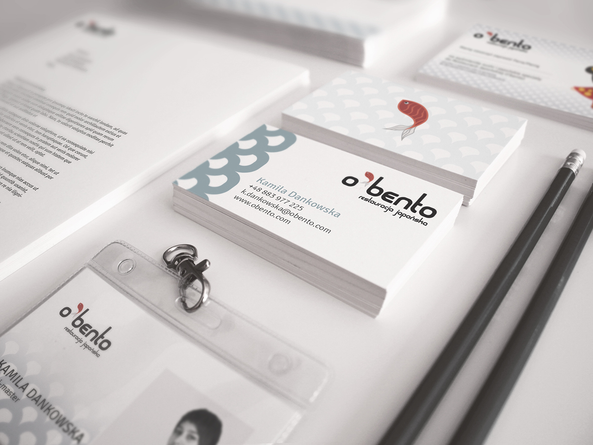
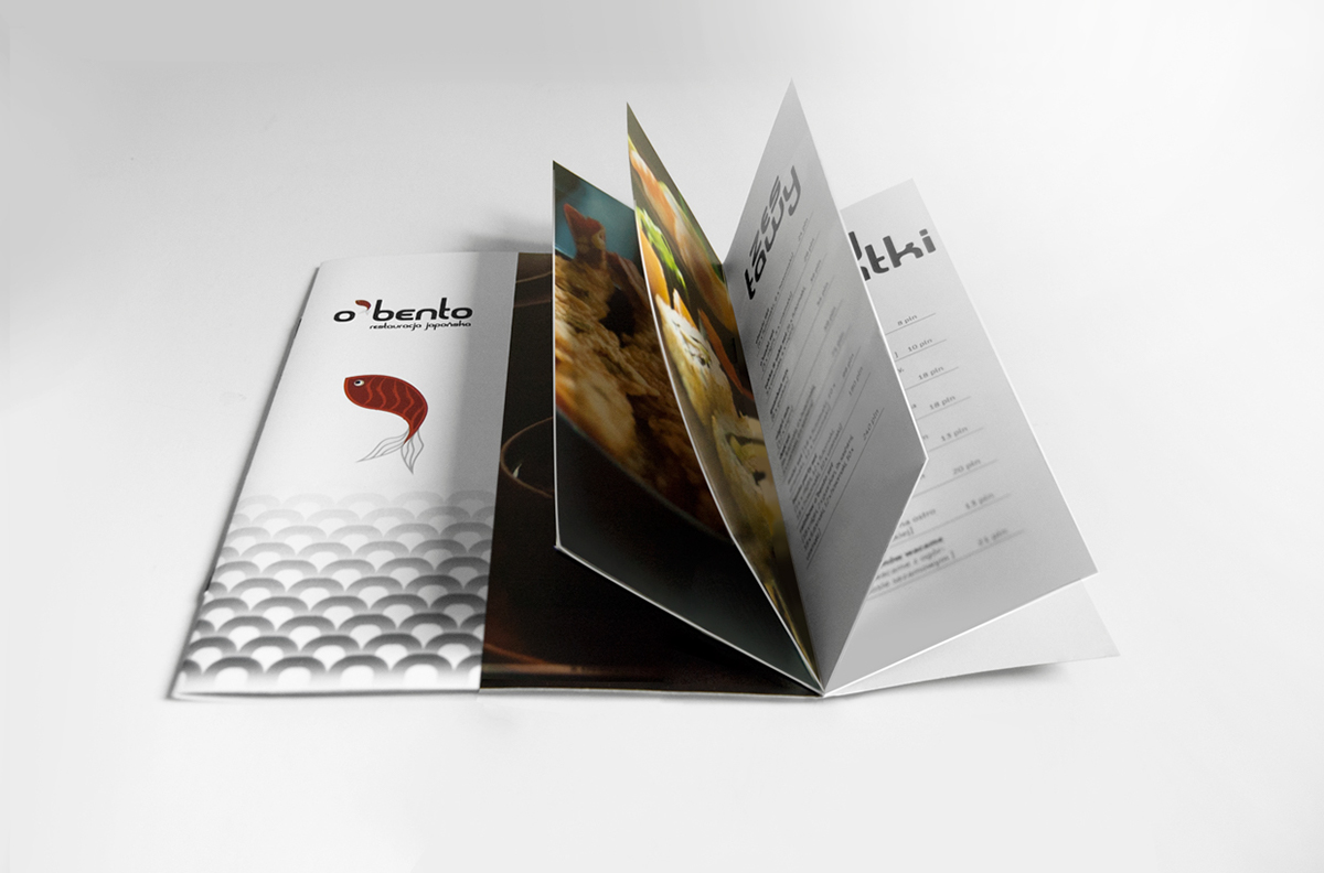
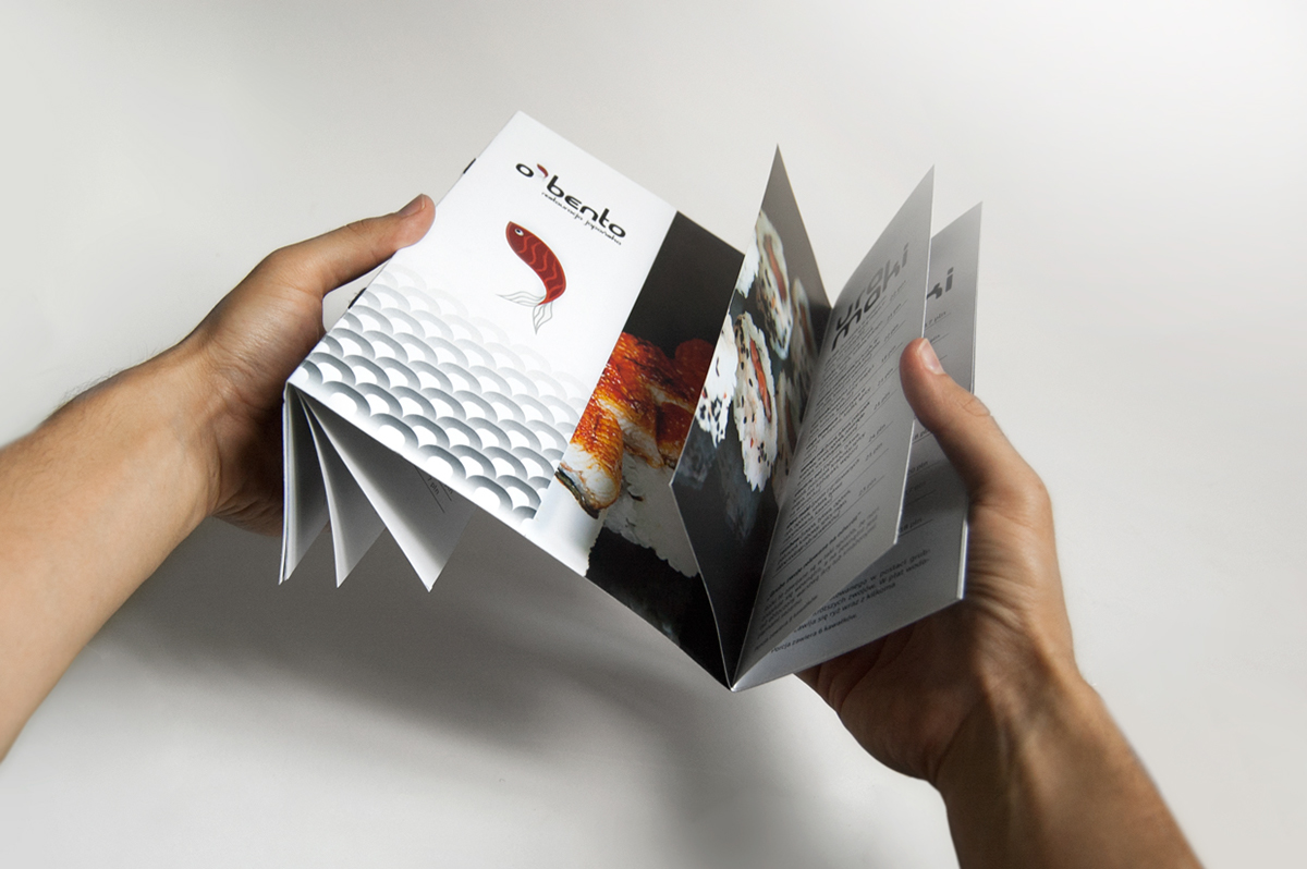
The identification of O’bento contains a logo and its varieties, a graphic motif (which was inspirited by the shibori pattern from Japanese kimonos) and guidelines of appropriate usage for these elements. I also designed stationery elements (business cards, envelopes, letterhead, folders etc.) and equipment for the restaurant such as take-out packaging, aprons, menu etc.
My inspiration for the logo was the shape of futomaki sushi (thick roll), one of the most popular kinds of sushi. I took the shape of a the sushi and stylized it as the letter “O”. This shape was applied in the logo, graphic motif and a decorative font.
I have designed three kinds of packaging: O’bento Mini, Midi and Max. They are meant to hold different sizes of sushi sets. I wanted to create functional packaging, which would also be handy and interesting for the user. The packages are therefore equipped with a handy holder (which can be folded make the package cubical) and it is easy to arrange an aesthetic composition of sushi inside. The sushi’s appearance is as equally important as its taste.
Colors used for packaging and identification are simple and elegant. I used white, red, black and delicate shades of grey to allude to Japanese style. The graphics are minimalistic and modern , the main decorative elements are the logo and a traditional shibori pattern.