


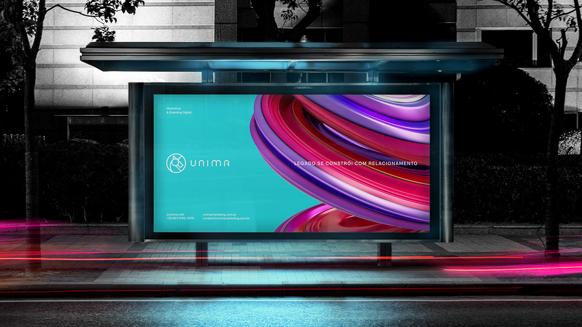
"Legado se constrói com relacionamento".
É com base nessa frase que a Unima, agência de marketing digital desenvolve seus serviços e gerenciamentos de mídias sociais, sempre pensando em conexão com o público de maneira eficaz, tanto para a empresa quanto para o target.
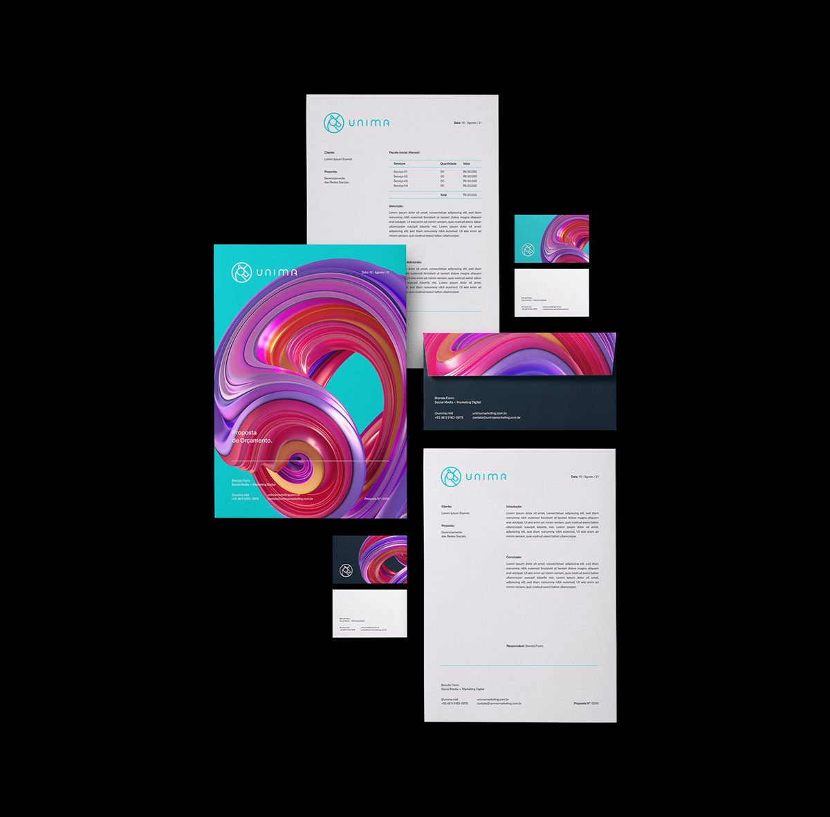
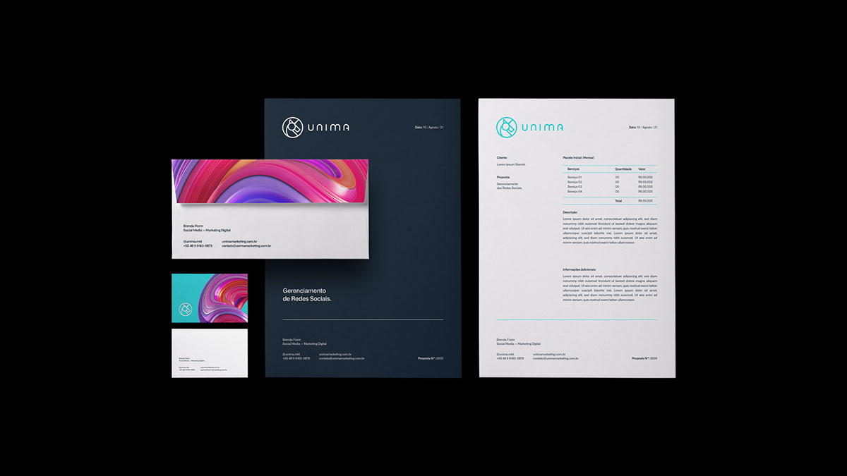
Fui contratado para projetar o logo e toda a comunicação visual da empresa, focando em reforçar os principais pontos de contato e conceitos antes descritos: A conexão entre o digital e o pessoal.
-
"Legacy is built on relationship".
It is based on this phrase that Unima, a digital marketing agency, develops its services and management of social media, always thinking about connecting with the public in an effective way, both for the company and for the target.
I was hired to design the company's logo and all visual communication, focusing on reinforcing the main points of contact and concepts described above: The connection between the digital and the personal.
Client: Brenda Fiorin • Company: Unima • Year: 2020 • Country: Brazil

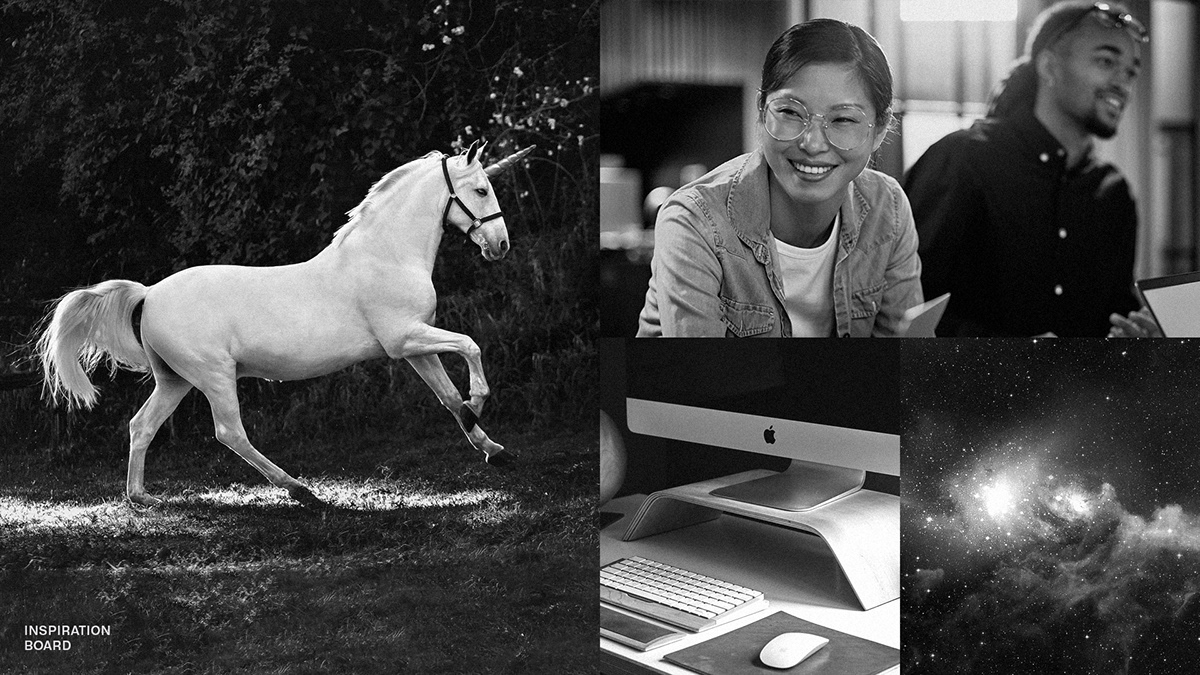
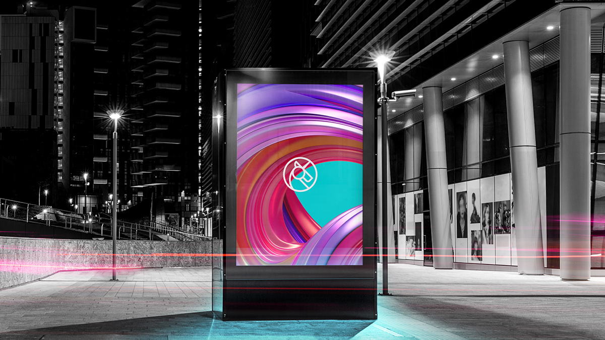
"Unima" é um nome criado à partir das palavras "Unicórnio" e "Alma", por isso, foi escolhido trabalhar com a representação do unicórnio como símbolo. As imagens que me inspiraram no projeto contrastam entre o lúdico, o digital e a conexão de atendimento ao cliente.
-
"Unima" is a name created from the words "Unicorn" and "Alma" (Alma = Soul), so it was chosen to work with the representation of the unicorn as a symbol. The images that inspired me in the project contrast between the playful, the digital and the customer service connection.

O símbolo foi criado em um grid geométrico construído pelos círculos da proporção áurea (*1,618), trazendo assim, uma grande harmonia e justificação no posicionamento dos traços.
-
The symbol was created in a geometric grid built by circles of the golden proportion (*1.618), thus bringing great harmony and justification in the positioning of the lines.


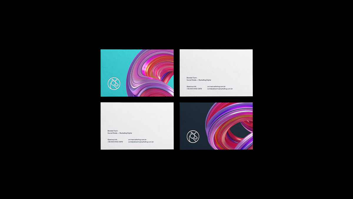
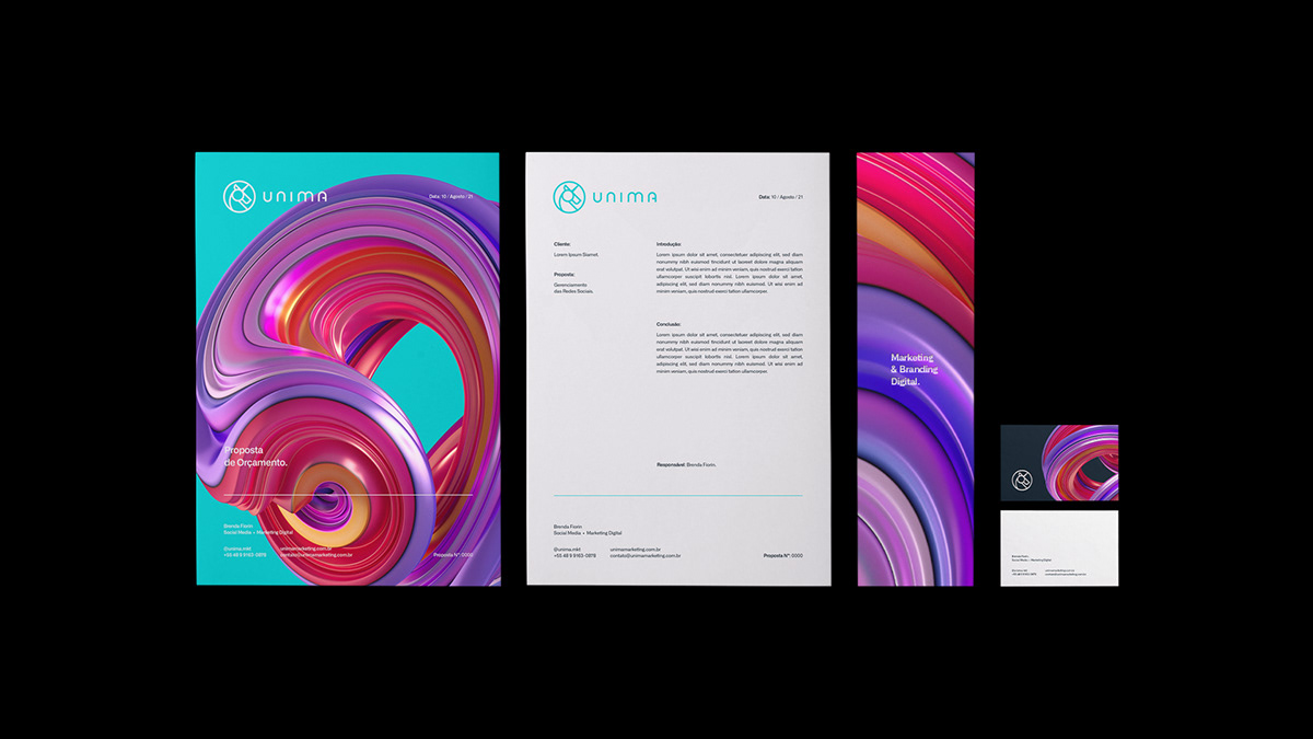
Reforçando o foco no digital, as tonalidades de azul foram escolhidas principalmente pelo contraste entre o neon e o opaco, harmonizando com o off-white em suas aplicações. A combinação das cores com o elemento de textura líquida, traz muito movimento e conexão nas artes, a forma orgânica traz a parte mais pessoal e humana do projeto.
-
Reinforcing the focus on digital, the shades of blue were chosen mainly for the contrast between neon and opaque, harmonizing with off-white in their applications. The combination of colors with the liquid texture element brings a lot of movement and connection in the arts, the organic form brings the most personal and human part of the project.
A tipografia também foi construída com base no mesmo grid e proporção do símbolo, e polida com ajustes ópticos para trazer a melhor leitura e legibilidade possível quando combinada com o símbolo. As curvas e minimalismo das letras também reforçam os conceitos digitais da Unima, mas de maneira simples e eficaz.
-
The typography was also built around the same grid and aspect ratio as the symbol, and polished with optical adjustments to bring out the best readability when combined with the symbol. The curves and minimalism of the letters also reinforce Unima's digital concepts, but in a simple and effective way.


VISSOTTO STUDIO


