


Travel Magazine Logo, Cover, & Spread
As part of my Sessions College coursework, I was tasked with designing 3 logo options, a cover, and an interior spread for a travel magazine based on a fictional client brief. As an added challenge, the 3 logo options had to communicate their distinctive connotations through typography alone—no graphics allowed.
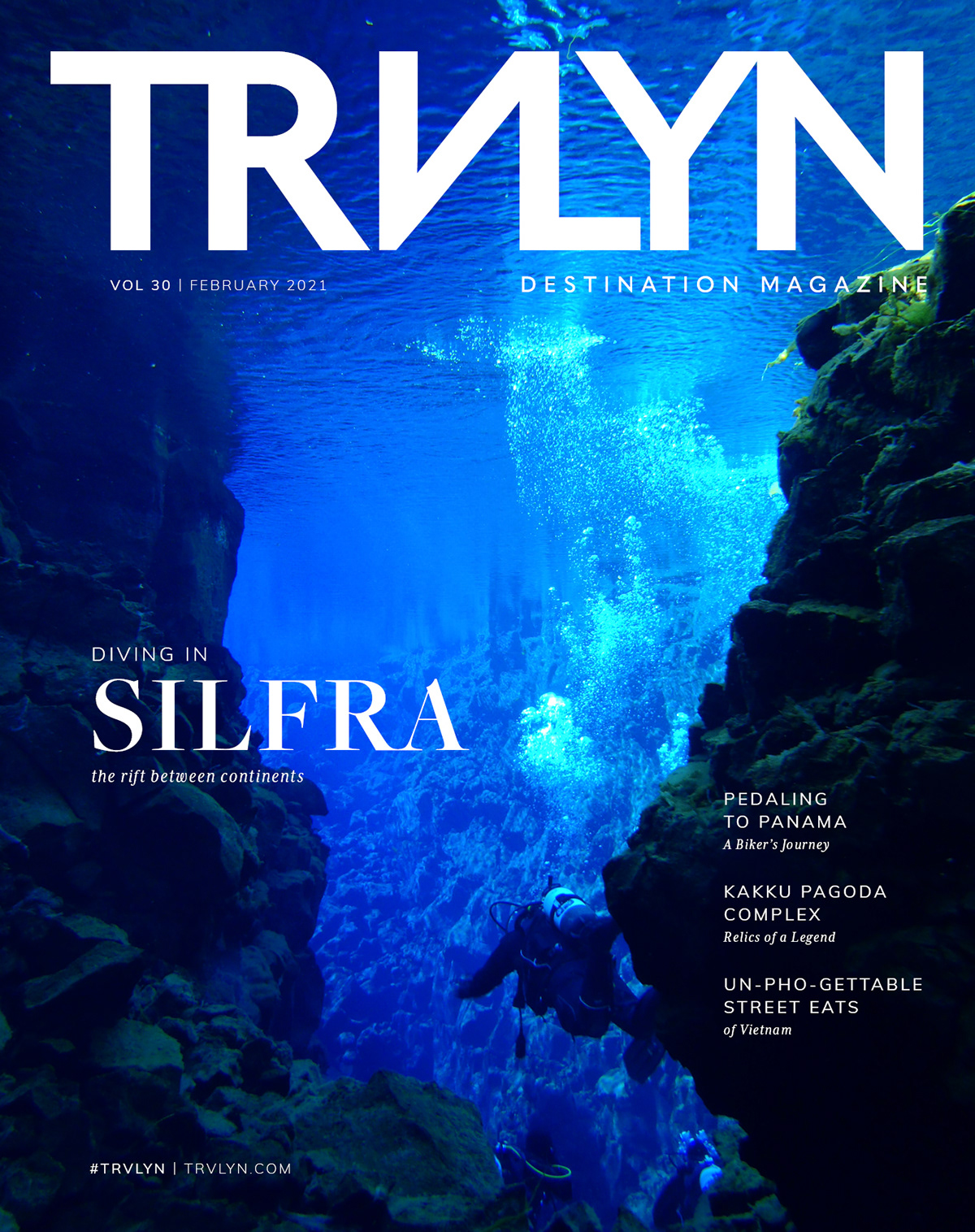
The logo options I developed are each strong in their own way: #1 would work great for an exotic destination magazine with a whimsical illustration style (such as those found on vintage travel posters), and #2’s softer look feels cozy and approachable, perfect for a budget-friendly magazine featuring a range of different destinations and topics. In the end, option #3 proved to be the most modern and versatile, with an authoritative silhouette that adapted well to the dramatic design I had in mind for the cover and spread. On the cover, the stark white type creates strong contrast against the intriguing deep blue of the photo; while on the spread, the title straddles the divide between the photo and the rest of the page, underscoring Silfra’s status as one of the world’s most unique diving destinations.


